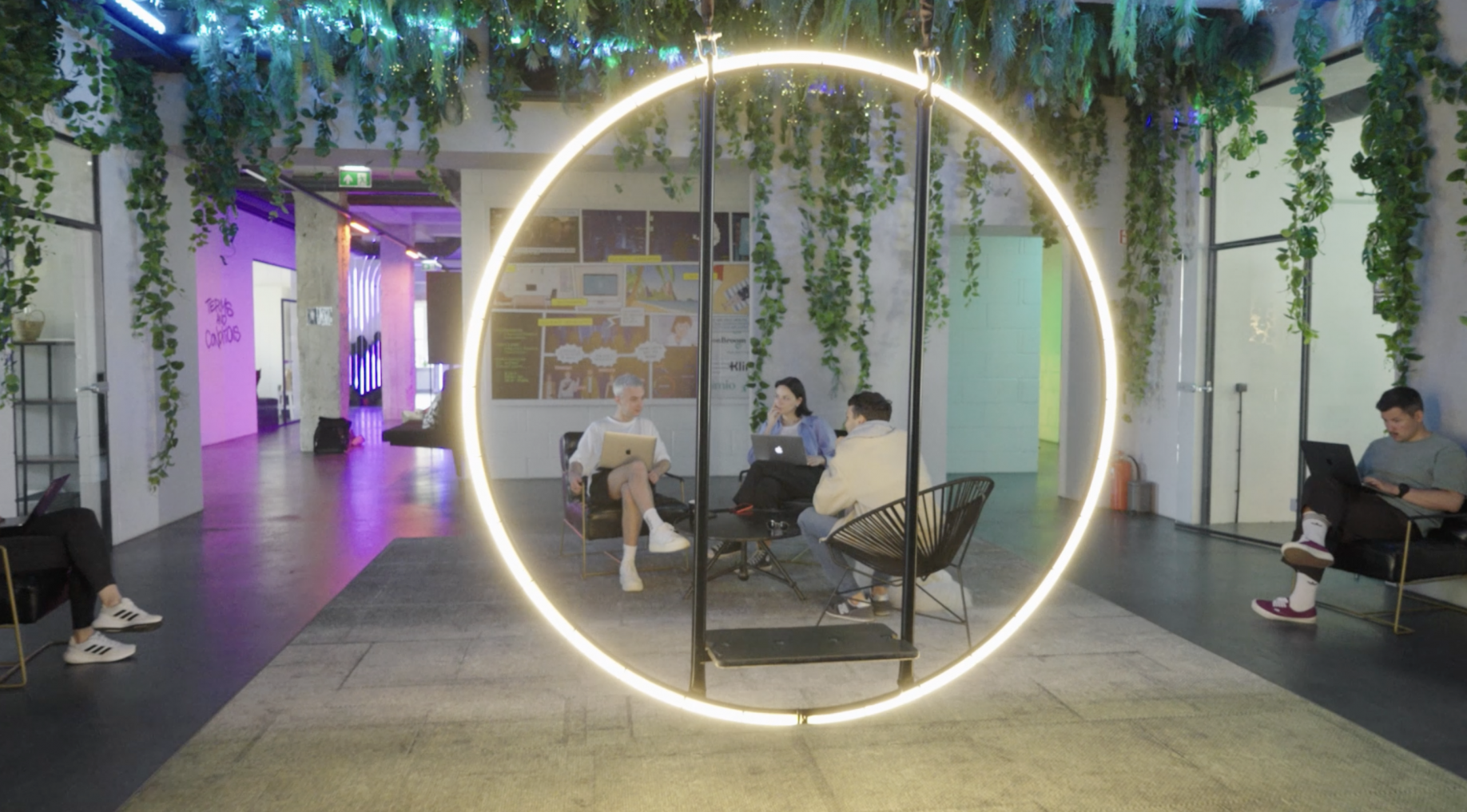
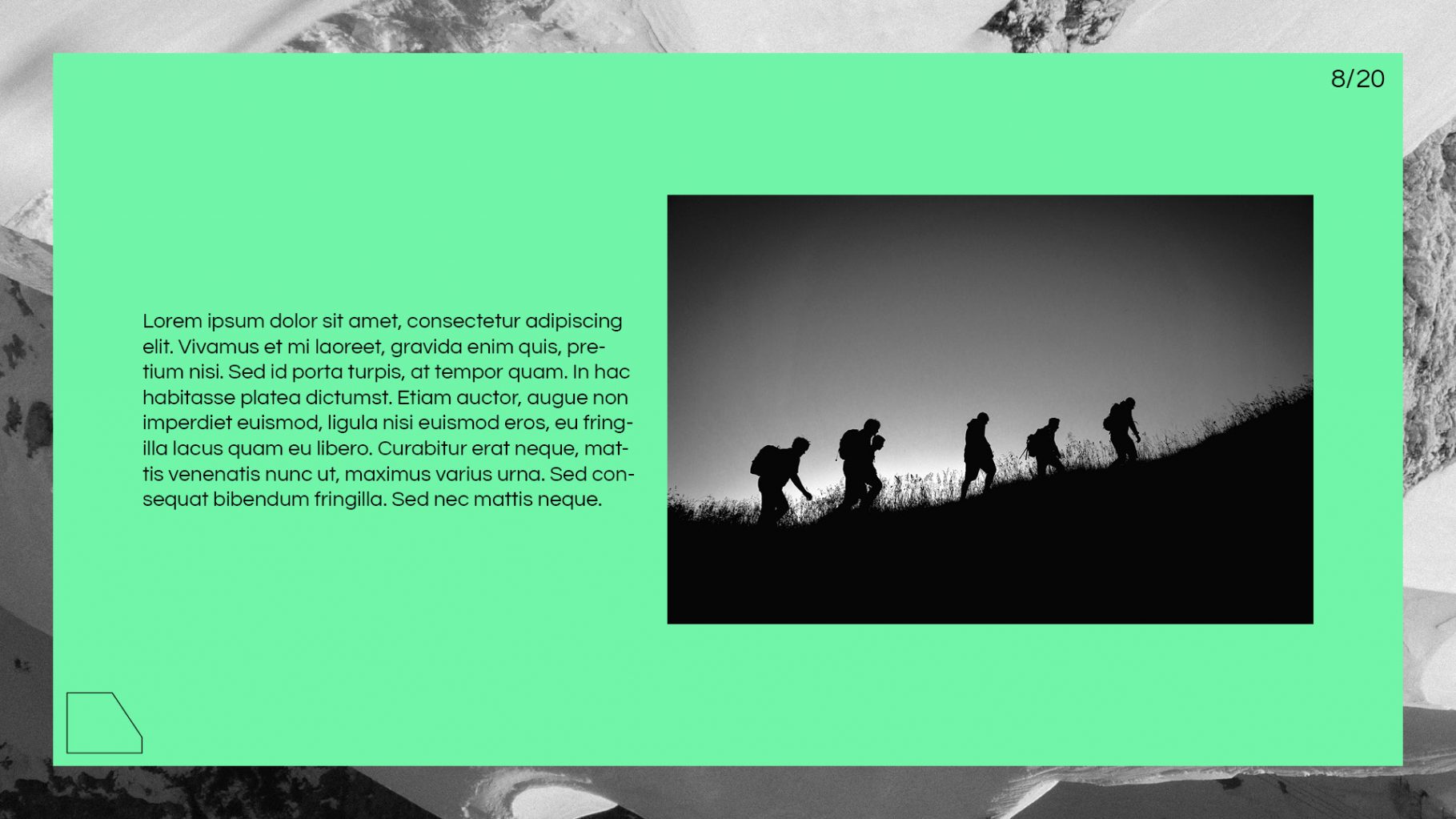
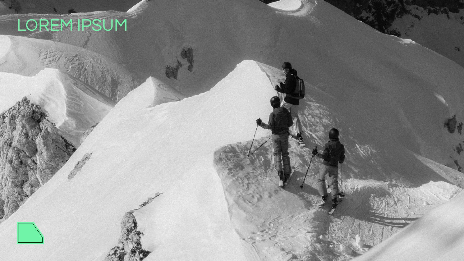
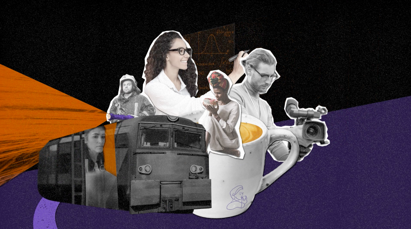
Works
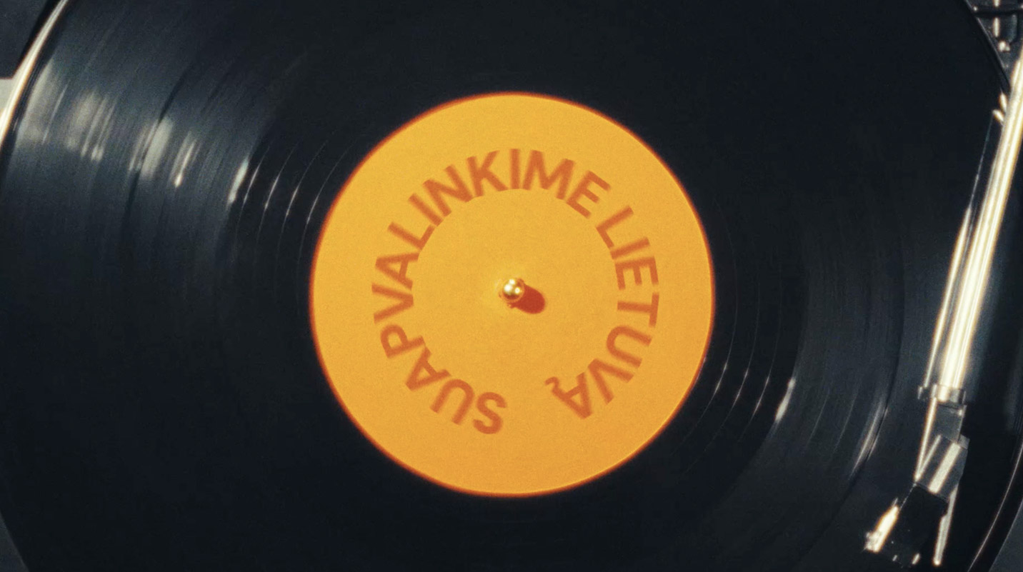
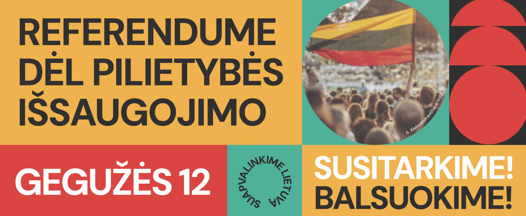
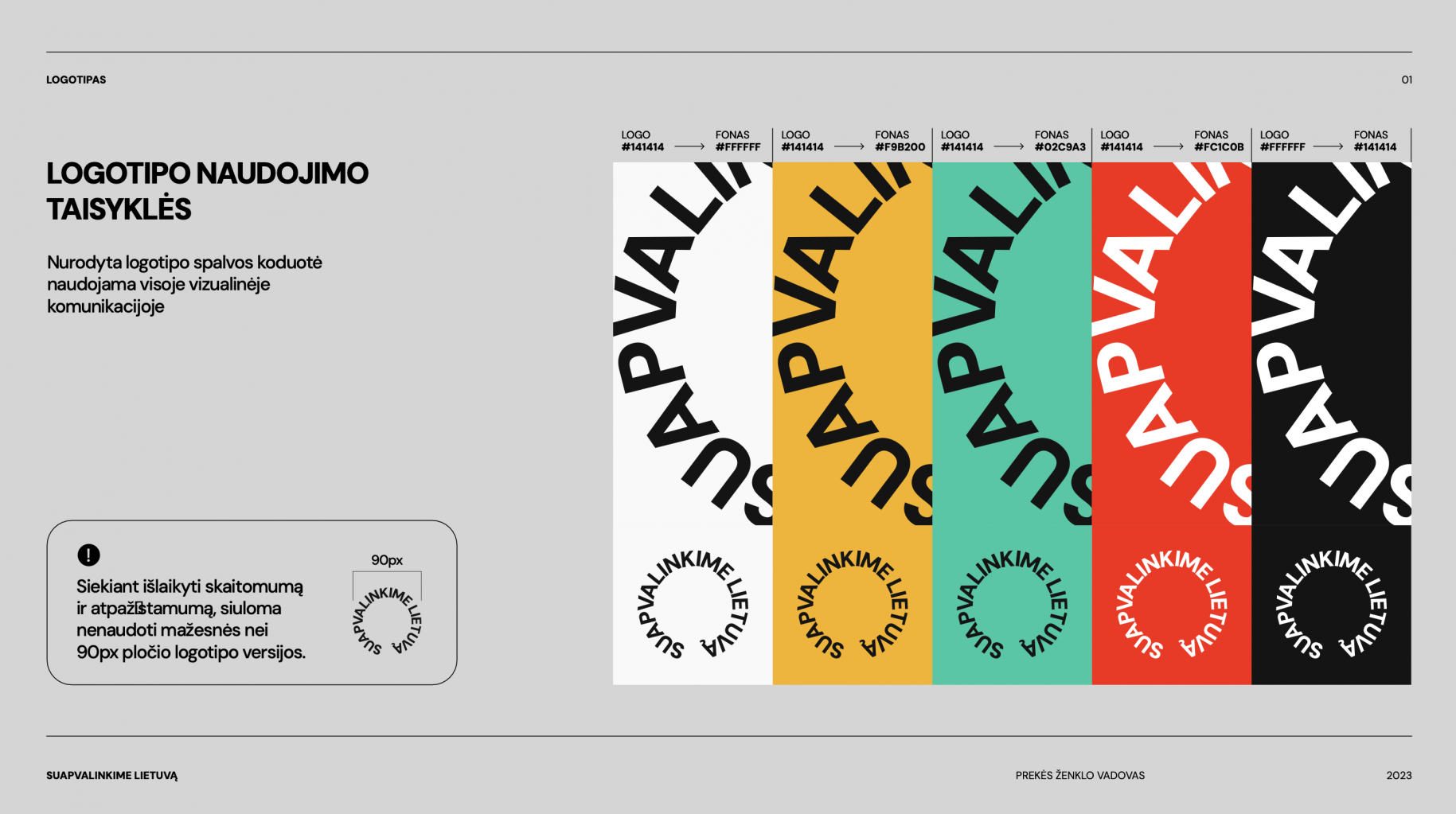
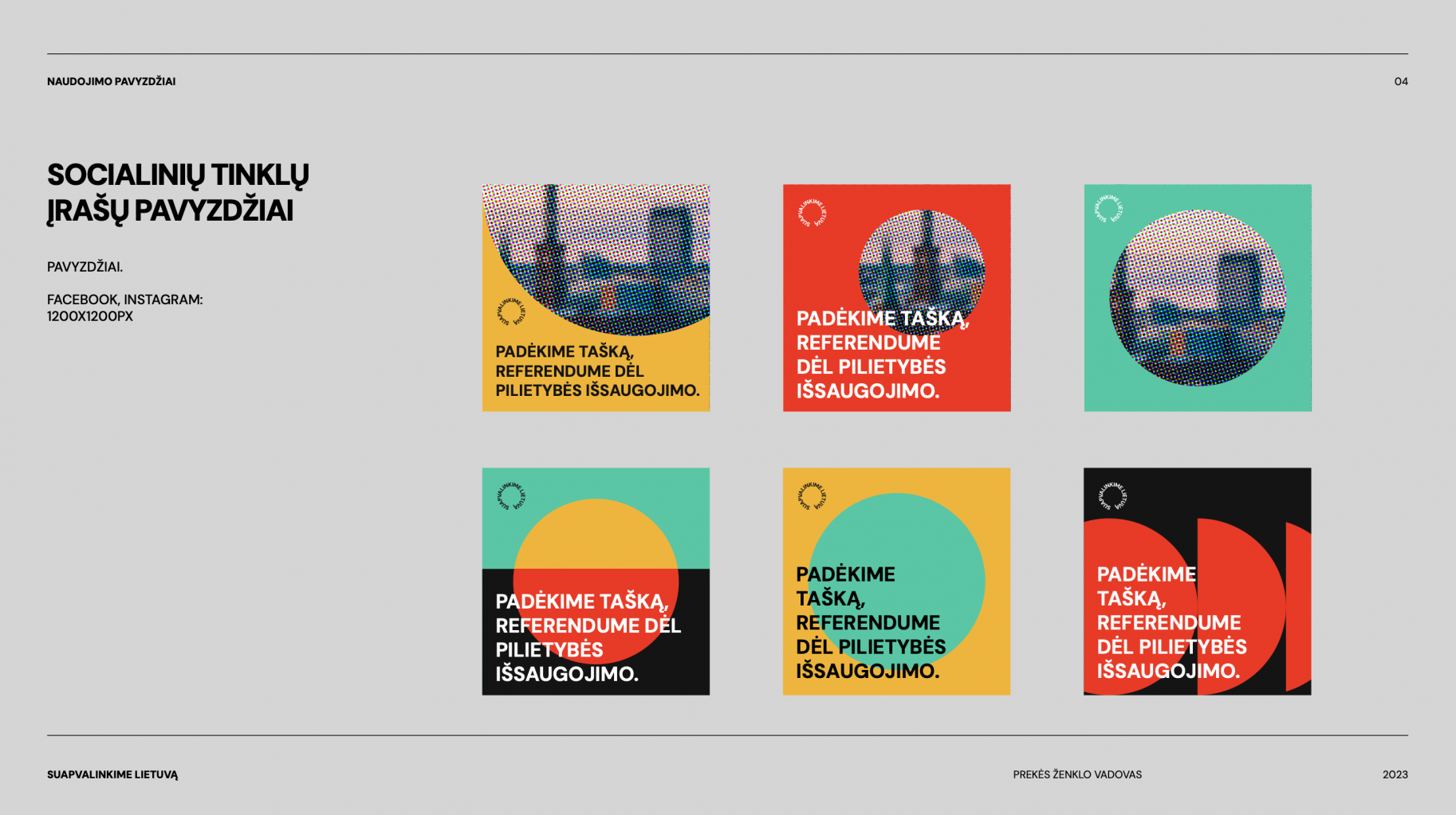
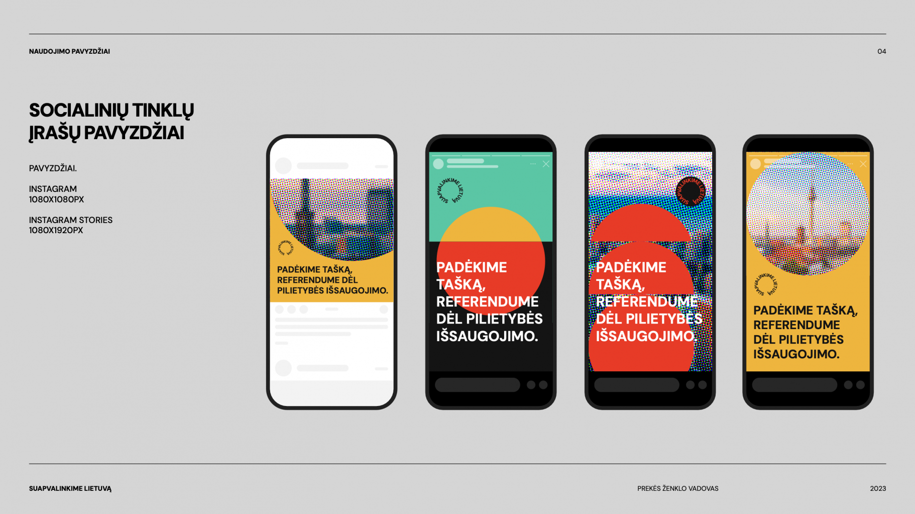
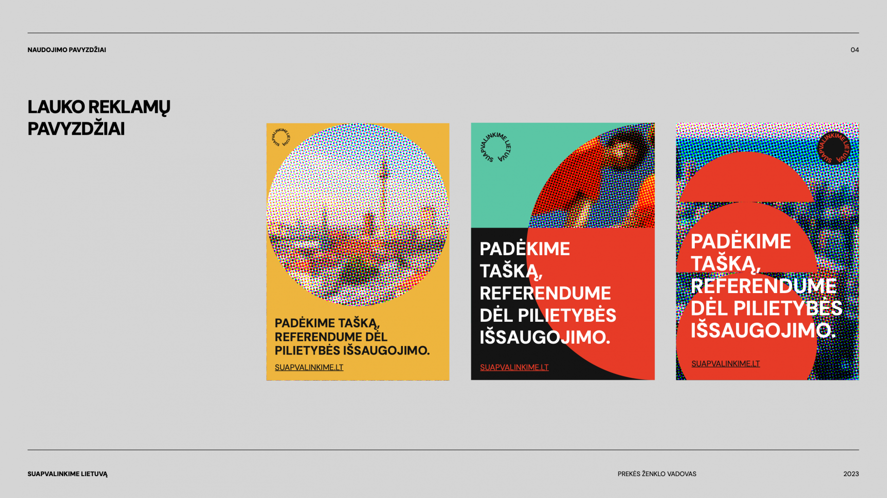
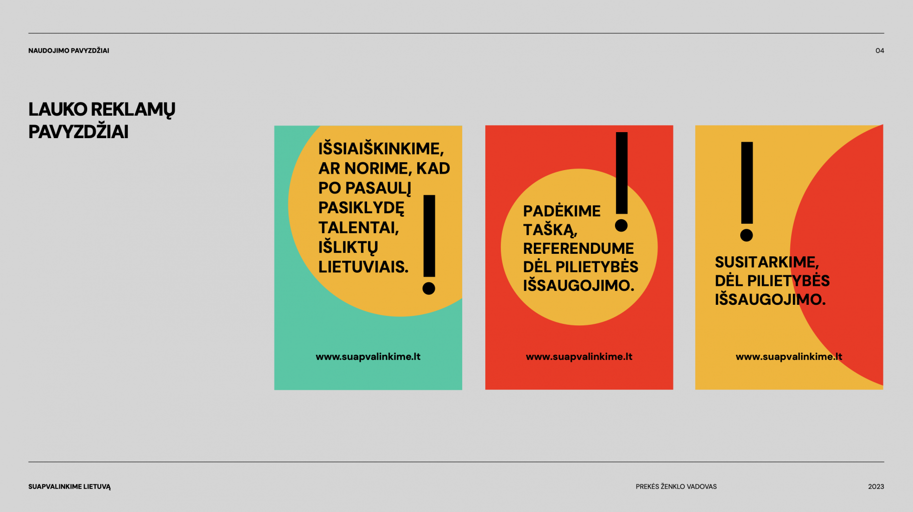
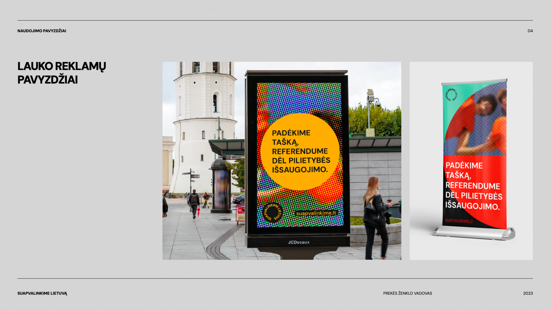
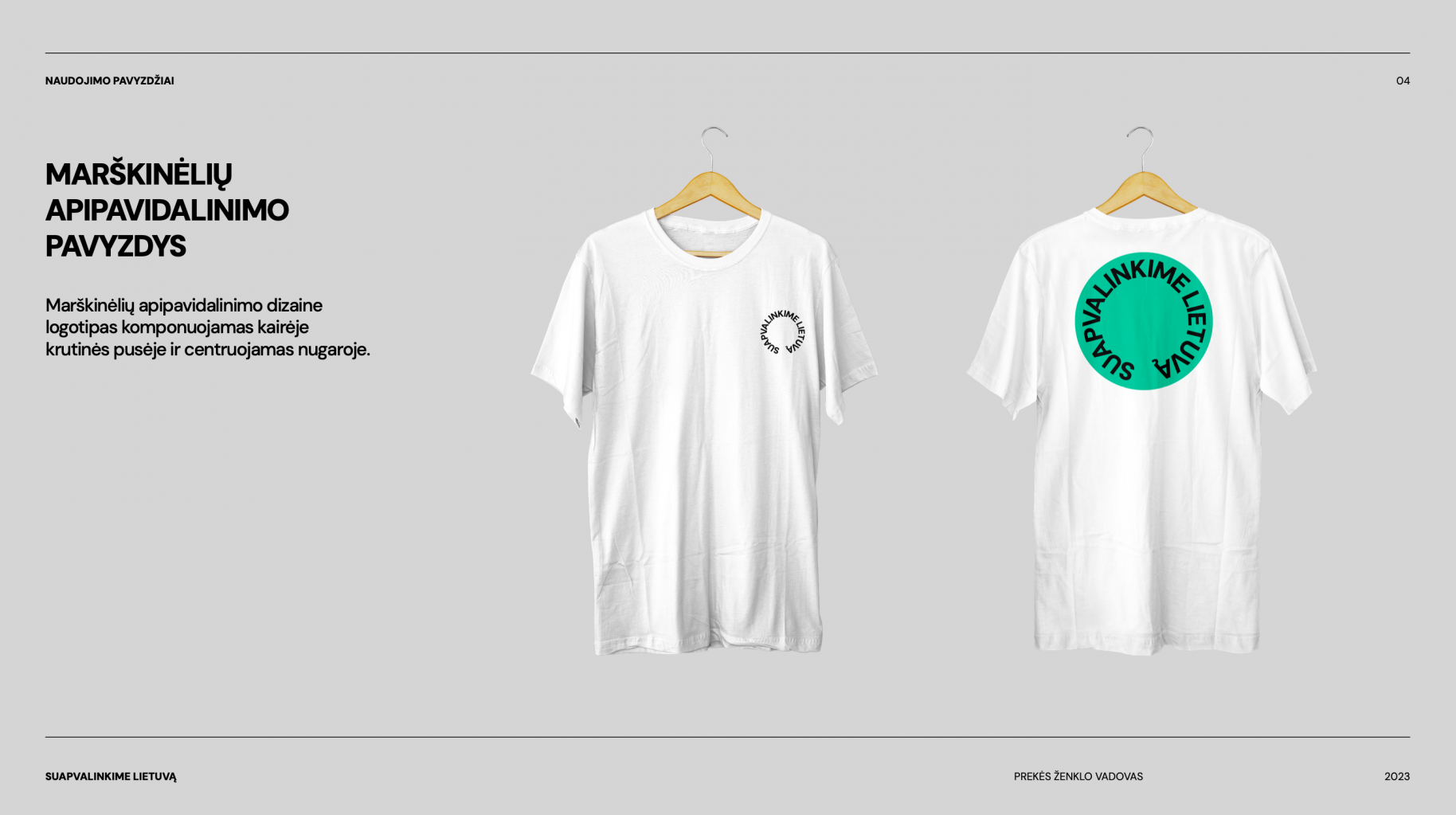
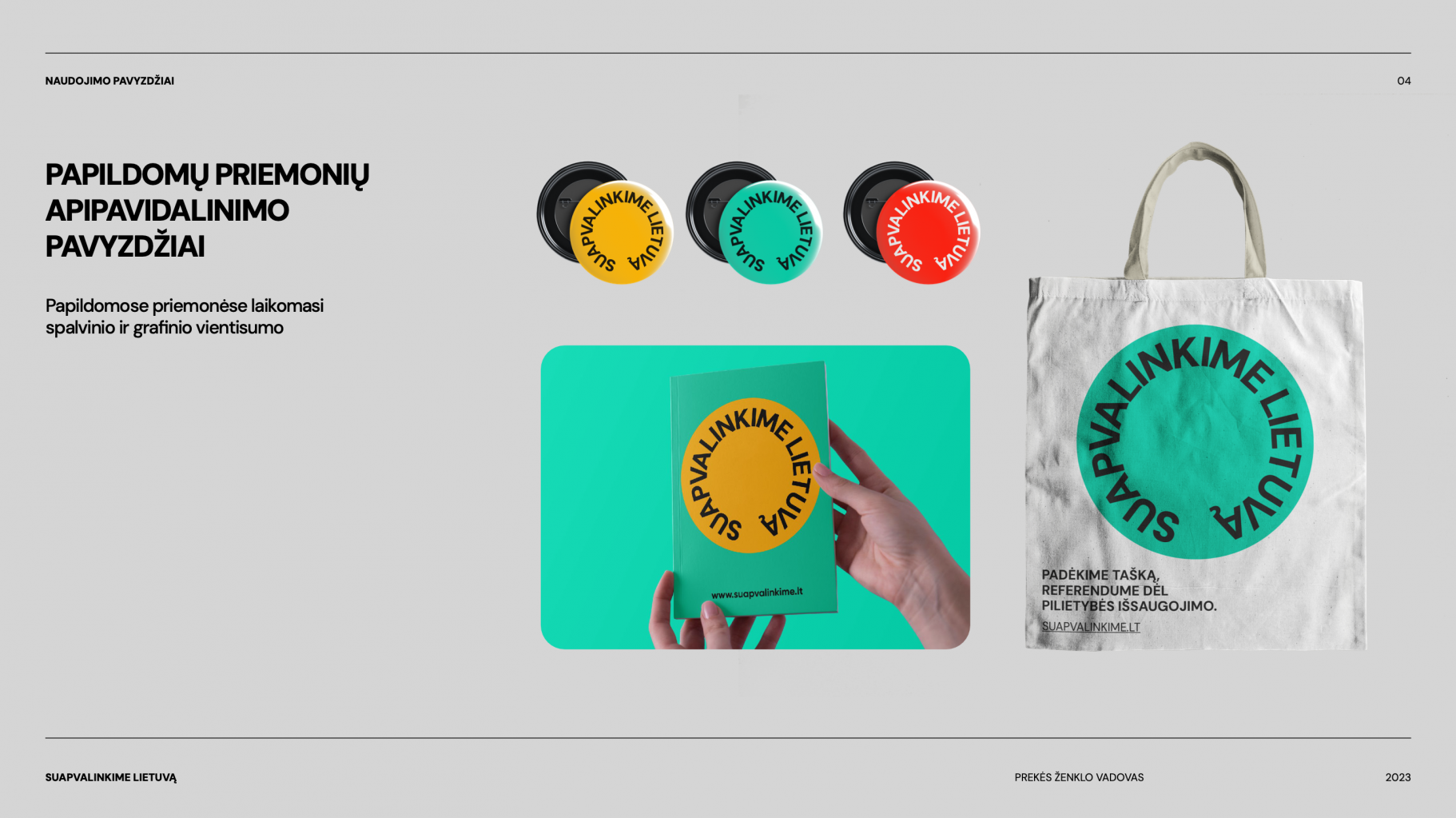
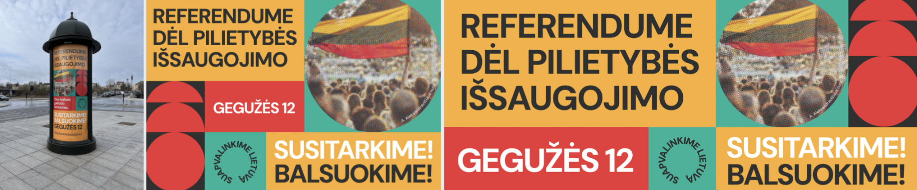
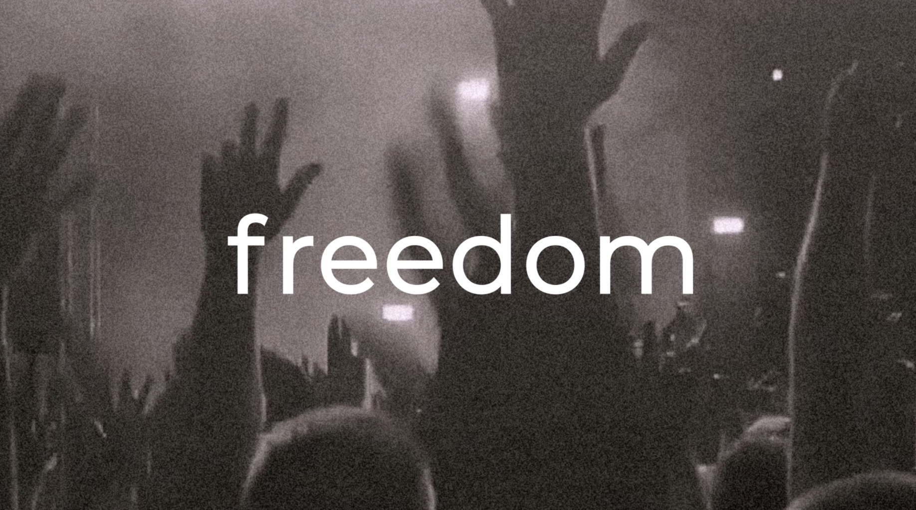
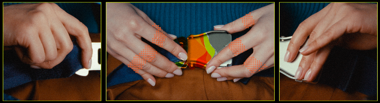
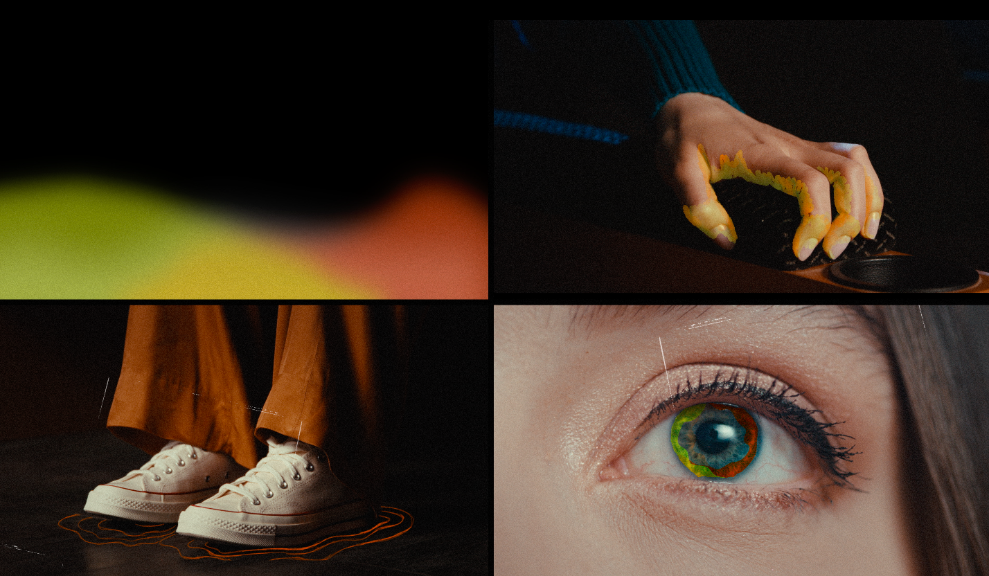
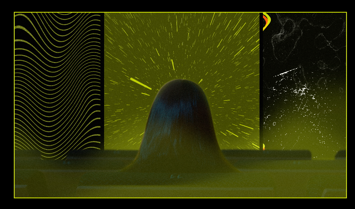
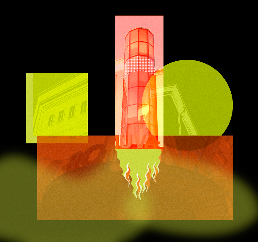
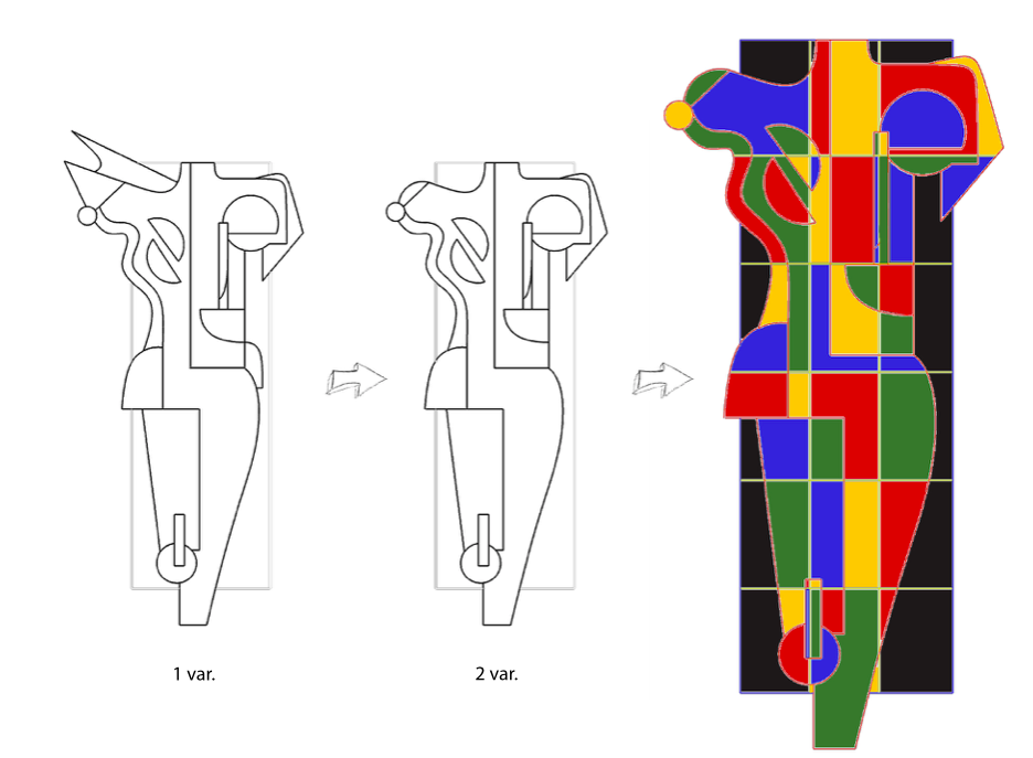
Social campaign for the Referendum on retaining citizenship Branding
Concept:
Using the “rounding” metaphor, we aim to visually convey whether we want more or fewer Lithuanian citizens, larger or smaller demographic indicators, and stronger or weaker ties with Lithuanians spread across the globe. At the same time, this act of “rounding” invites, finally, to solve this troubling question, which raises many “sharp corners” in society, i.e. i.e. calling for an agreement using a referendum.
Branding:
When translating the concept into a design language, we chose to use a lot of geometric shapes and a recurring motif of roundness. Maximum bright colors were chosen, with an allusion to the colors of the national flag of the Republic of Lithuania. The campaign’s graphic design is dominated by geometric elements, variously combined with typography. This goal is maximum visibility, the ability to arrange the necessary accents, and awarenesses.
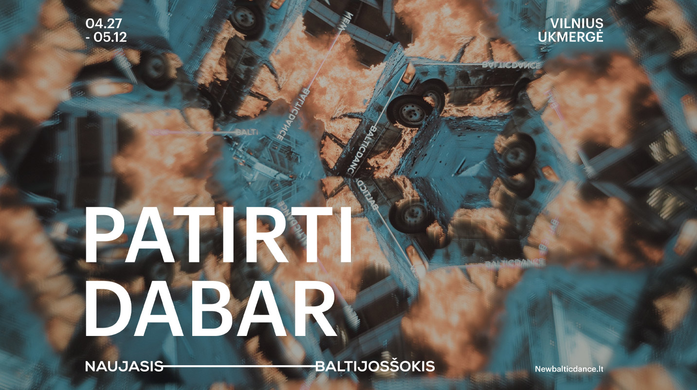
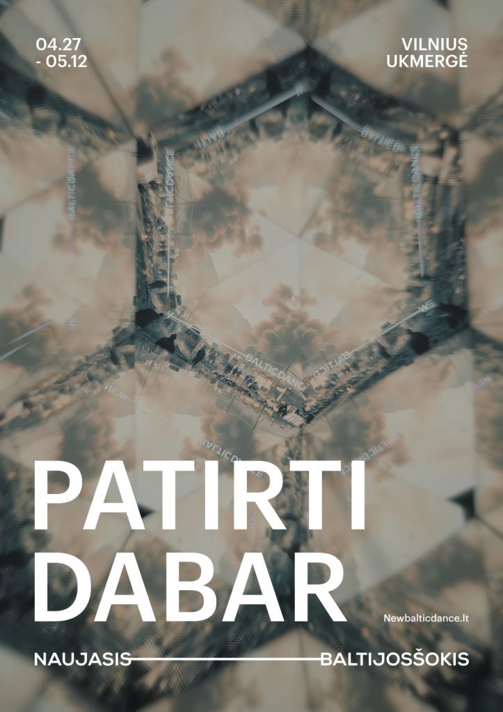
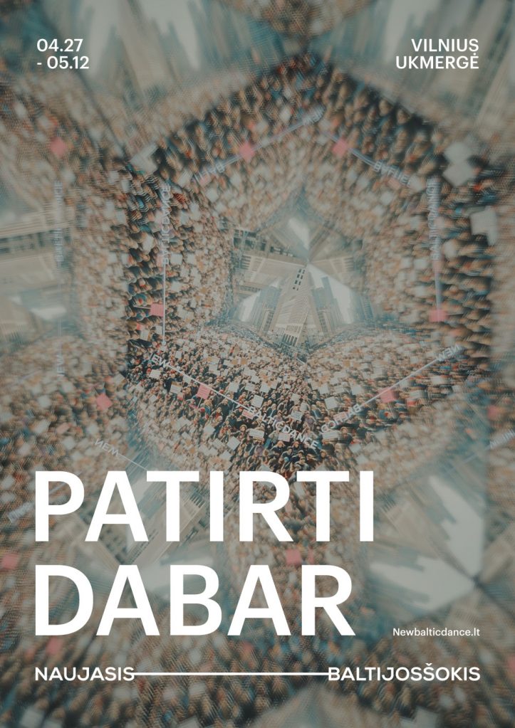
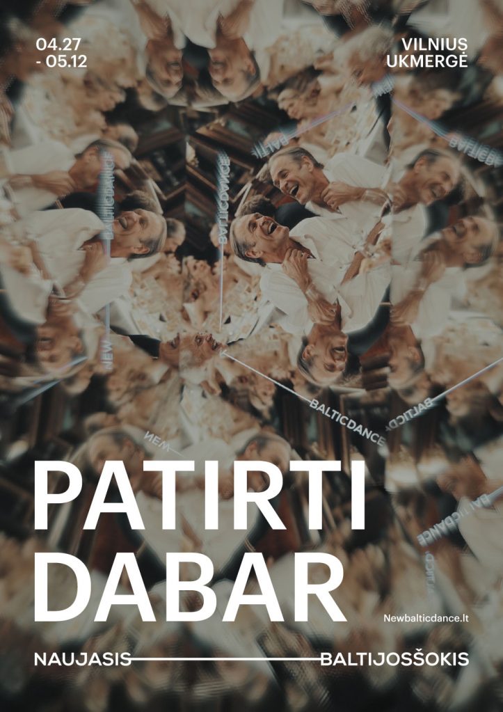
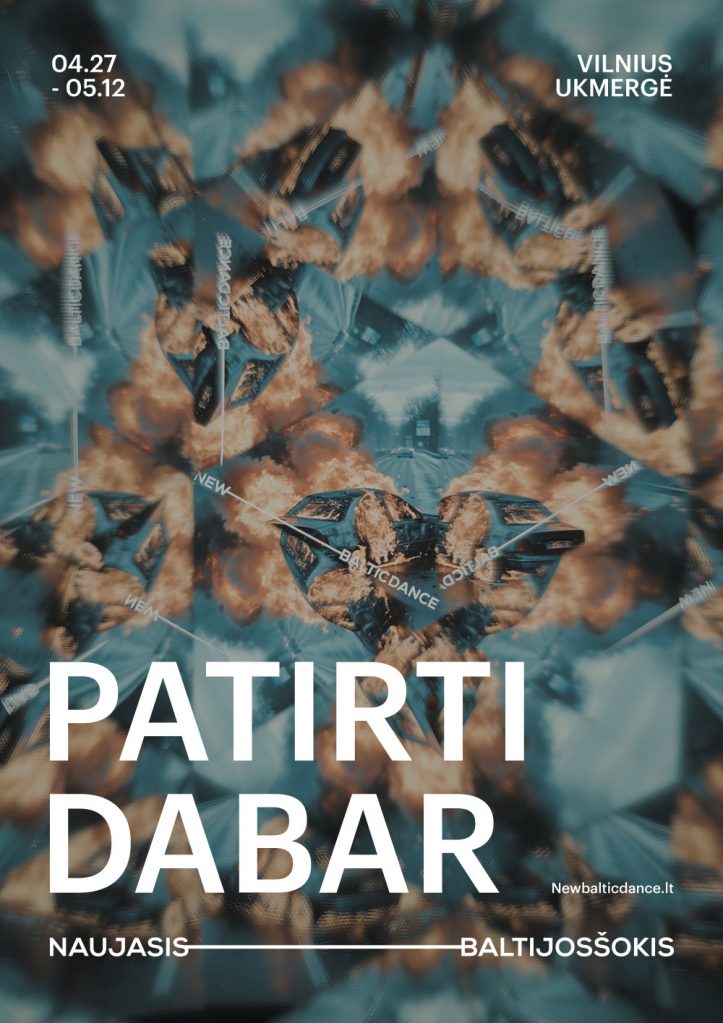
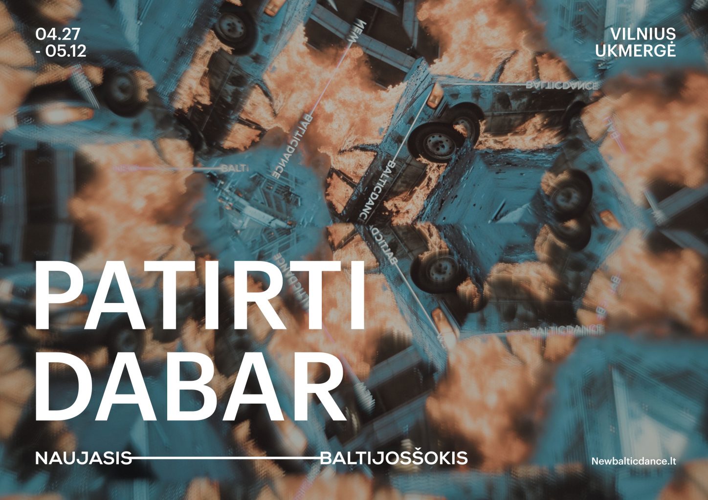
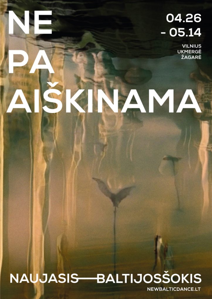
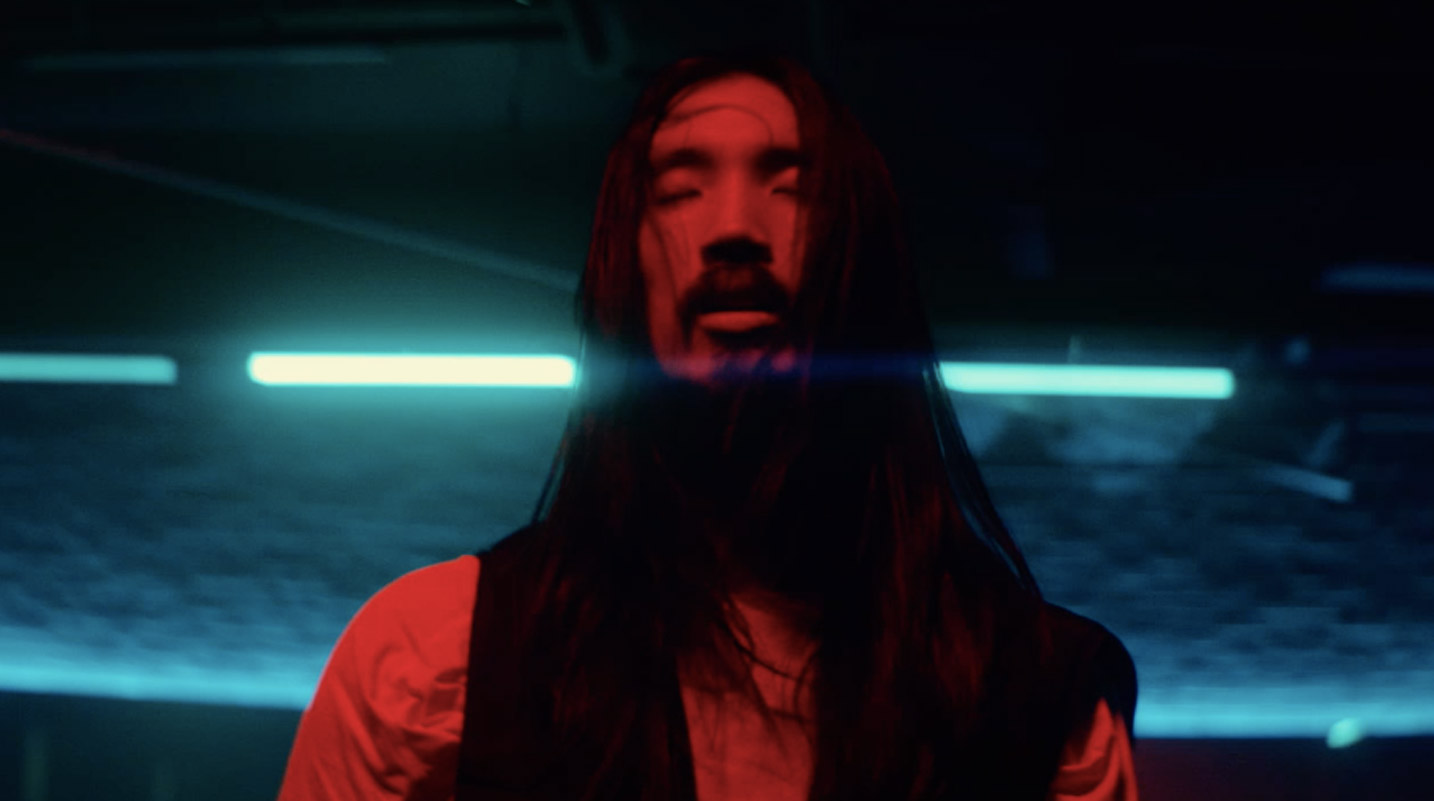
NEW BALTIC DANCE – EMBRACE THE NOW Advertising
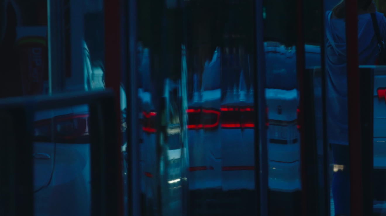
In this work, we combined AI-generated images with “prehistoric” kaleidoscope technique. We created a real kaleidoscope to observe, through the reflections of its mirrors, a multitude of images from our contemporary media environment, as seen on news channels. Thus, these eerie images of reality start to twist and dance, transforming into impressive kaleidoscopic reflections of reality. Because only art has such power – to turn the horrors of reality into beauty. The contemporary dance festival “New Baltic Dance” invites you to experience the transformations of the present, to see in dance the sharpest reflections of our reality, transforming into a bright, intriguing, and powerful experience.
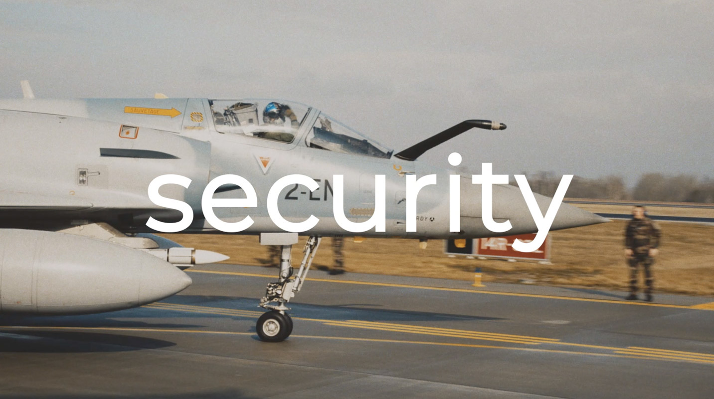
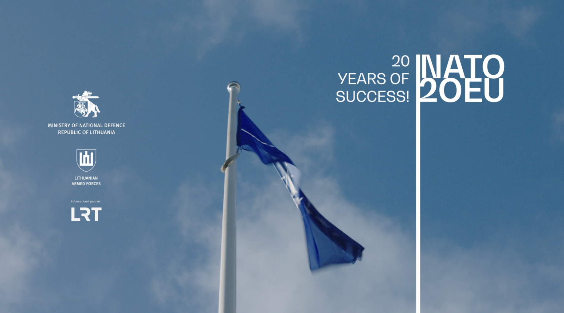
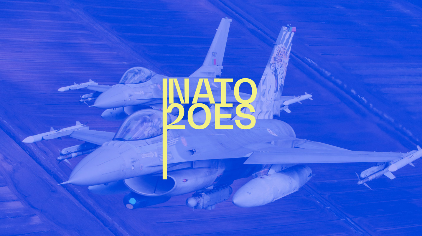
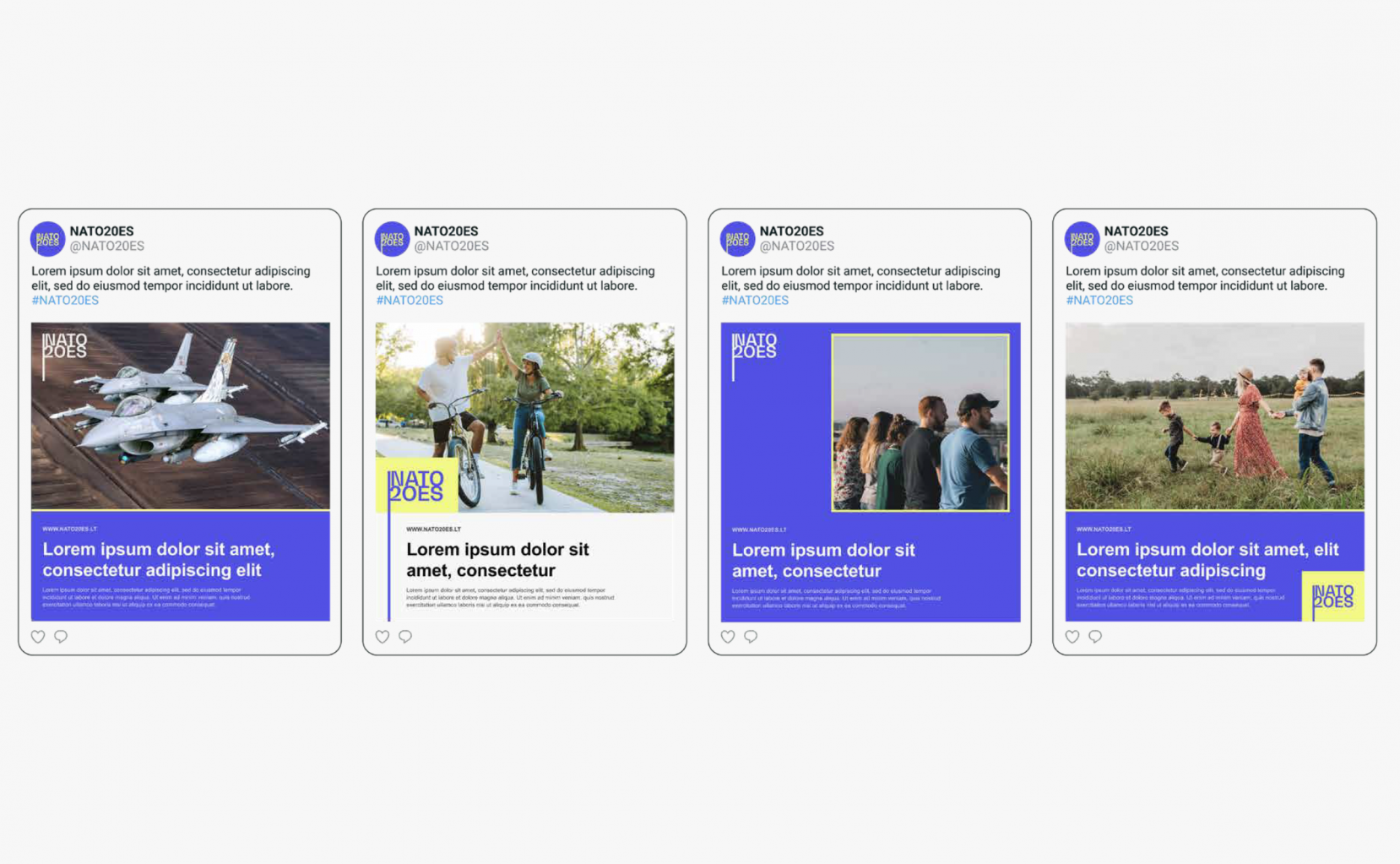
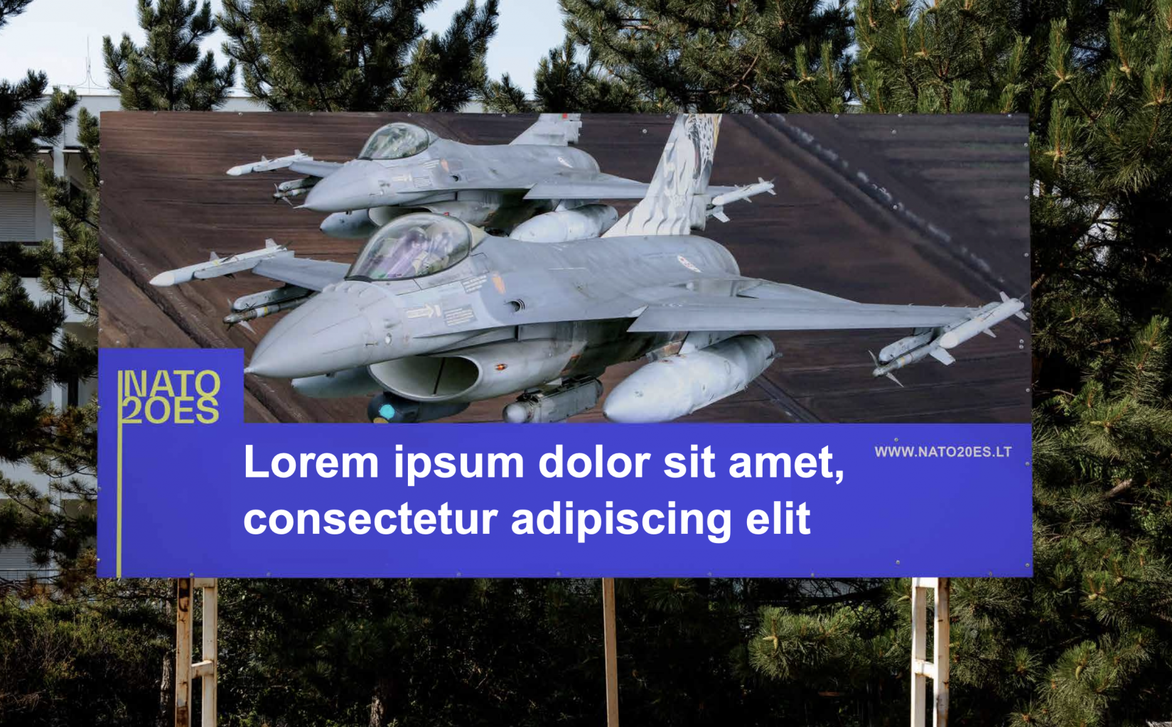
NATO / EU – 20 years of succsess Advertising
It turns 20 years this month since Lithuania joined NATO.
We are sharing a video created by us to celebrate this important anniversary, the success story of Lithuania.
Thanks to the entire team of partners. And most of all, we thank the people who made it happen twenty years ago. Twenty years ago, overcoming all challenges, all “impossible” with their work, they brought Lithuania to NATO and the EU. Thus giving us twenty years of security, peace and success. Thanks to all of them!
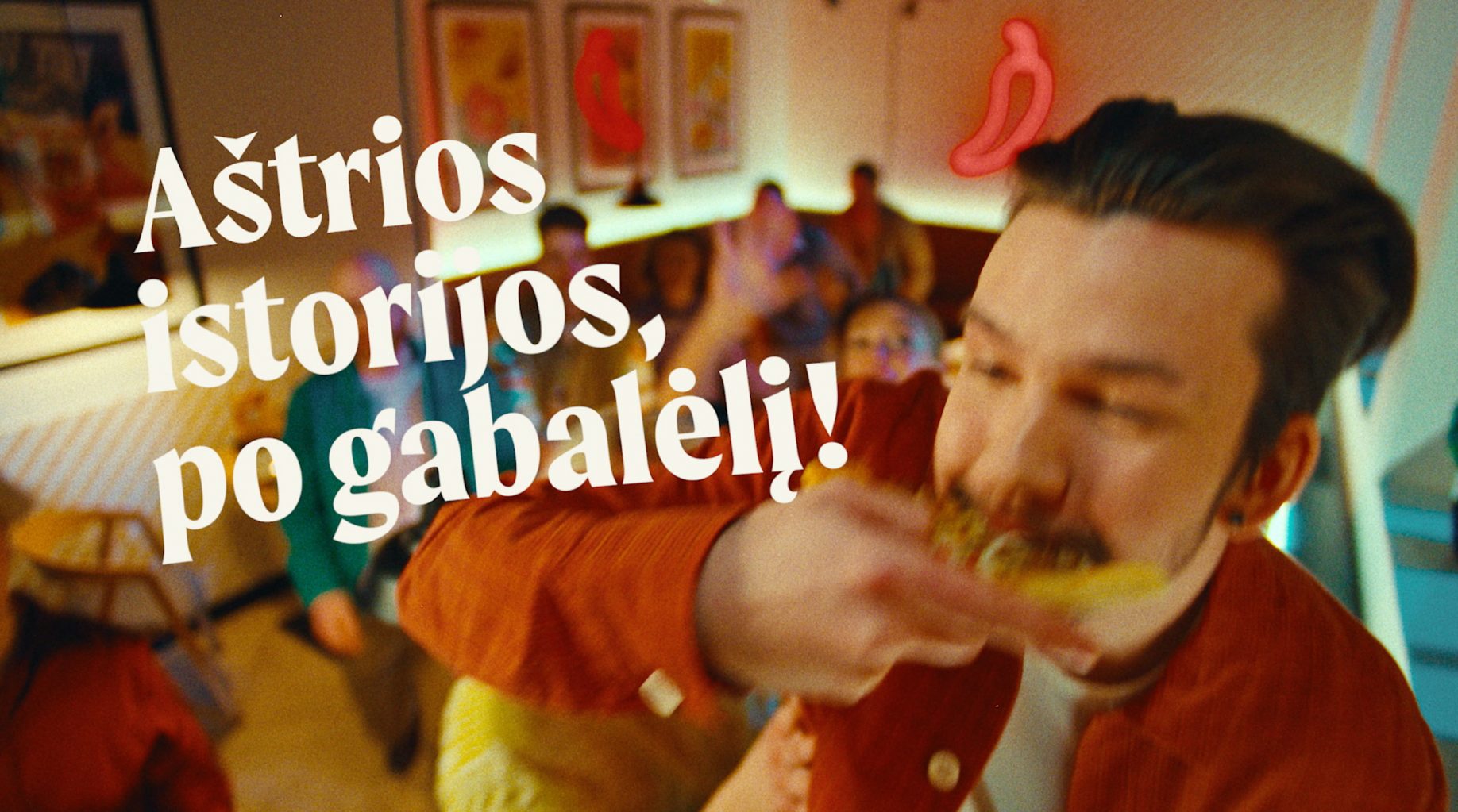
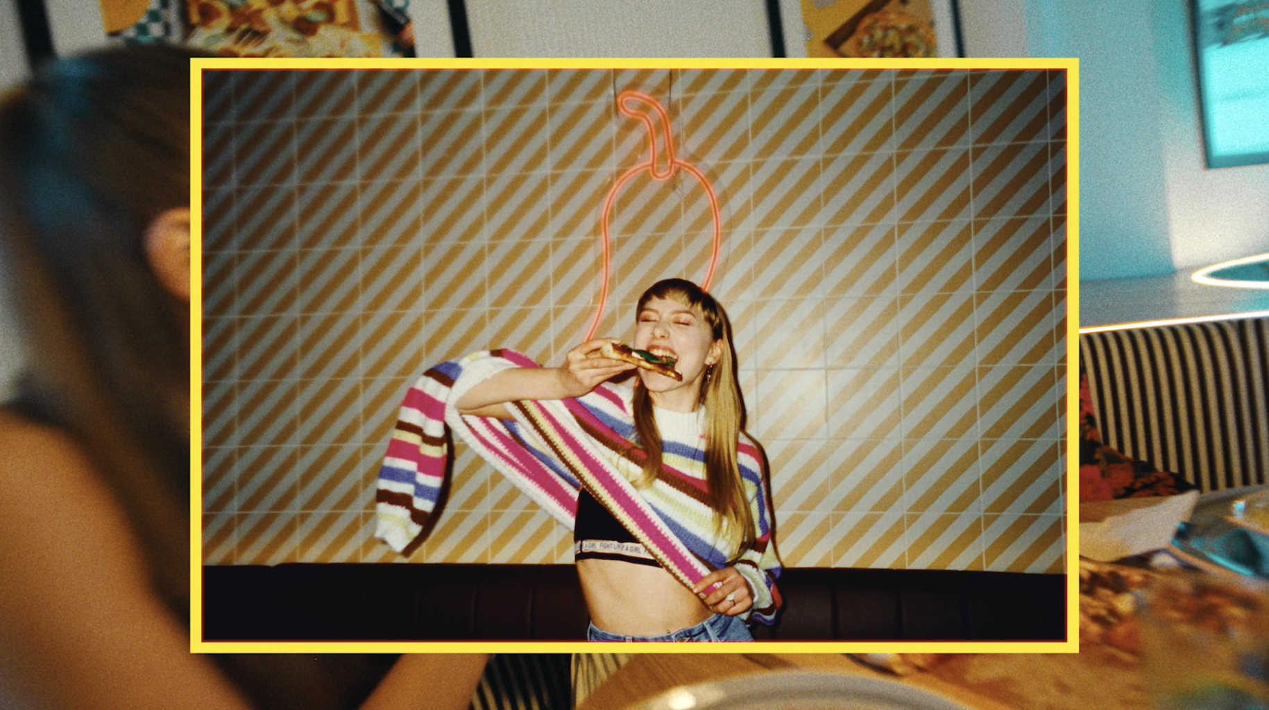
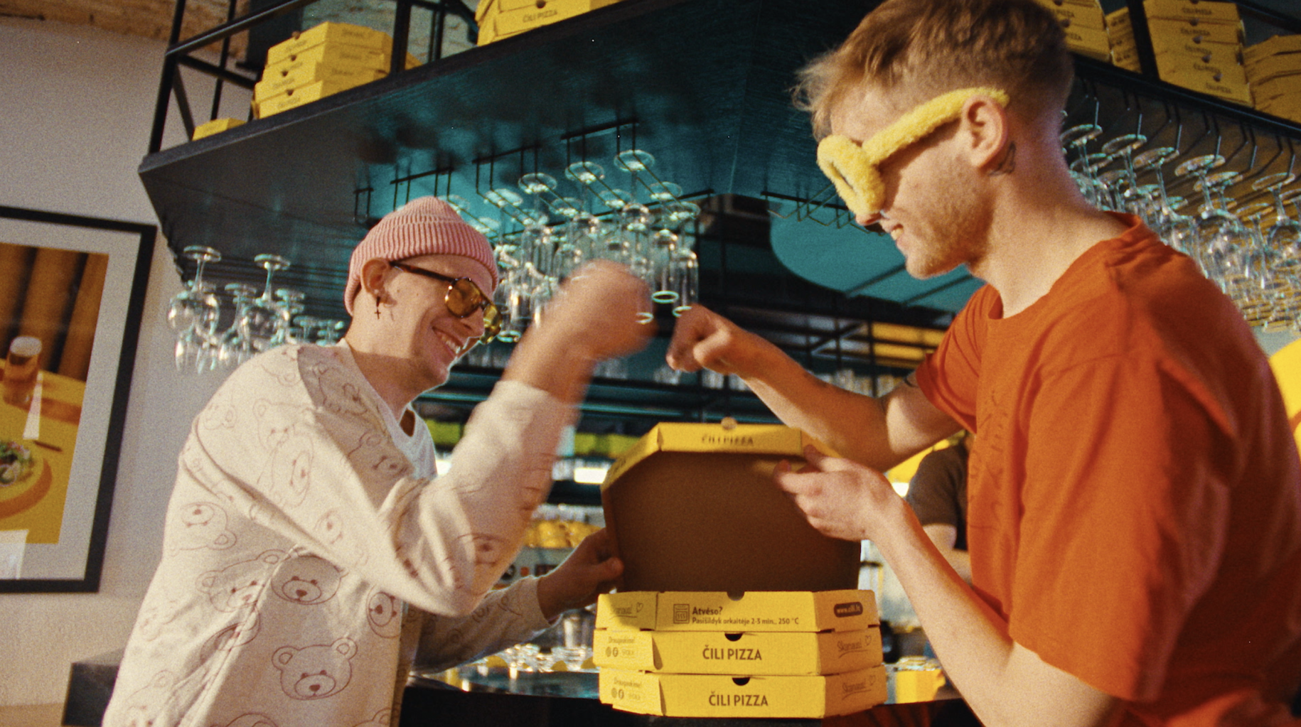
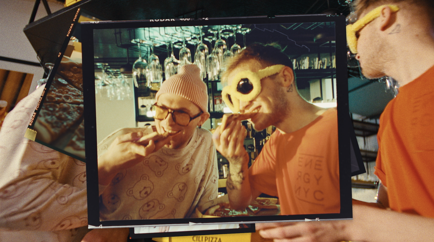
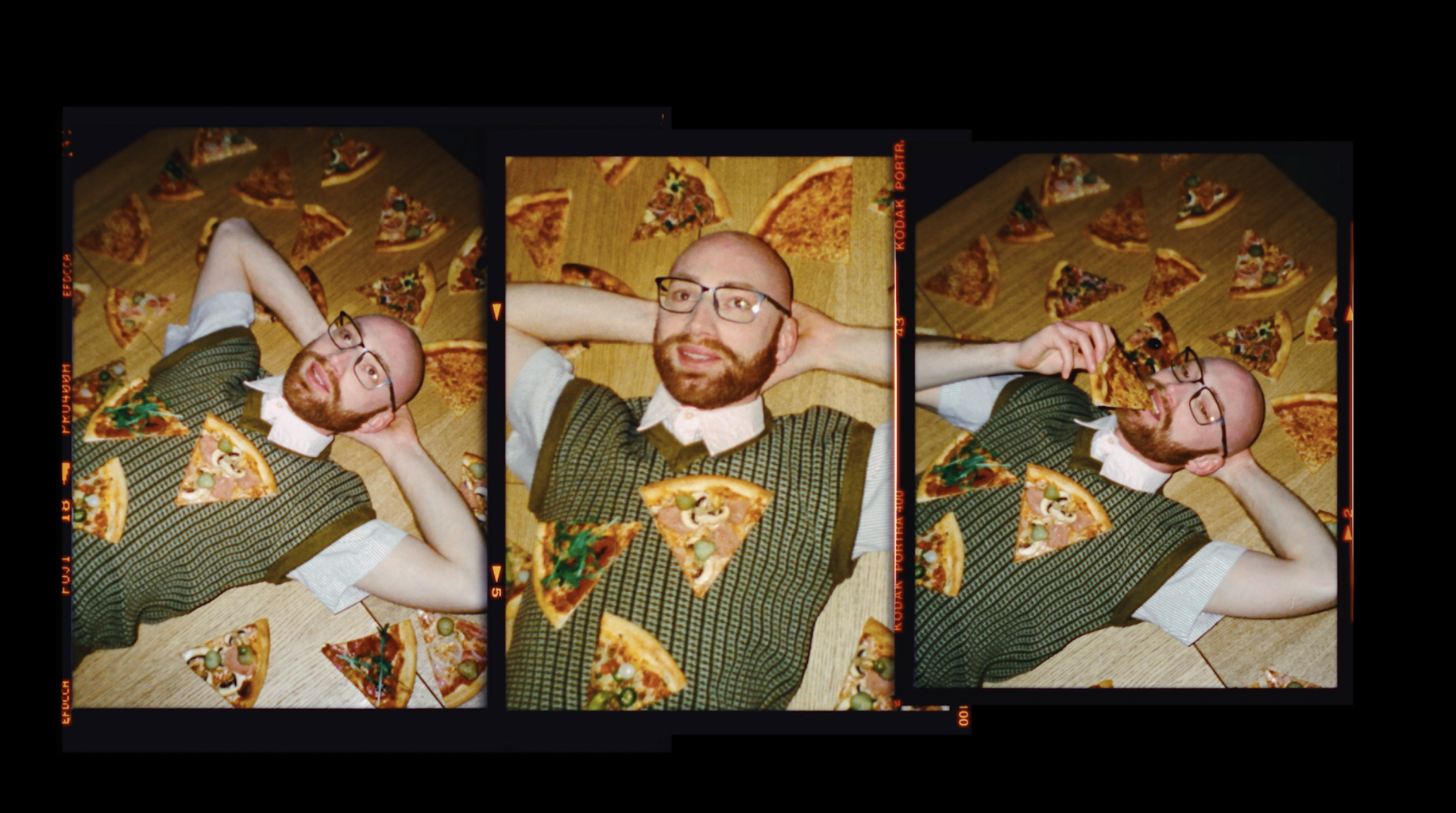
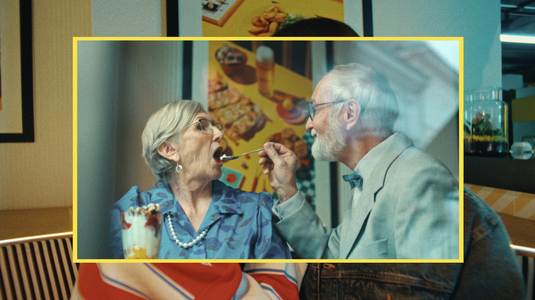
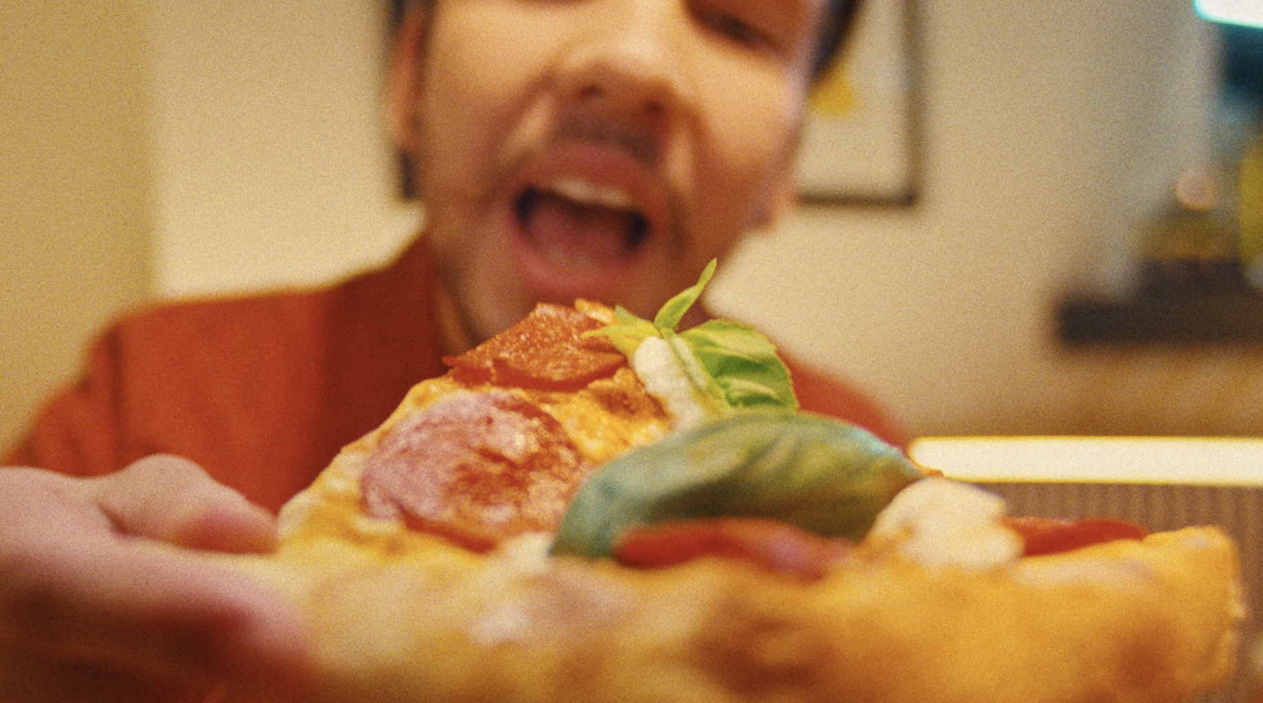
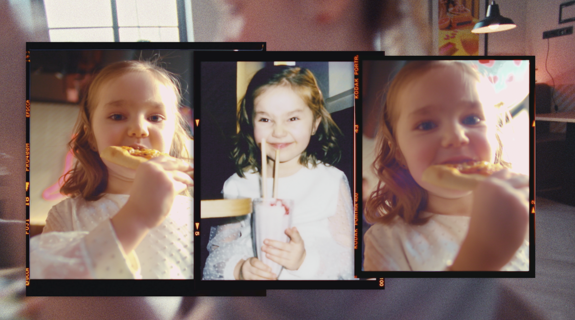
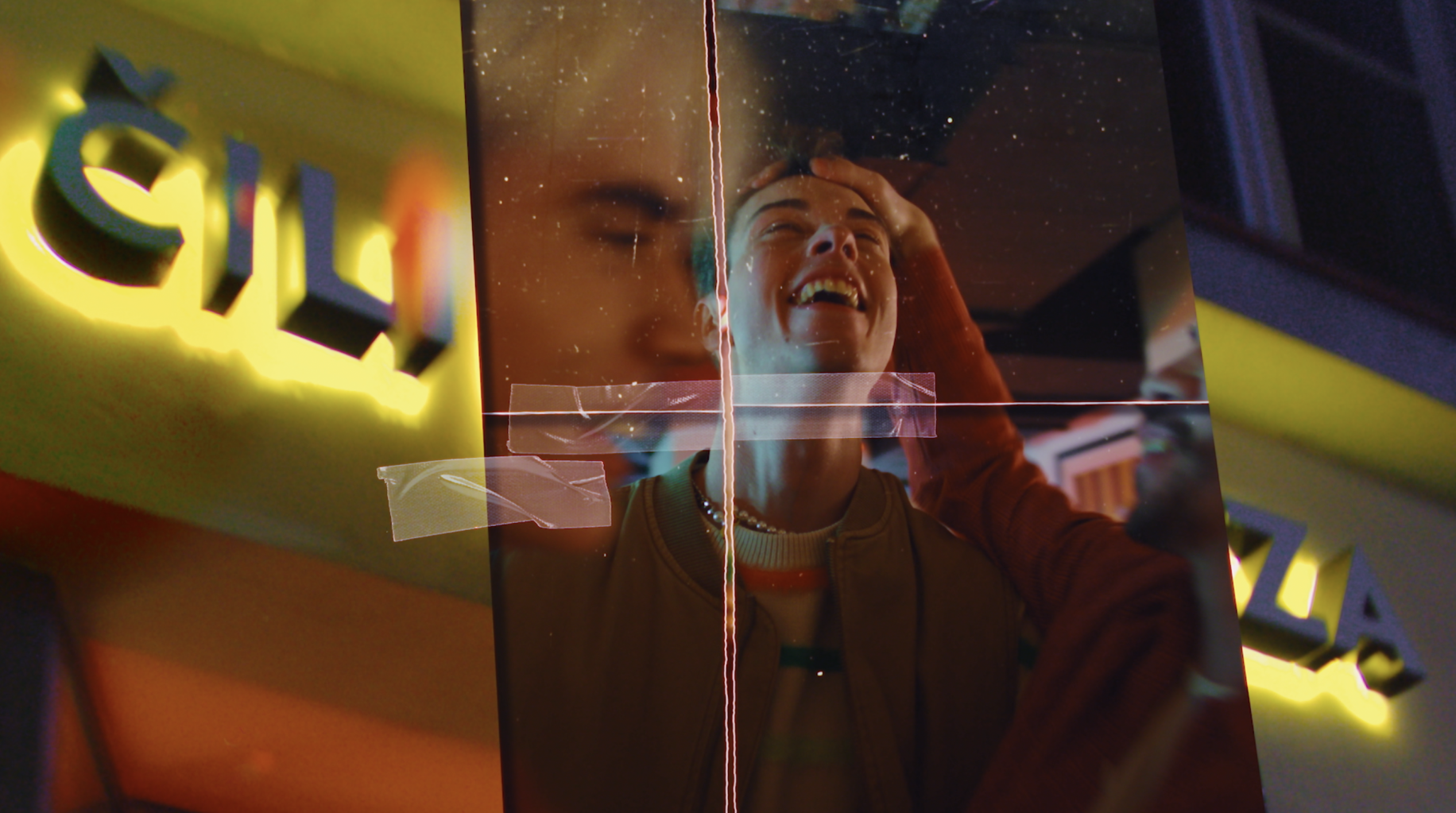
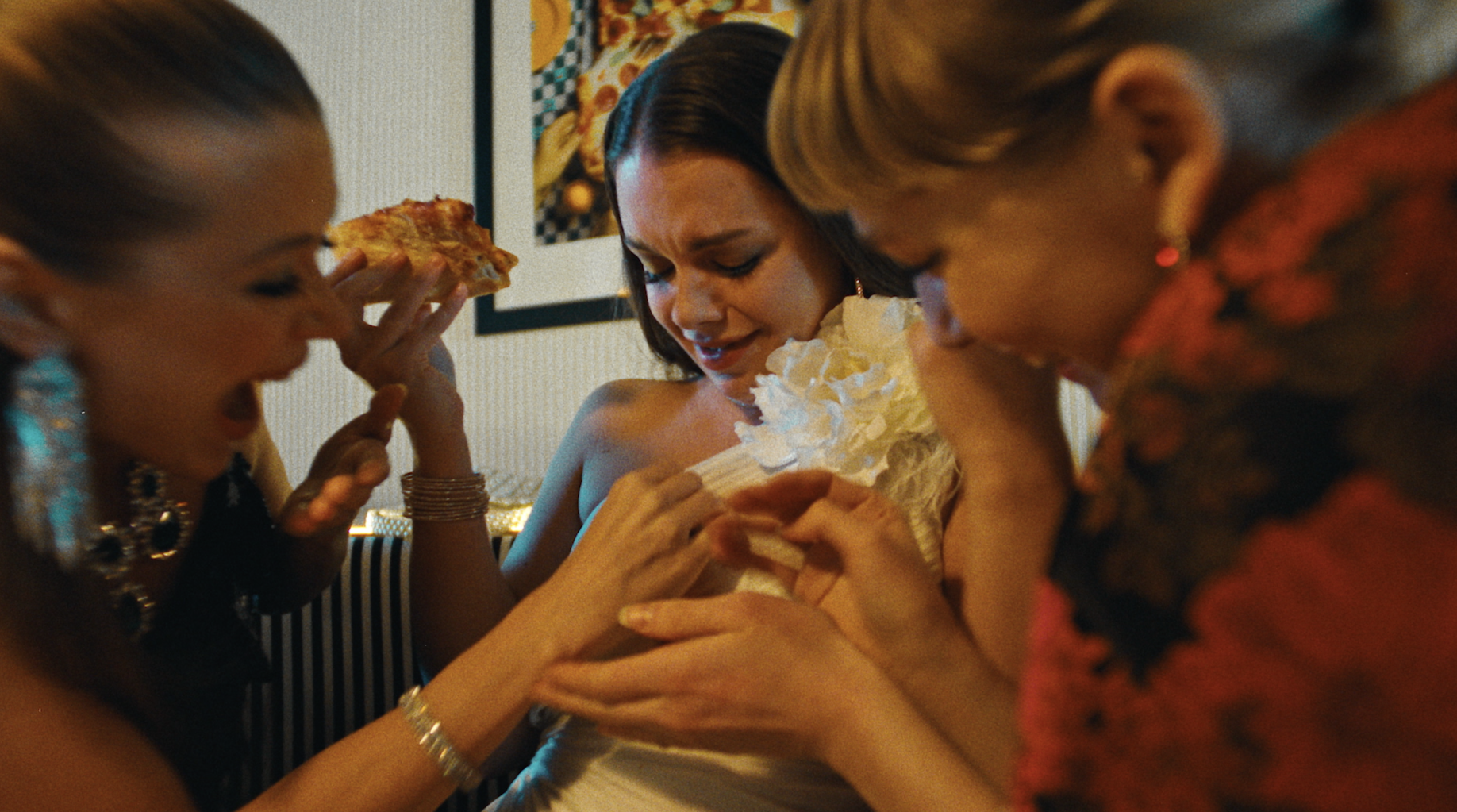
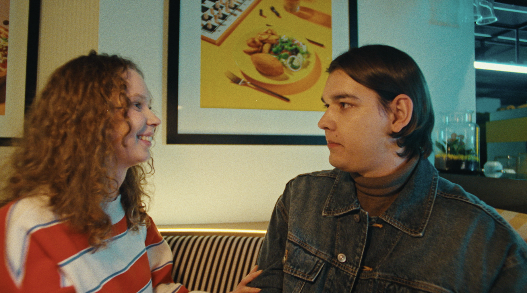
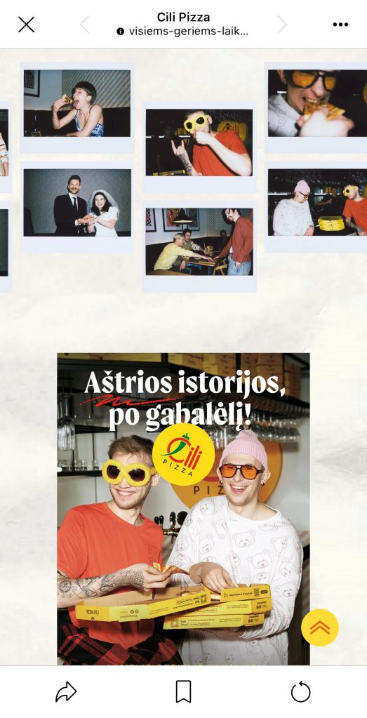
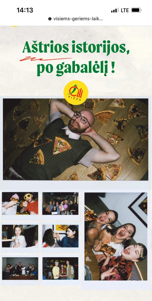
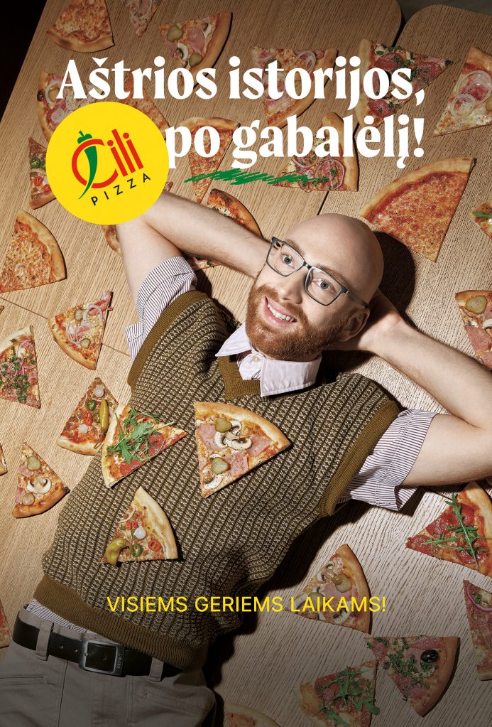
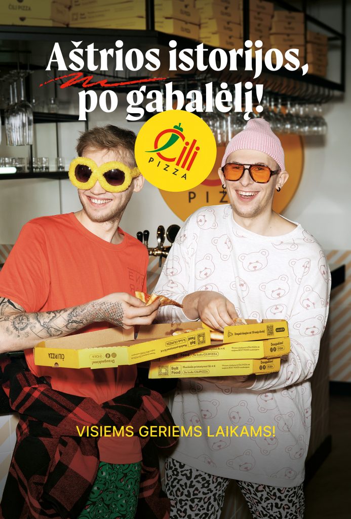
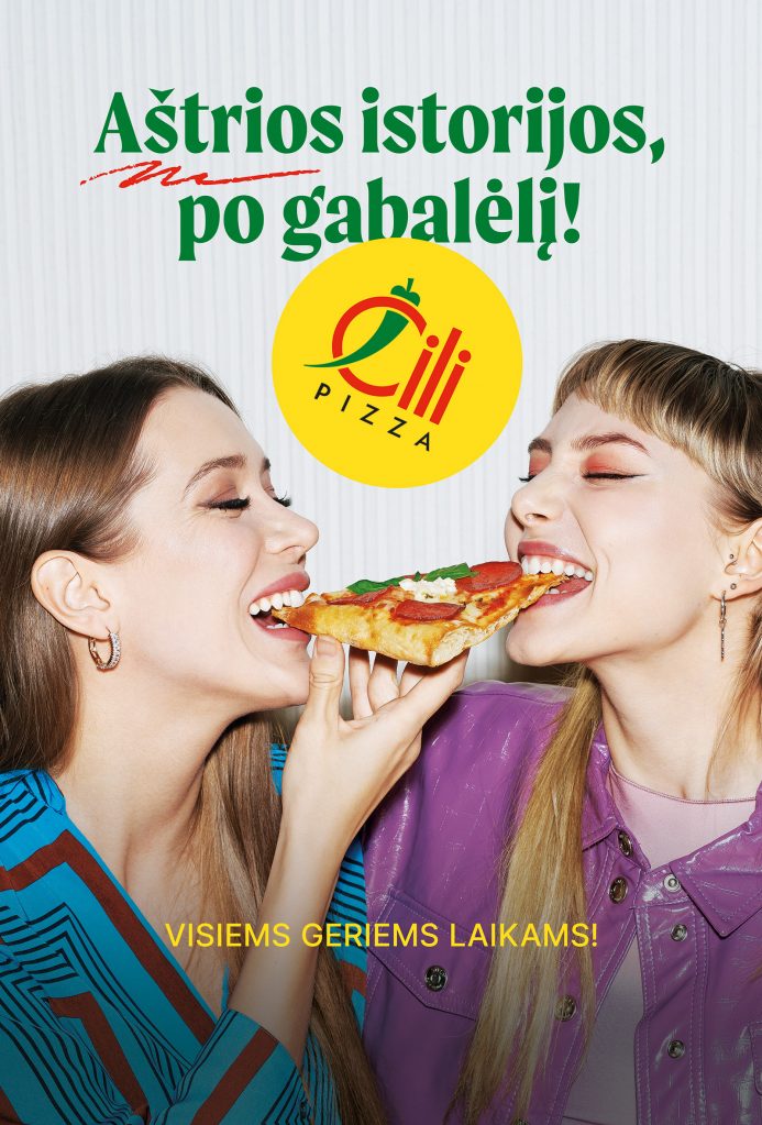
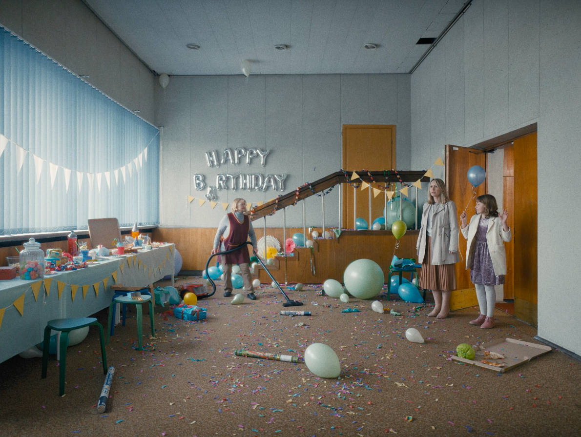
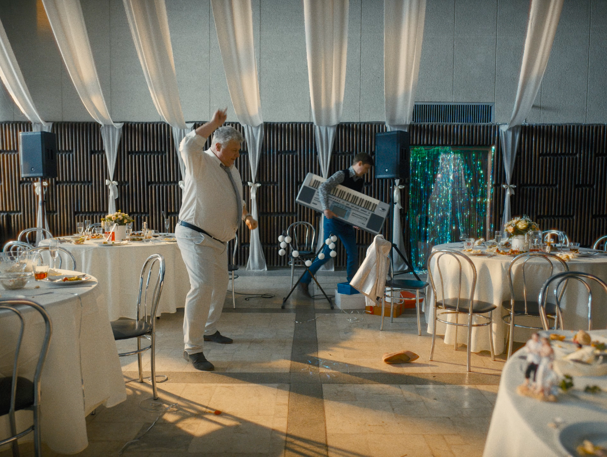
Čili Pizza – Get your piece of spicy stories! Advertising
We like working with brands that have a history.
The legendary “Čili Pizza” remembers all your spiciest stories.
And those stories, about pizzas on mornings, all those birthdays, pre-parties,
and dates, we all have plenty of them.
Some stories – maybe even with the sharpness of three chili peppers.
“Čili Pizza” returns renewed, with a campaign
“Get your piece of spicy stories!”
“For all the good times!”

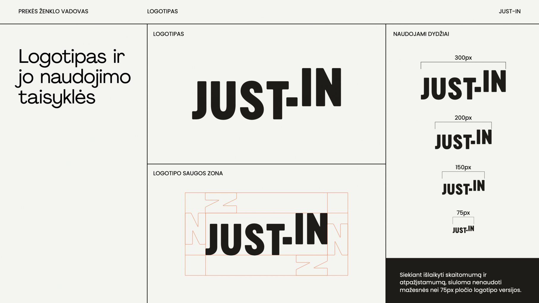
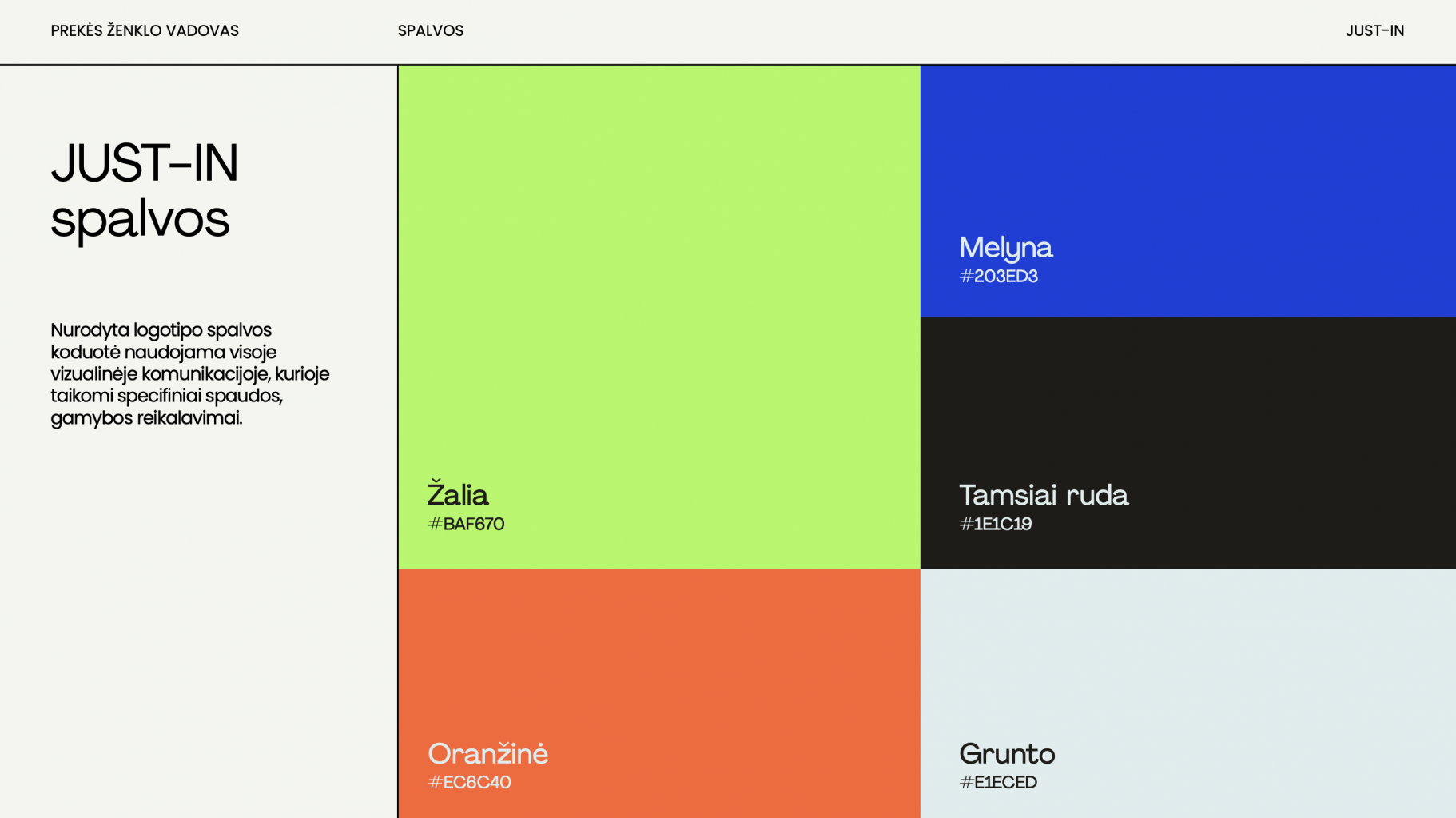
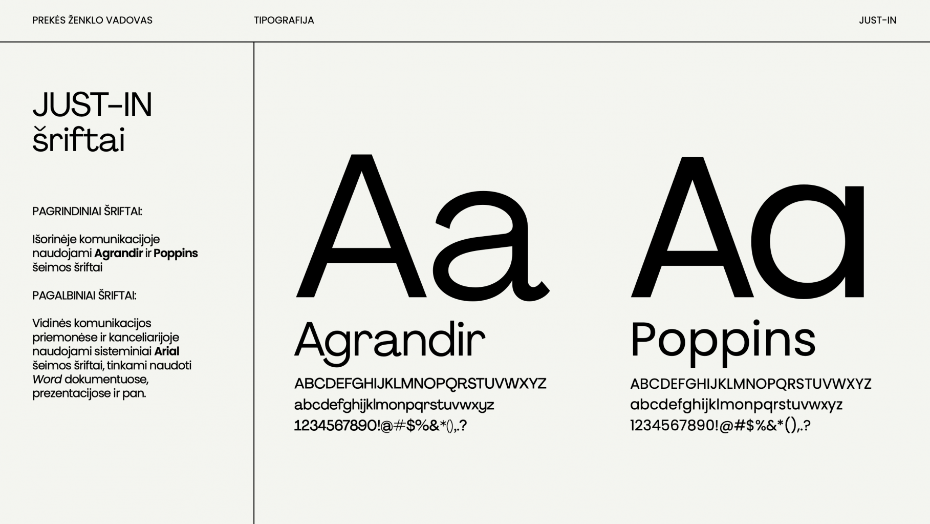
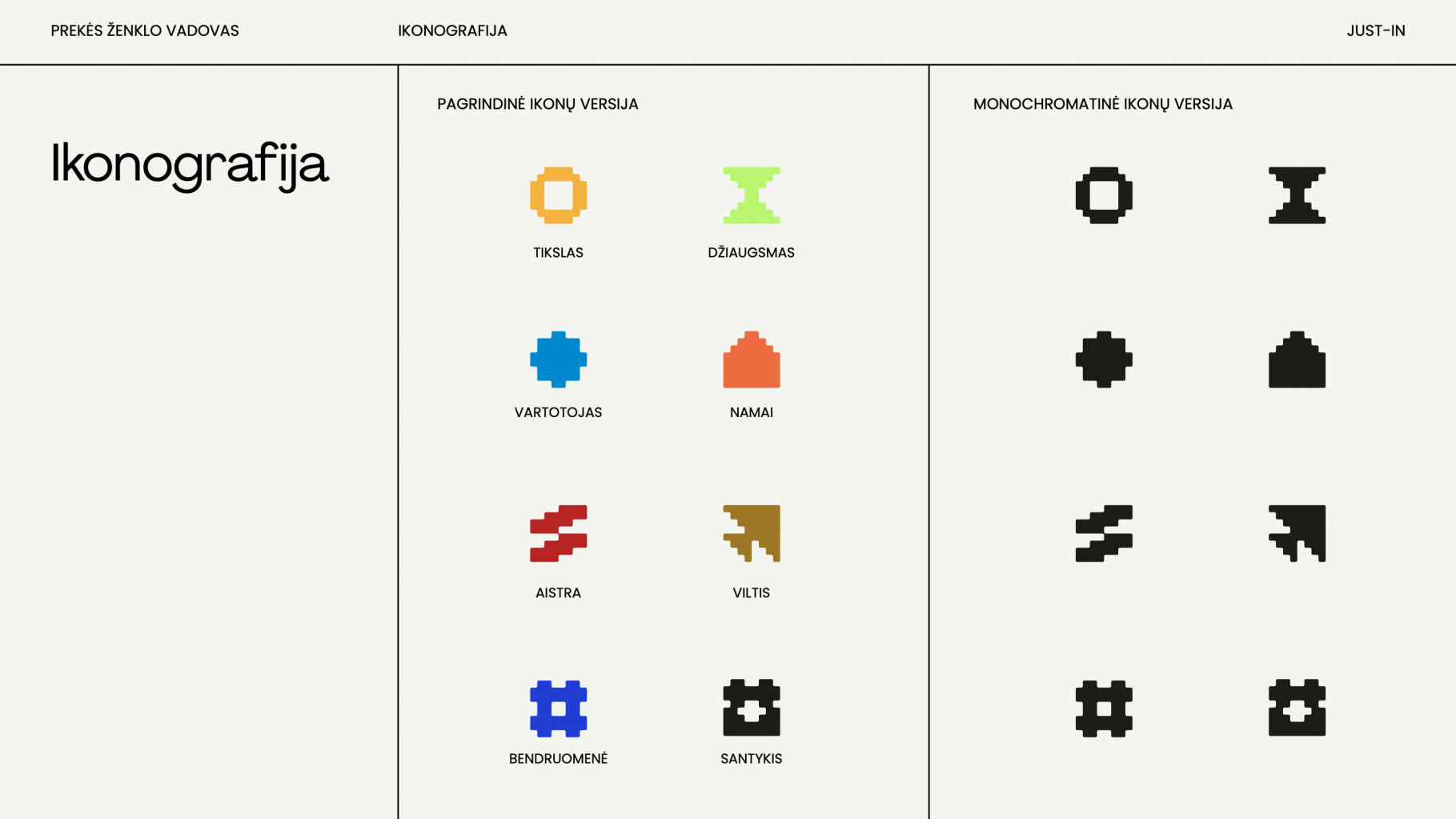
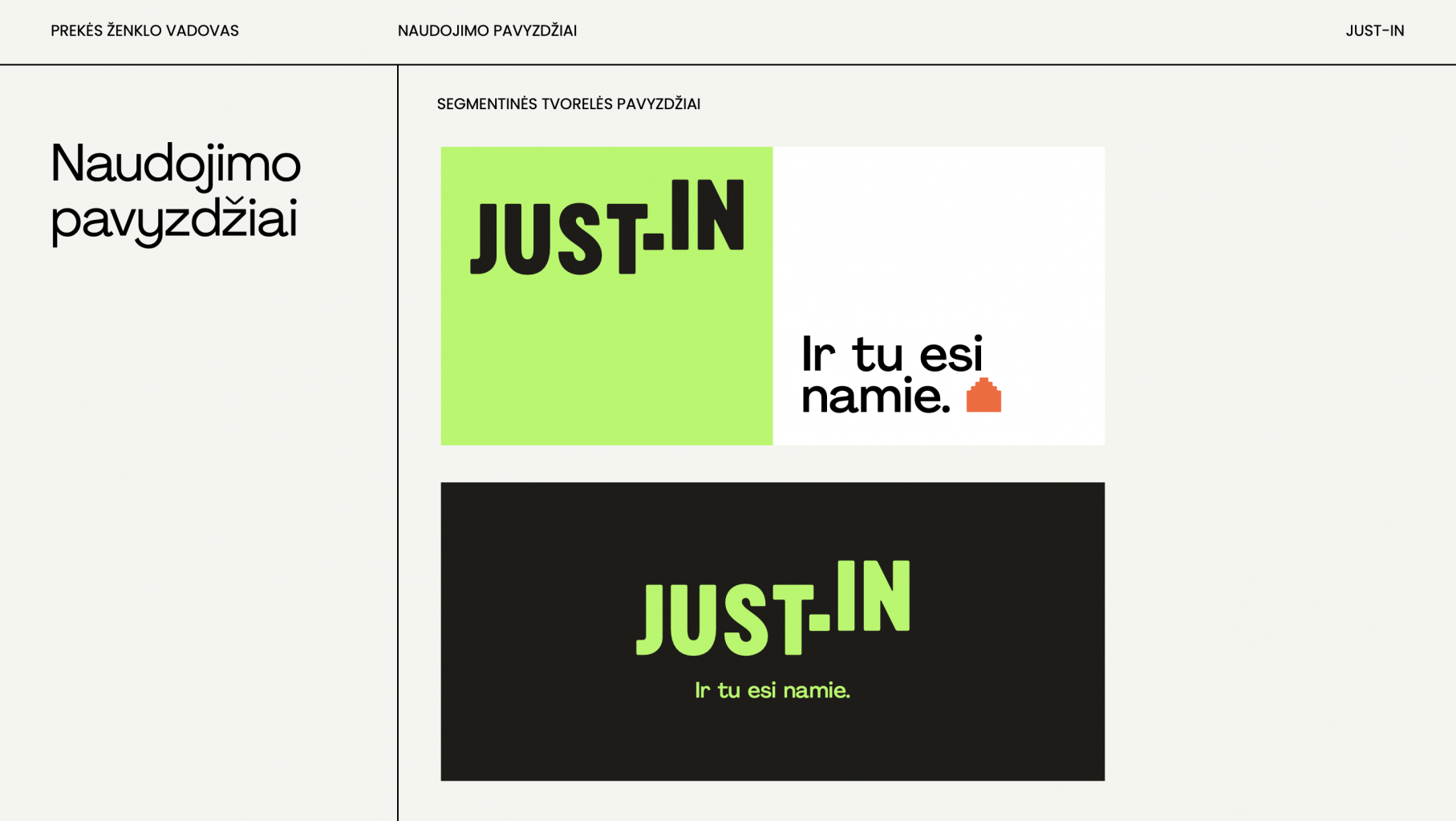
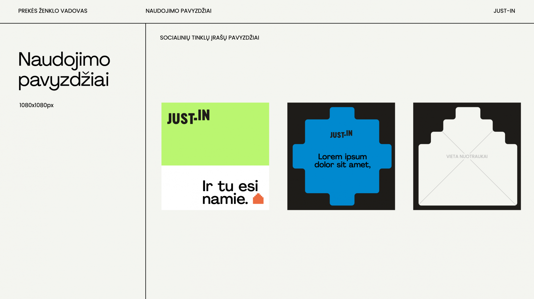
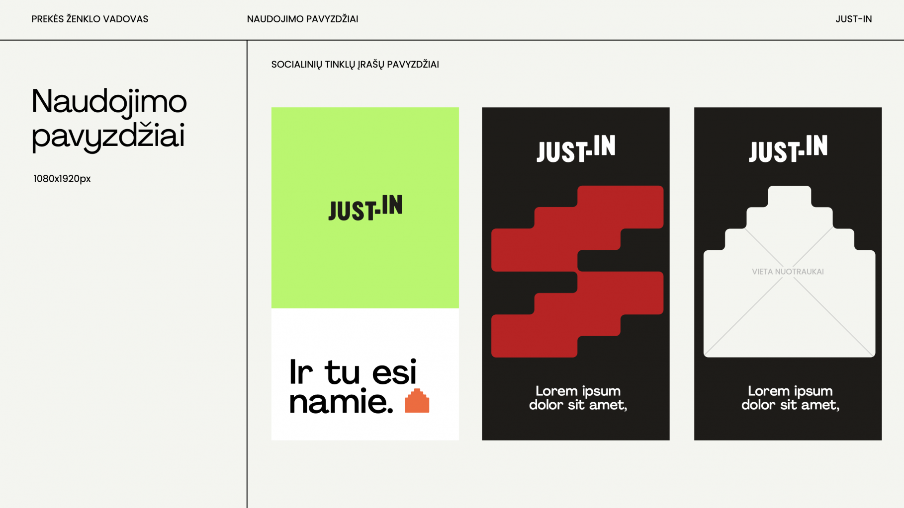
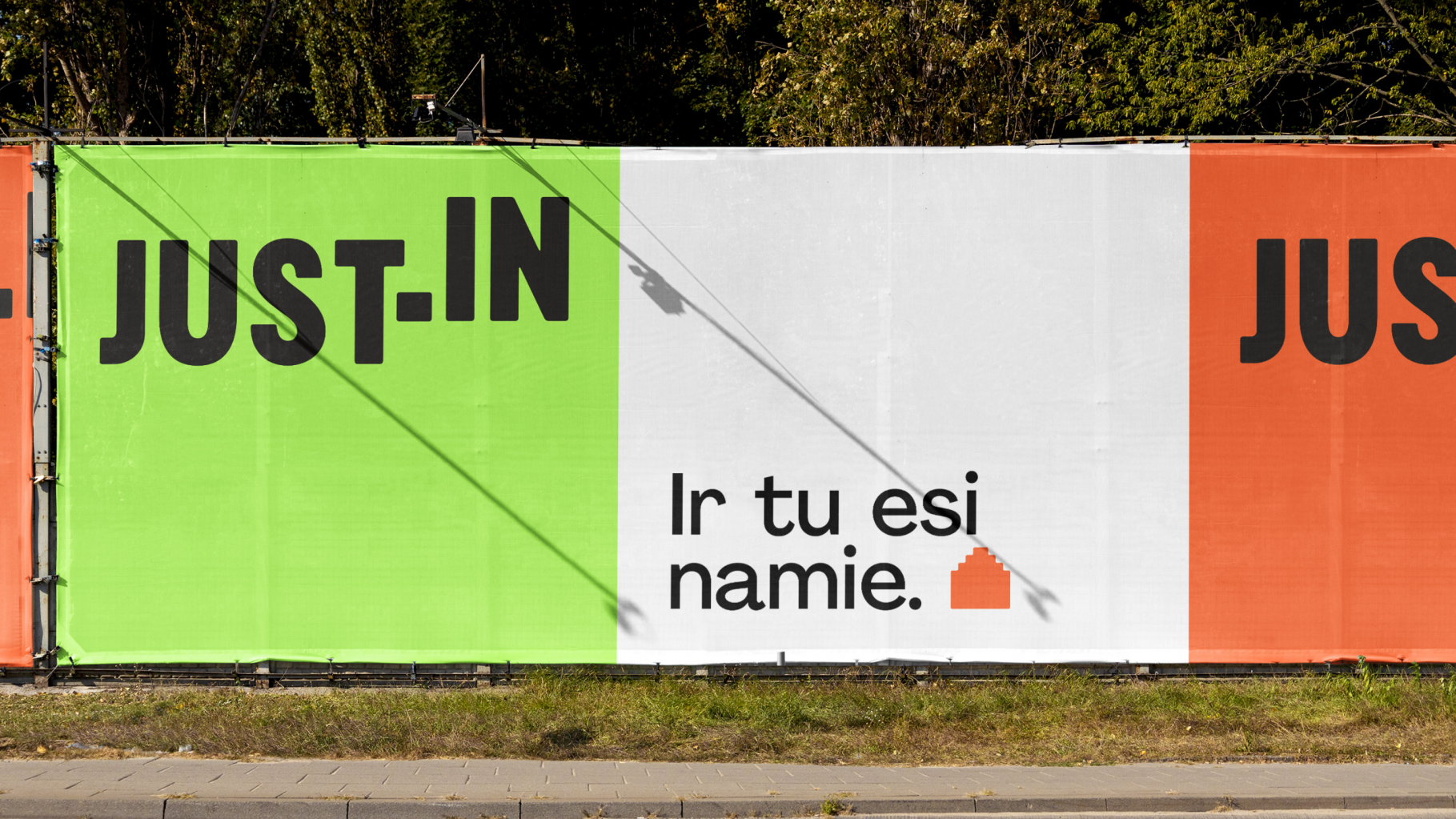
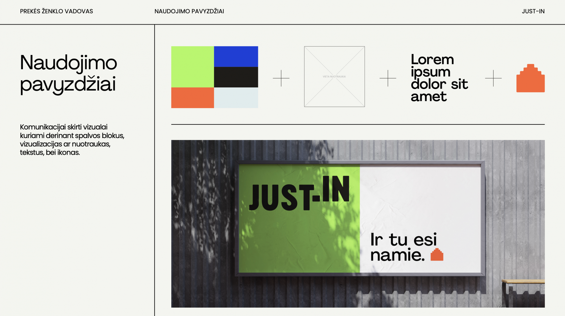
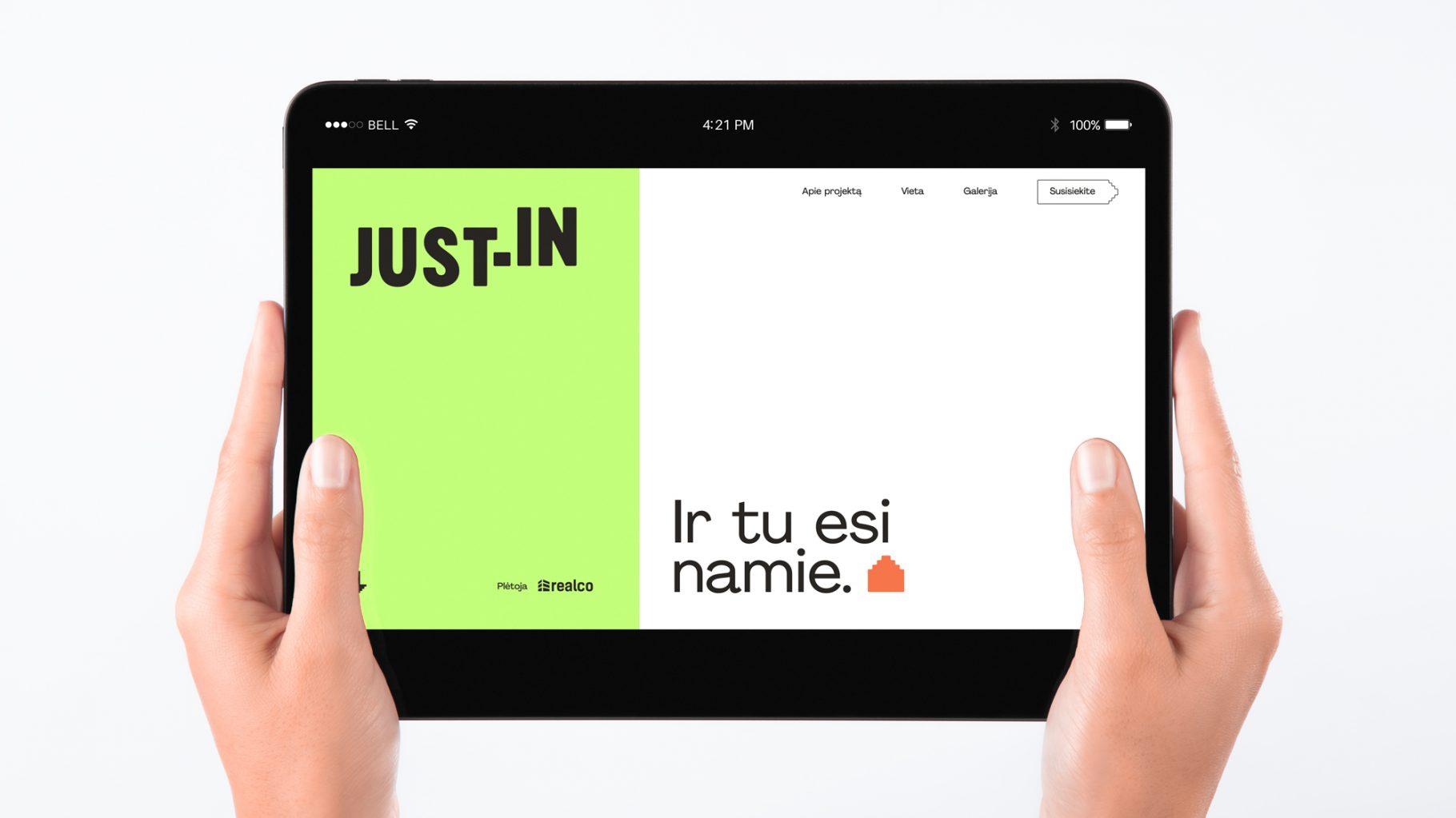
Just-In Branding
“Just-in” – our new branded project. The residential quarter “Just-in” presented by the developers “Realco” offers a contemporary concept of a residential neighborhood, characterized by distinctive architecture and assistance in moving into new homes quickly and easily. With the name “Just-in” we aimed to accentuate simplicity and accessibility. We strived to create a vivid, playful, distinctive visual identity for “Just-in” reflecting the architectural character of the project and targeting a younger, modern audience of city dwellers seeking their first home.
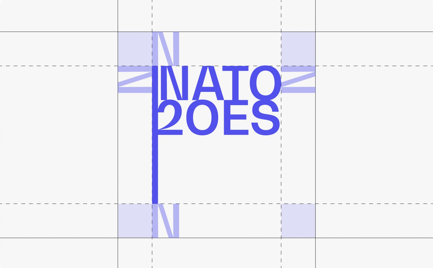
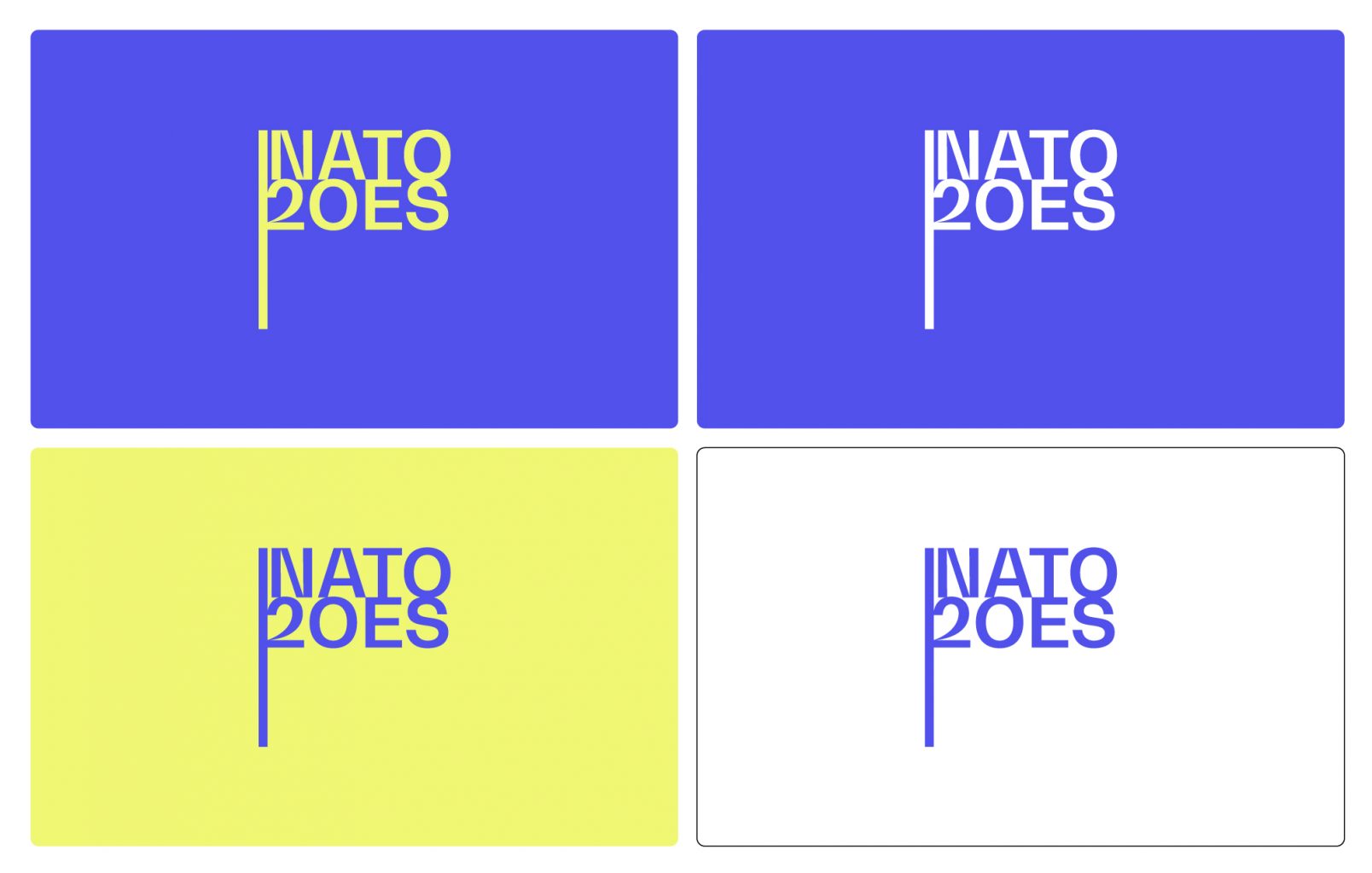
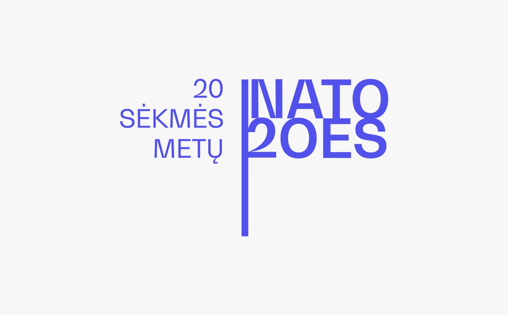
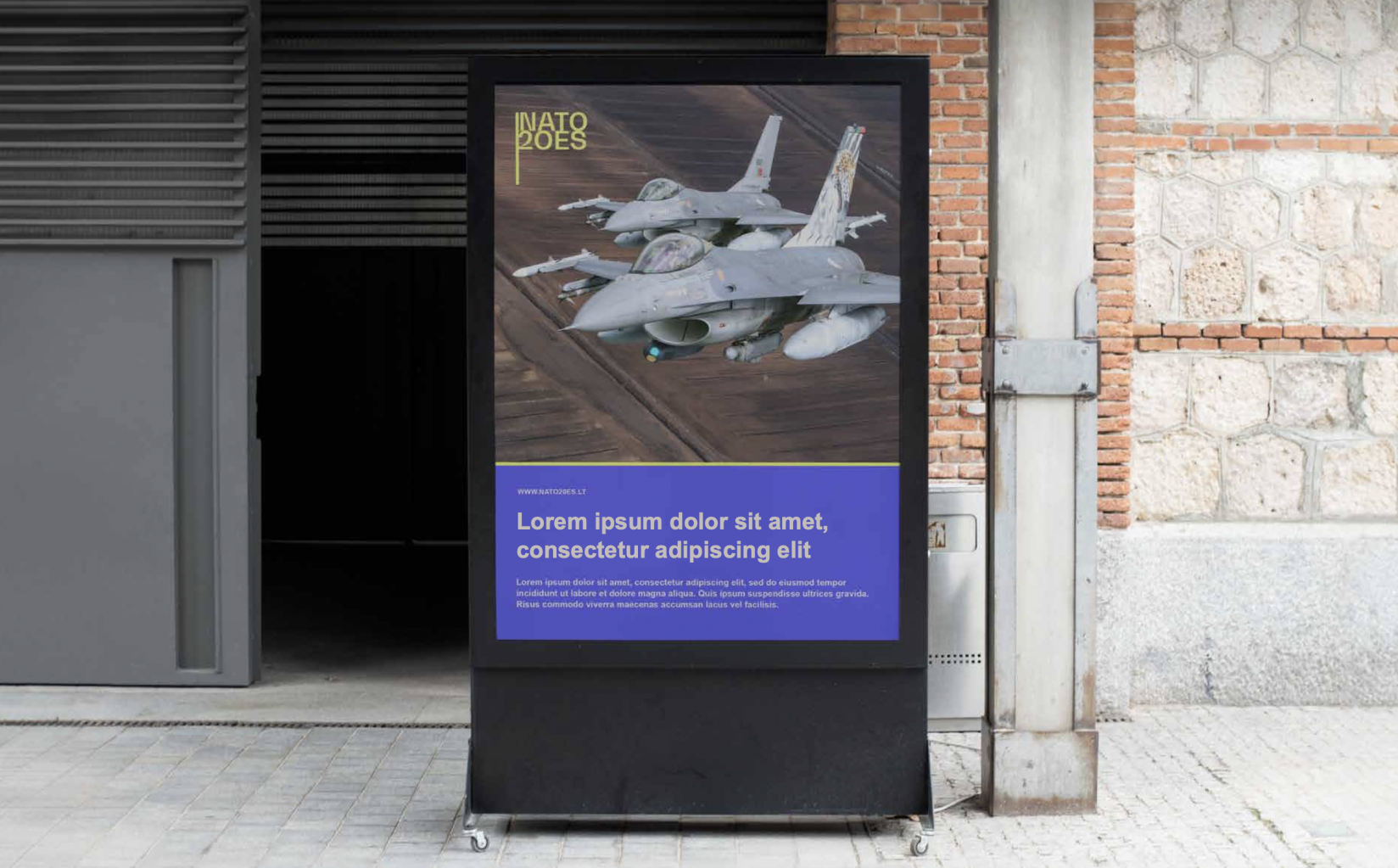
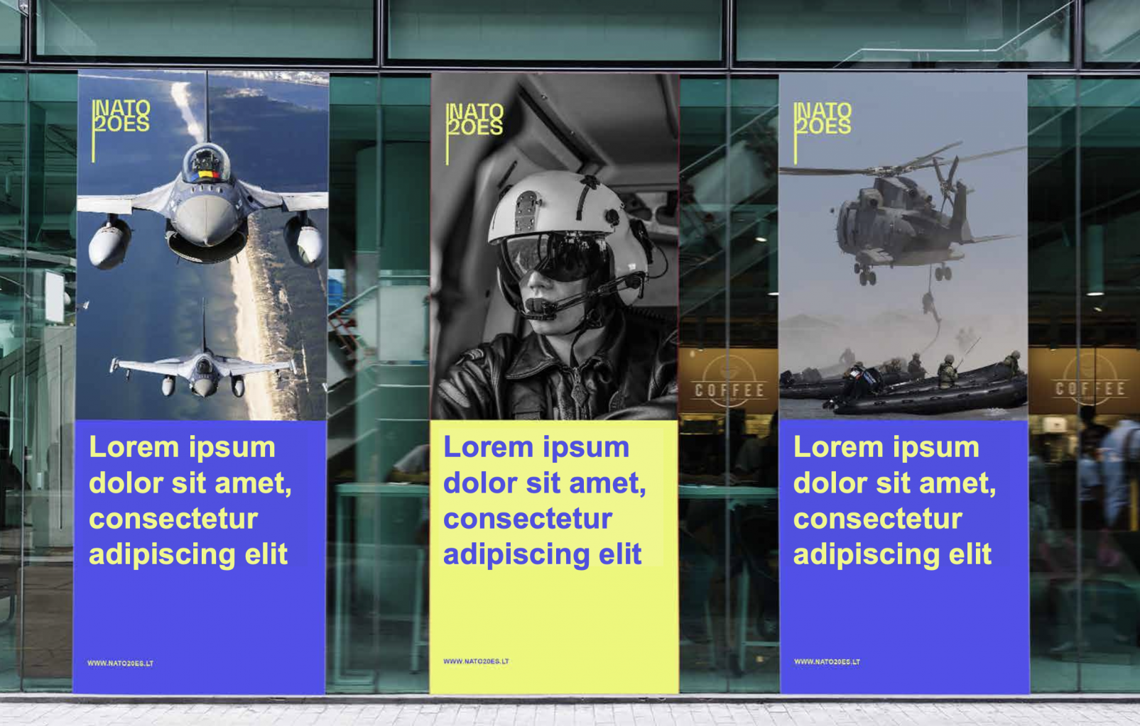
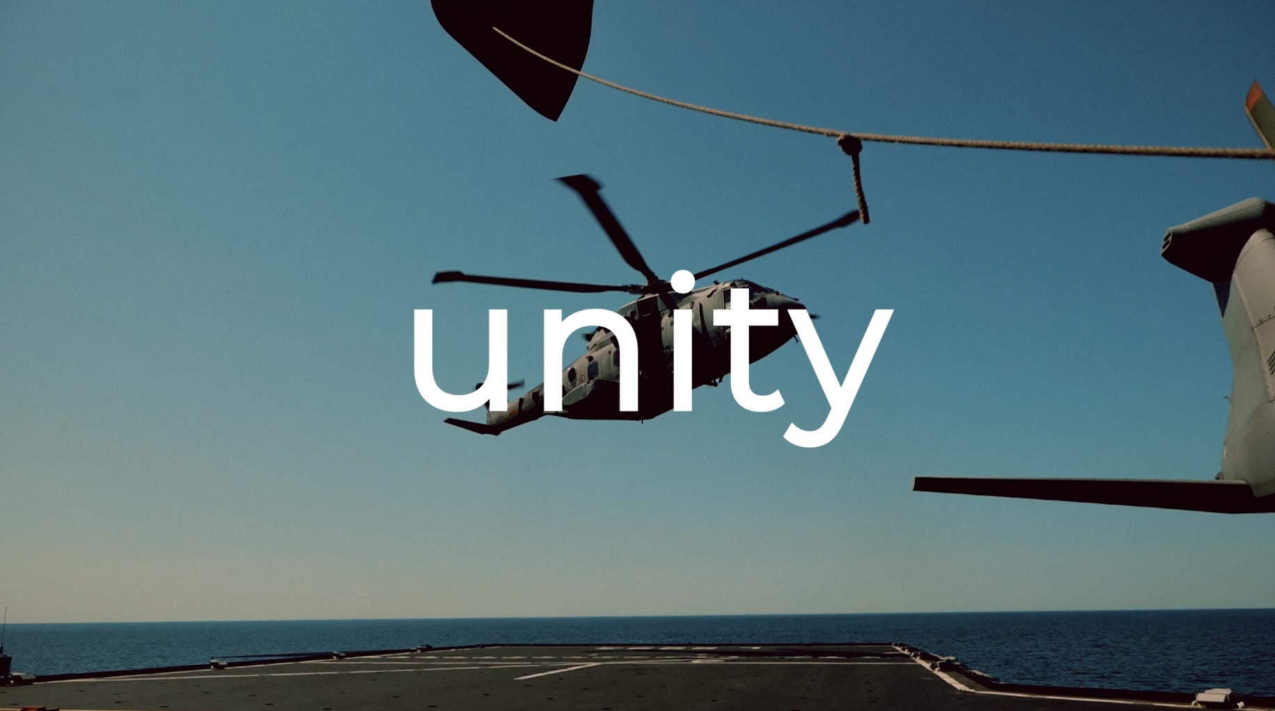
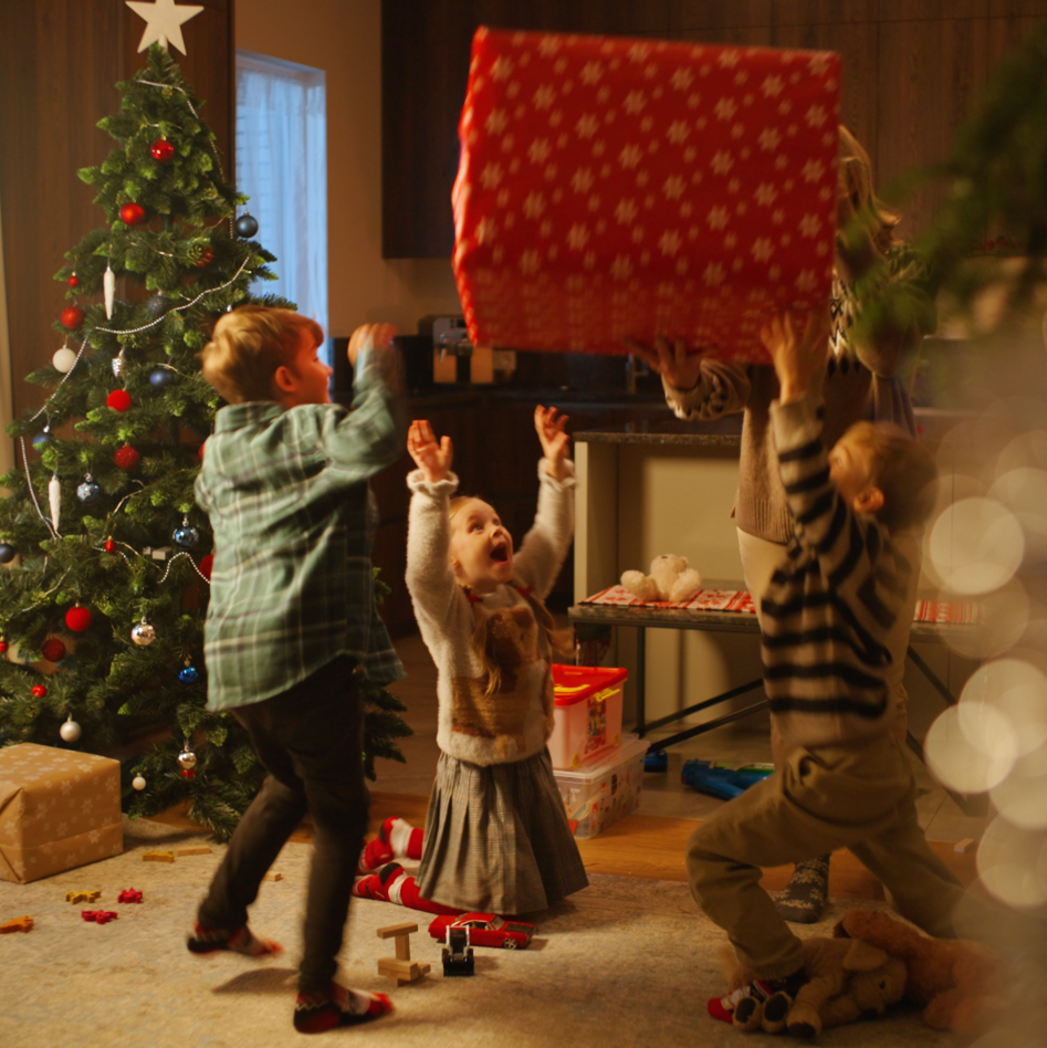
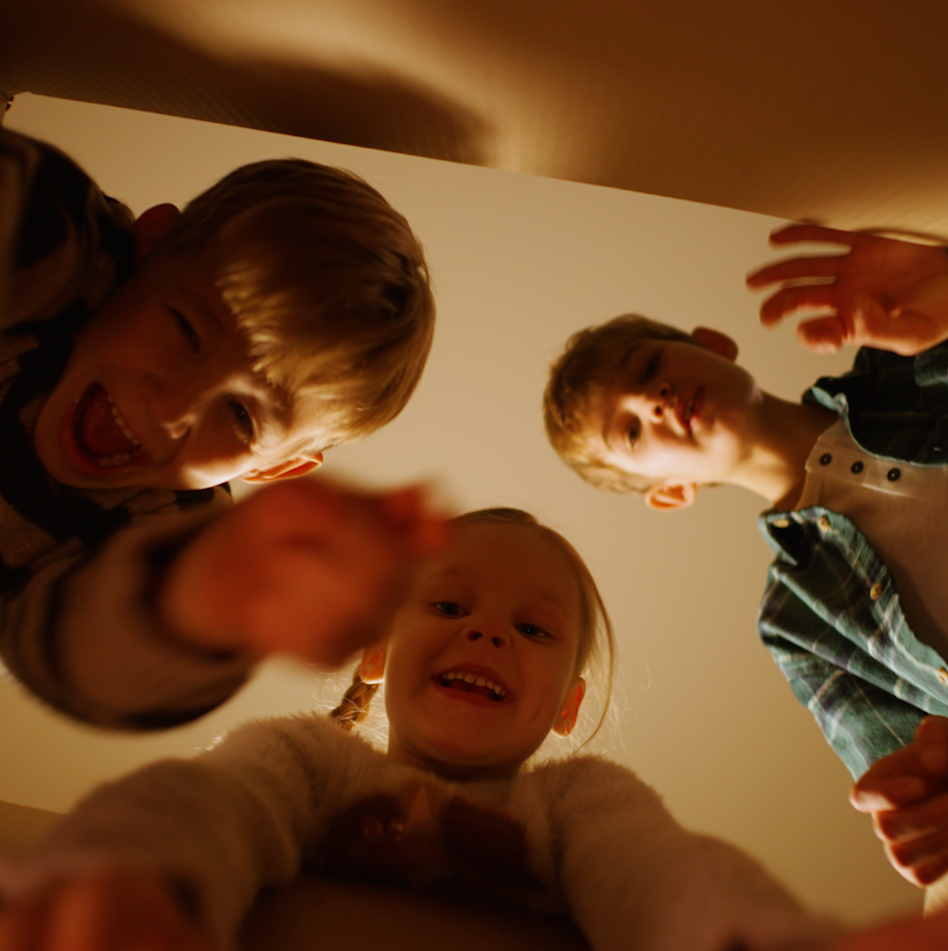
20 years of Lithuania’s membership in NATO and the EU Branding
This year is going to be exceptional. We gonna celebrate 20 years of Lithuania’s membership in NATO and the EU.It is a good time to assess how important these milestone events have been for us as individuals and as a country. Shaping our lives and making us the successful prosperous country and free citizens. We have created the branding for this celebration uniting a multitude of events and projects commemorating the 20th anniversary. Marios team are grateful for the opportunity to contribute to this important project to the entire team: the Ministry of National Defense the Ministry of Foreign Affairs and the Chancellery of the Government of the Republic of Lithuania.
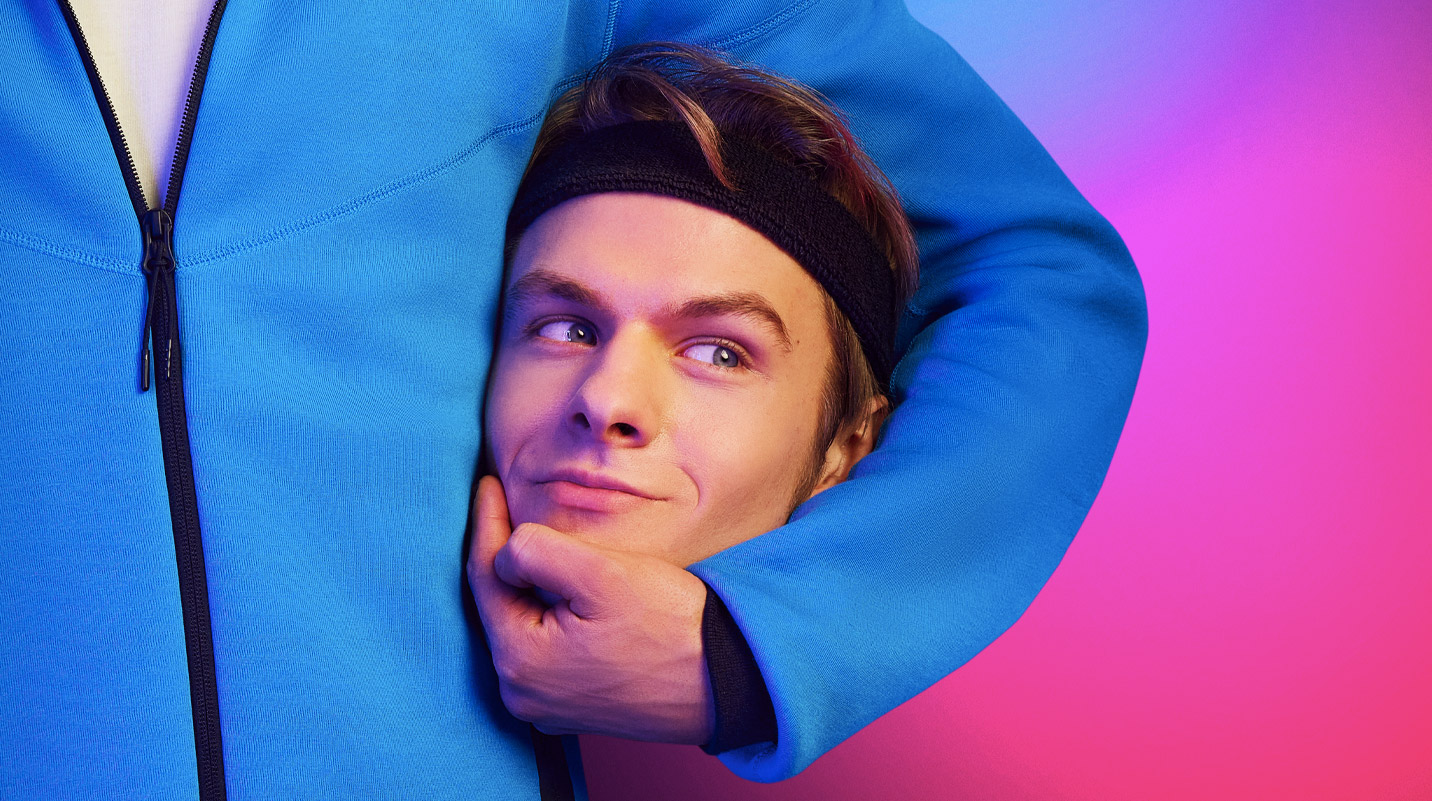
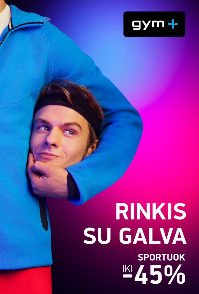
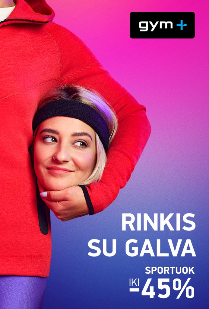
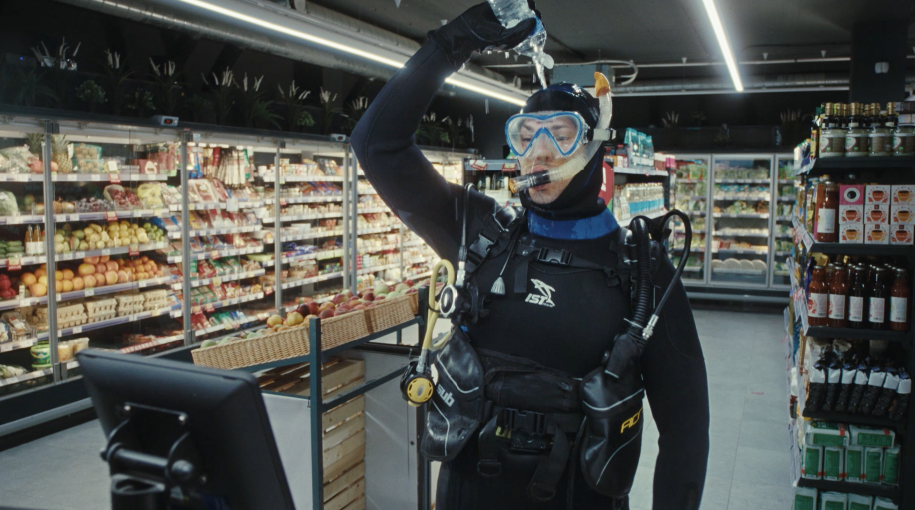
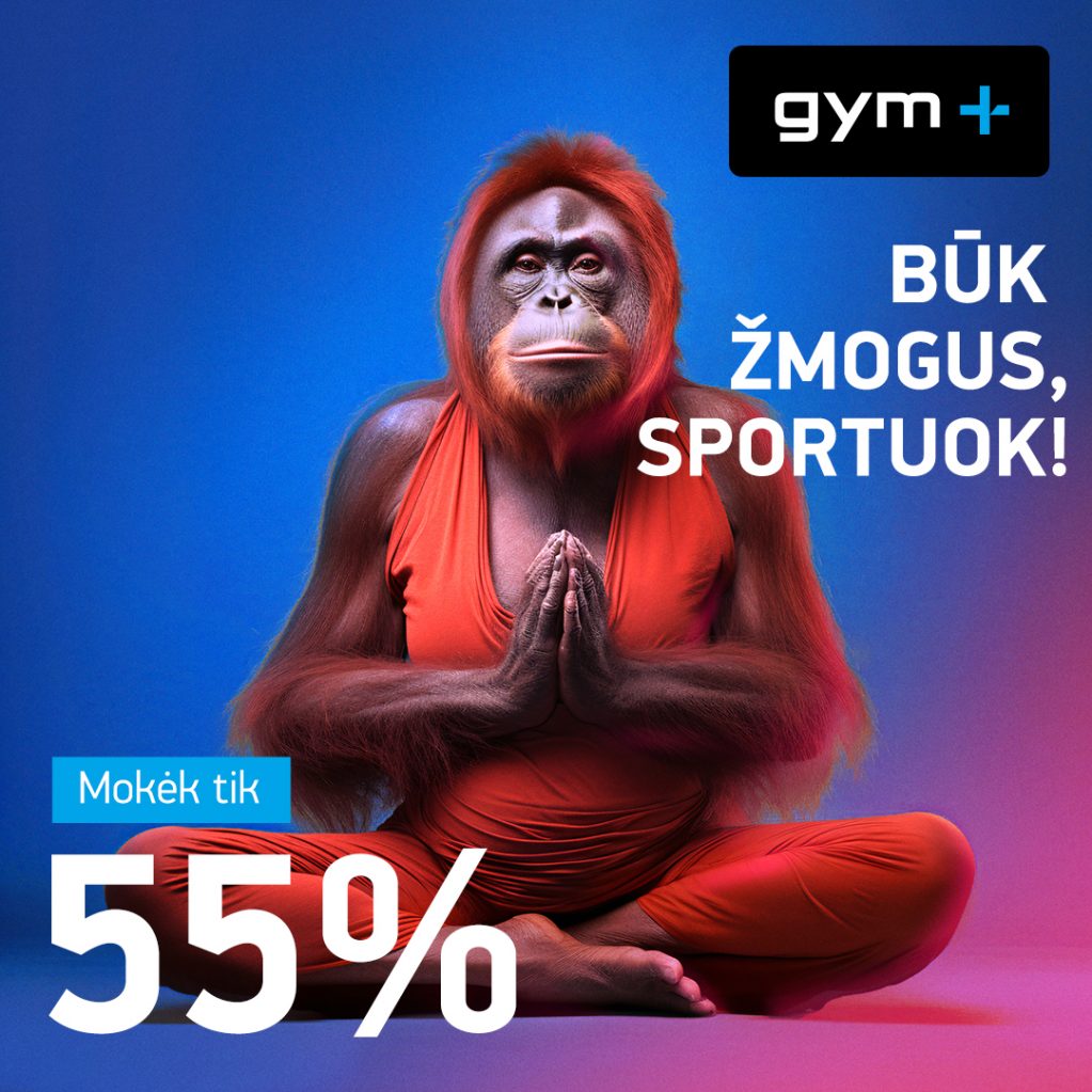
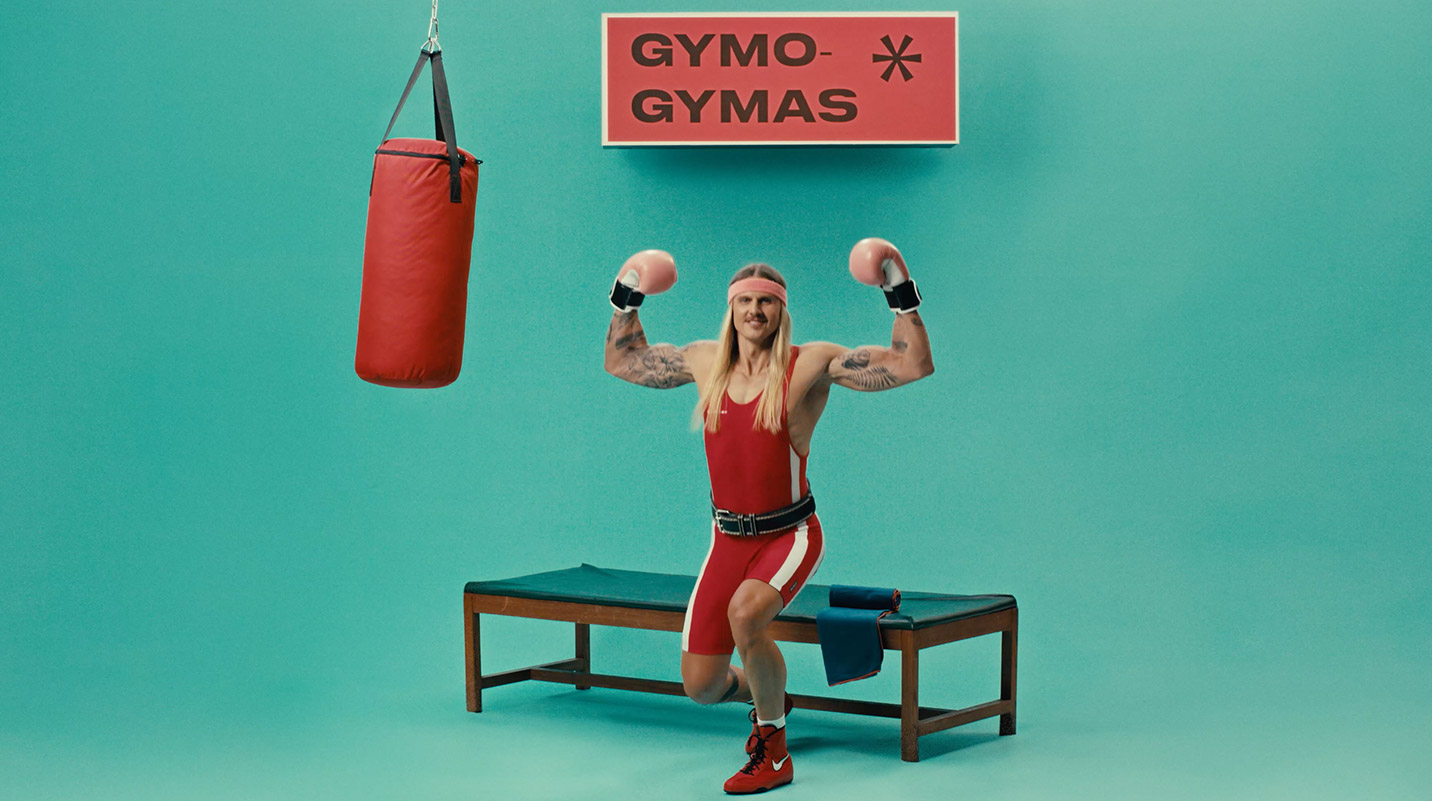
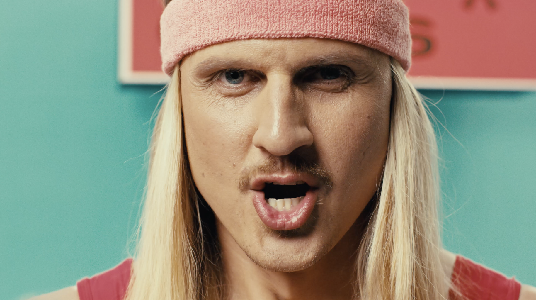
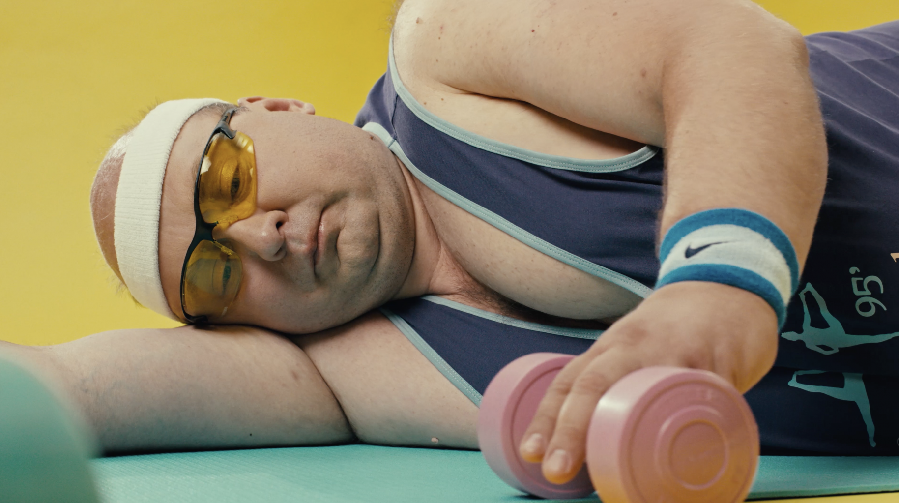
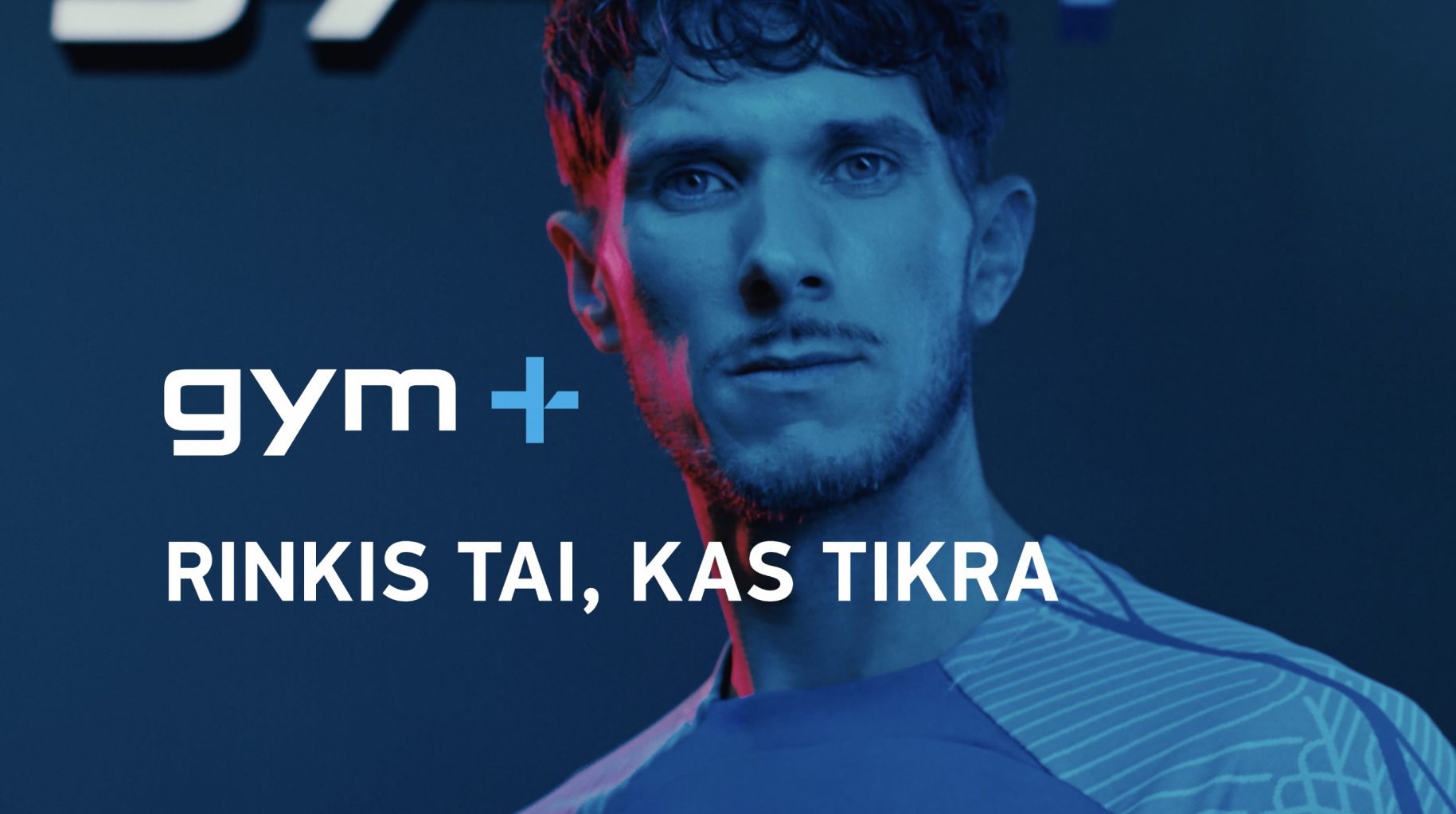
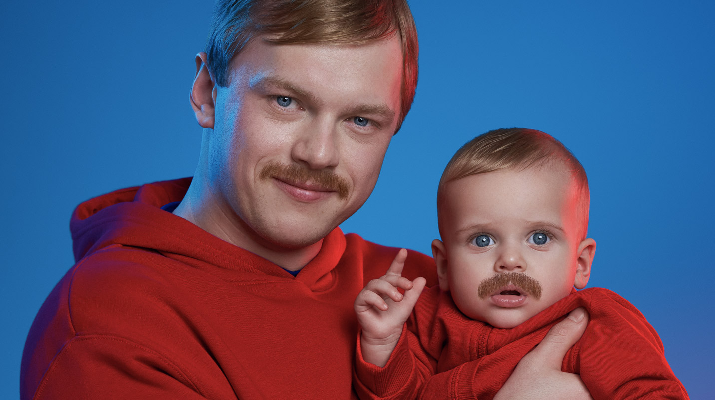
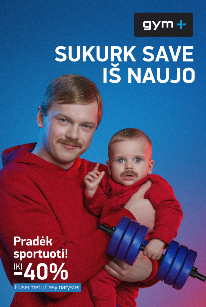
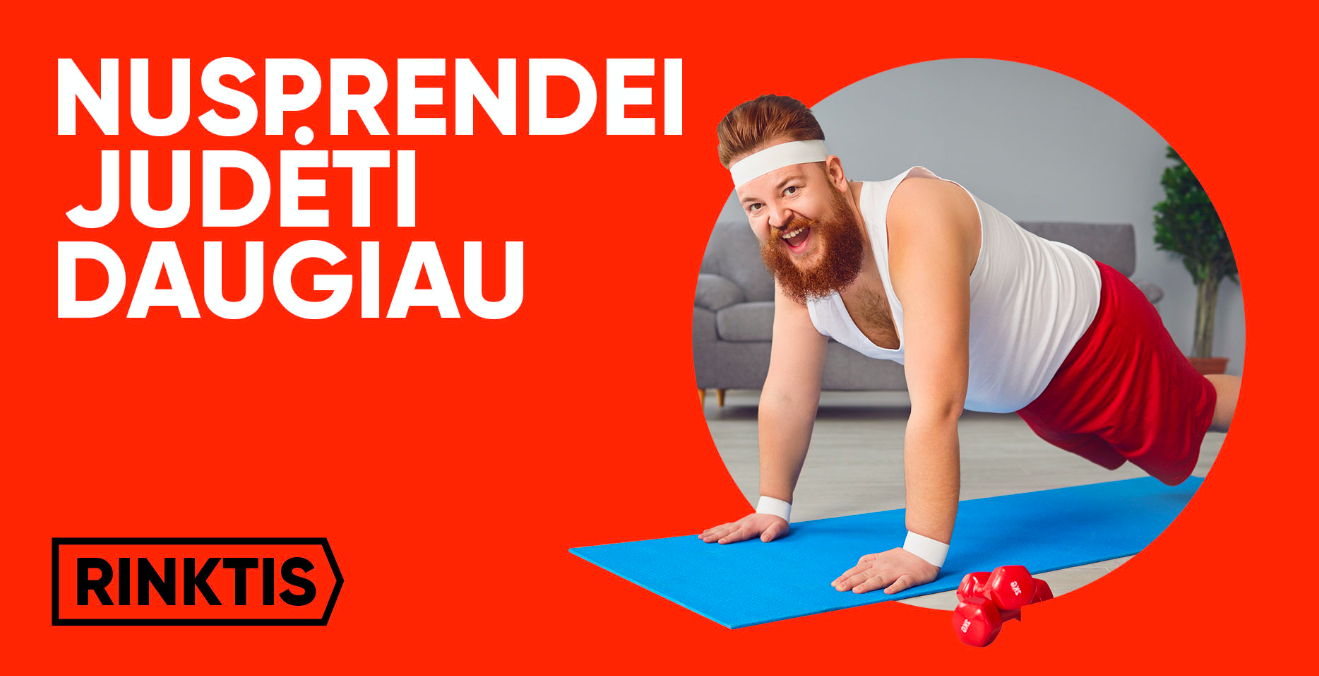
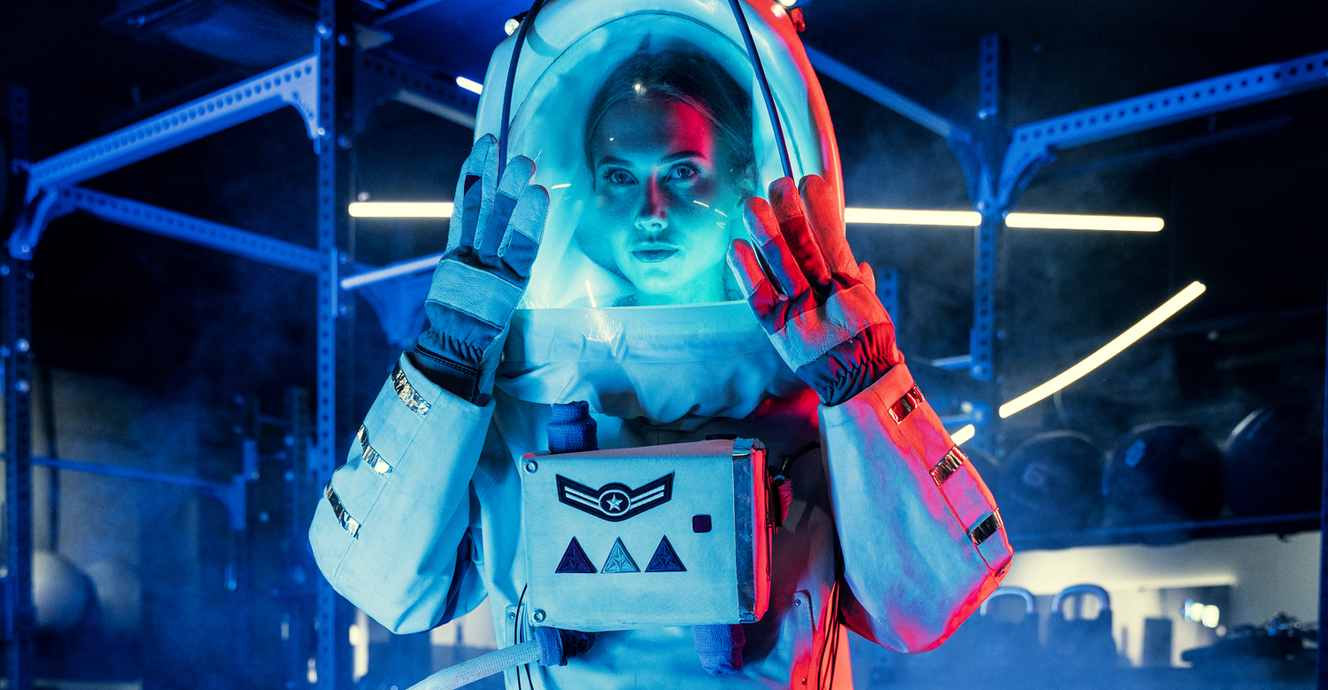
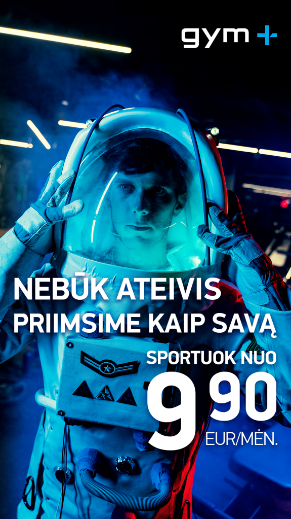
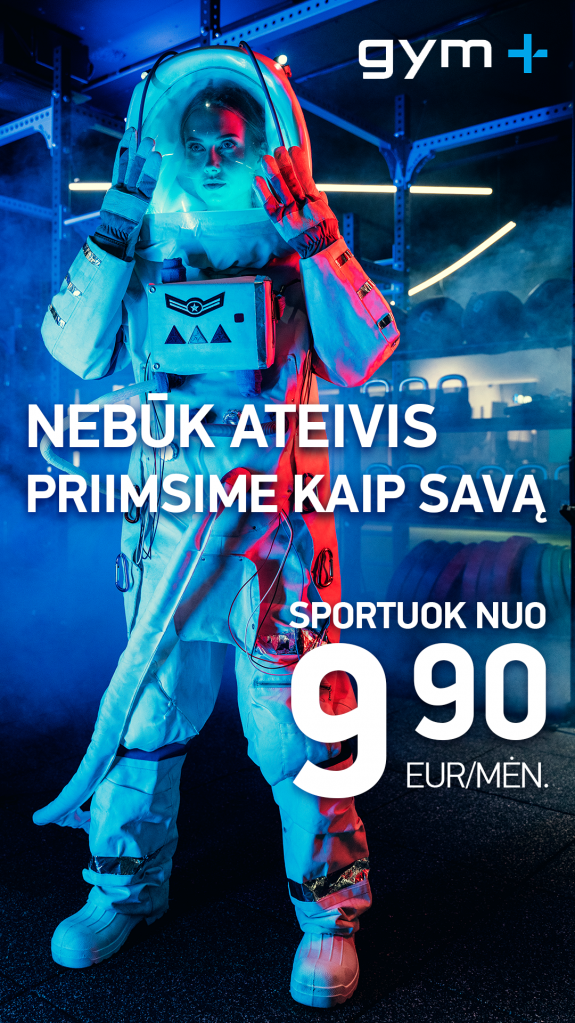
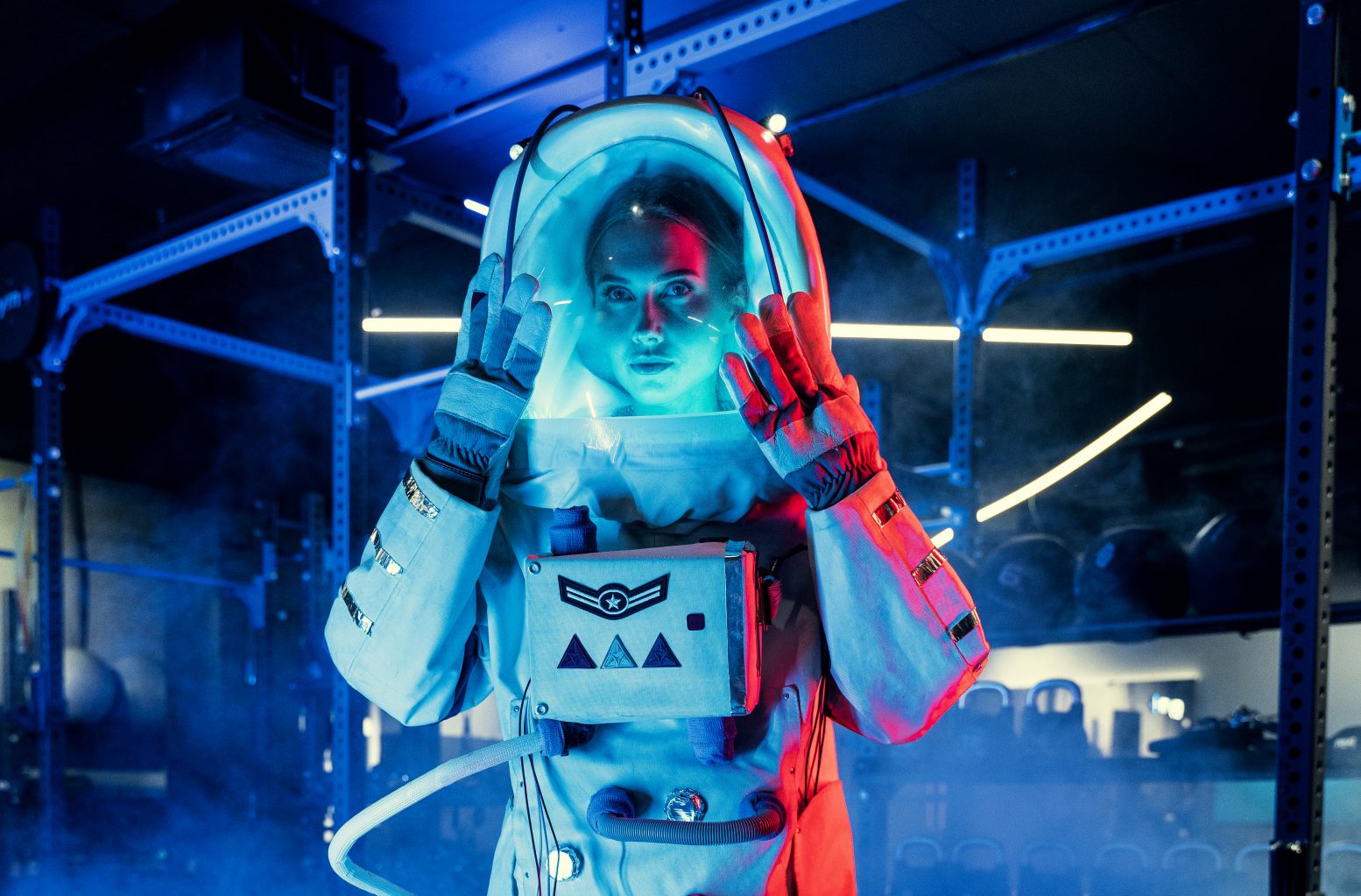
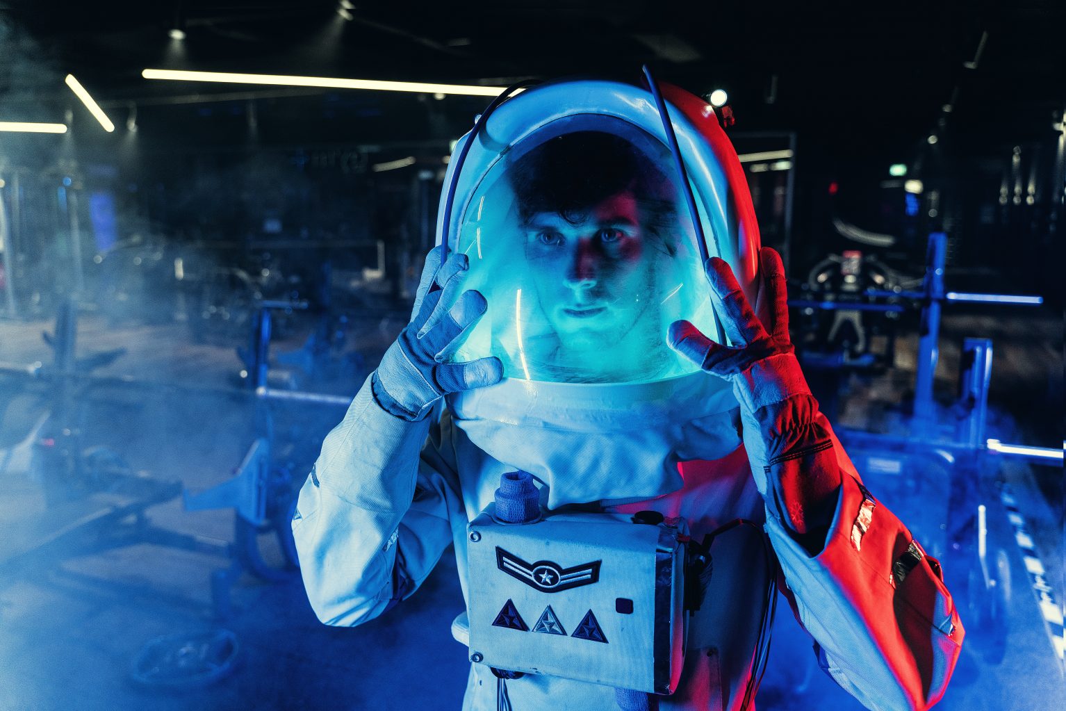
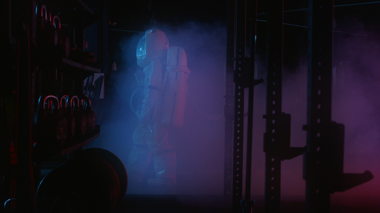
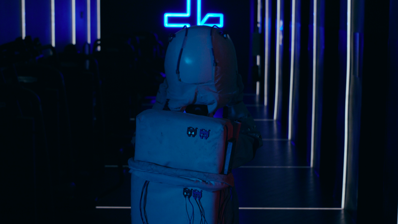
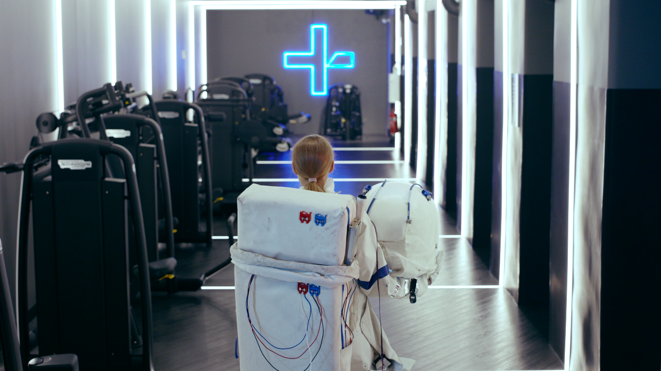
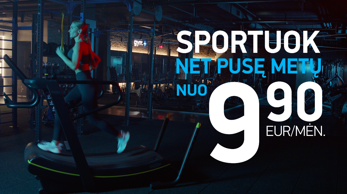
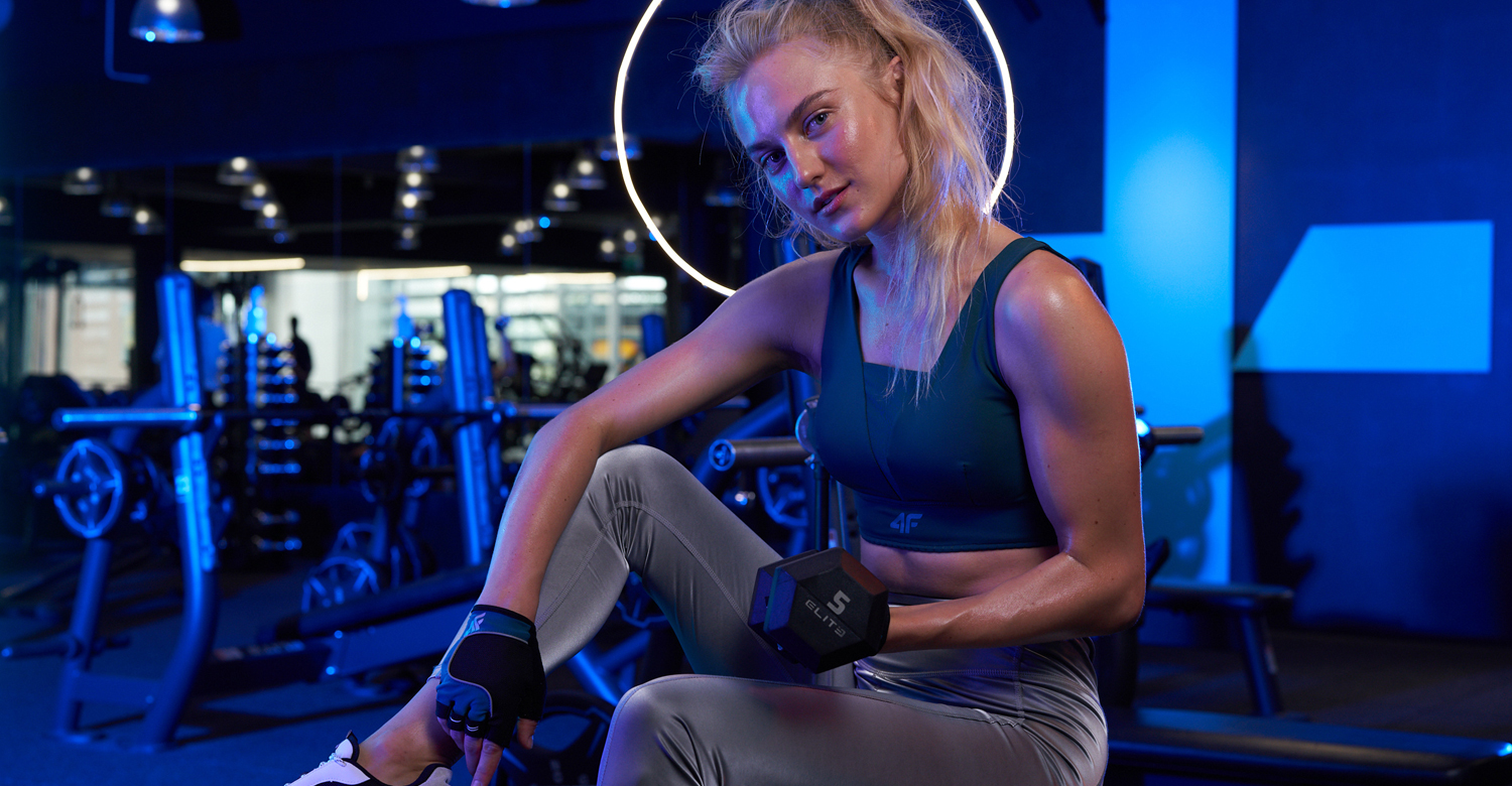
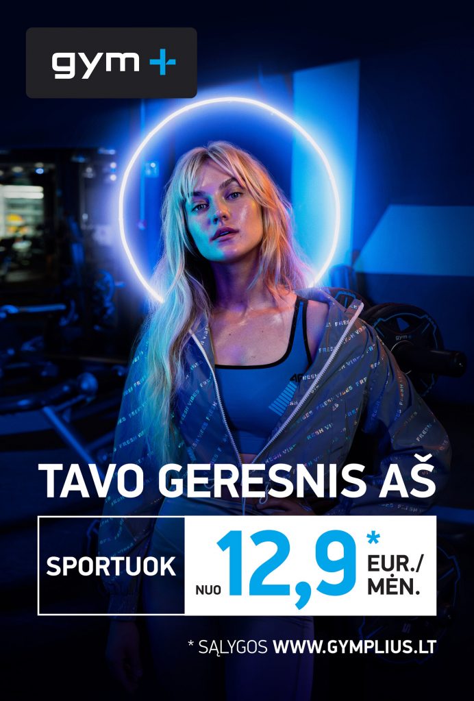
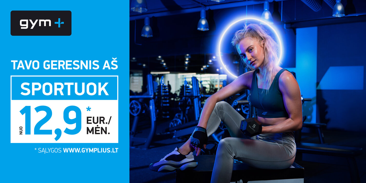
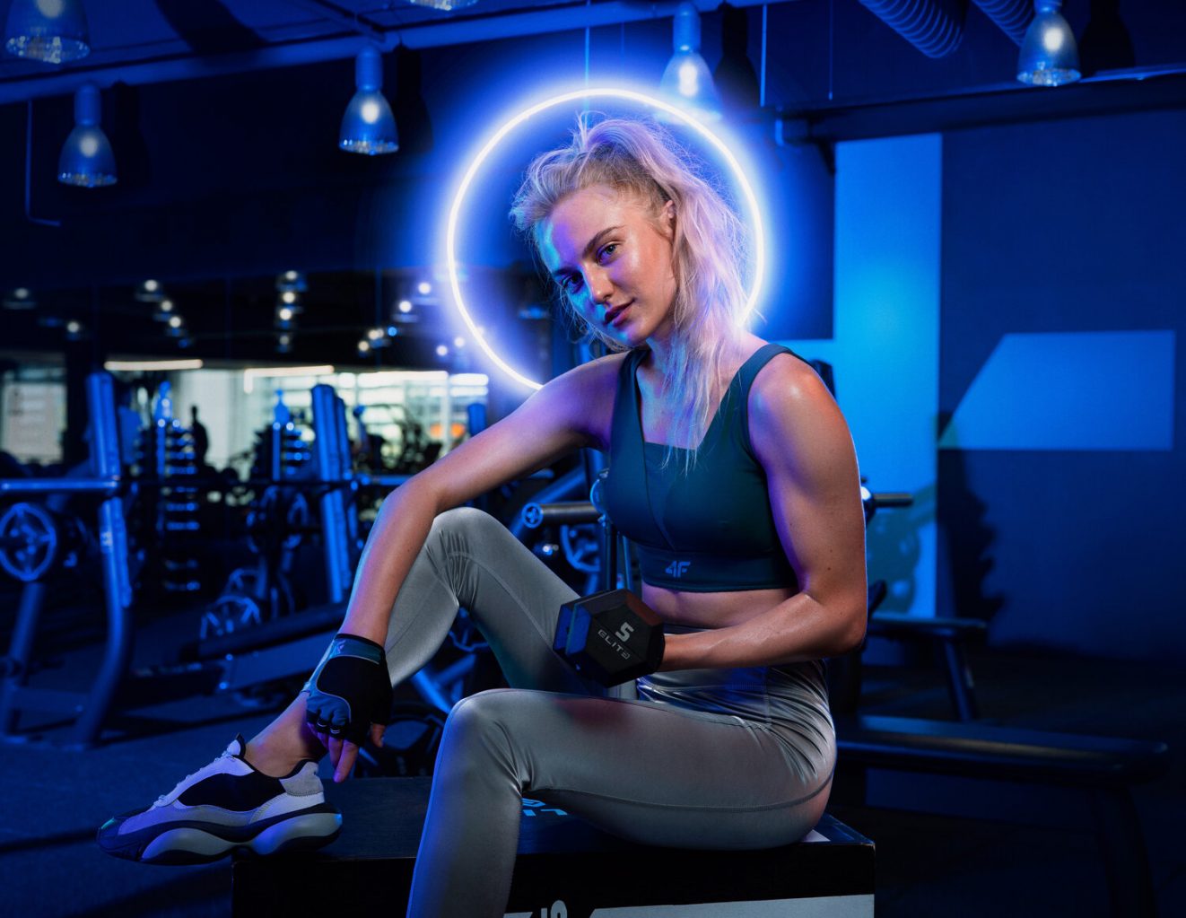
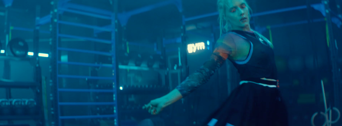
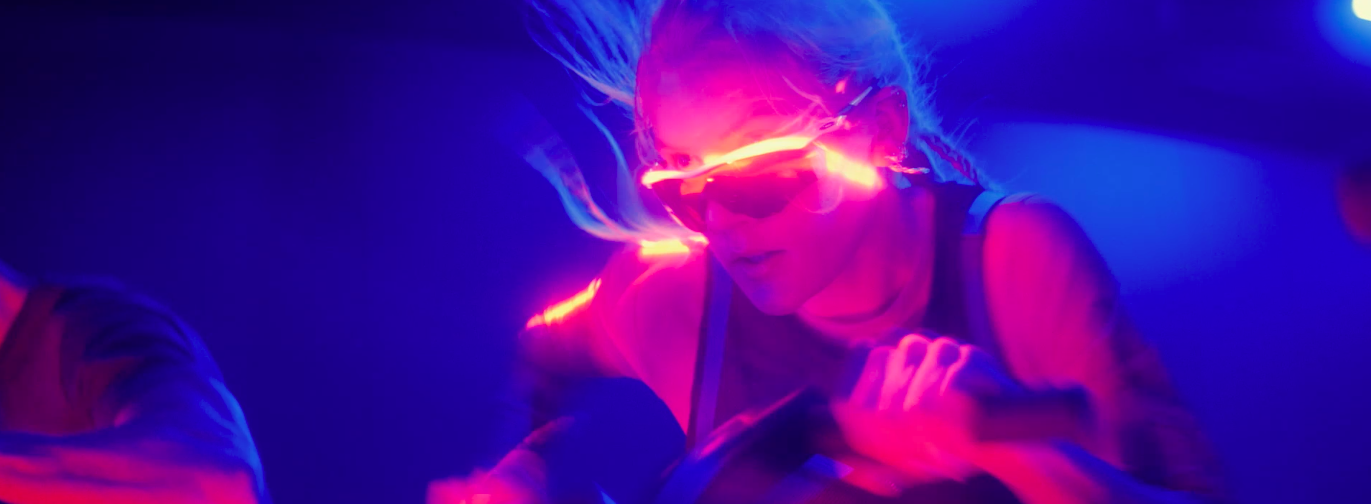
GYM PLIUS IMAGE CAMPAIGN 2024 Advertising
In order not to lose sight of what matters, Mãrios Agency starting the GymPlius promotional campaign in 2024.
Choose where to exercise wisely, use your head. Be careful, smart, and assess the true value of the offer.
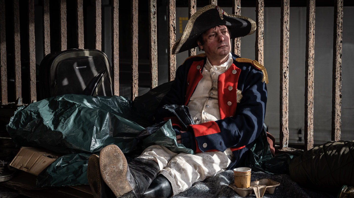
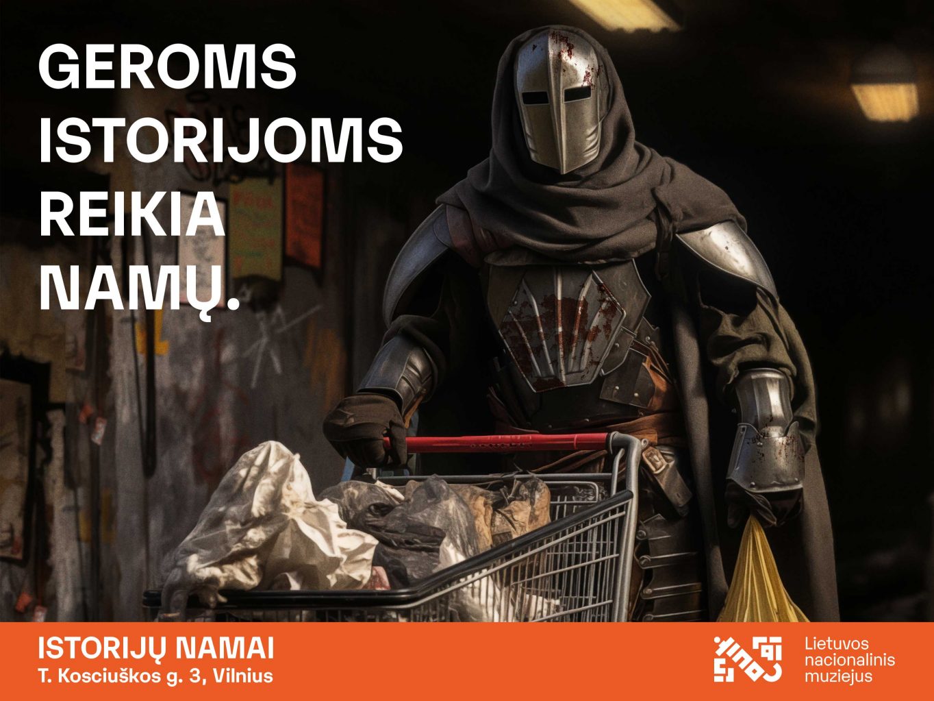
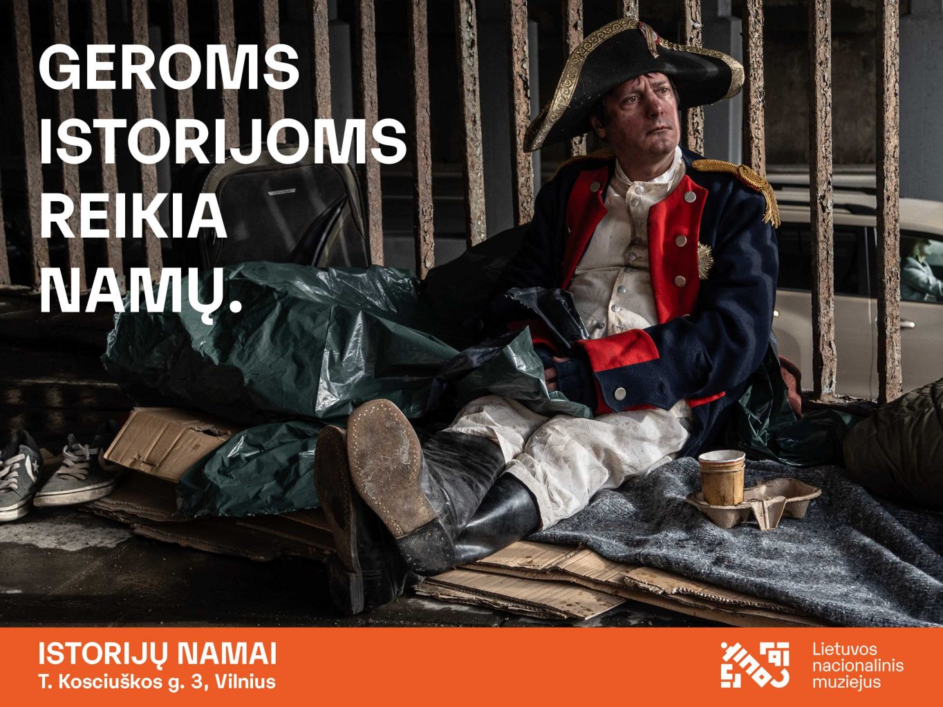
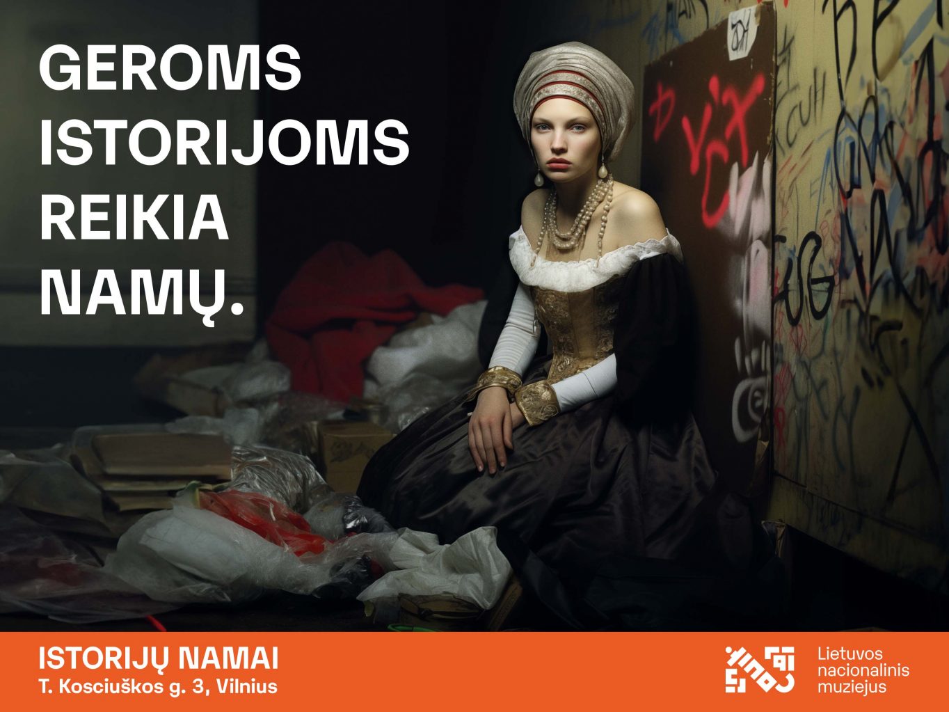
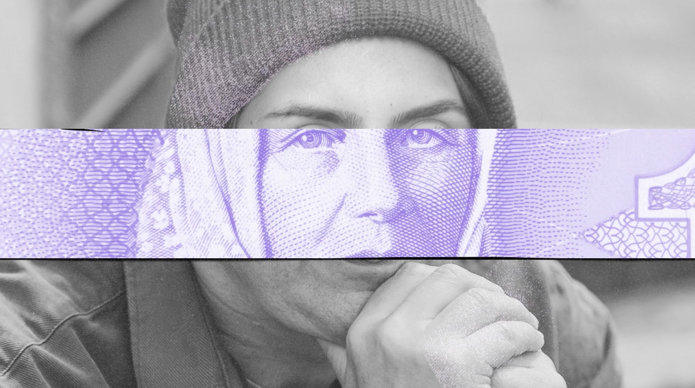
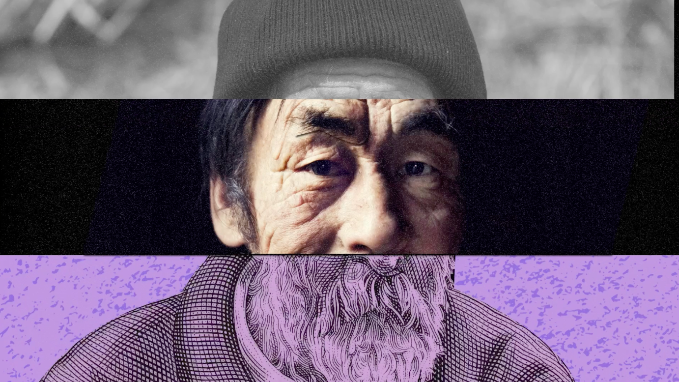
House of Histories – Homeless stories Advertising
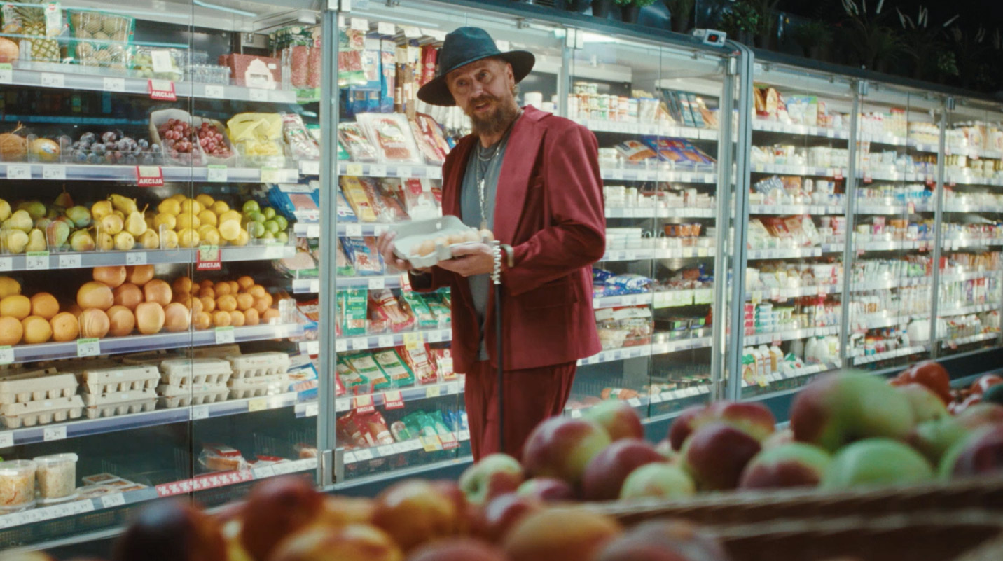
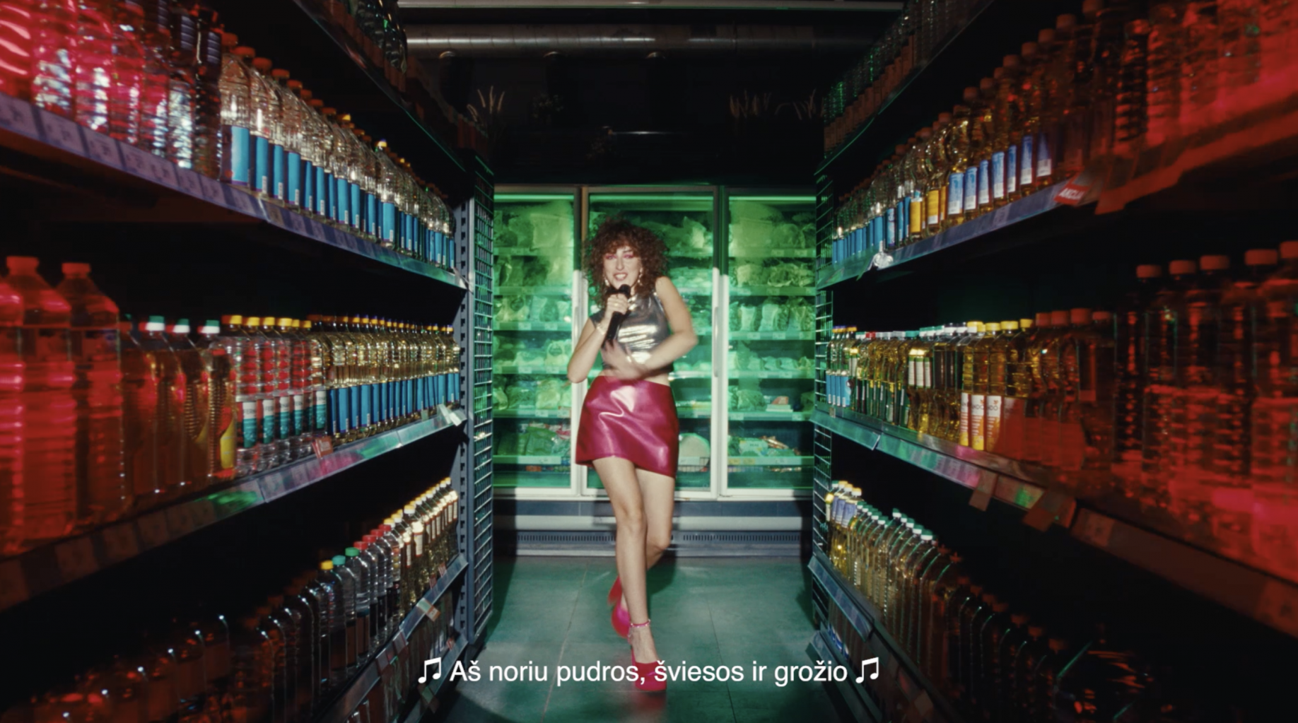
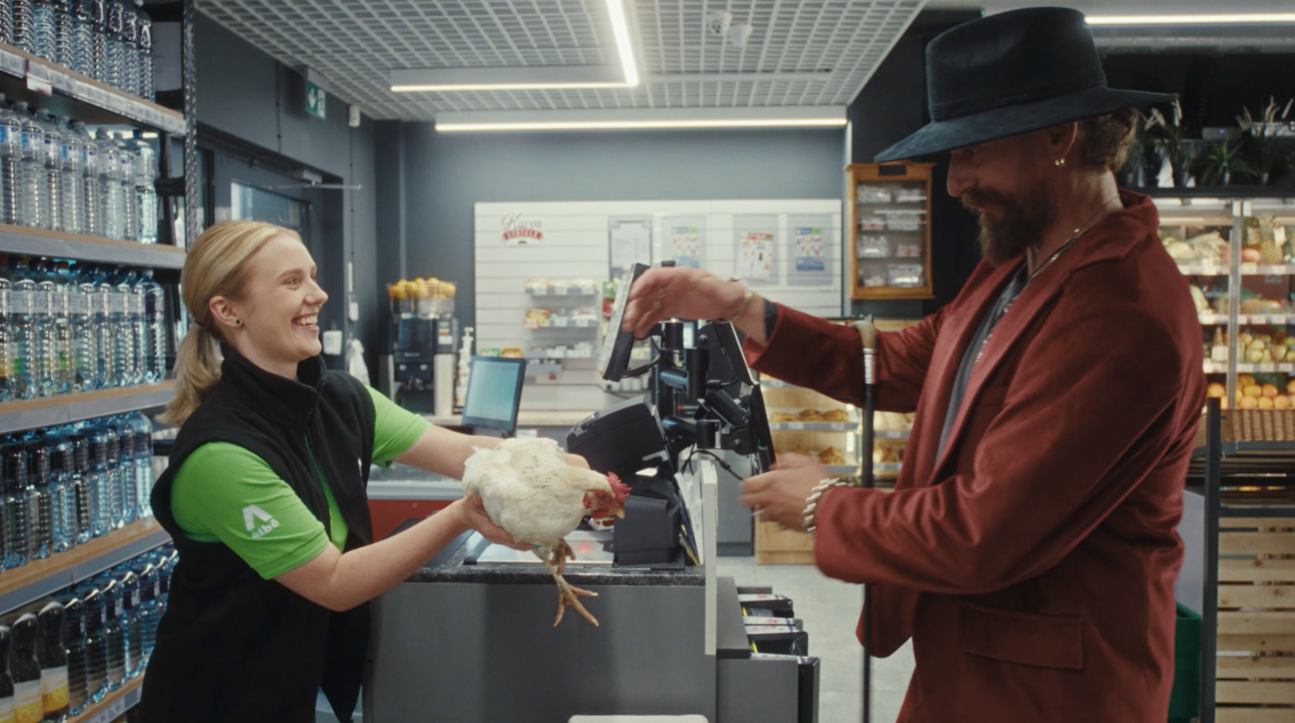
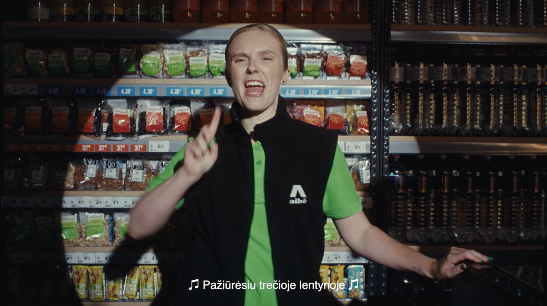
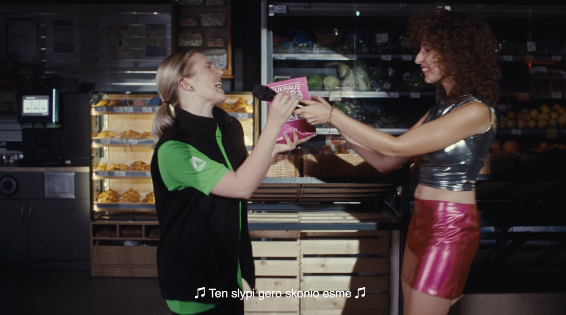
Aibė – Speaking the same language Advertising
AIBE, the retail brand with the largest number of stores in Lithuania, which has been operating for more than two decades, is back with an image campaign “Speaking the same language”. We created a strategy for the image of this brand (DOGMA strategies), an image campaign that emphasizes the ability of this brand to adapt to a specific environment, its people and their needs. AIBĖ will understand and instantly will find anything you need, in “half a word”! It was really fun and interesting for us to return to work with an image for this authentic retail brand.
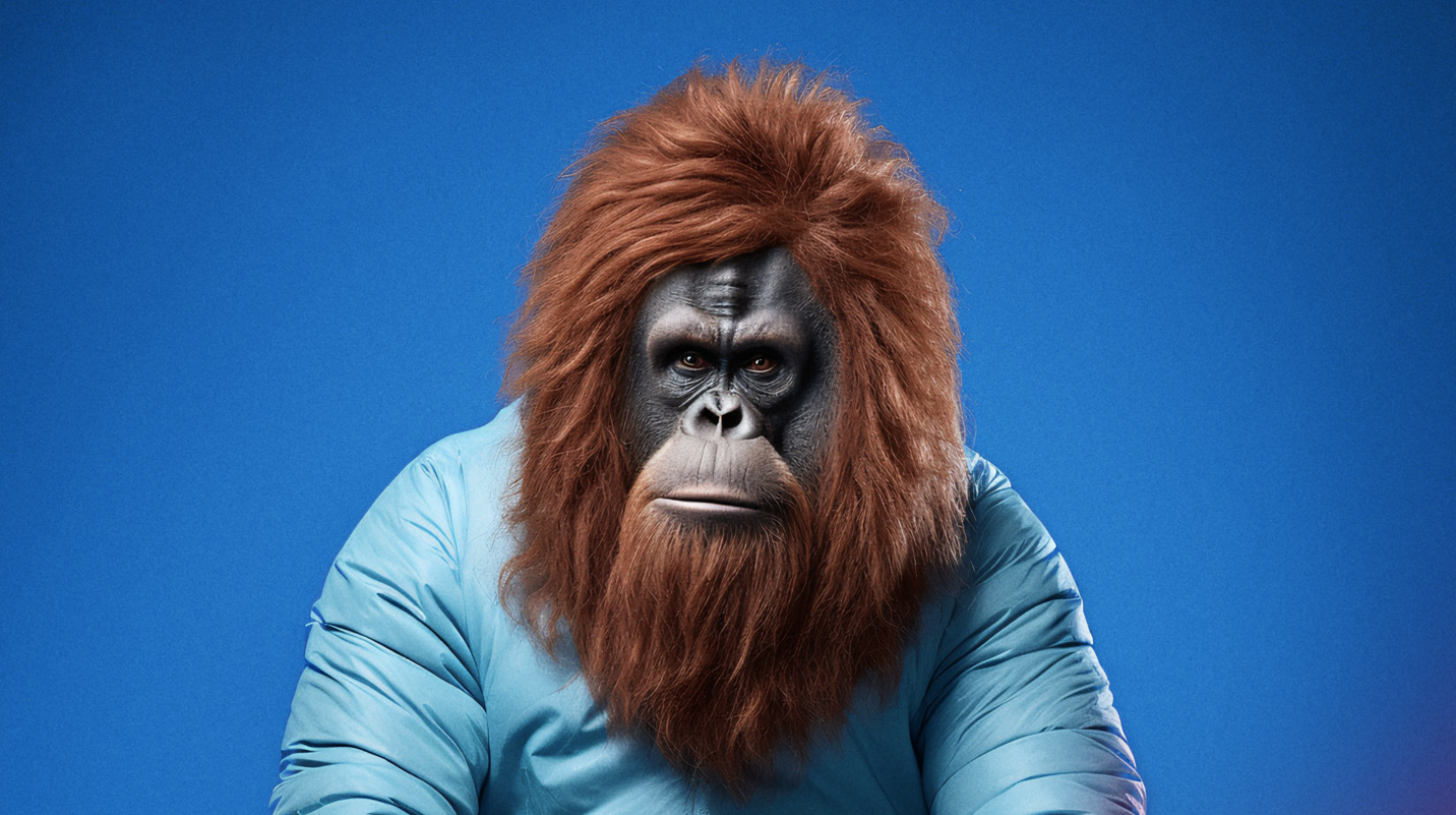
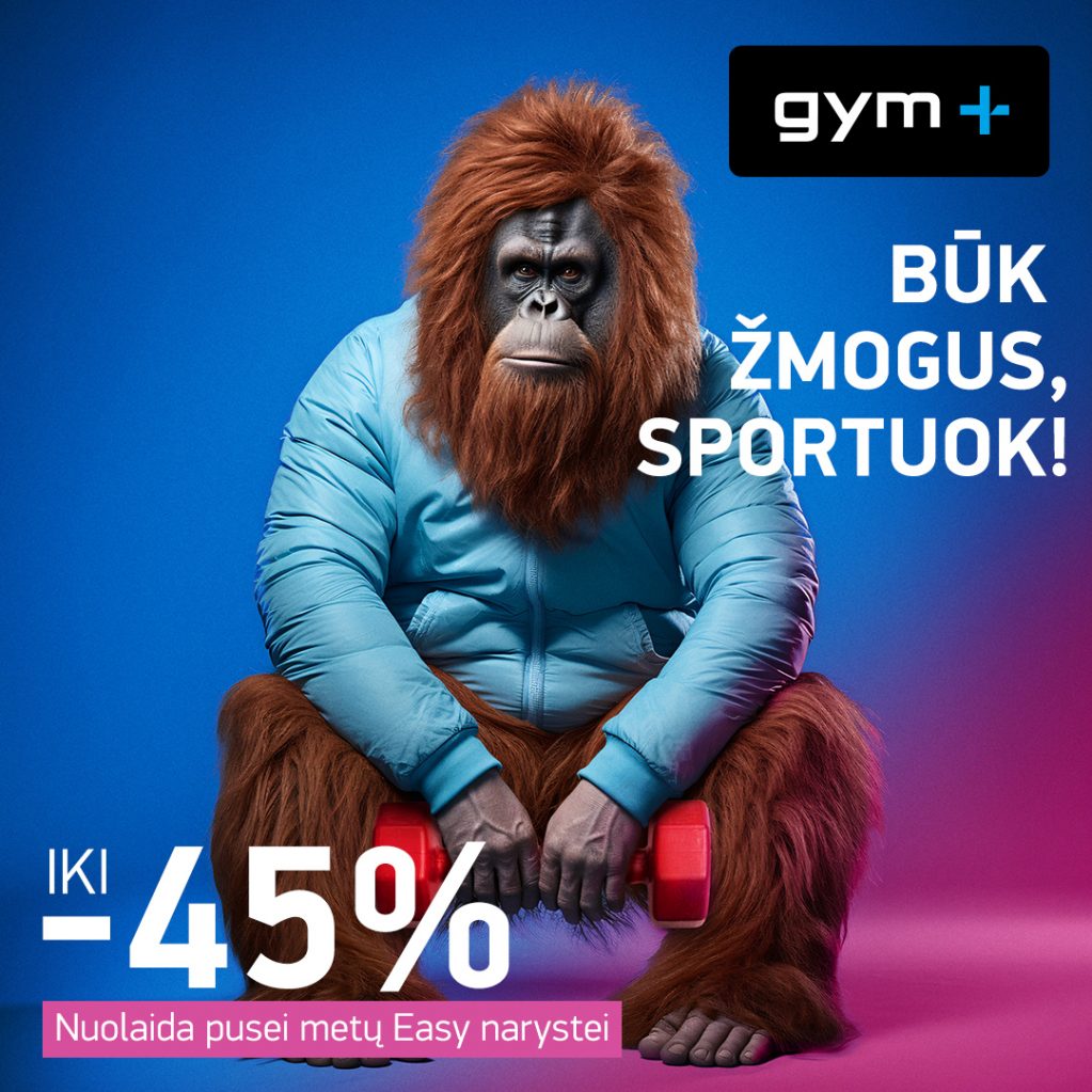
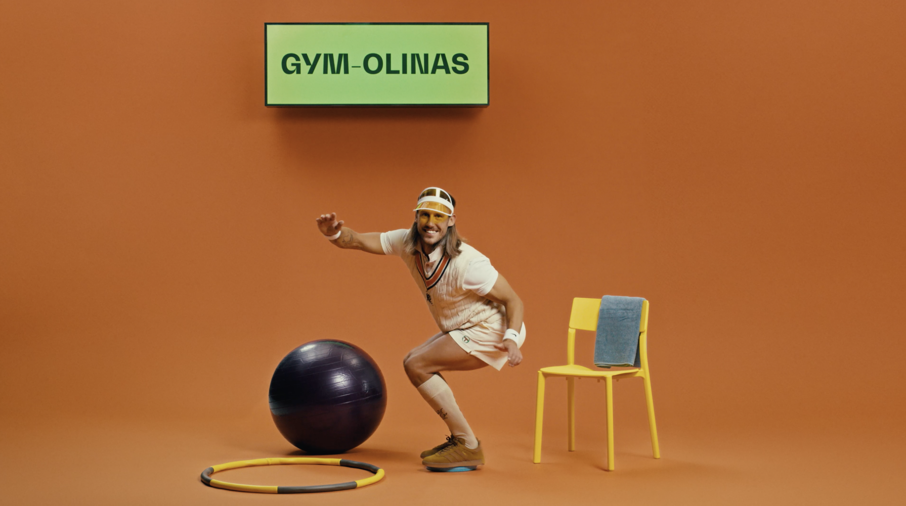
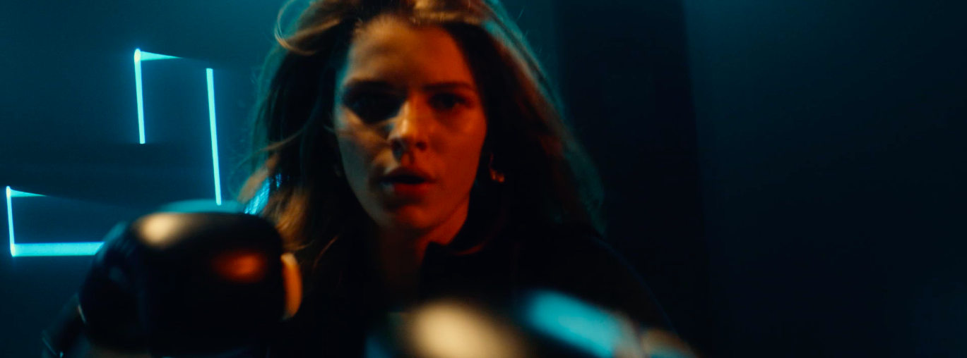
GYM PLIUS PROMO CAMPAIGN 2023 BE A MAN! EXERCISE! Advertising
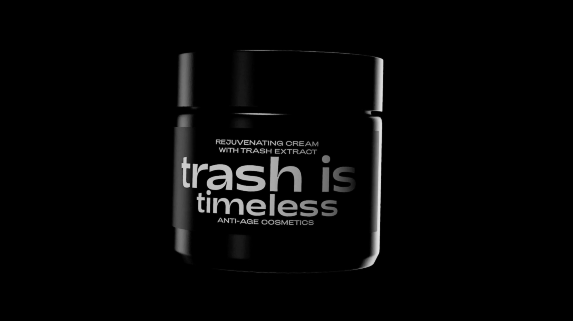
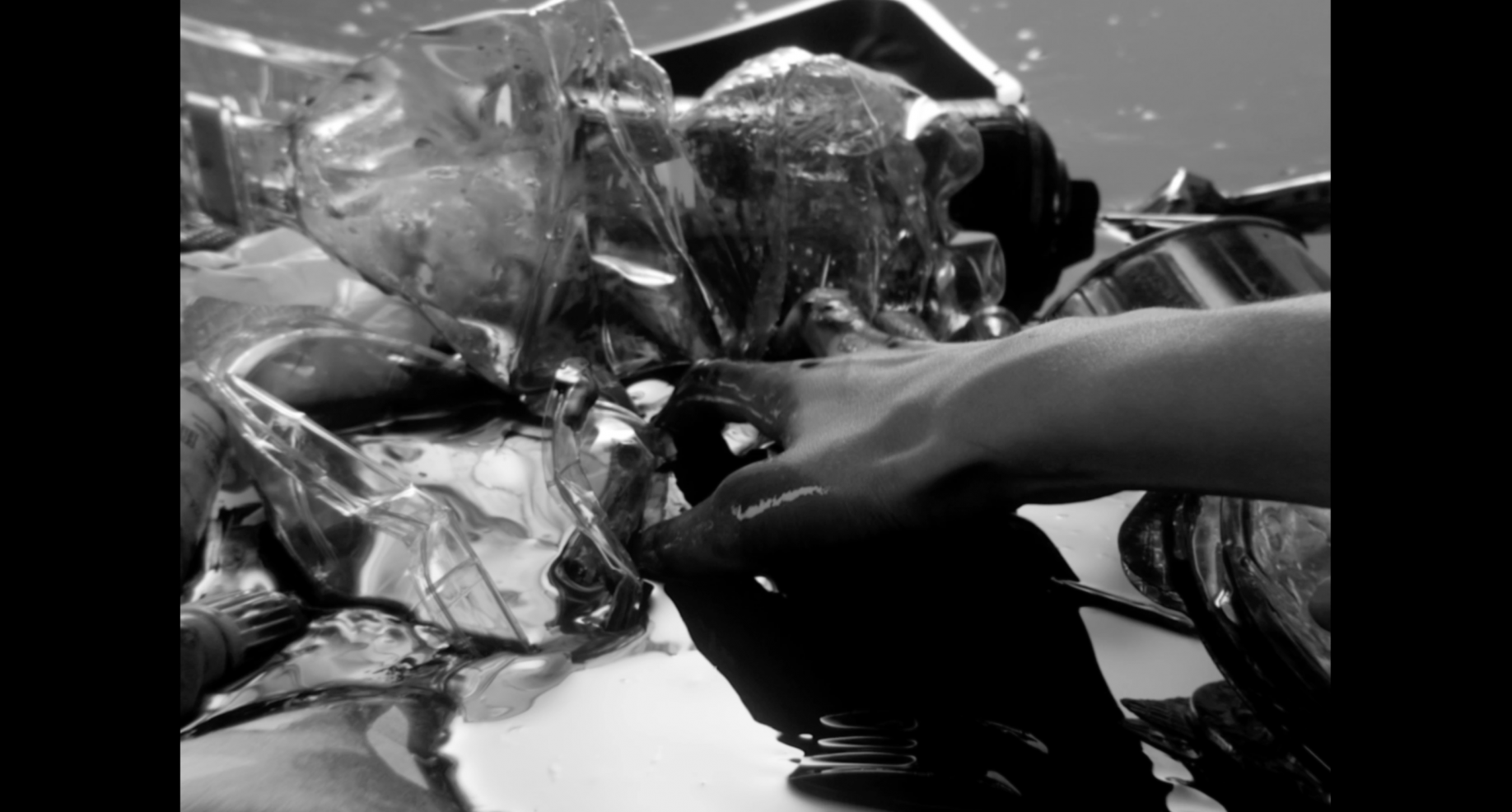
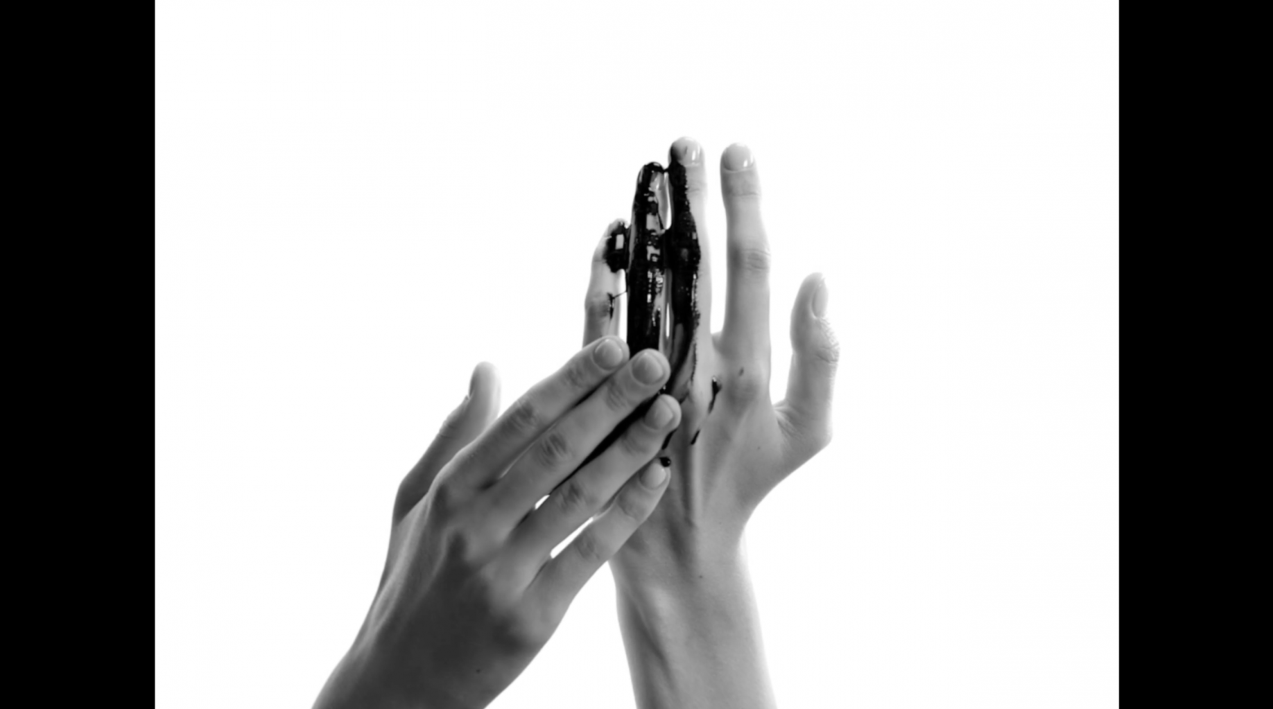
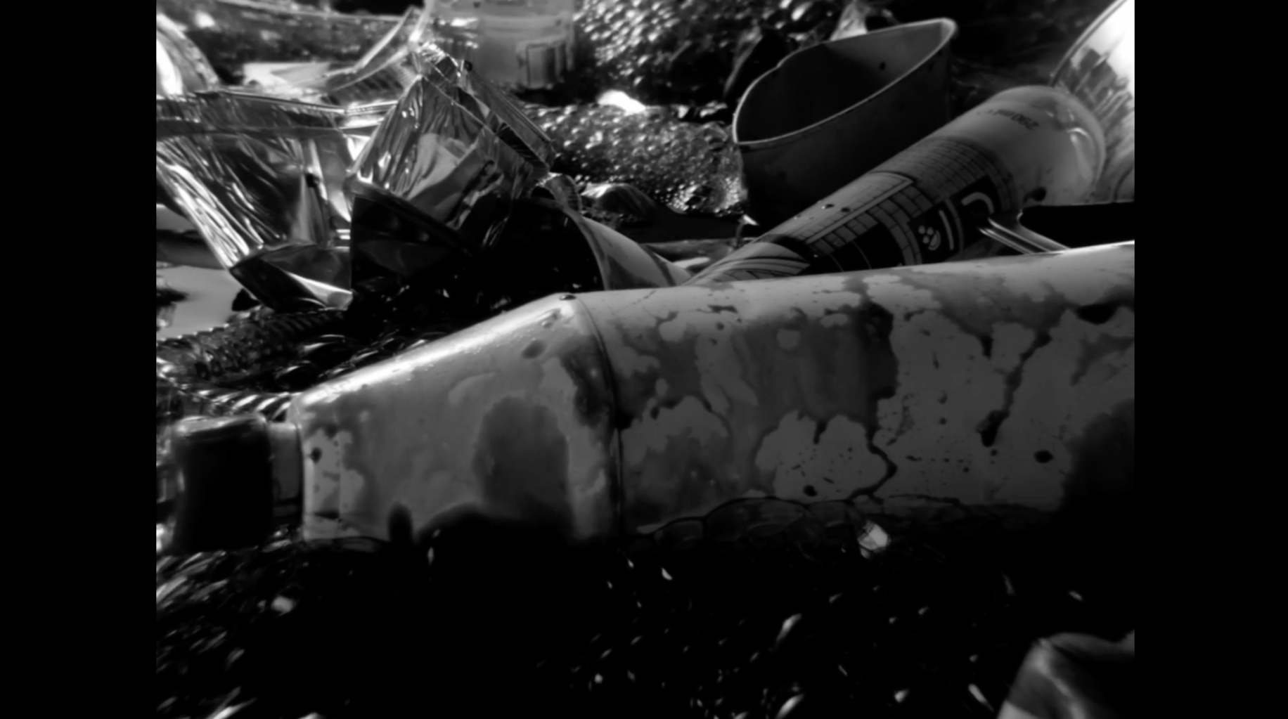
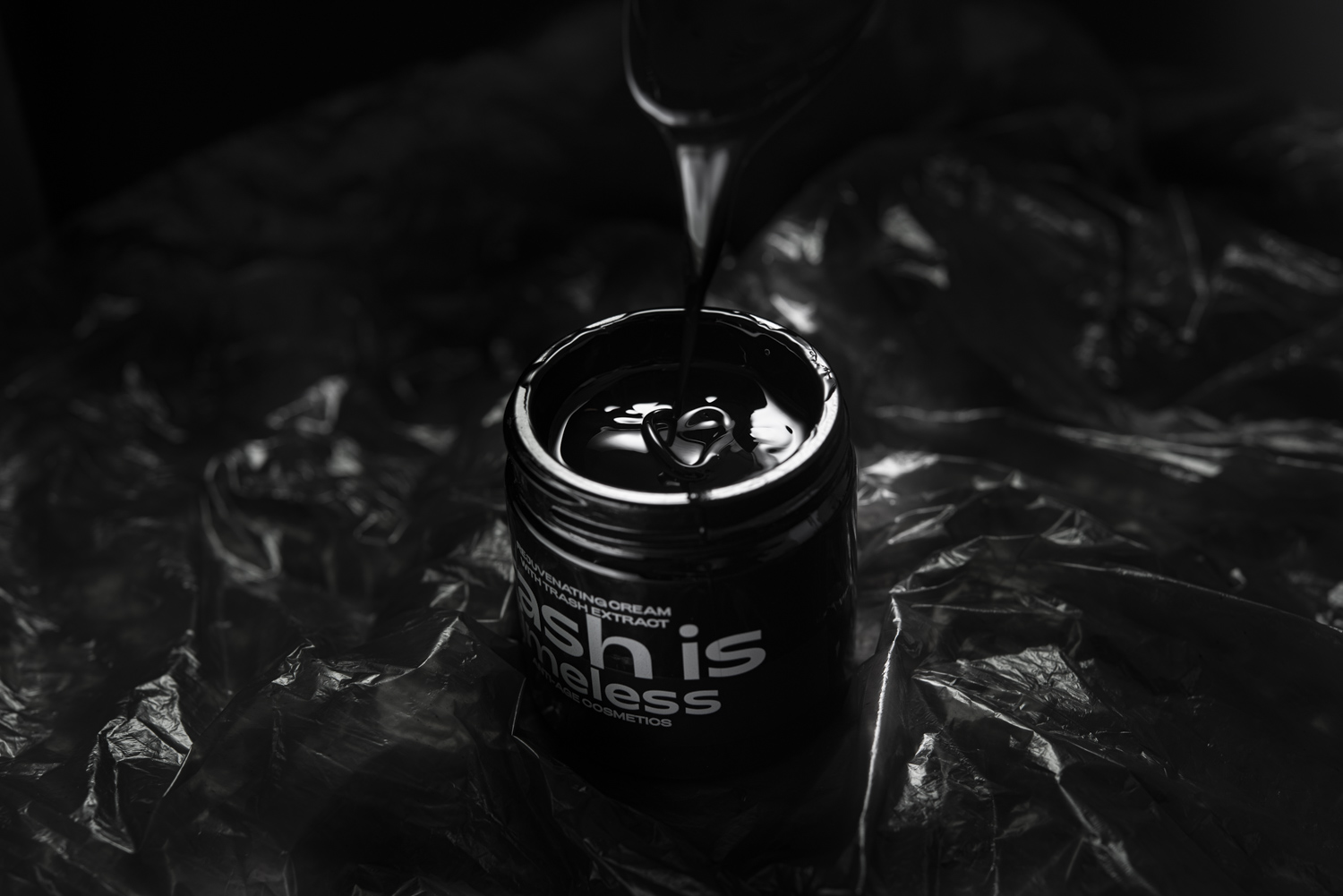
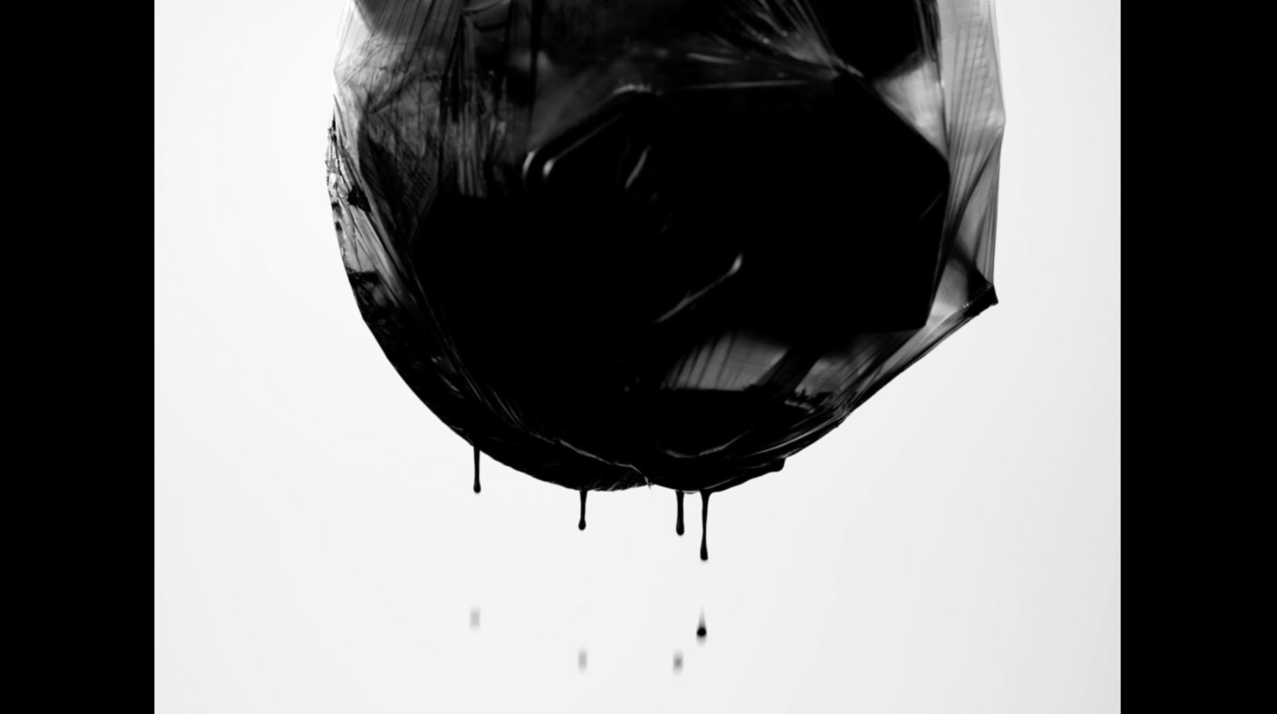
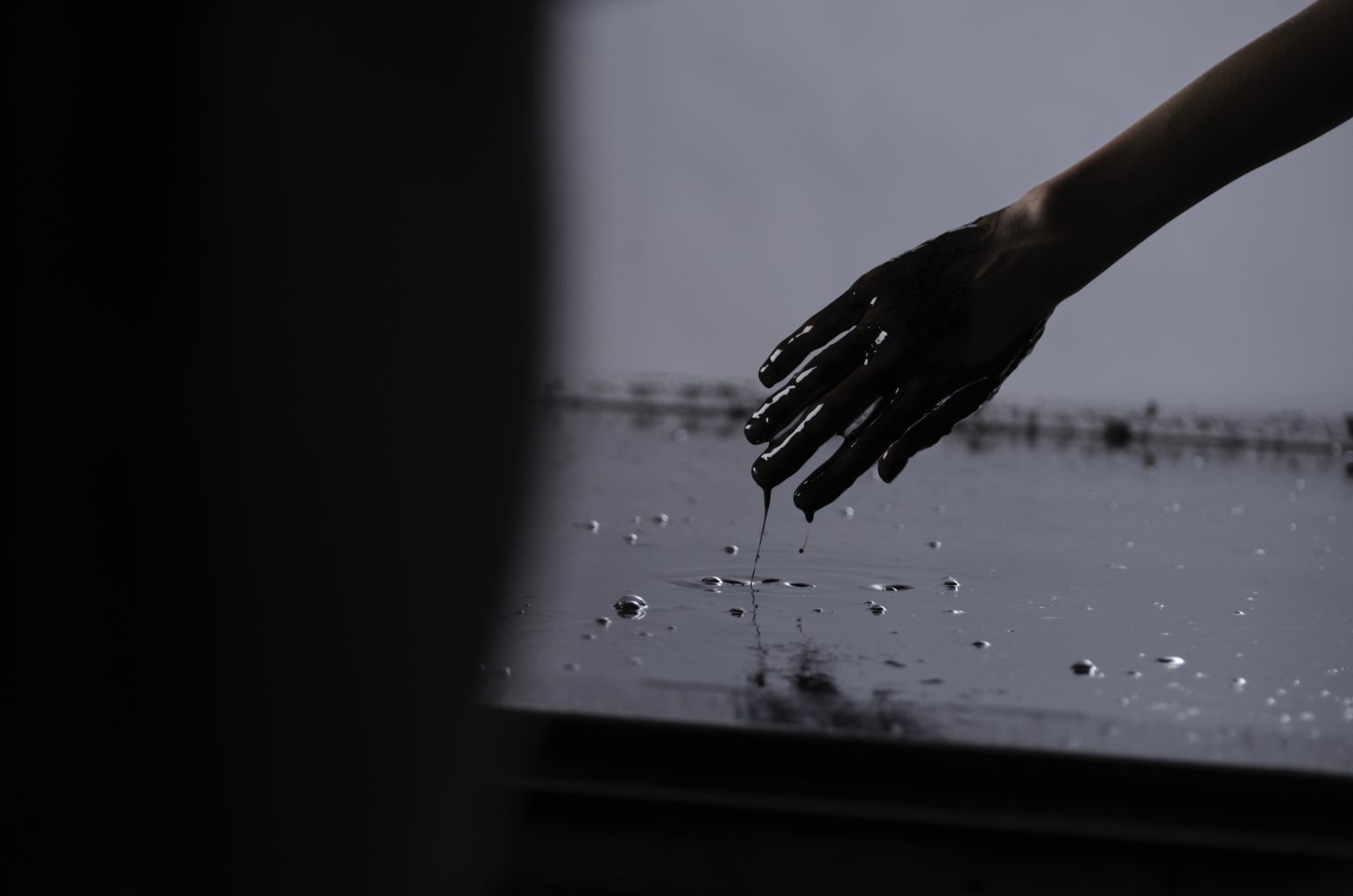
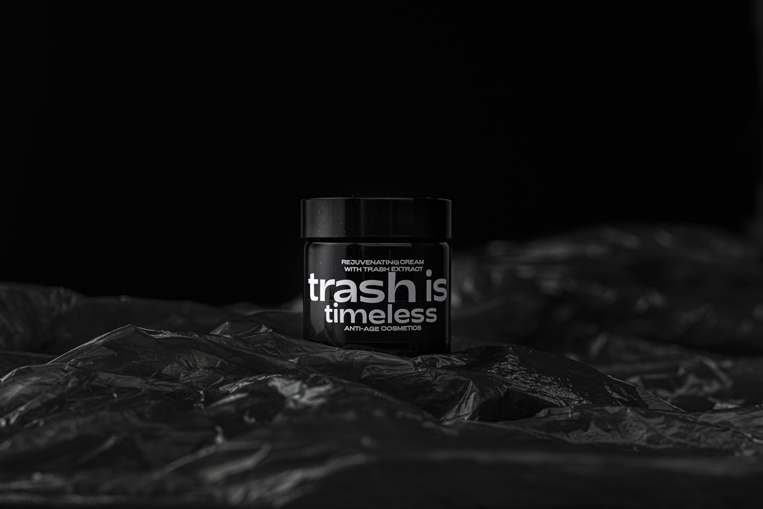
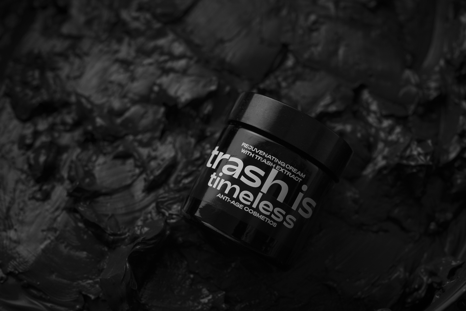
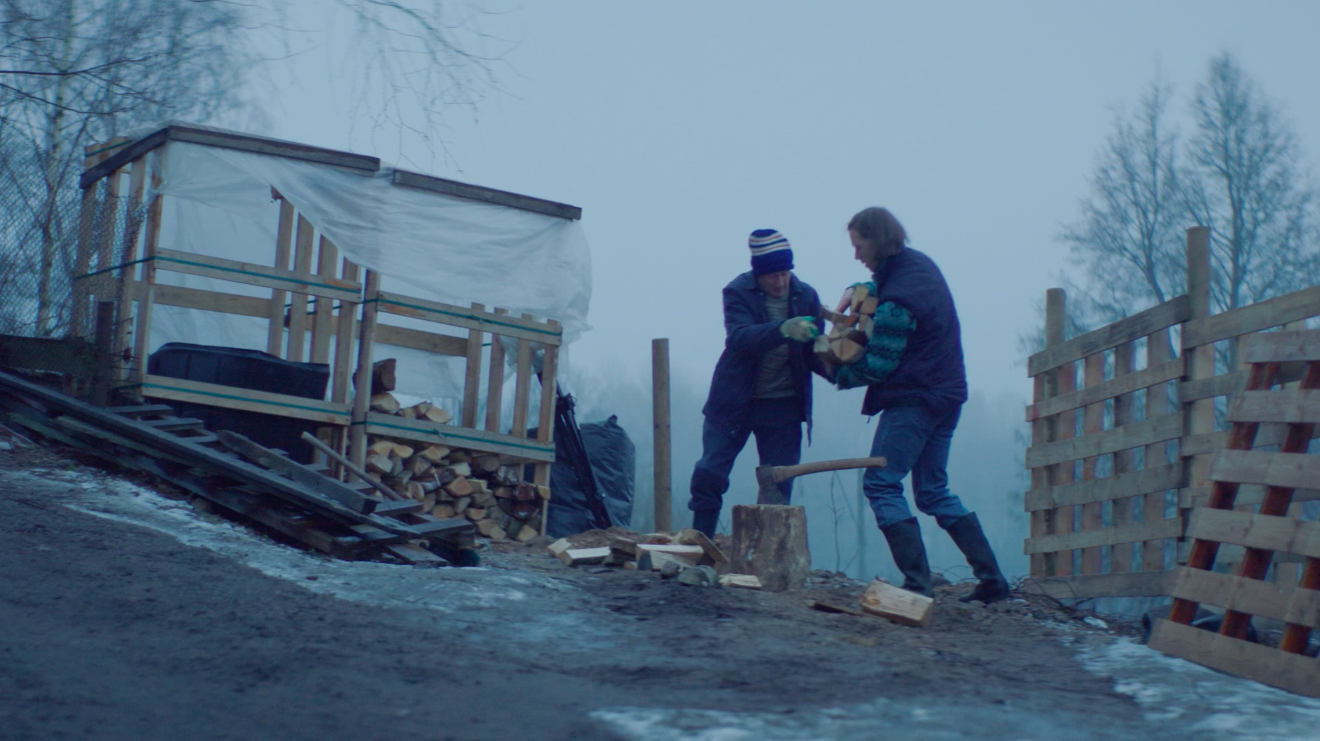
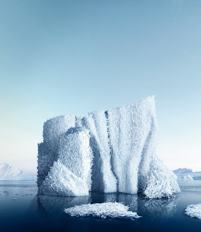
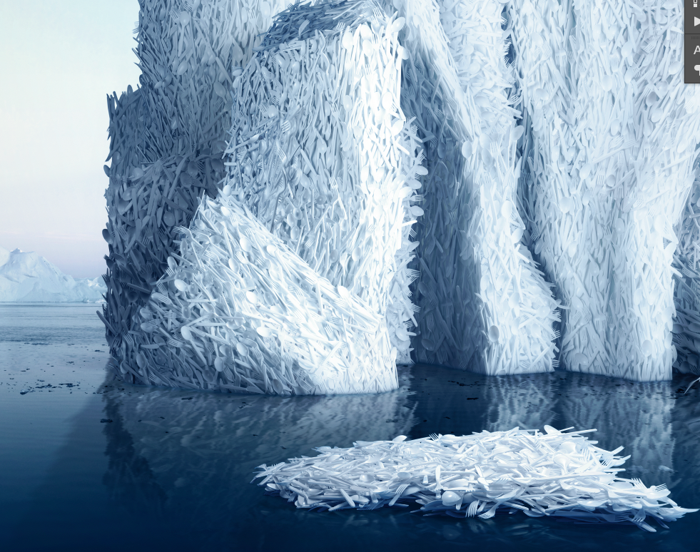
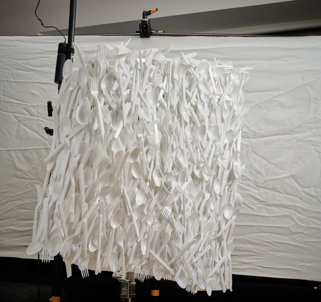
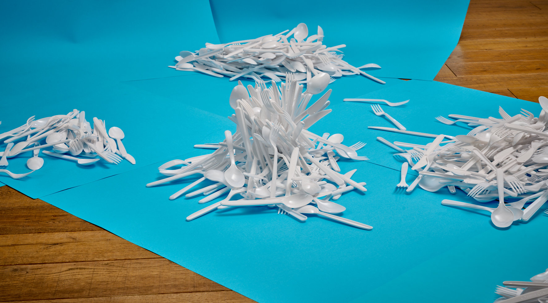
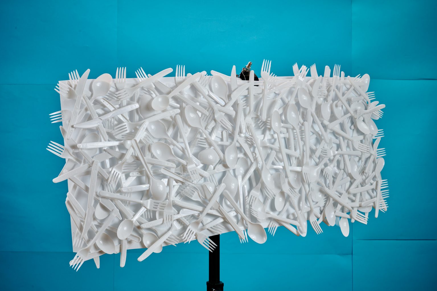
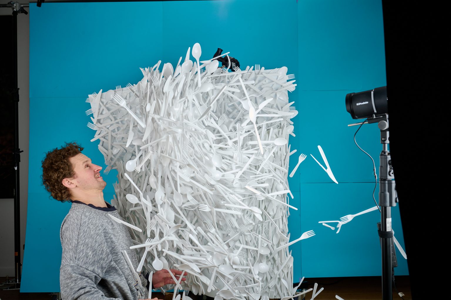
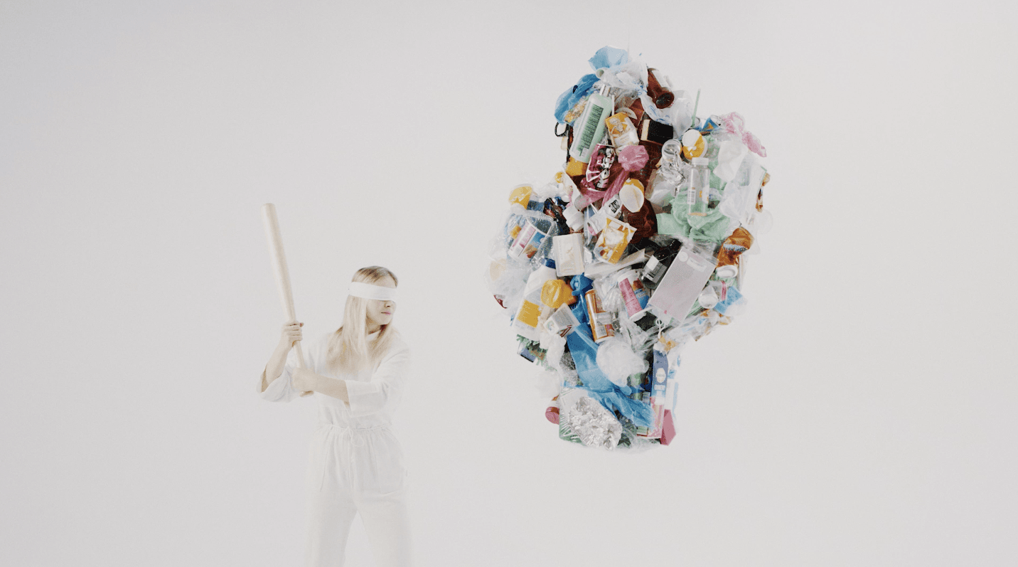
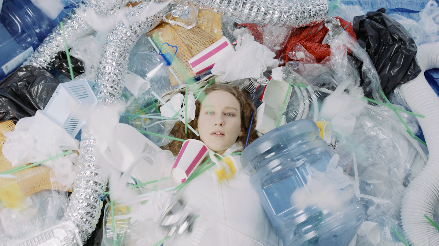
Gamtos Ateitis – Trash is Timeless Advertising
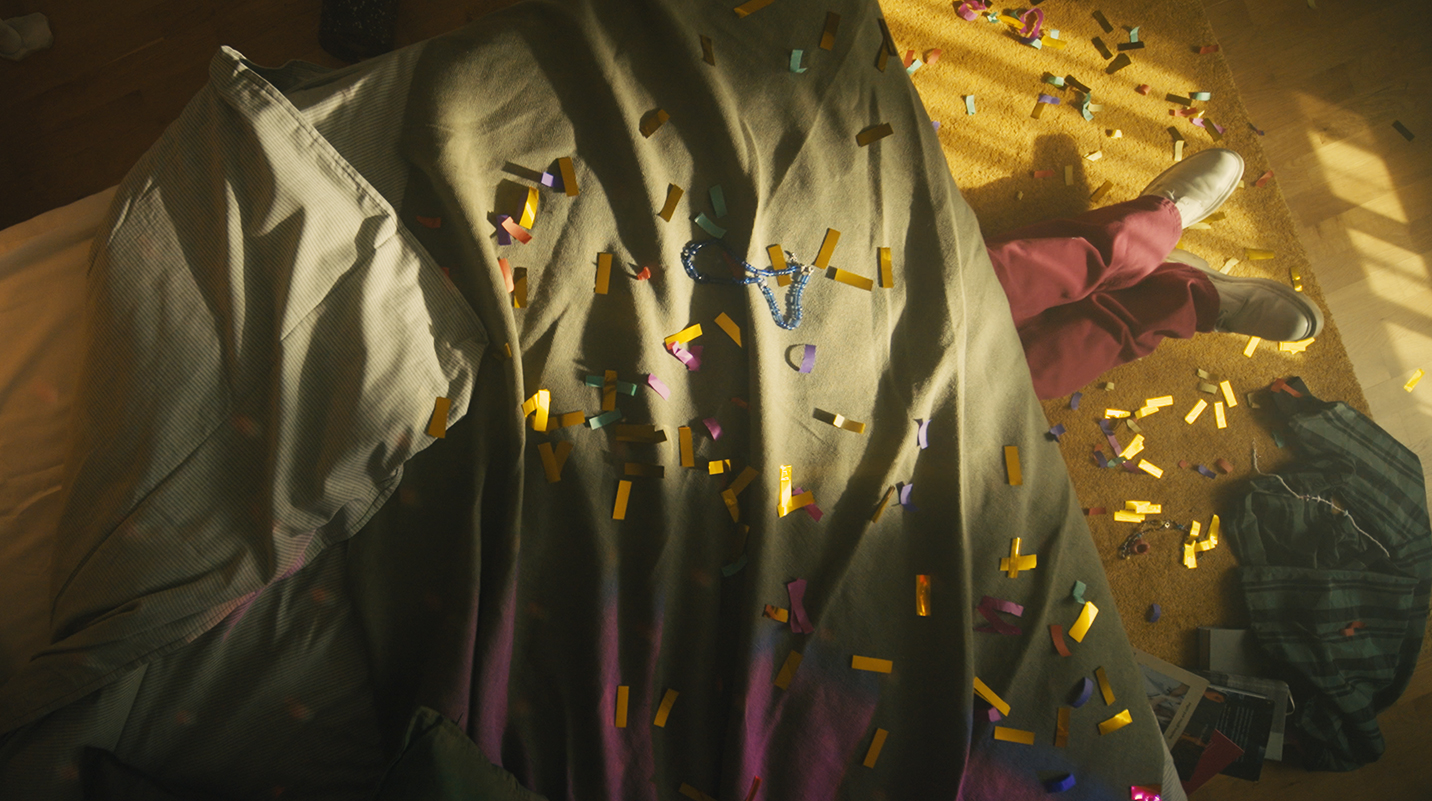
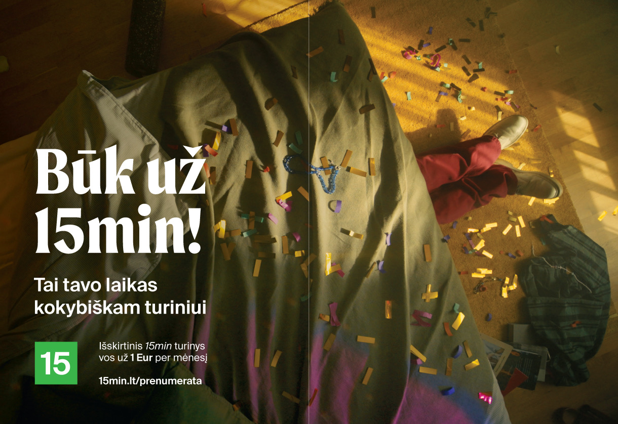
Būk už 15 min. Advertising
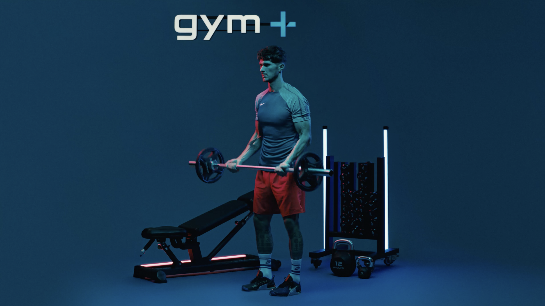
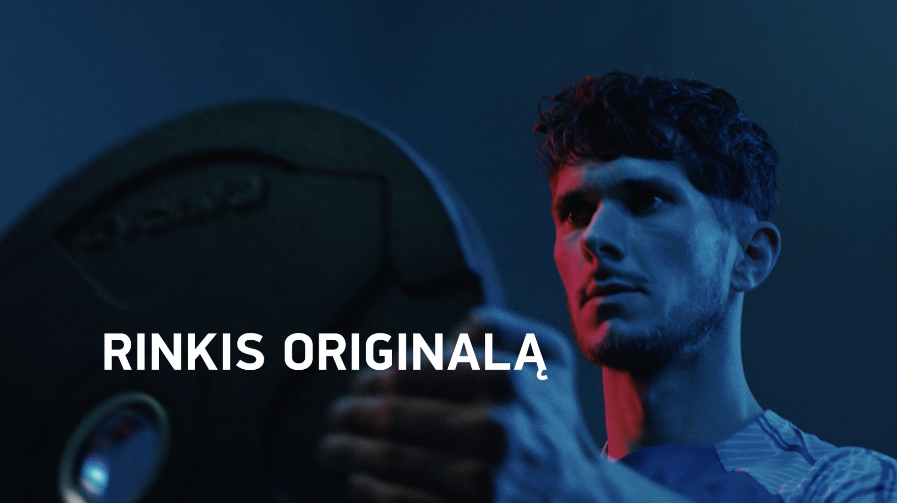
GYM PLIUS IMAGE CAMPAIGN 2023 – CHOOSE THE ORIGINAL Advertising
When you’re the largest network of sports clubs in Lithuania and offer quality equipment, modern interior, a lot of action inside and all possible training systems – you can confidently say:
Choose the Gym Plius UAB sports club. Choose the original!
Mãrios is happy to present the new fun campaign!
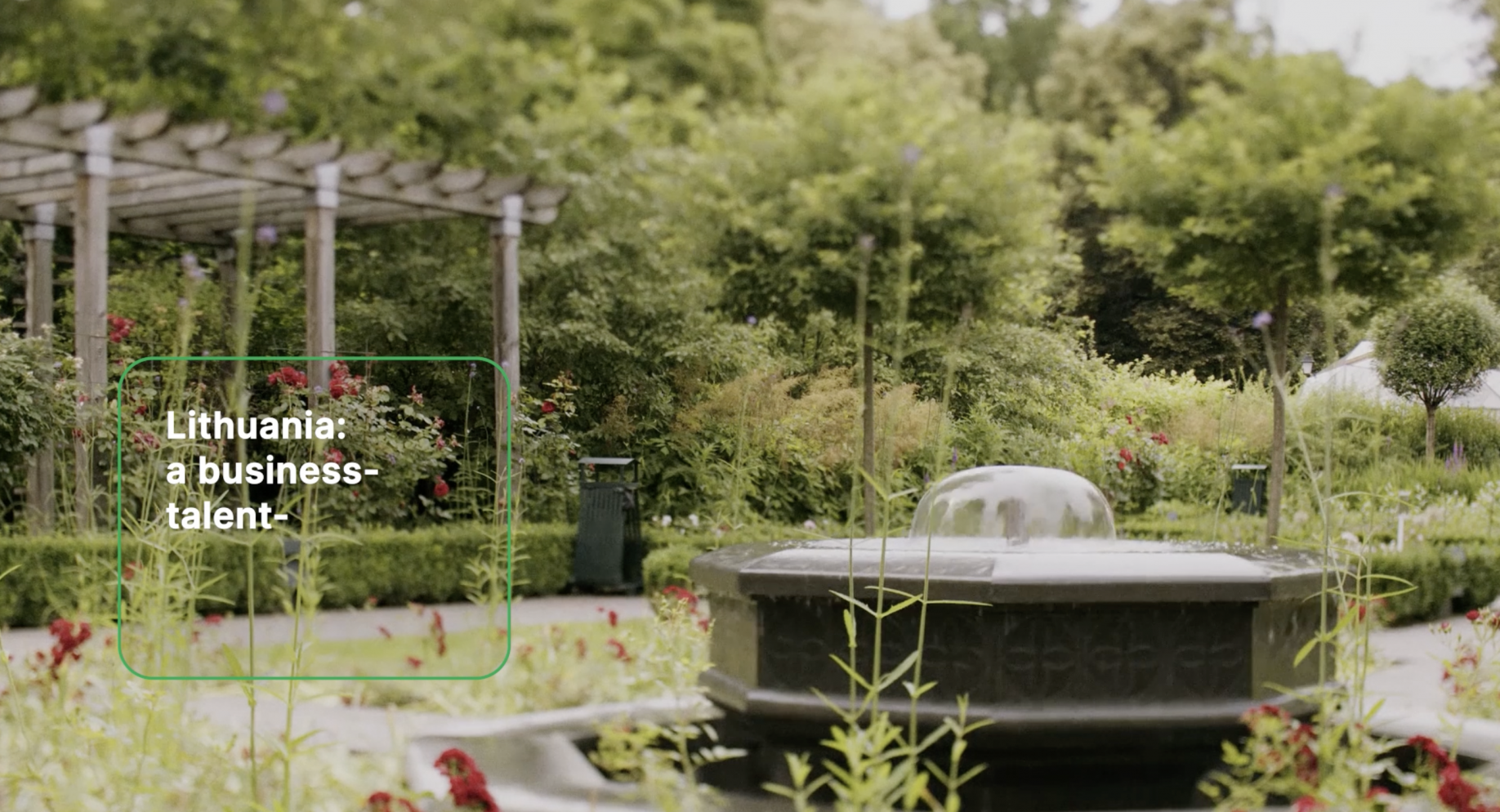
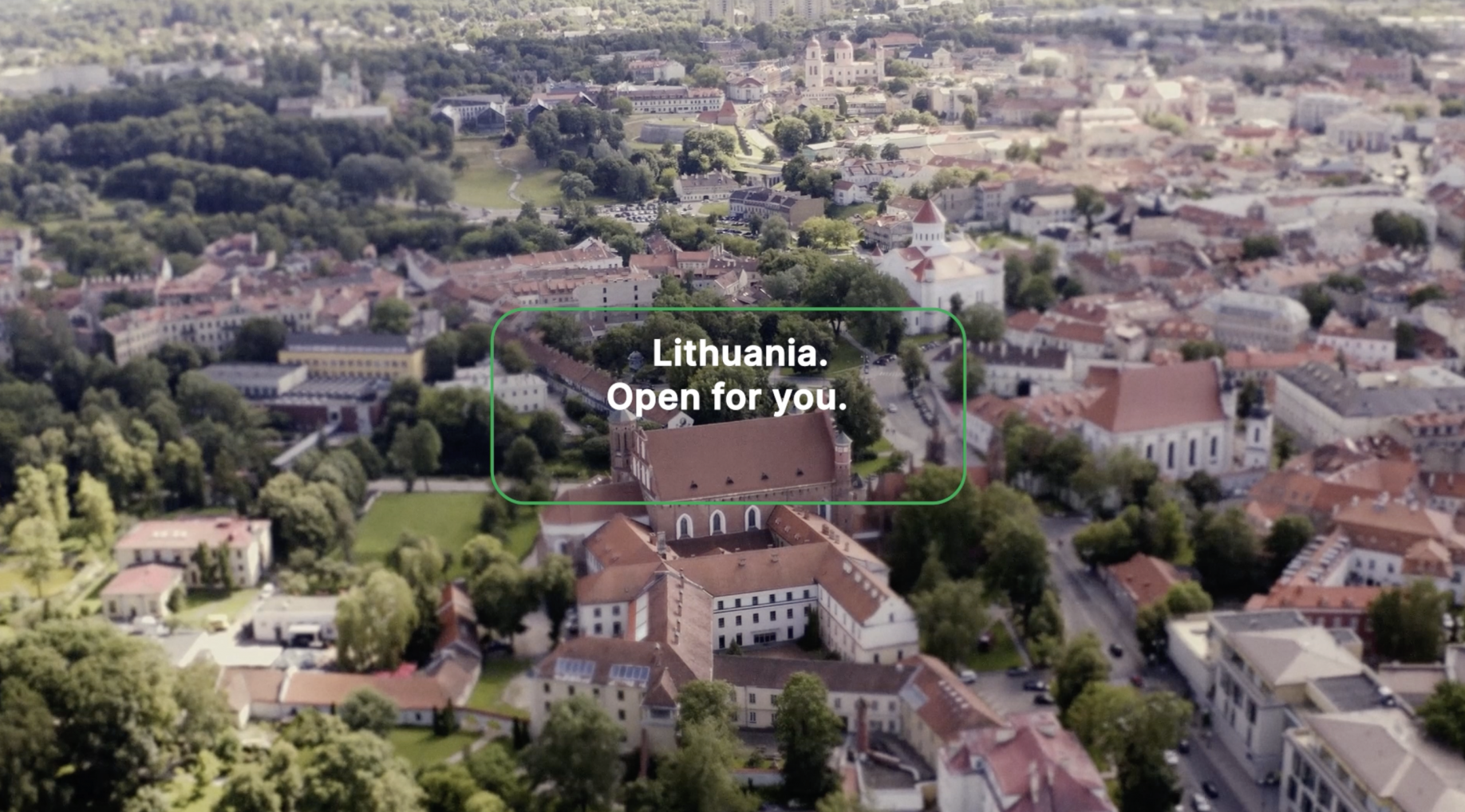
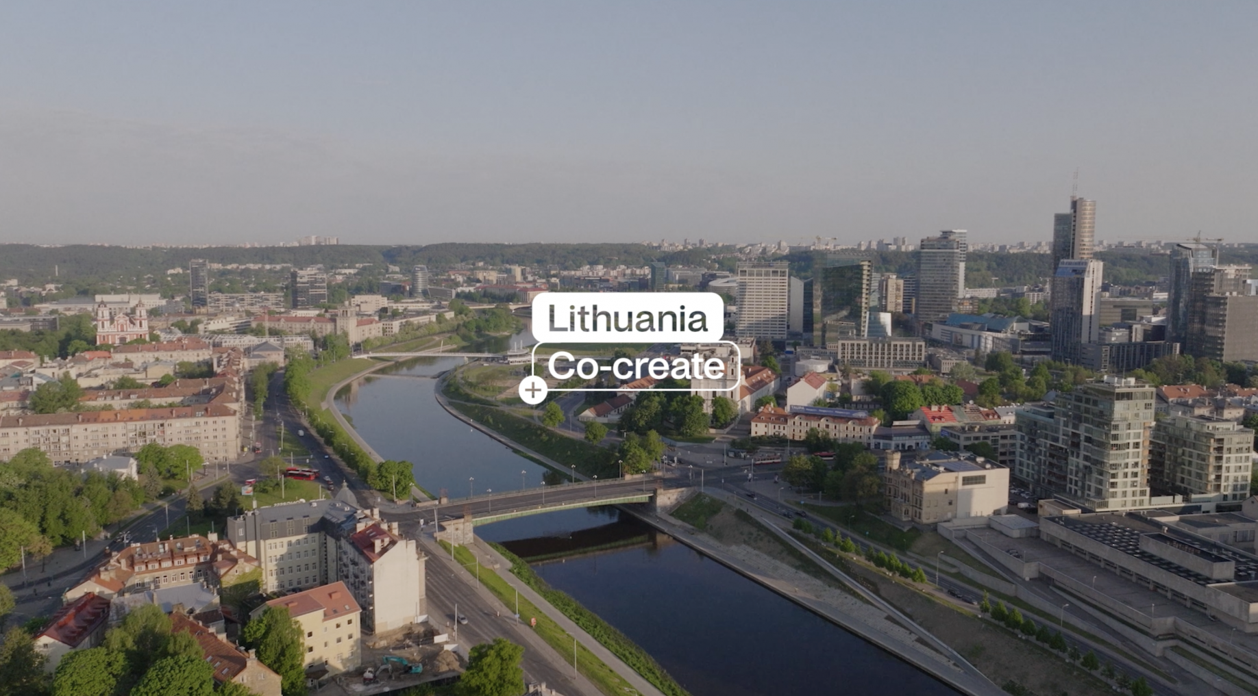
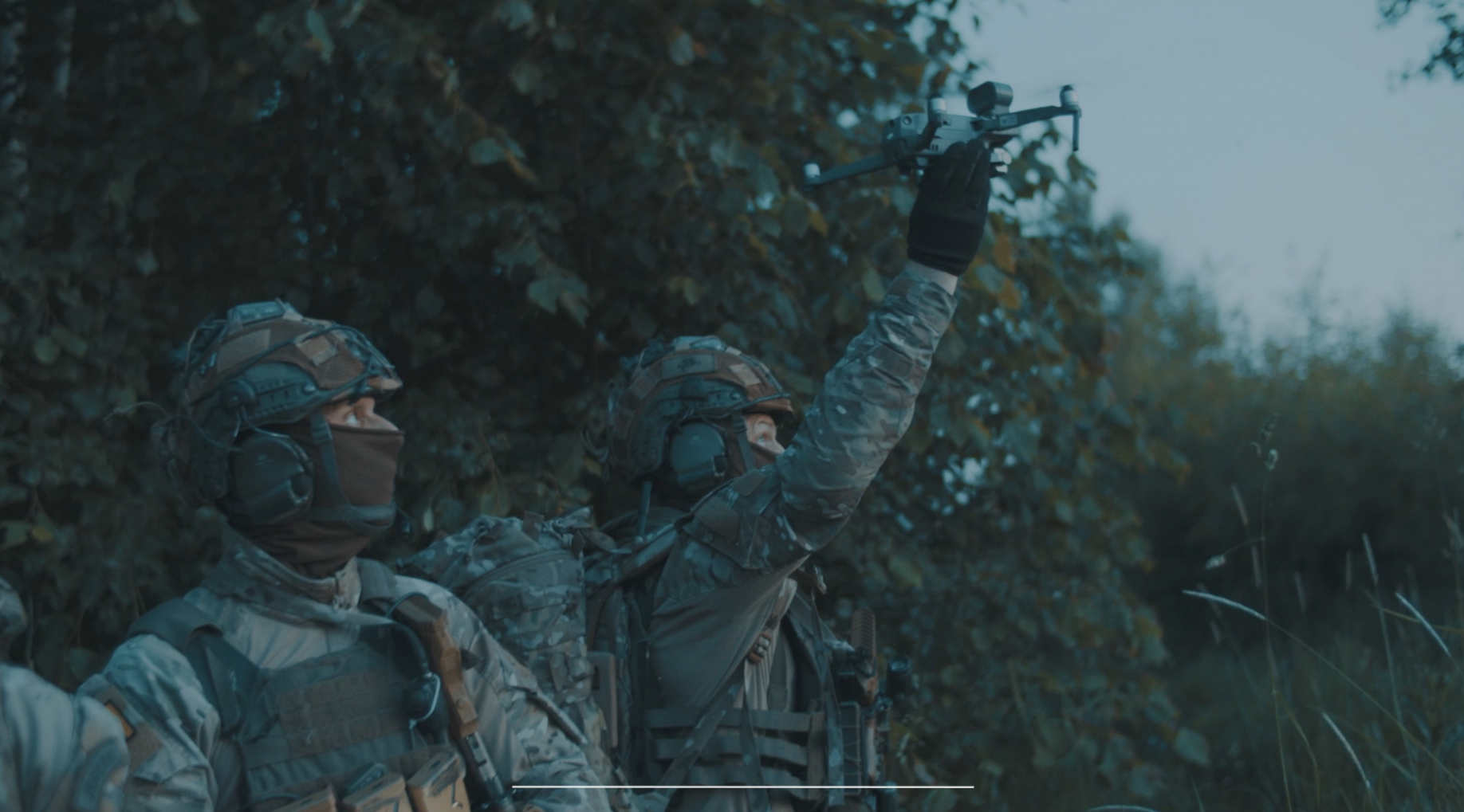
Lithuania Co-create Nato Summit film Advertising
Mãrios sends the best wishes to the guests of the NATO Summit 2023 in Vilnius. On such an important occasion we are happy to present Lithuania as a progressive and breakthrough country. The carefully crafted video is currently being broadcast on the screens of the summit location, where world media is working. It’s always a good feeling to spread a positive message about Lithuania.
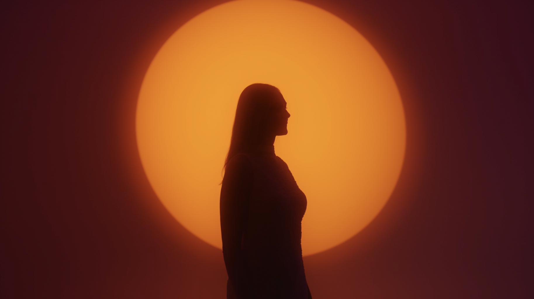
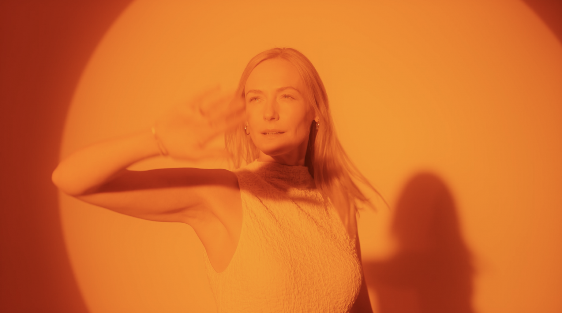
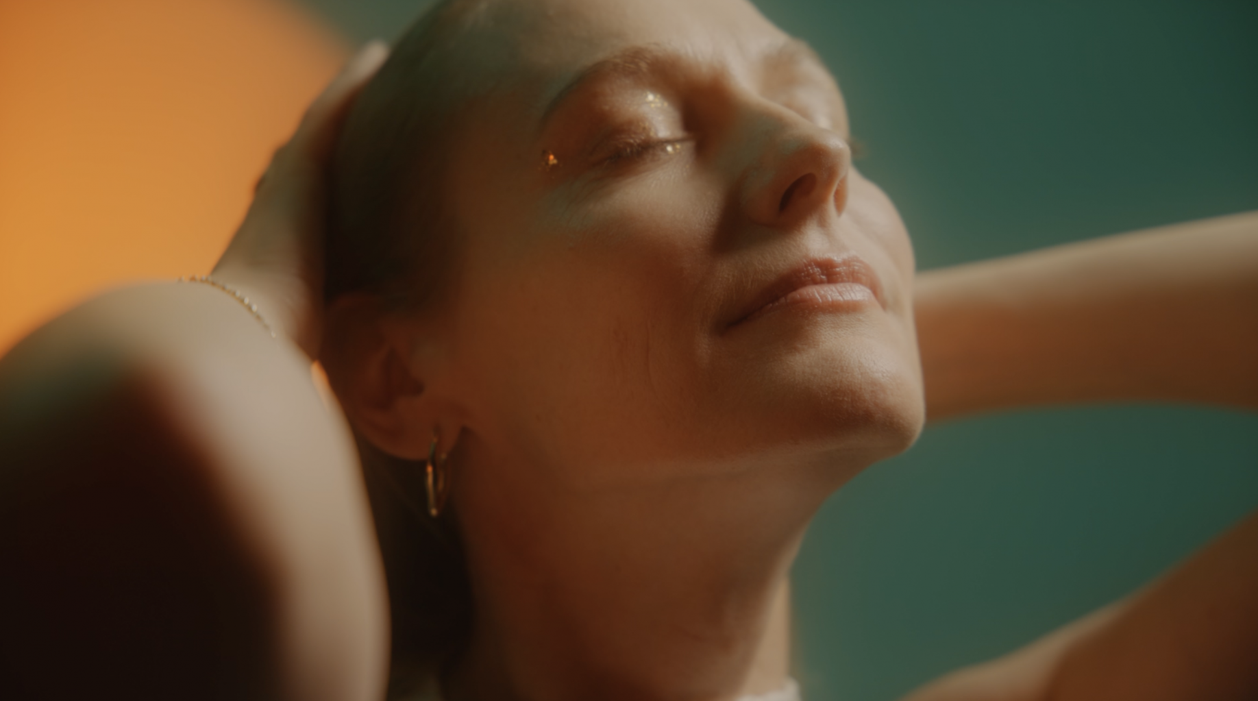
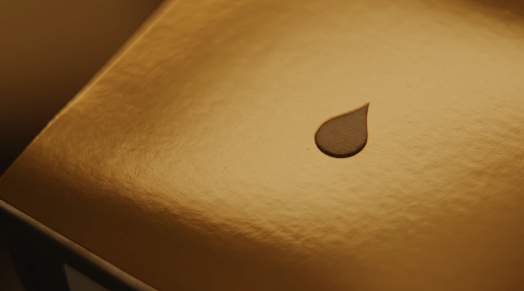
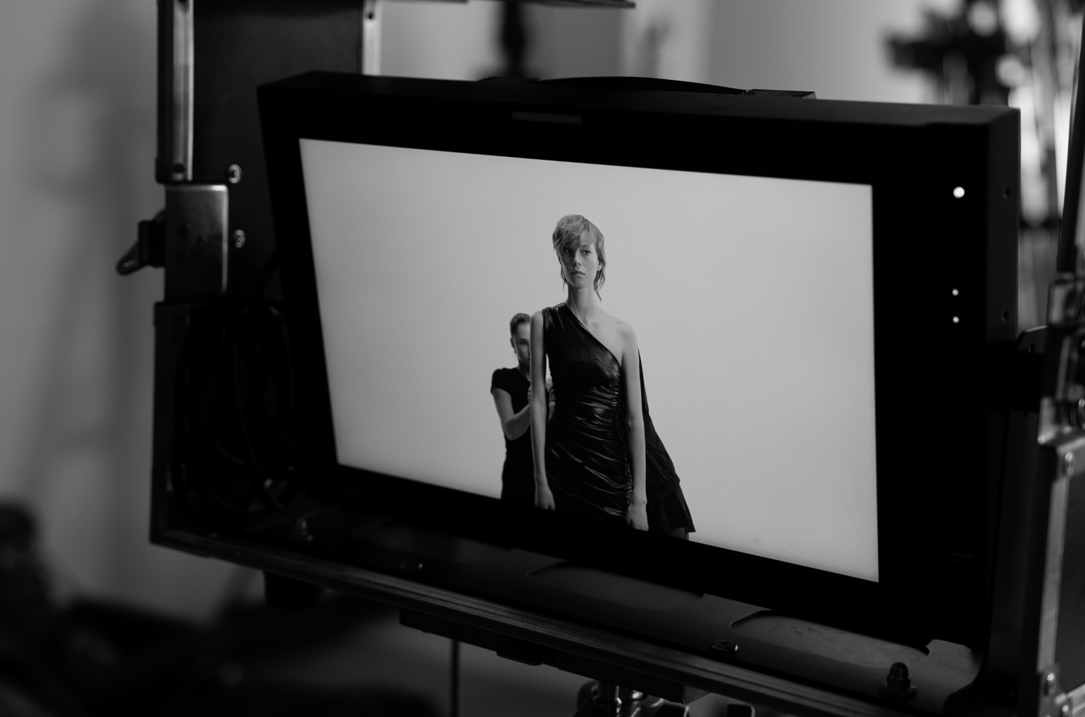
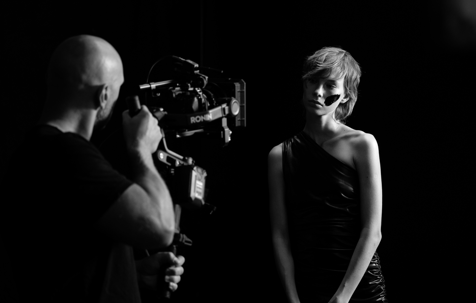
Rasa / Biok Lab – Come into the light Advertising
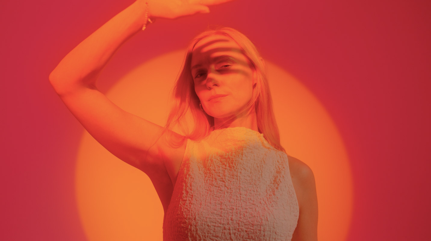
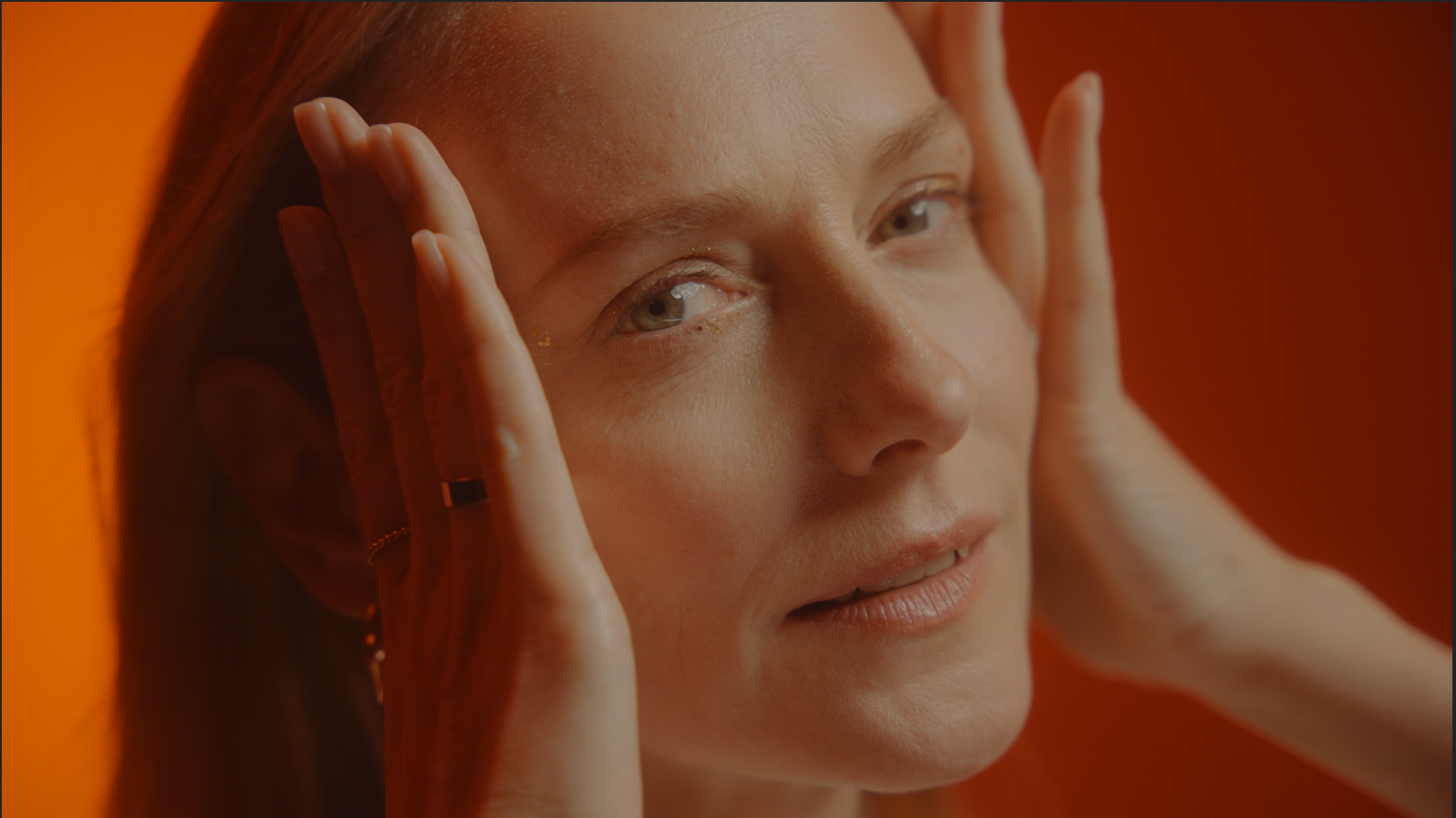
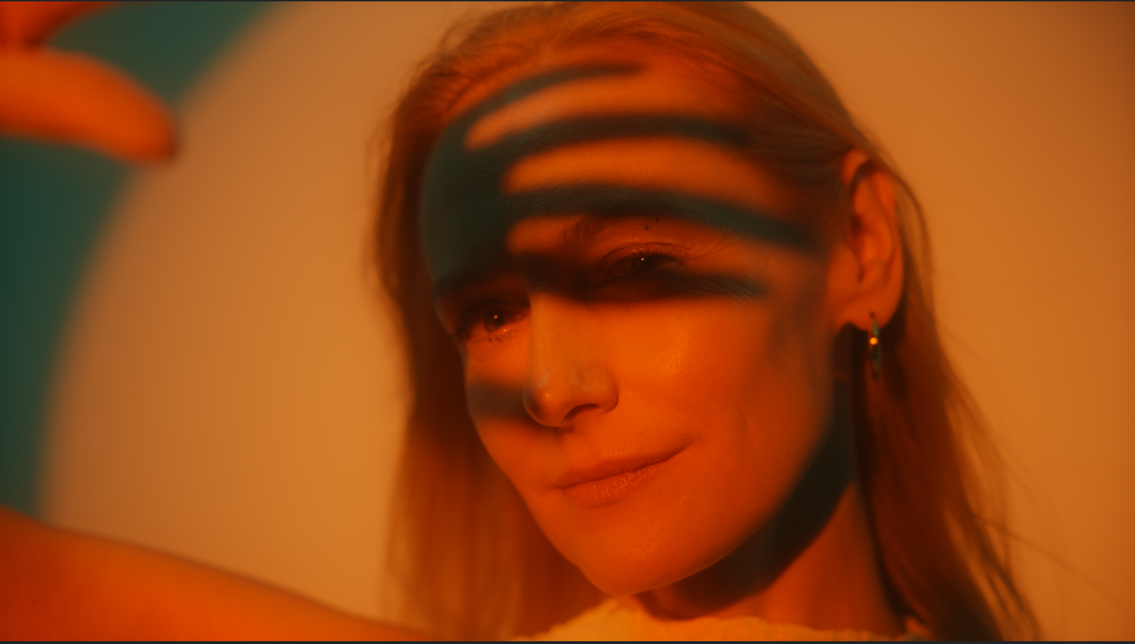
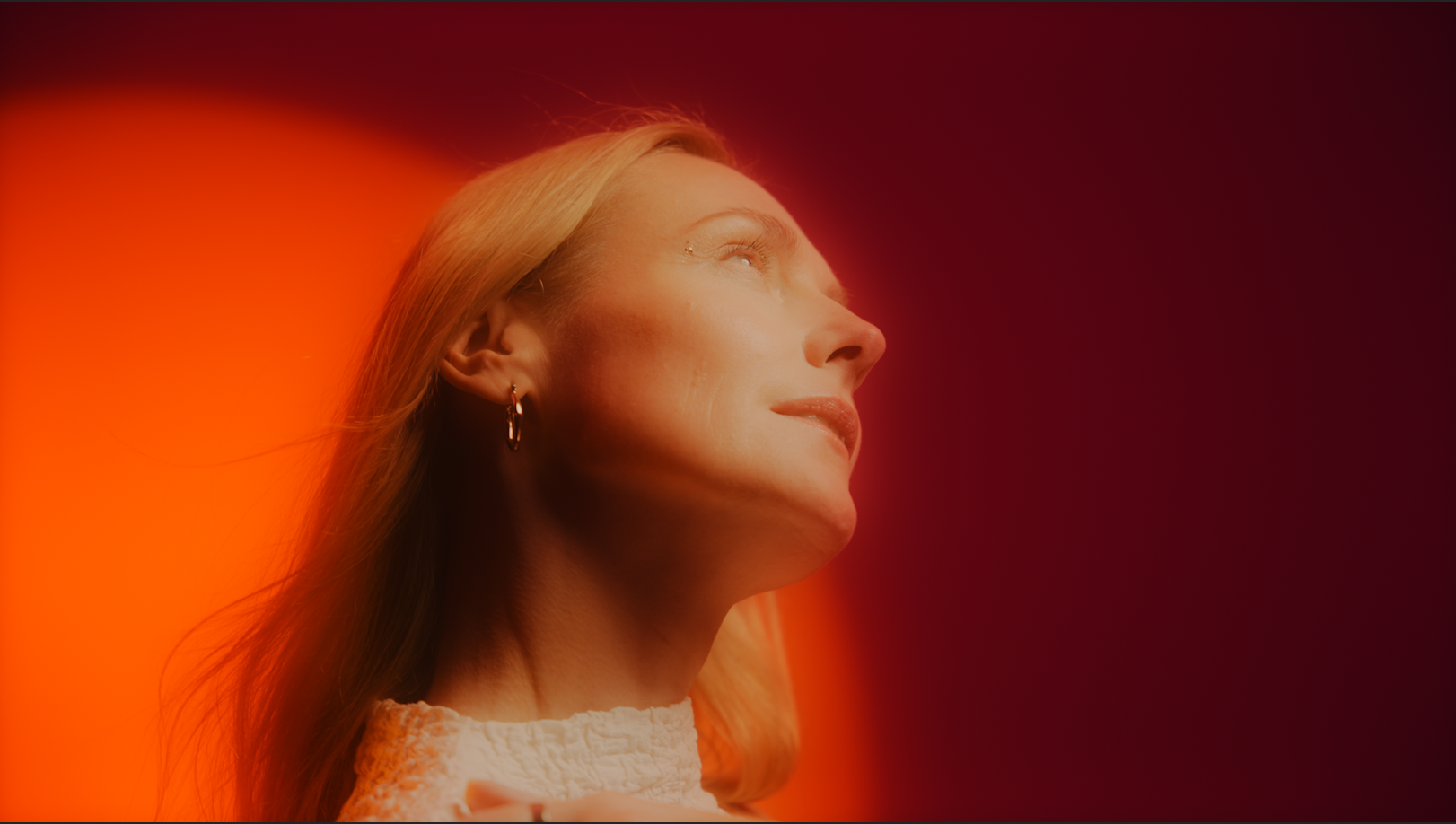
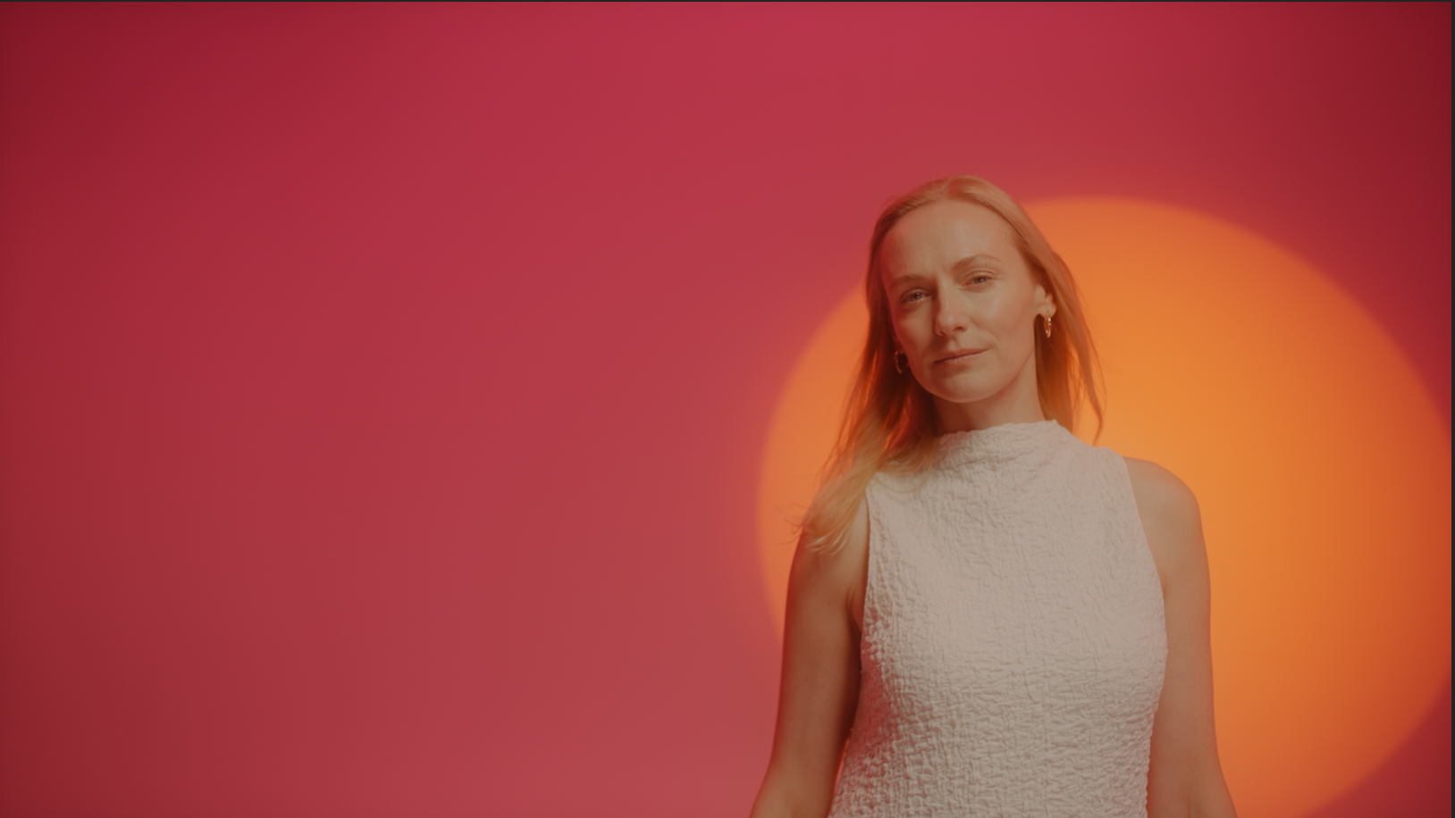
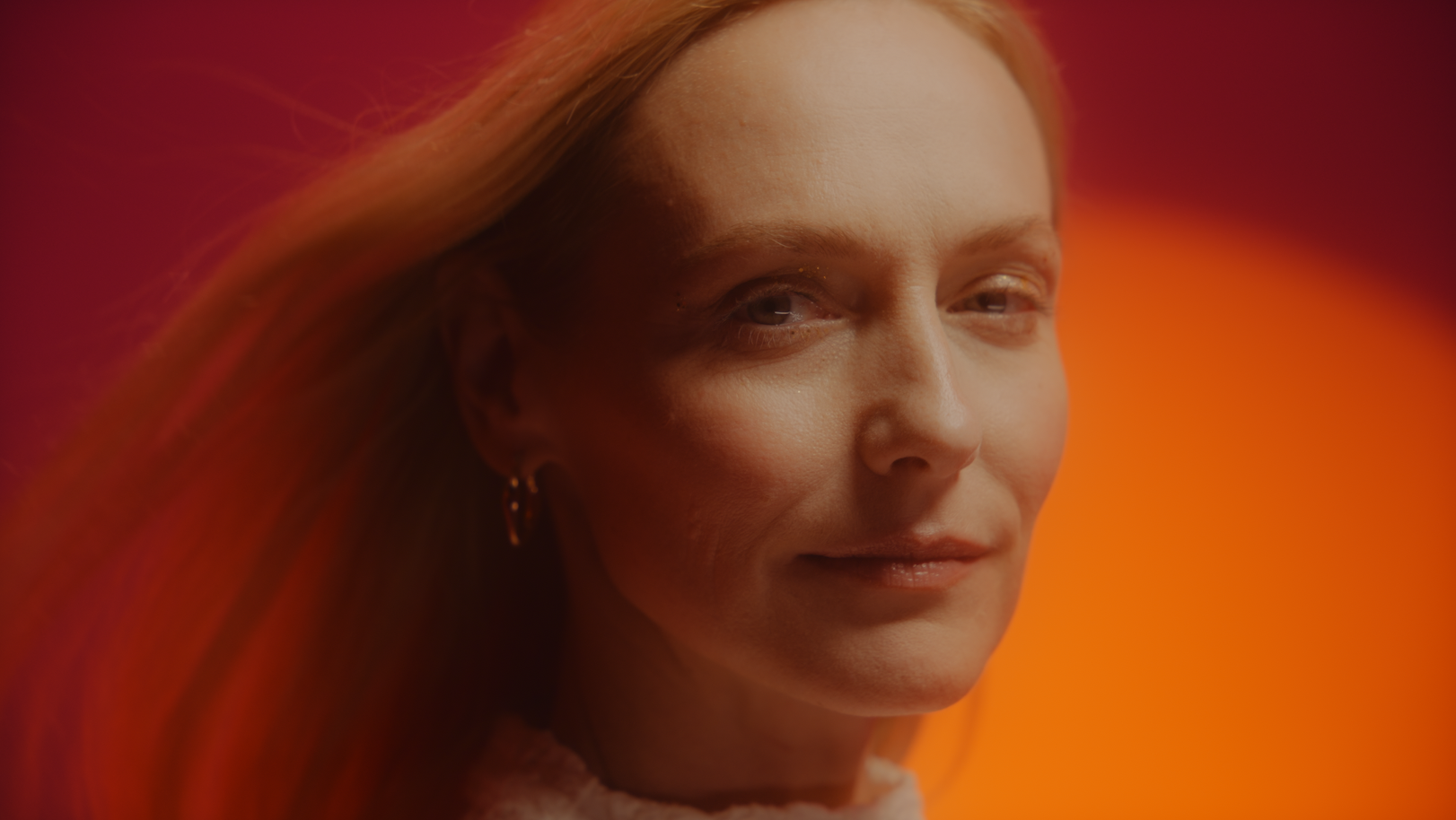
Marios Agency new campaign for the legendary cosmetics brand RASA illuminated by the colours of sunrise. After break it comes back to the life of many Lithuanian women. RASA returns renewed inside and out: improved product composition, stylish and modern packaging. Our message of the campaign for the anti-age line products appeals to 35+ women by encouraging and inviting them to come out into the light. Unfortunately in Lithuania many women get into the shadows after a certain age. It seems that everyone else’s priorities become more important than theirs. The RASA campaign aims to change that. Don’t be afraid to change your life. We say – your age is great, you can be bright, shining, brave, successful. These products help you to shine and be noticed at any age. Come into the light!
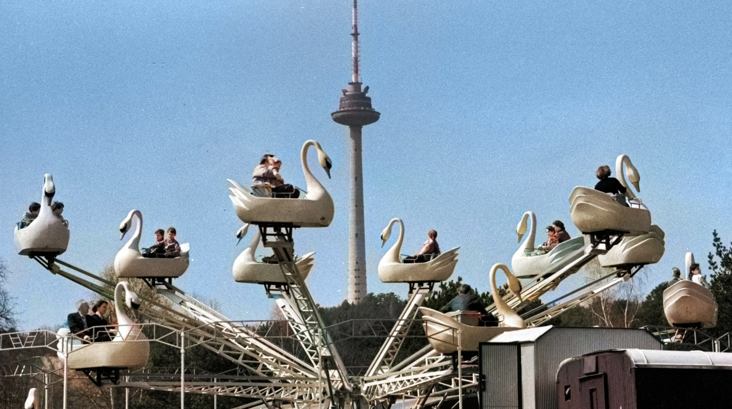
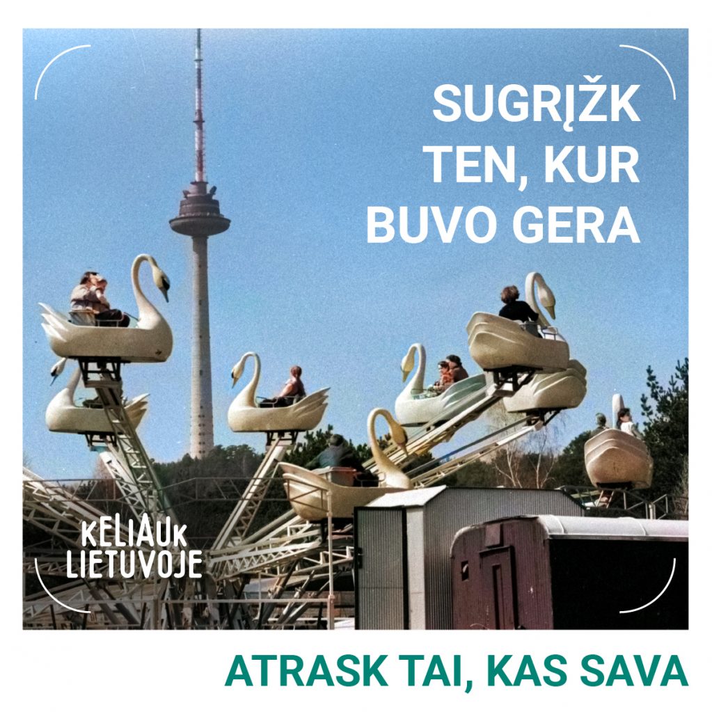
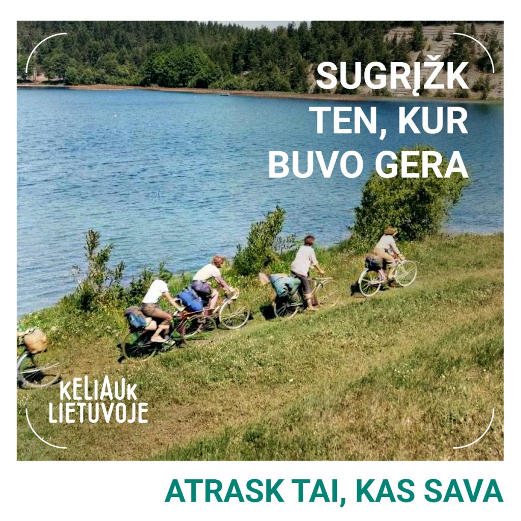
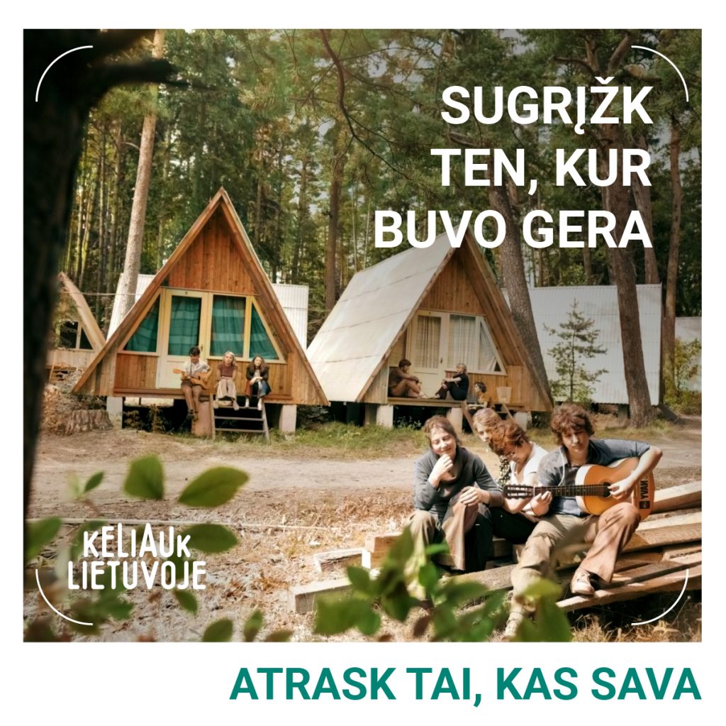
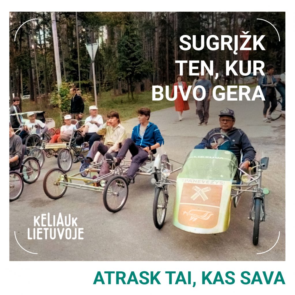
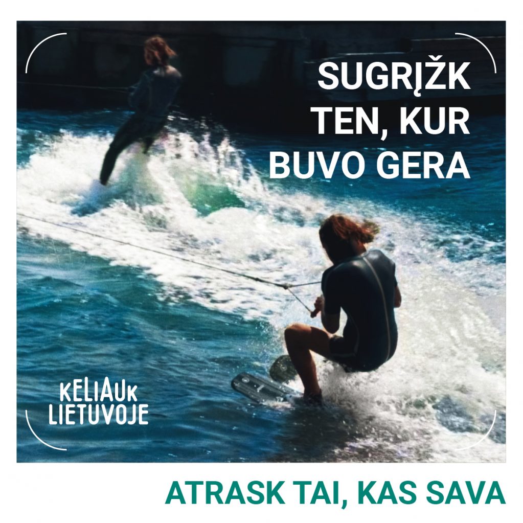
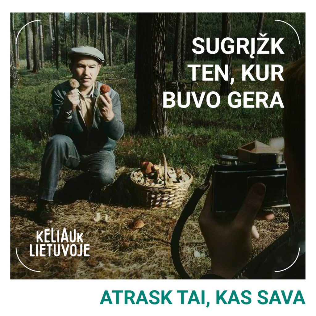
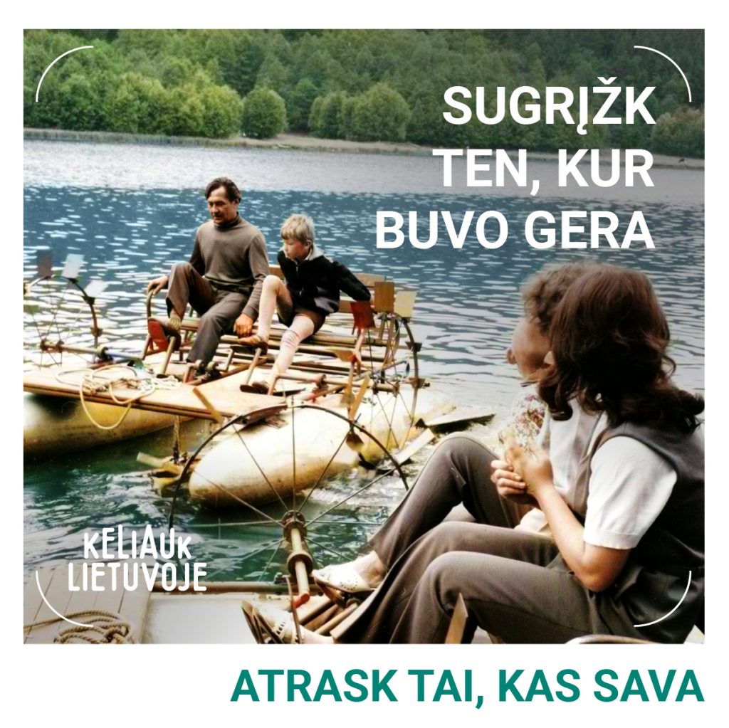
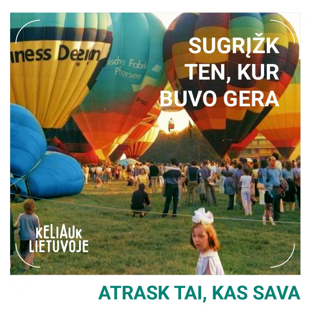
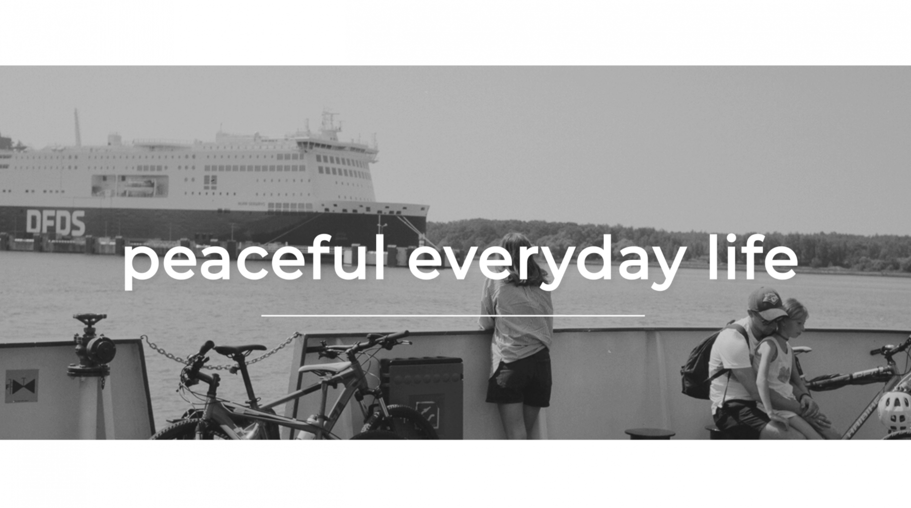
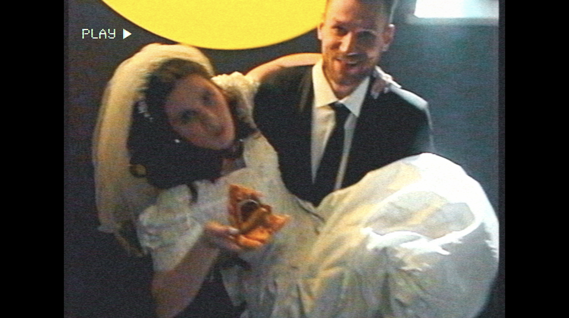
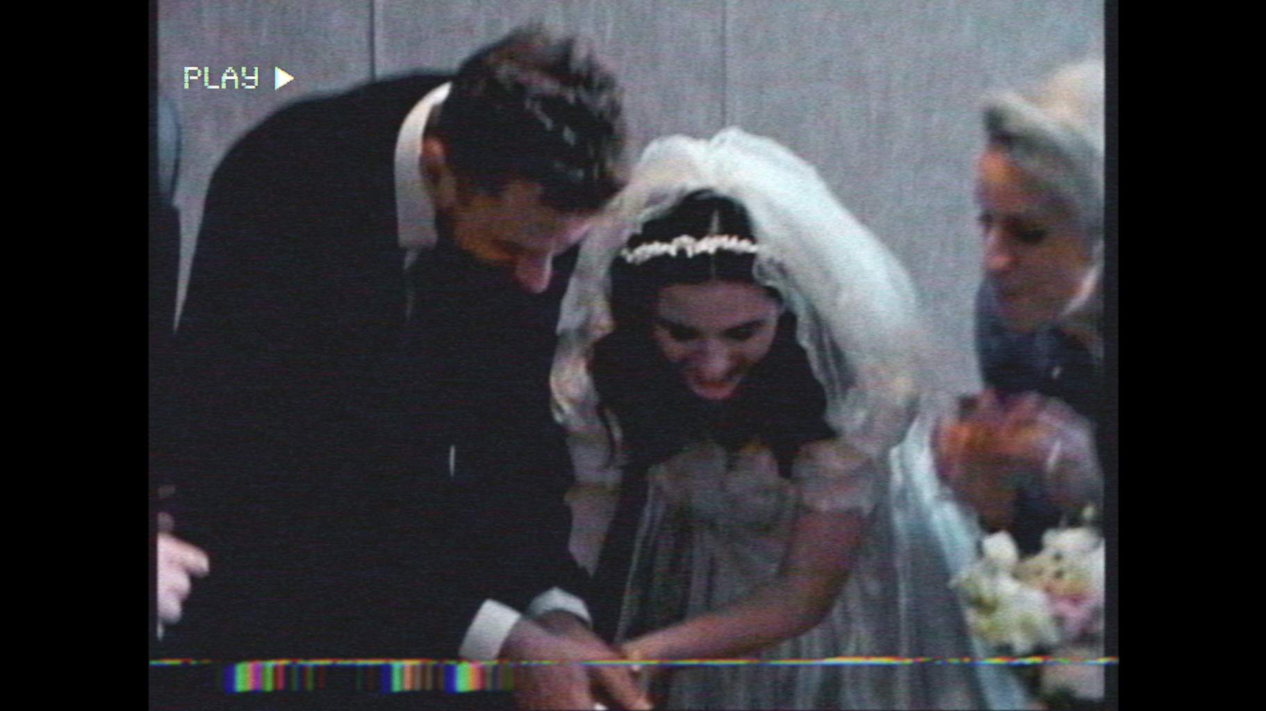
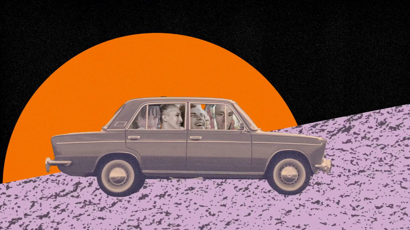
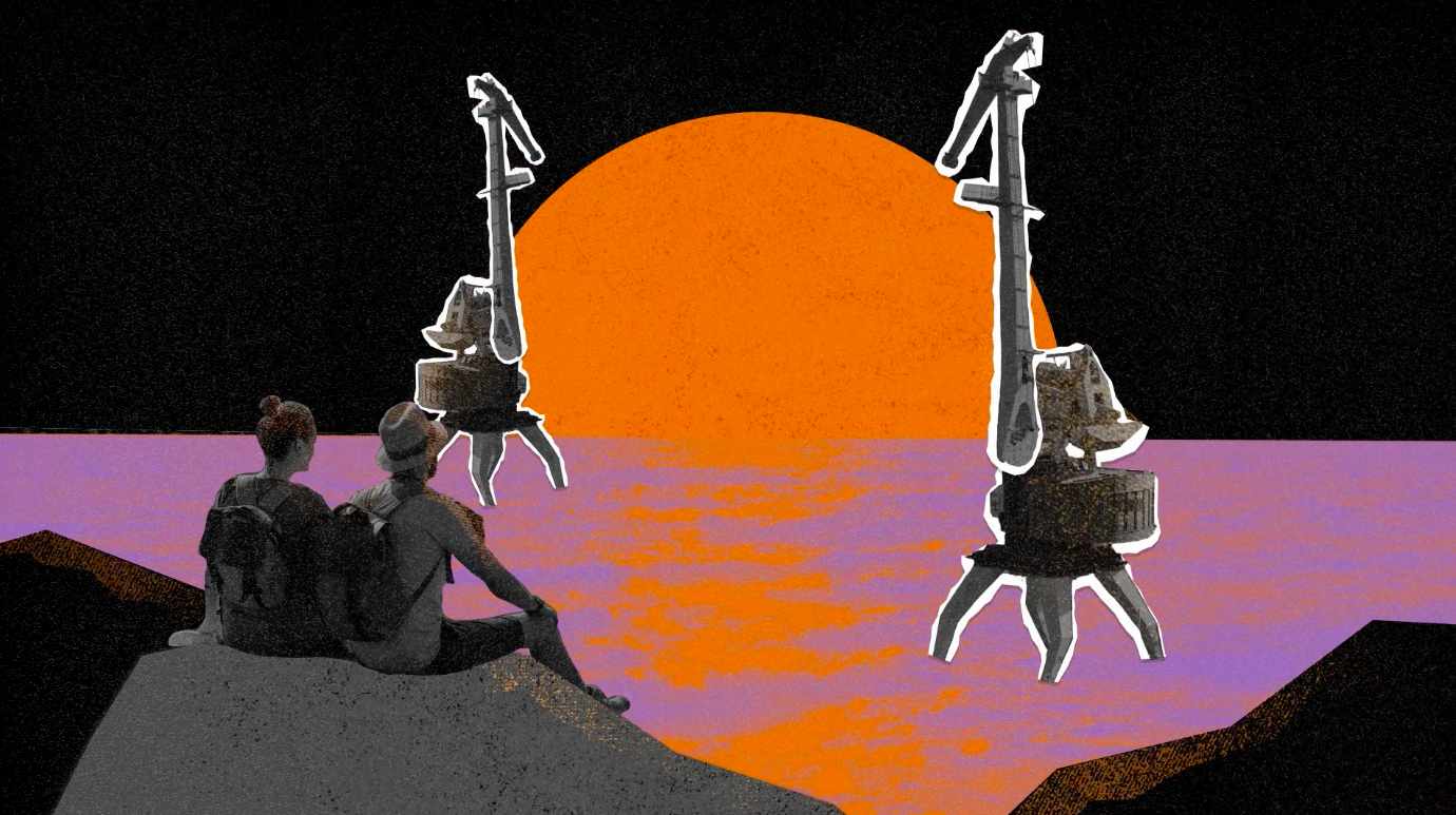
Travel Lithuania – local tourism campaign Advertising
Travel in Lithuania invites you to nostalgic summer trips around Lithuania.
Have you ever thought about going back to the best summers of your childhood? Reviving the routes of teenage adventures, funny school trips, wild student summer internships or hitch-hike tours? Remembering the fishing places where you had the biggest catch, picking mushrooms in places only your grandmother knew, visiting cozy townships, mounds and churches. Wading into the same river twice as on your first kayak trip.
All of us have a childhood photo with a lion at the Kaunas War Museum or near Egle the Snake Queen statue in Palanga’s Tiškevičius Park. Most of these places still exist and can be experienced today.
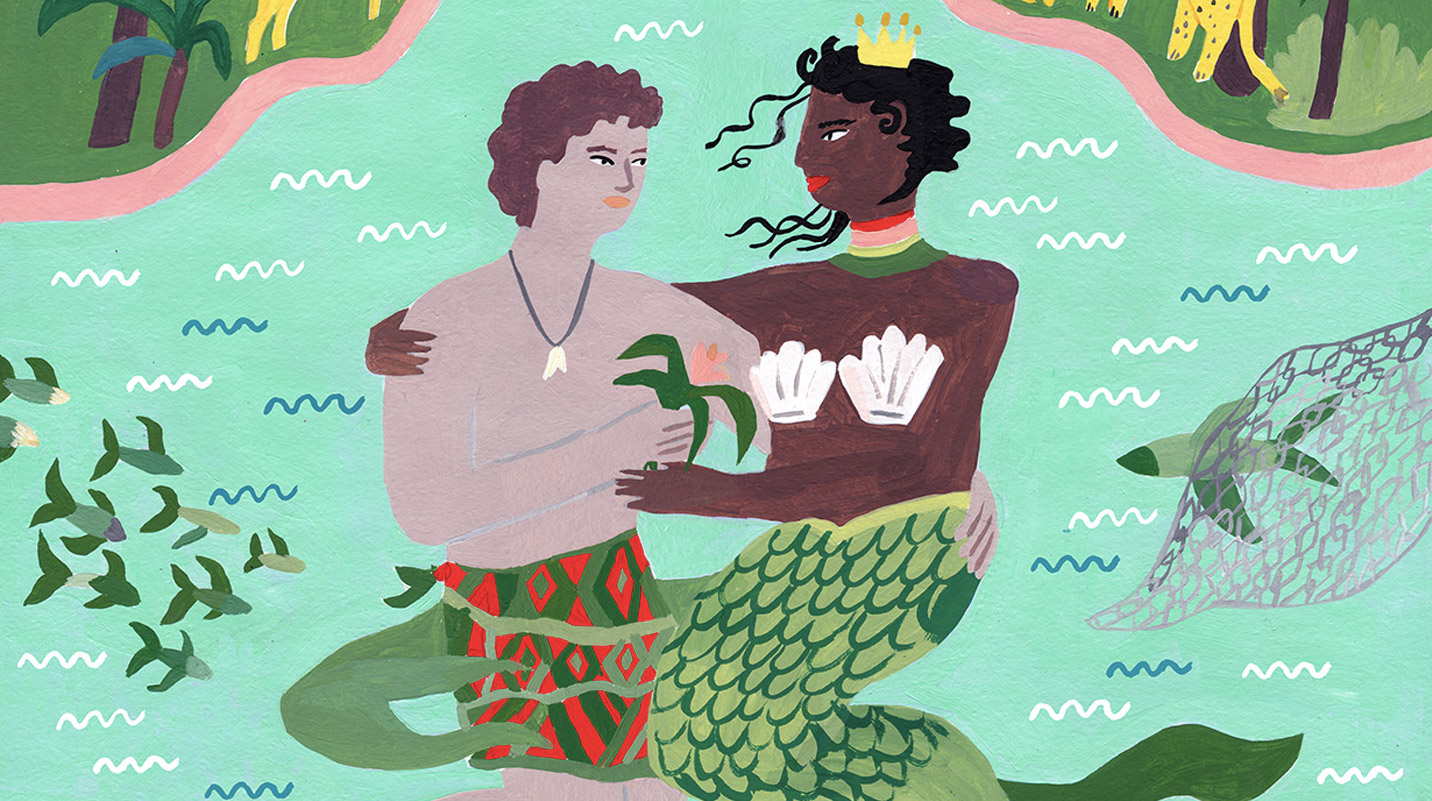
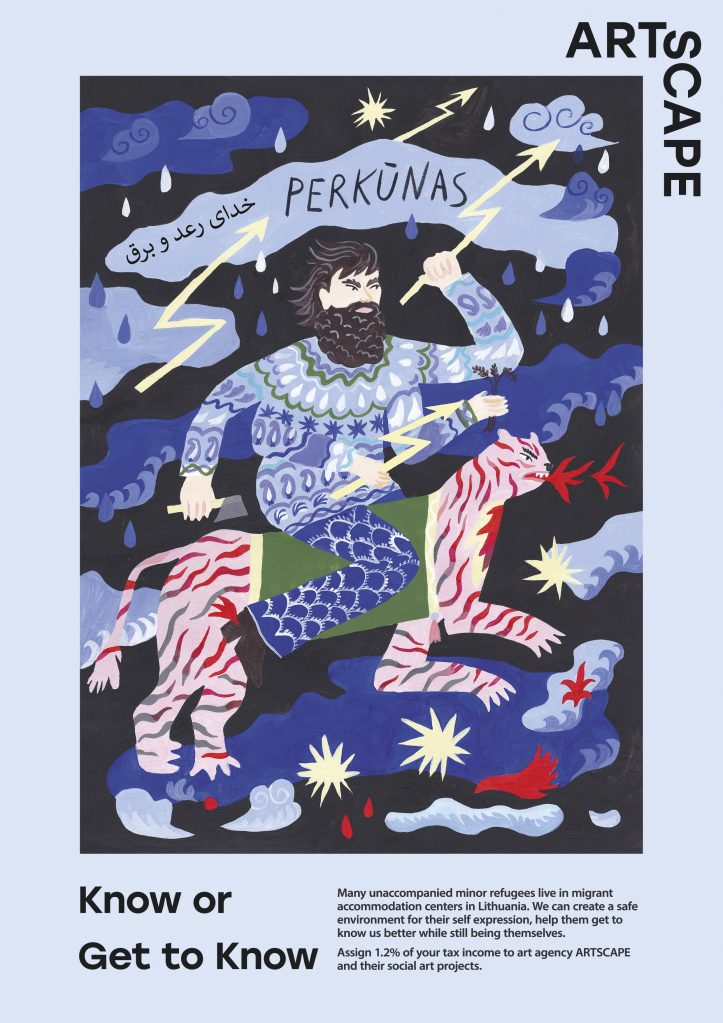
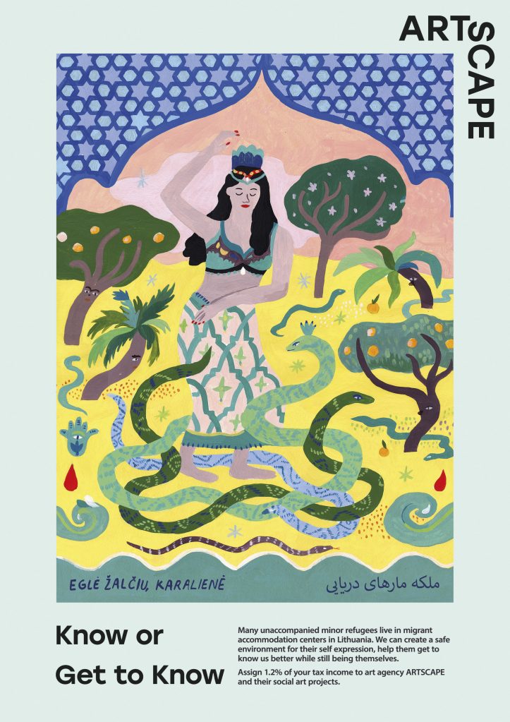
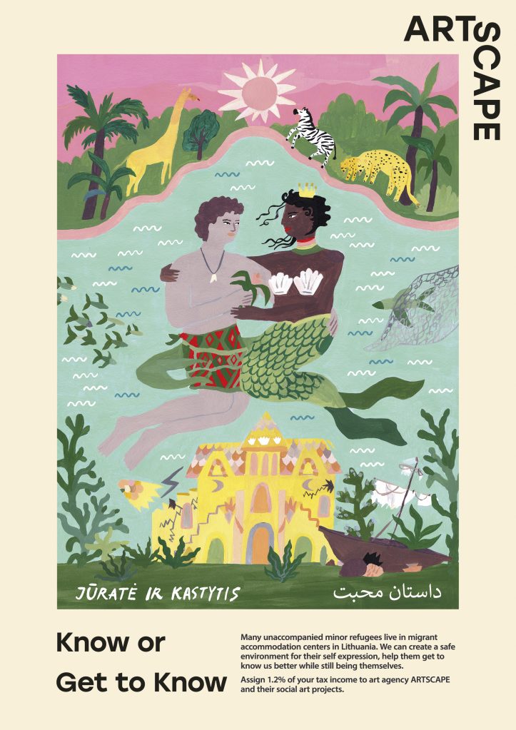
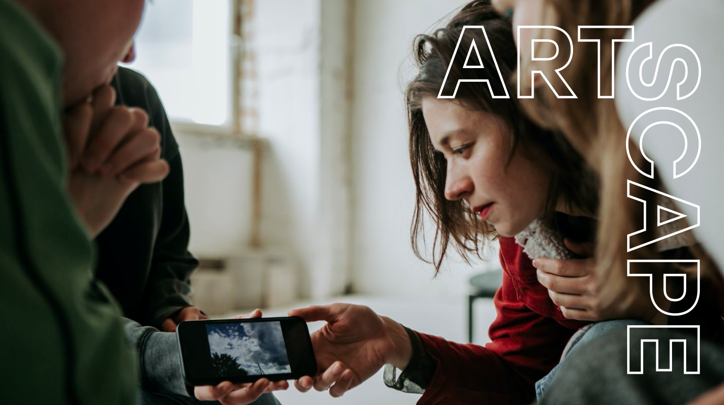
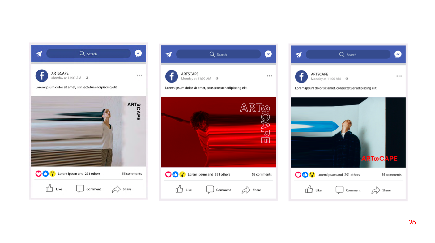
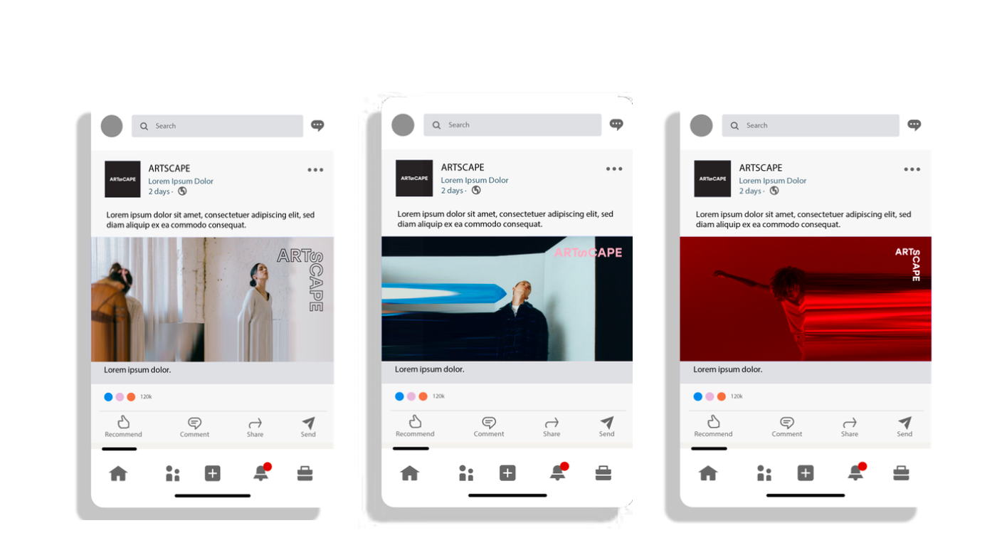
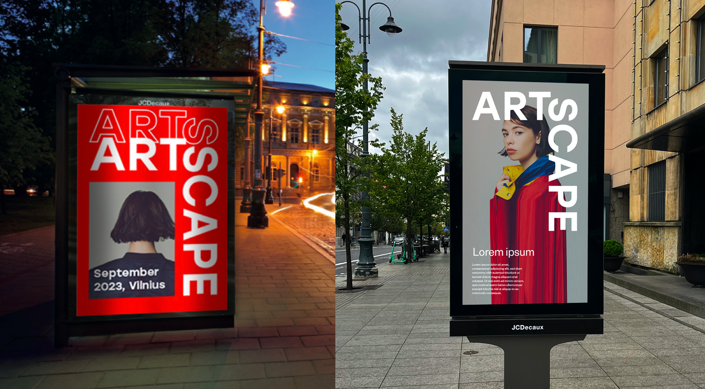
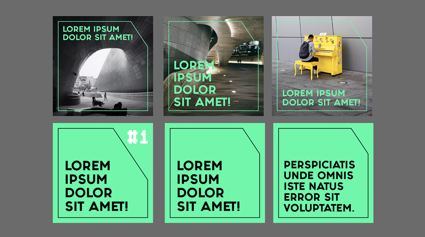
Artscape – social campaign Advertising
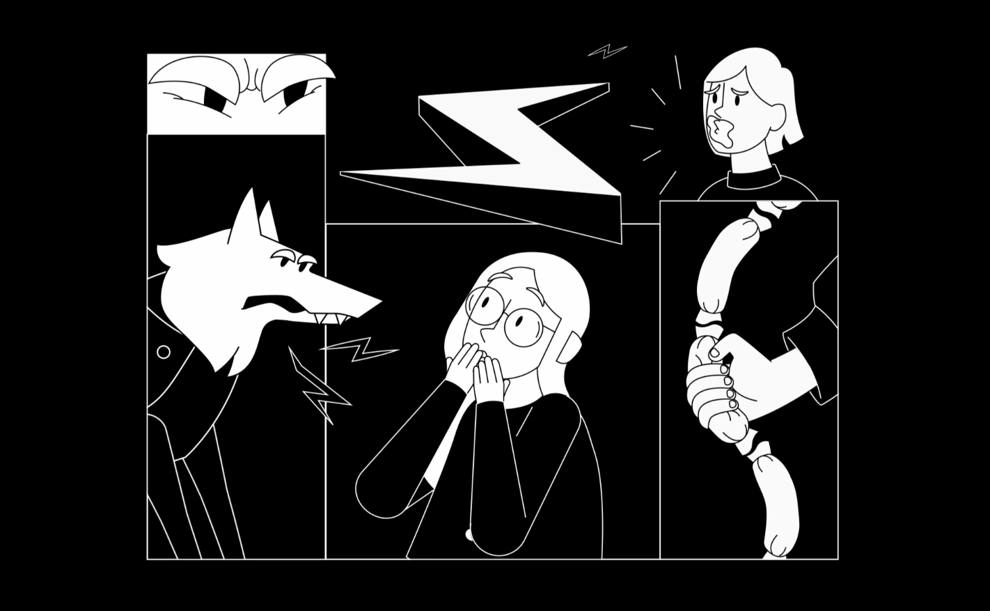
Know or Get to Know? Experiment with Lithuanian fairy tales
The campaign aims to talk about the reduction of exclusion in society and to encourage people to allocate 1.2% of their income taxes and thus contribute financially to the activities of various Lithuanian NGOs.
Three well-known characters of Lithuanian fairy tales and mythology – Jurate and Kastytis, Egle the snake queen and Thunder – became the main heroes of the visuals. Artscape speaks the language of art, so we chose original illustrations to express the idea. This idea is a kind of experiment: a way to imagine how Lithuanian mythology could look like through the eyes of children from lands far away from Lithuania. What would happen if usually white gods and heroes of fairy tales were to be imagined by those, whose traditions and worldviews are very different? The meaning of this experiment is much deeper than just creativity.
Art might become a medium where different cultures meet, it can help us talk and understand each other. It is very important and meaningful to take care of those who are easily forgotten in the background of dramatic events – the war in Ukraine, economic and social upheavals.
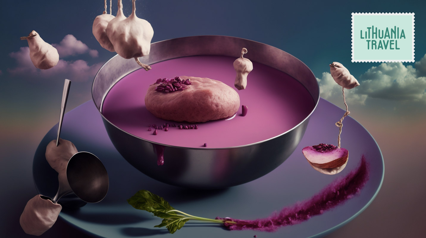
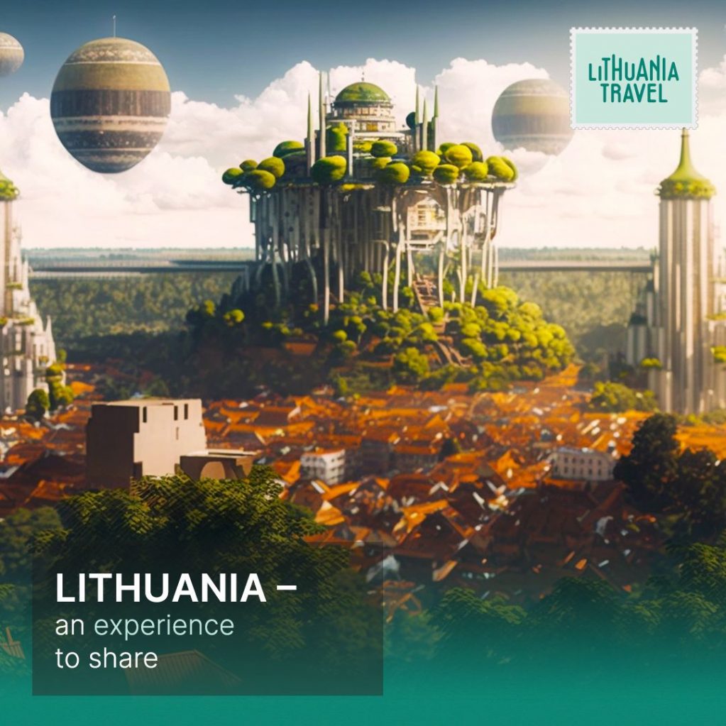
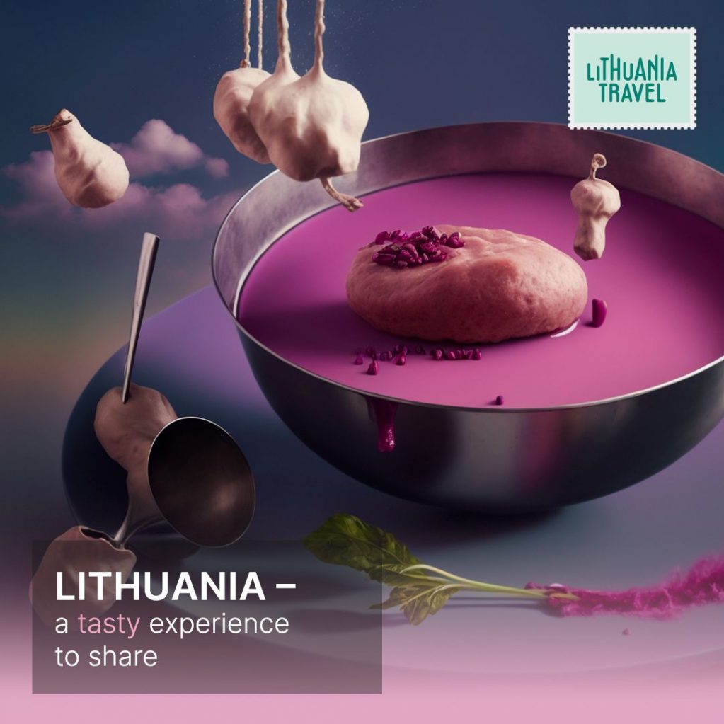
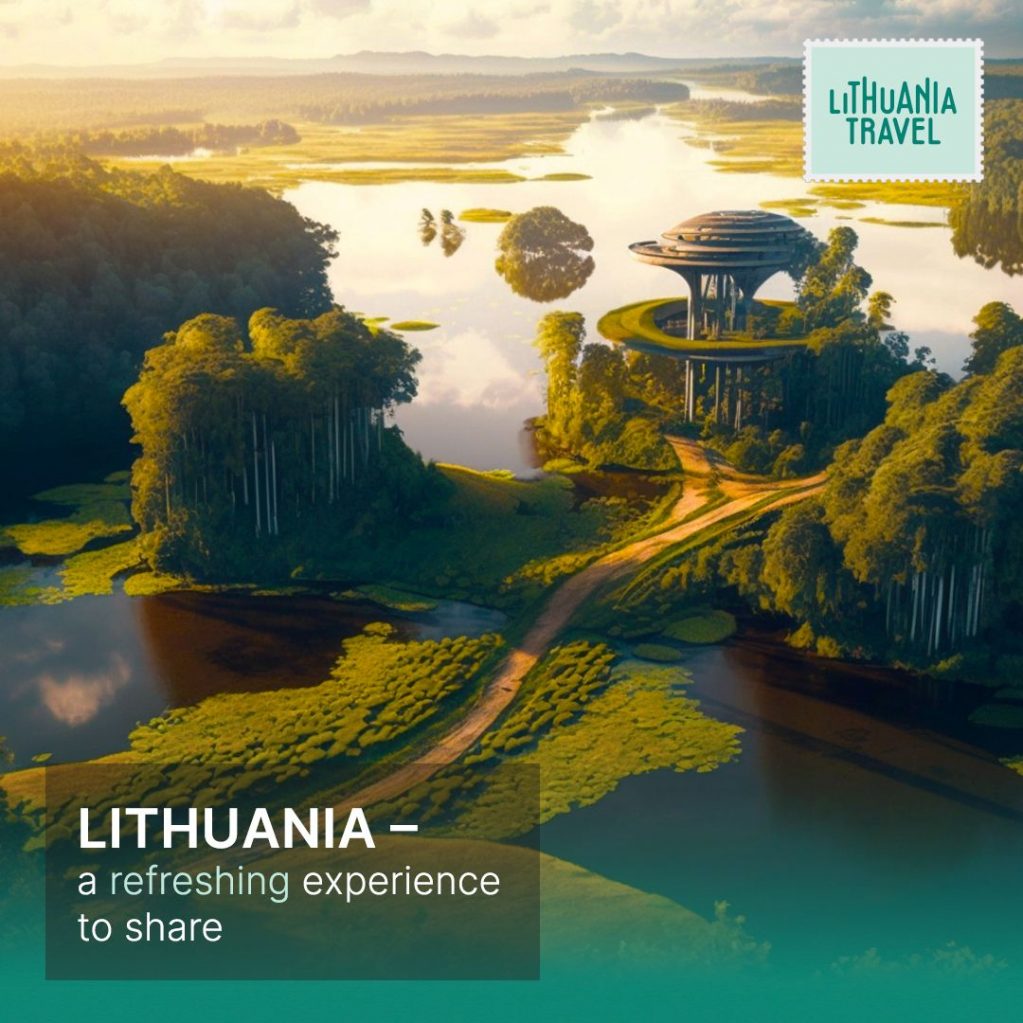
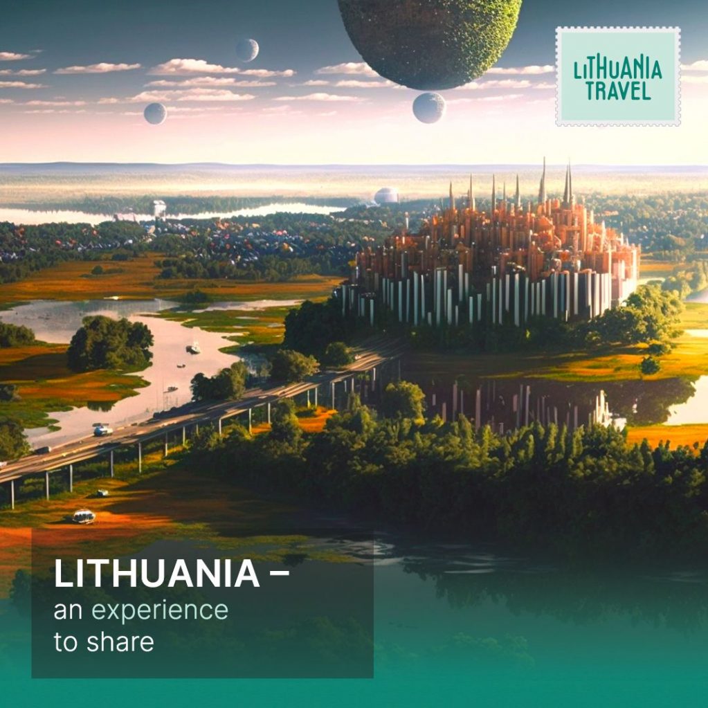
Lithuania Travel Promo Campaign 2023 (A EYE image) Advertising
This time we did campaign for Lithuania Travel.
See how AI reimagined traditional Lithuanian landscape and foods.
It’s an intreaging experience, international digital campaign, again, done with the team of Lithuania Travel and our partners A EYE – Image Synthesis Lab (Vytis Gruzdys / Rapolas Vosylius) and Tomas Gruzdys (aka. Groozdas).
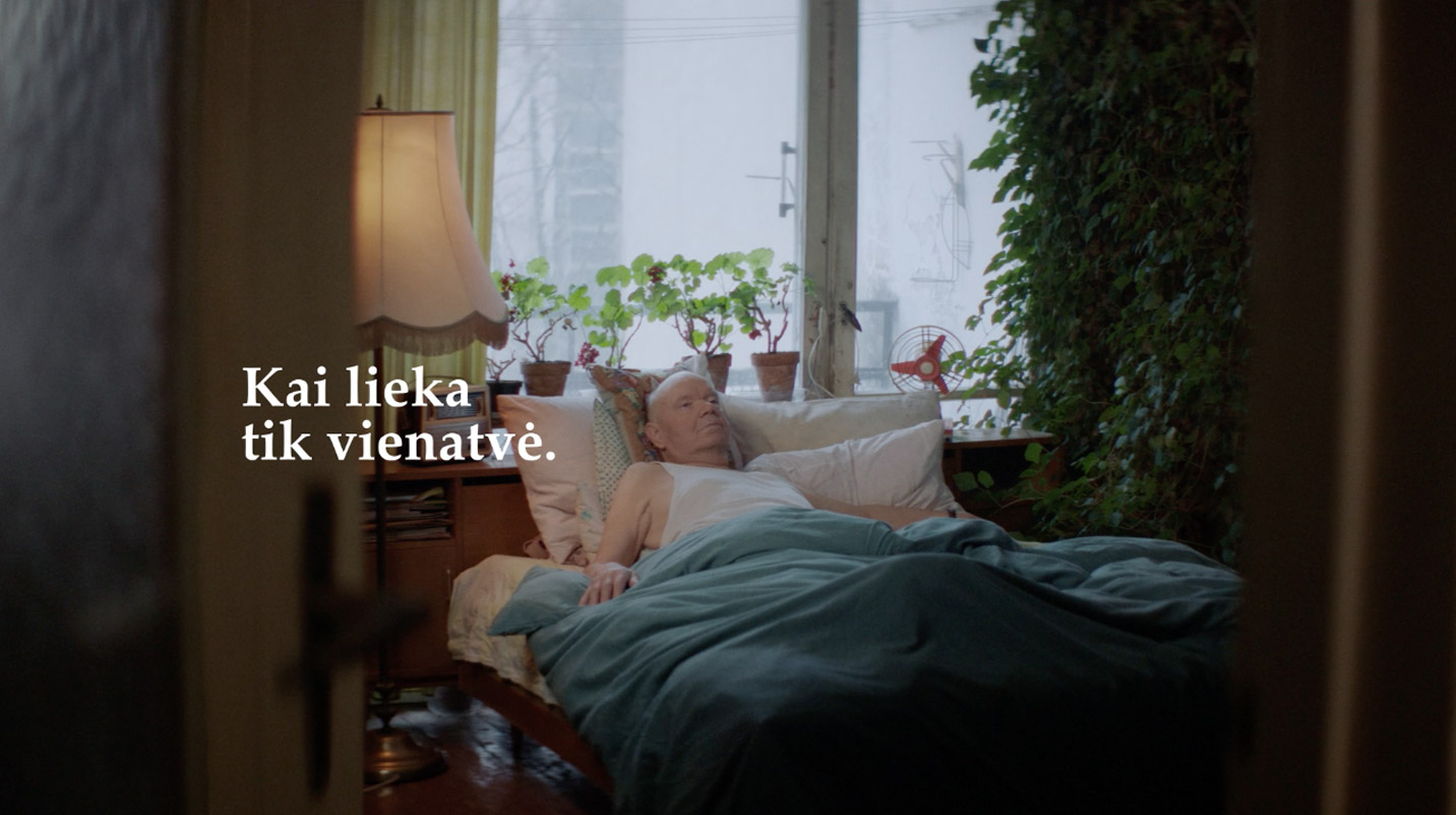
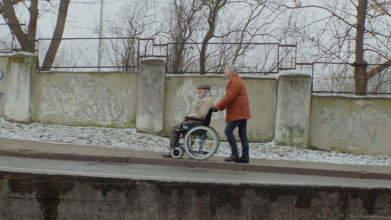
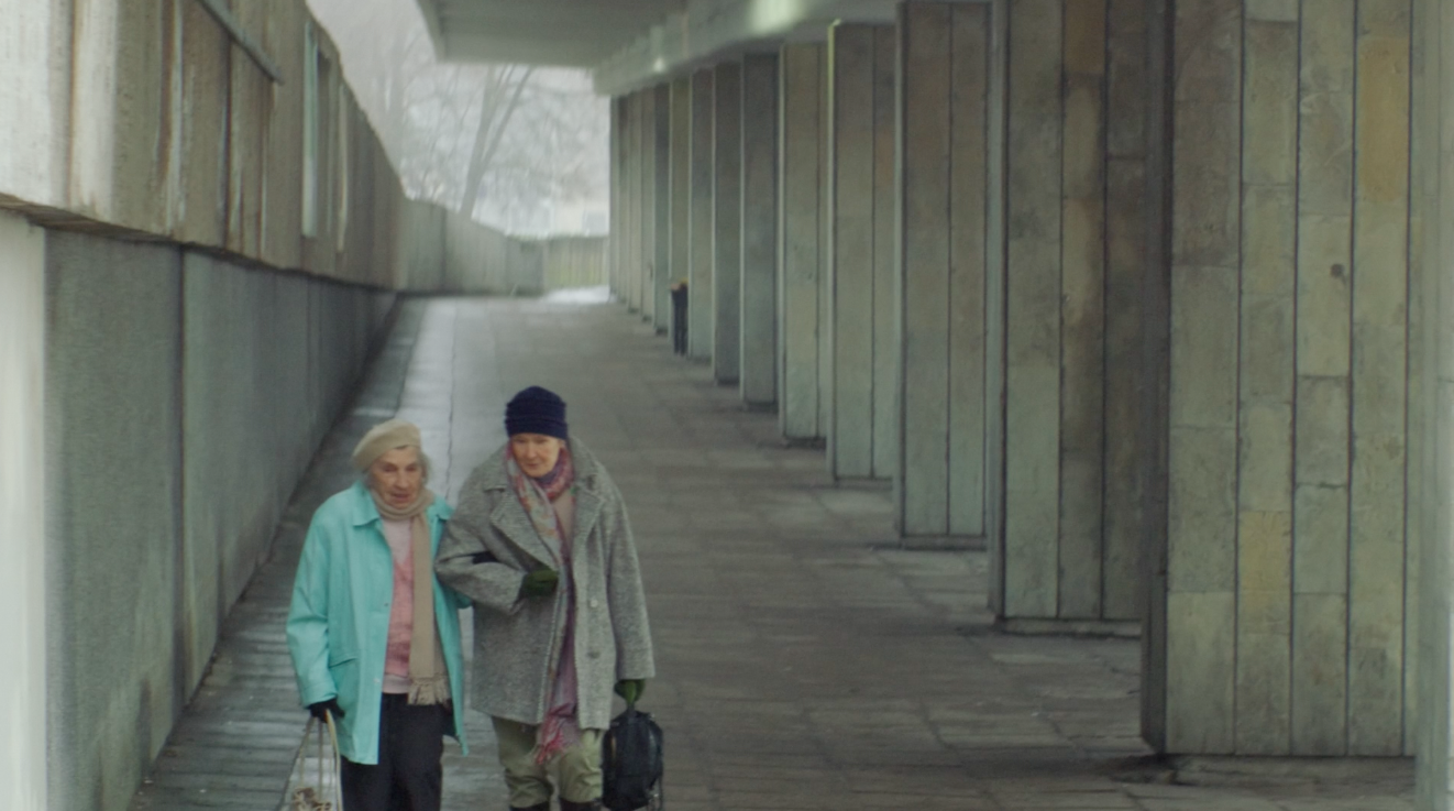
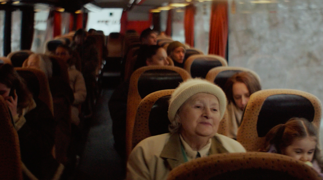
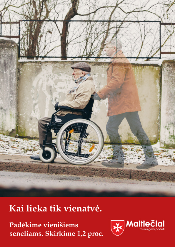
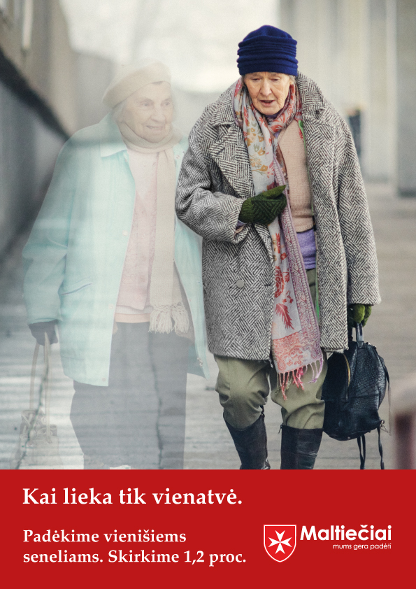
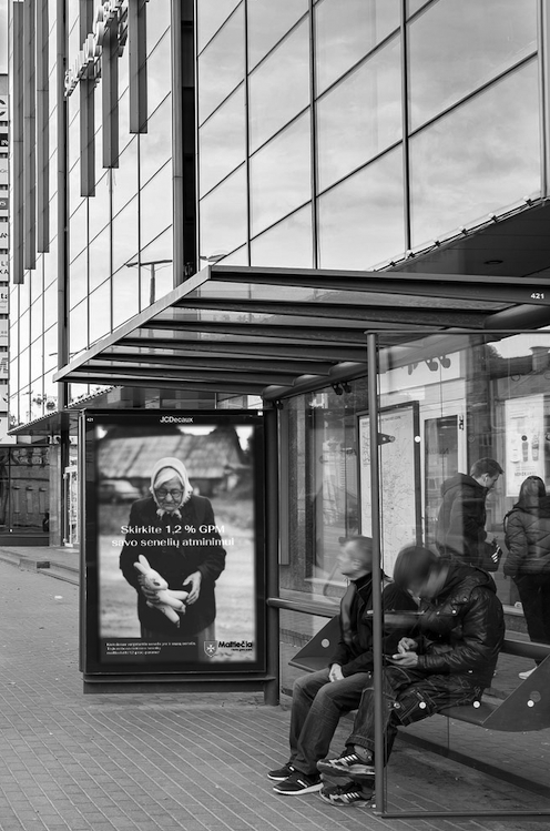
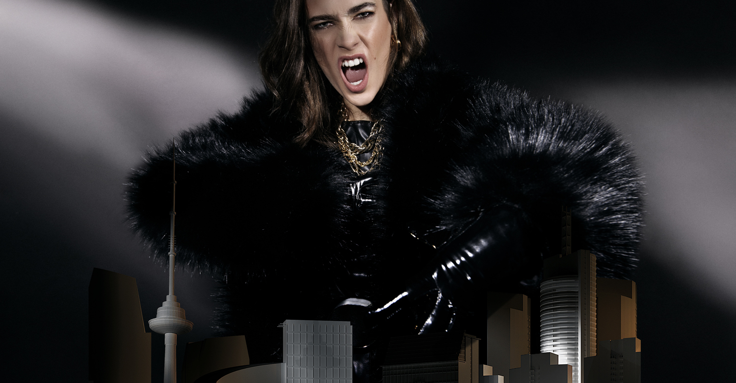
ORDER OF MALTA FUNDRAISING CAMPAIGN 2023 Advertising
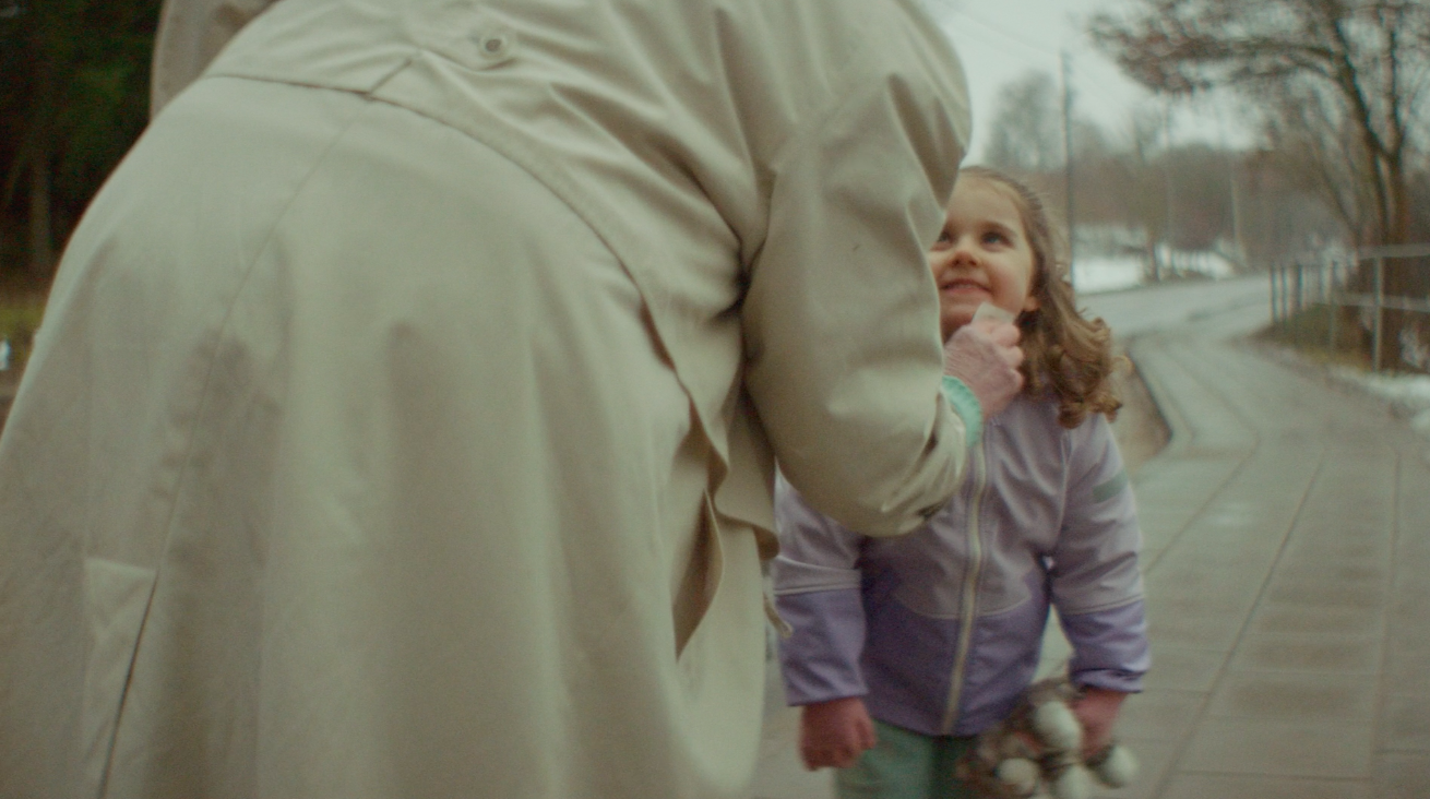
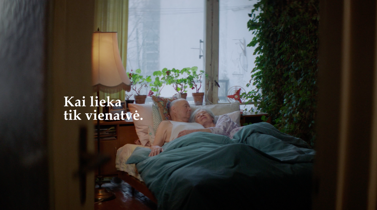
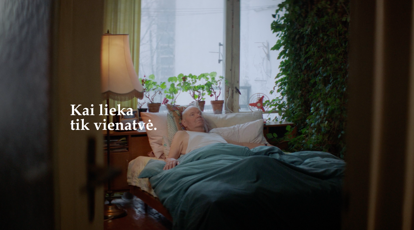
Old age = loneliness? No one should be left completely alone. Especially in senility. There are so many impoverished and forgotten old people who have nothing left in life but loneliness. Our latest social campaign When Only Loneliness Remain is intended to encourage for continuous support – allocation 1.2% of the income for the Maltesers. Mãrios agency is sincerely grateful to the Order of Malta for trust.

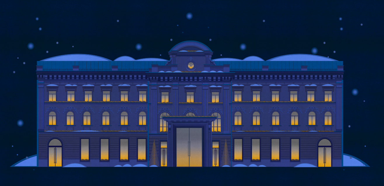
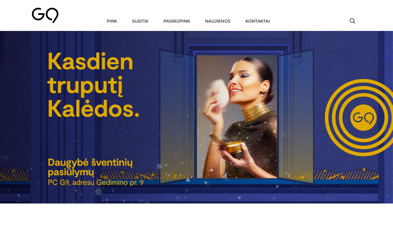
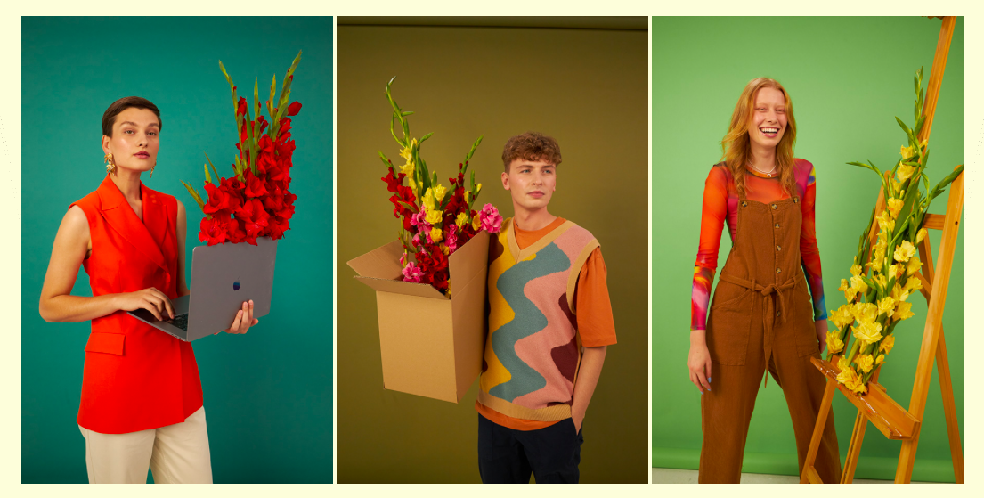
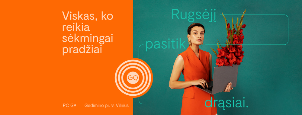
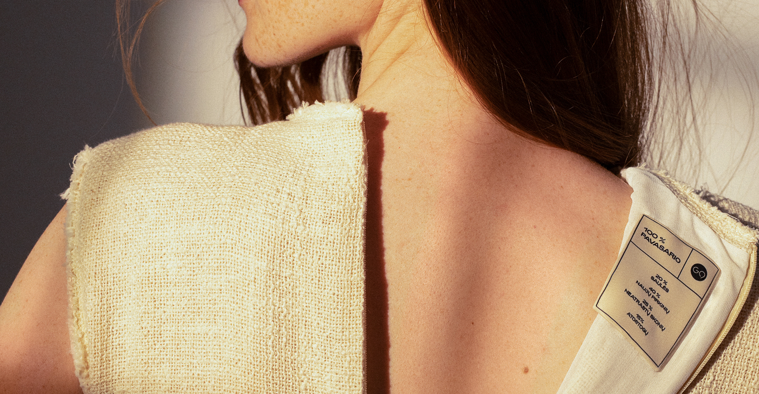
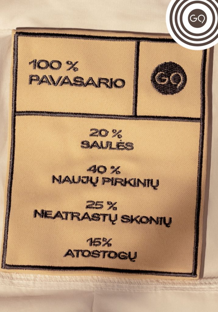
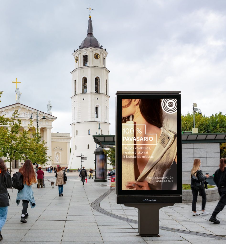
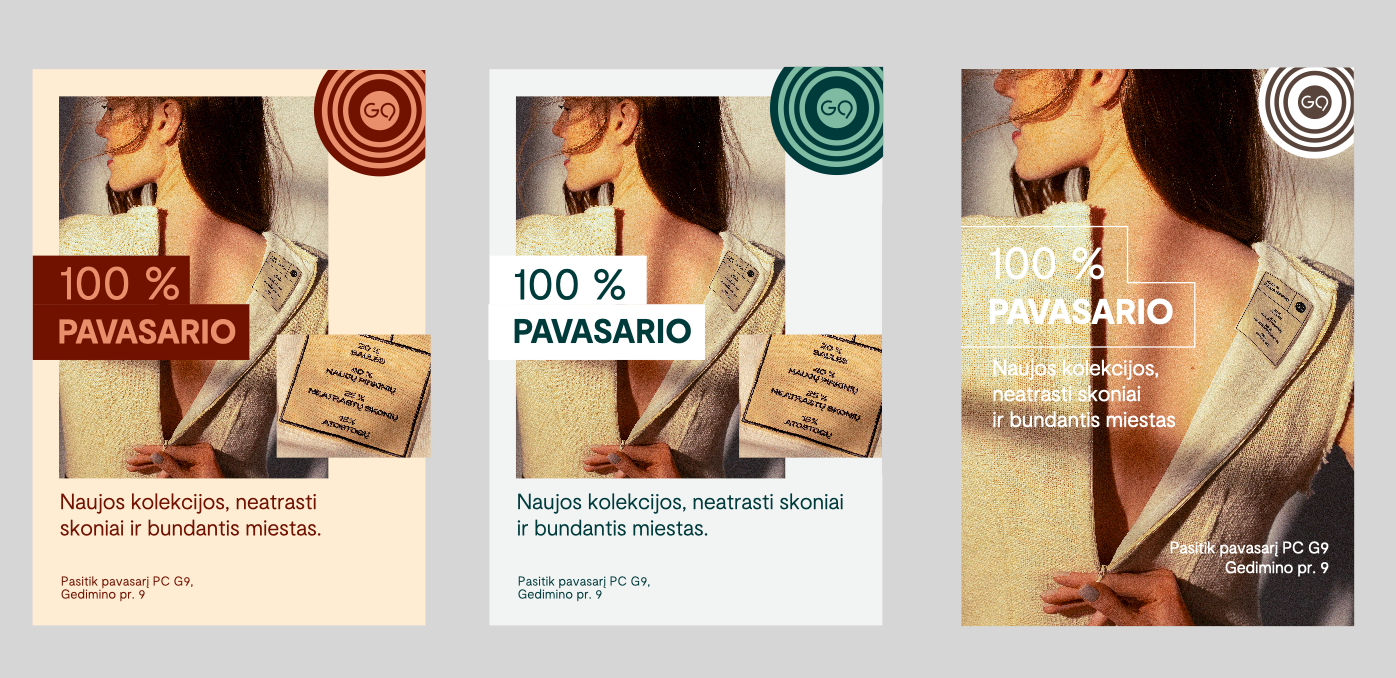
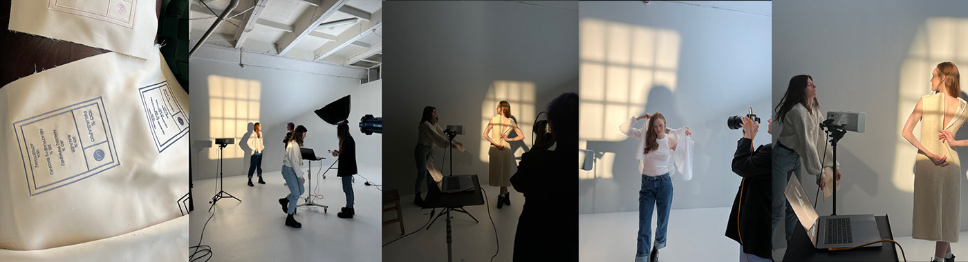
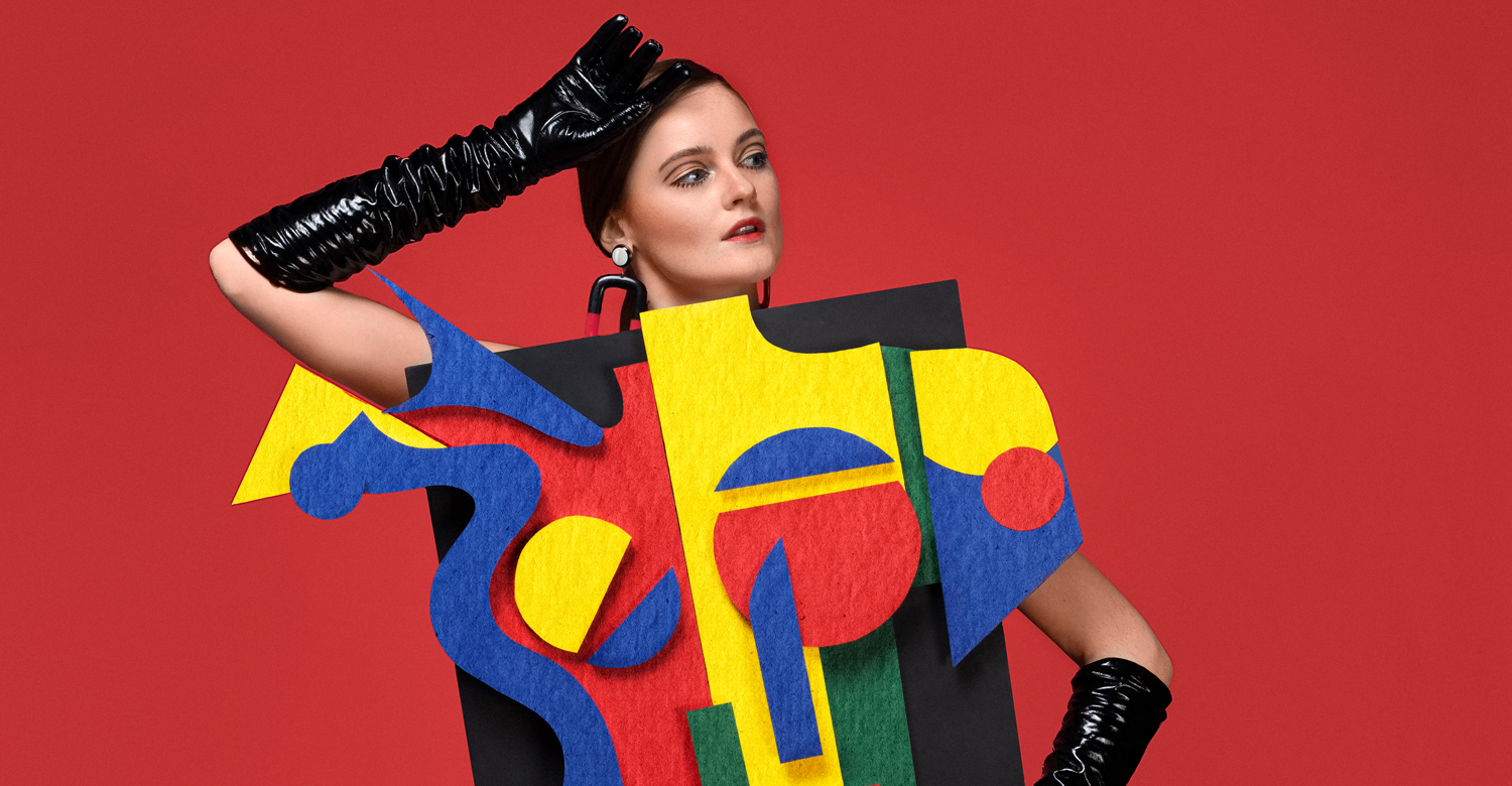
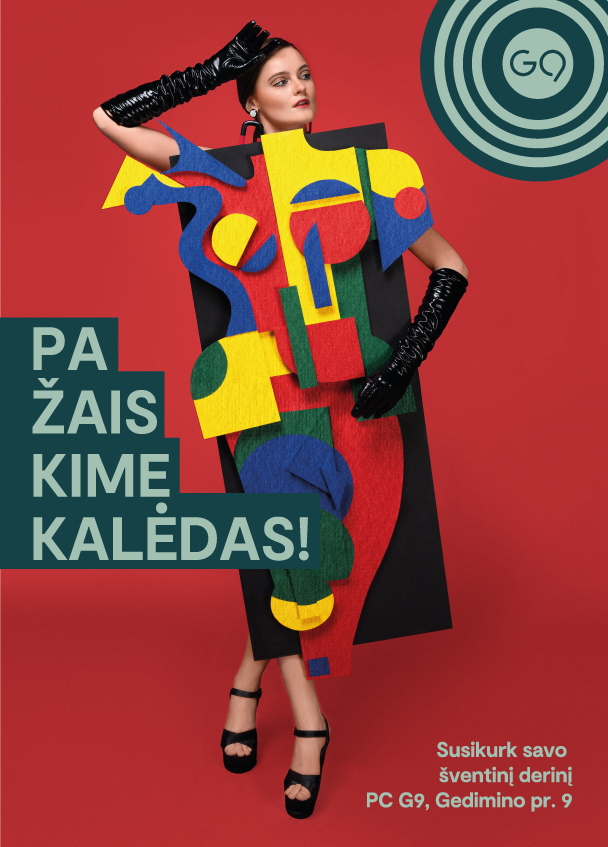
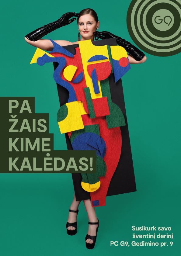
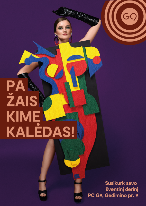
G9 SPRING 2023 Advertising
Outdoor & digital campaign for shopping mall G9.
Breath in the Wind!
Fresh air makes the spring feel better!
Spring campaign is on the Air.
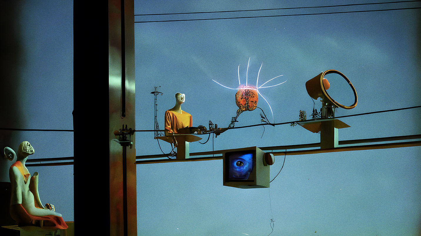
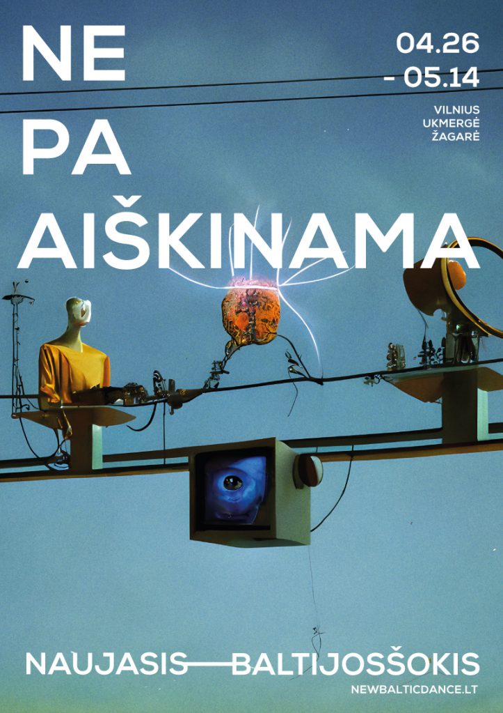
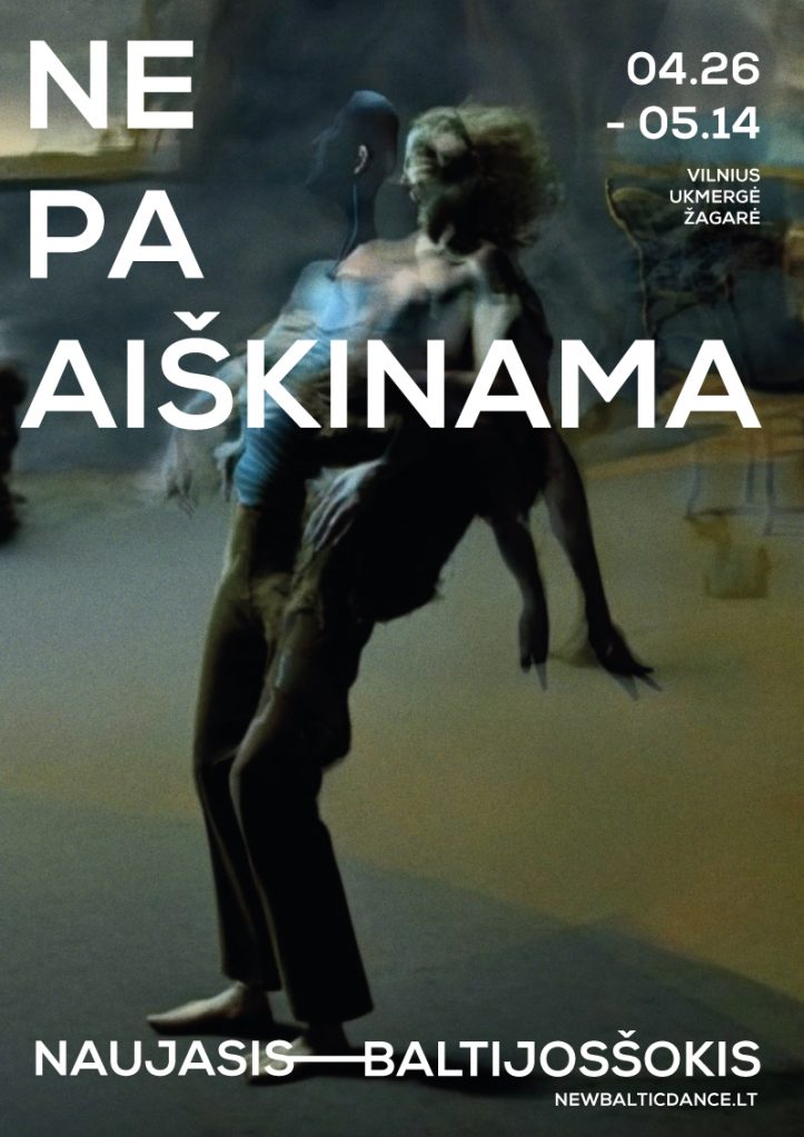
New Baltic Dance 2023 Campaign (A EYE image) Advertising
While celebrating the 3rd year of cooperation with the New Baltic Dance festival, we’re launching a new image campaign called Unexplained. It’s quite difficult to give a rational explanation for a modern dance performance, providing intense, unexpected emotional experience that expand a different perception of reality. When you don’t try to explain or interpret and experience it with open senses, reality becomes more exciting. Surprisingly, looking for an expression of this creative concept, we found ourselves in a place completely devoid of emotions. Artificial intelligence!
Our partners were irreplaceable AI tamers, video design professionals Vytis Gruzdys and Rapolas Vosylius from A EYE image Synthesis Lab. As a form of creativity AI can be characterized by a difficult character, persistently proposing its own creative visions like Čiurlionis on drugs and others. There were many arguments between us. It was used to convey newly created, unexplainable experiences, interpretations of reality.
With the help of AI, we transformed the everyday life, fragments of performances, pictures of reality. Without relying on any normal human logic, we got unique, surreal images that perfectly match the avant-garde atmosphere of New Baltic Dance events. Not necessarily pleasant, but evoking a whole range of emotions, from admiration to threat when observing something unexplained.
Savy Advertising
Peer-to-peer lending platform SAVY is a brand in the rapidly growing field of electronic banking, designed to meet the specific needs of borrowers. It was interesting to work on SAVY’s advertising campaign, encouraging people to choose SAVY as an alternative to traditional banking. SAVY’s key promise to borrowers is “We look humanly”. The human relationship and the flexibility dictated by it, when looking for suitable borrowing opportunities, only confirms how important the psychological needs of a person are when making decisions when borrowing.
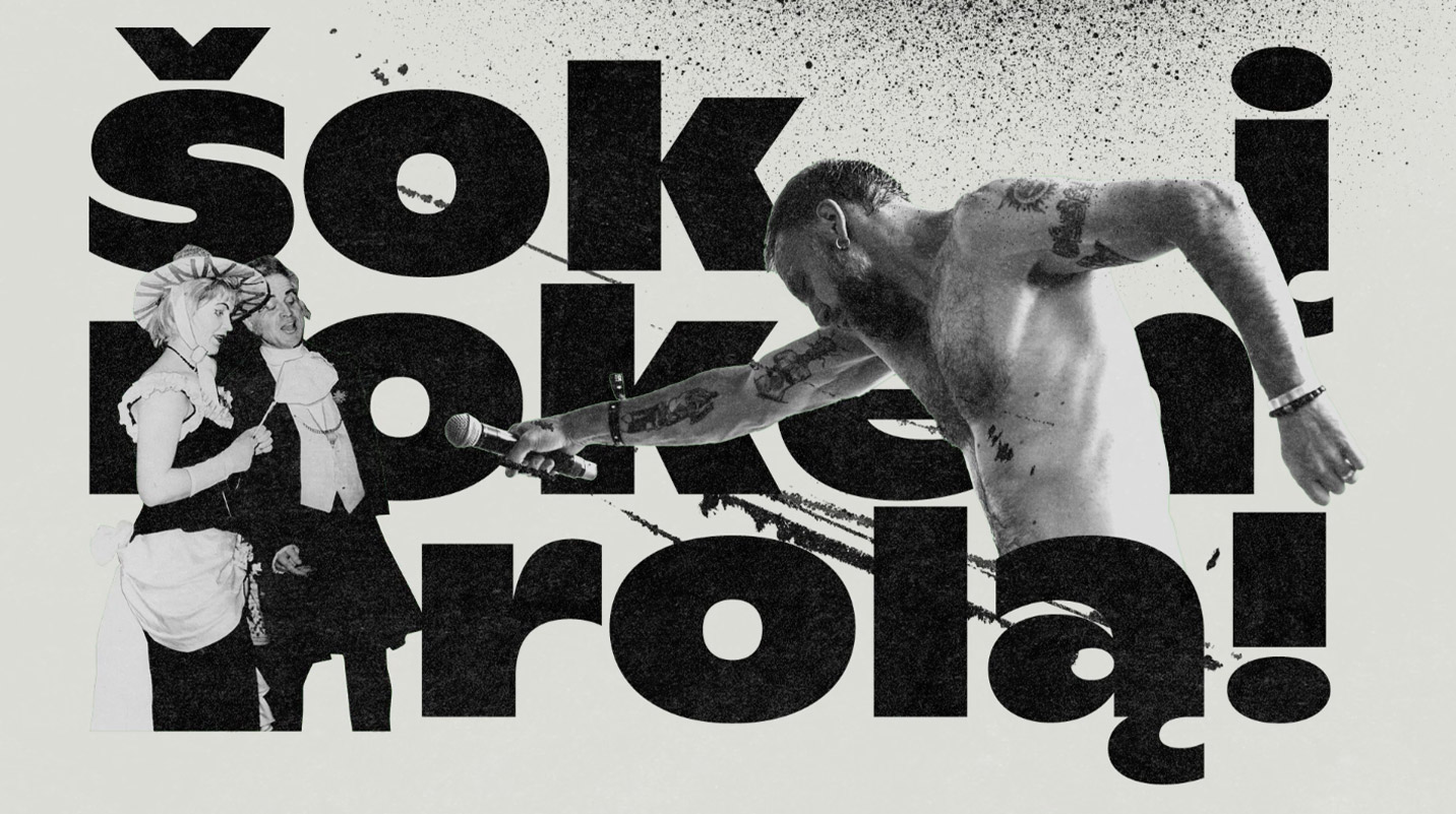


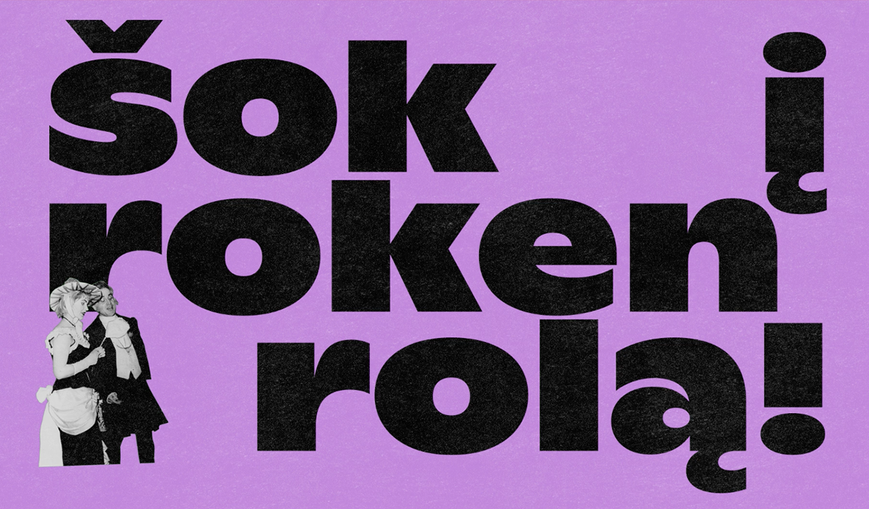
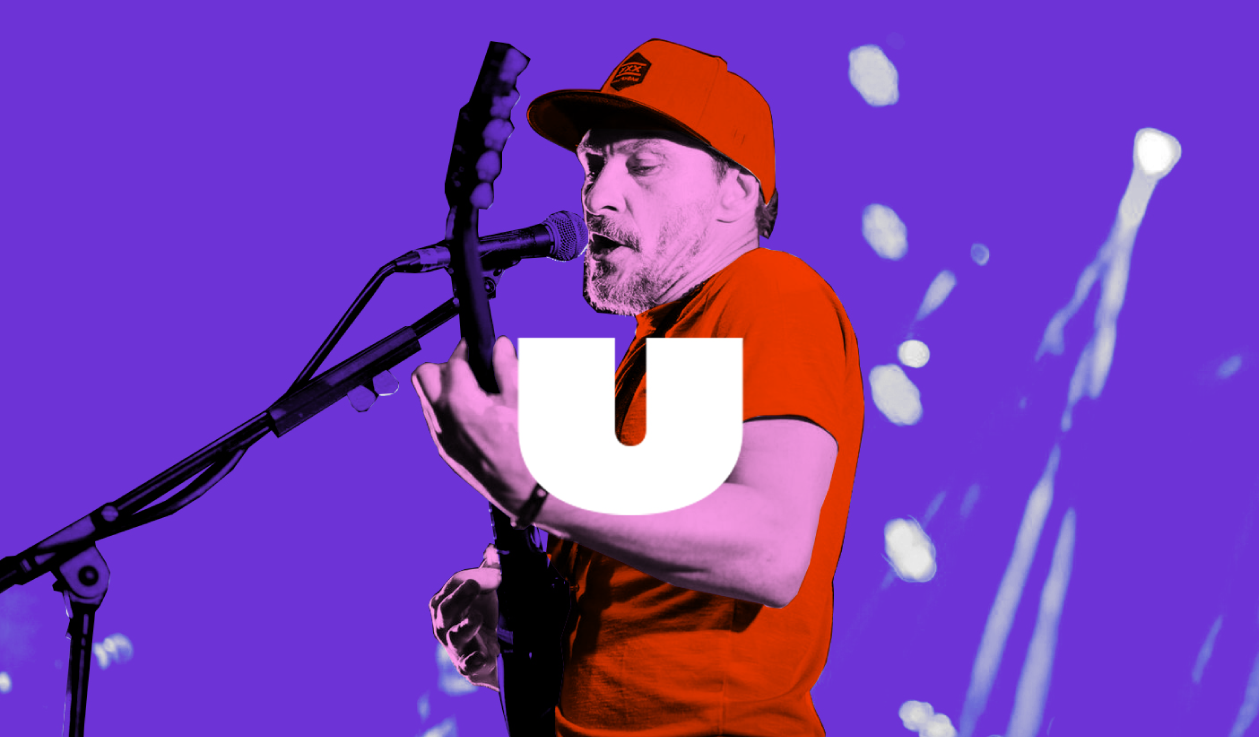
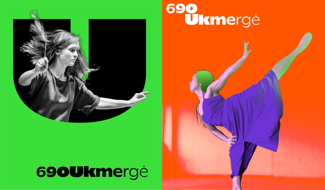
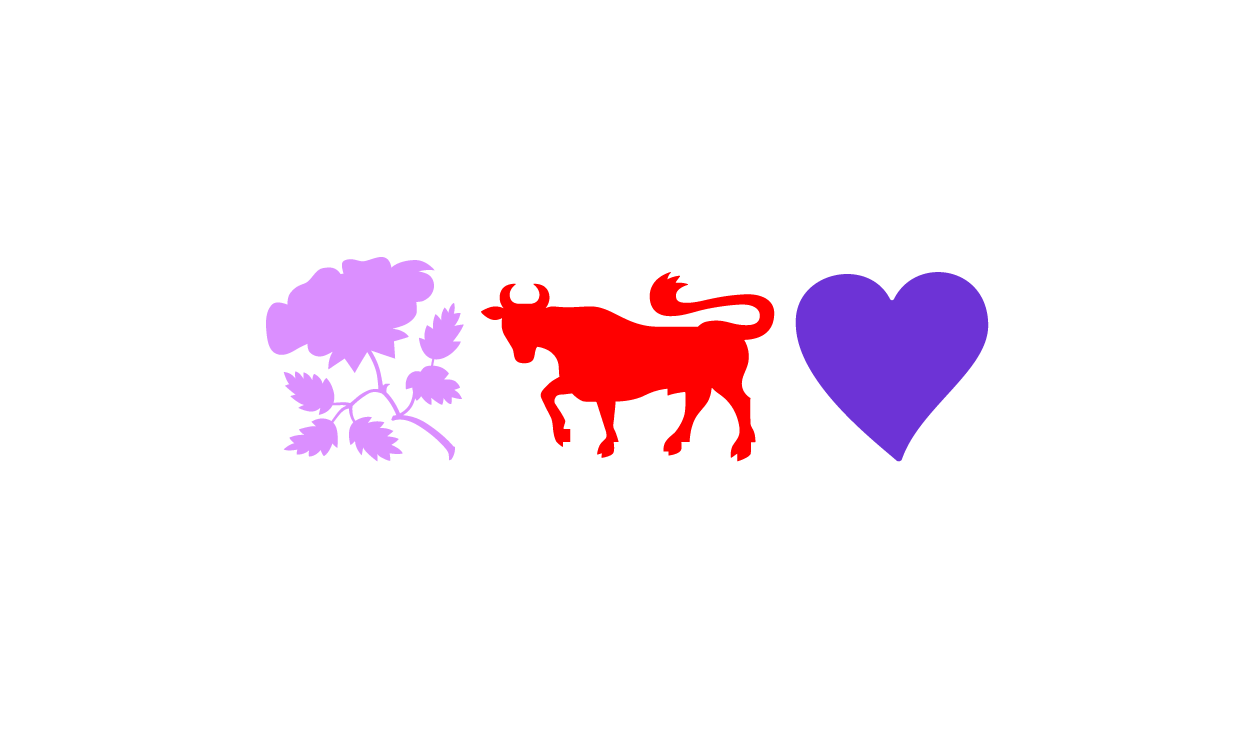
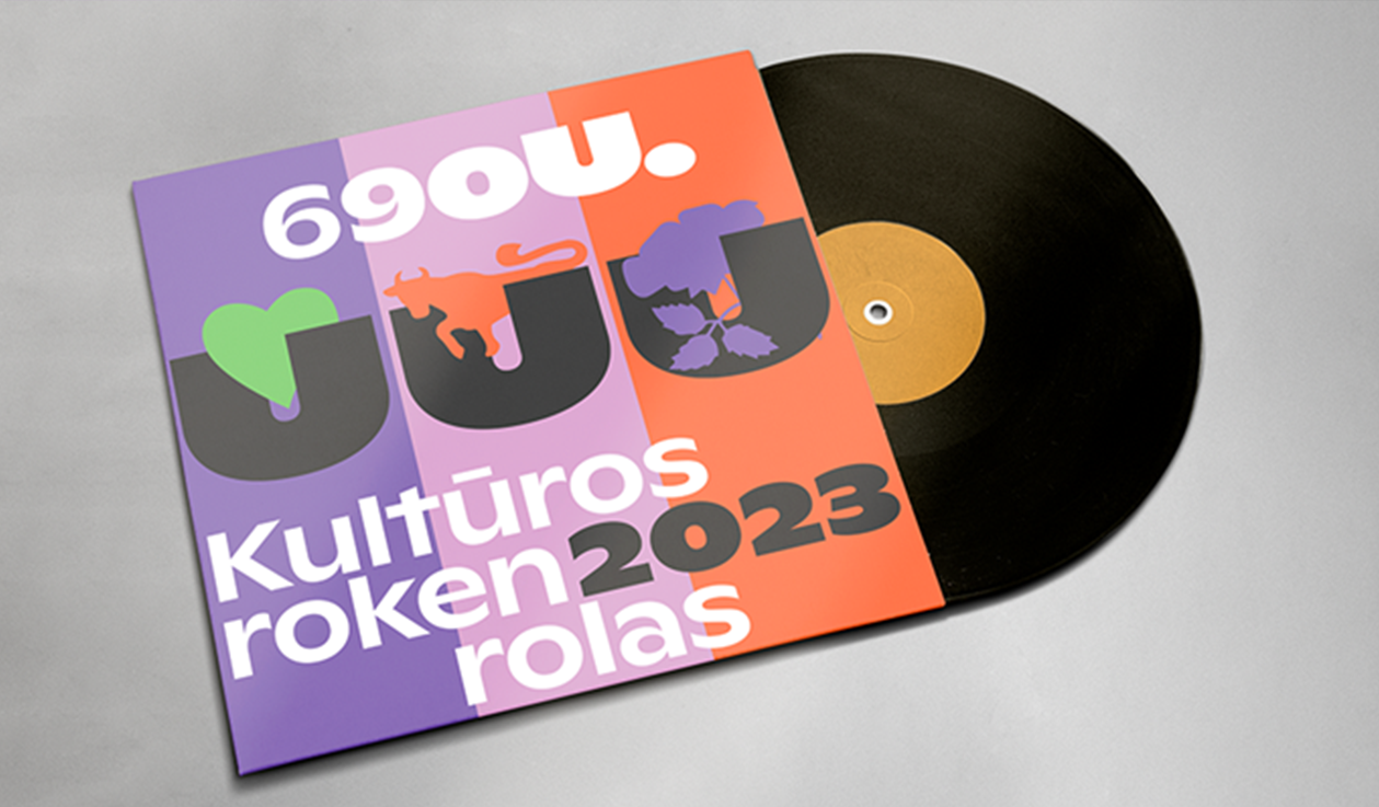
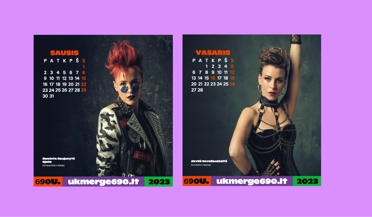
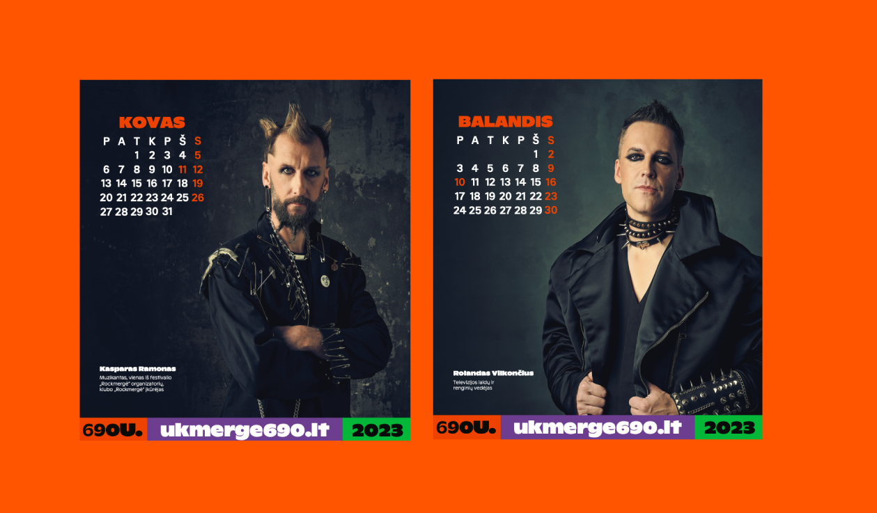
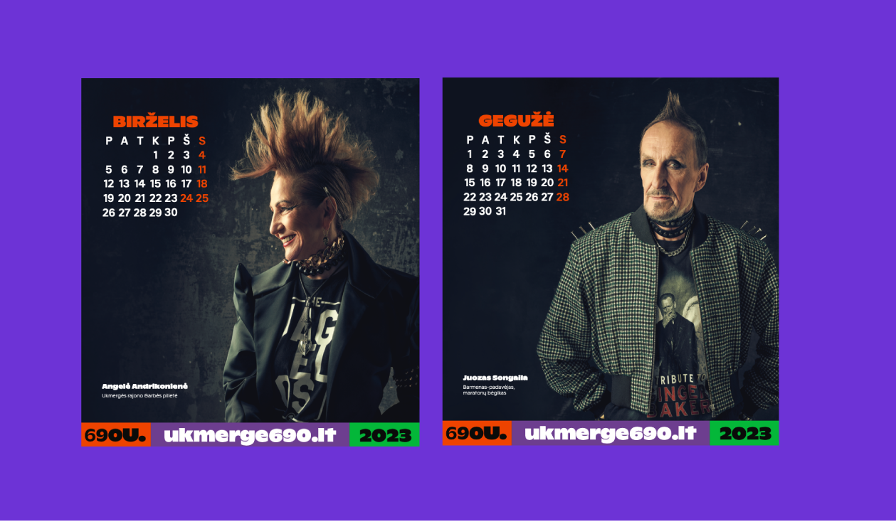
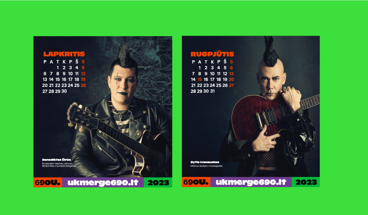
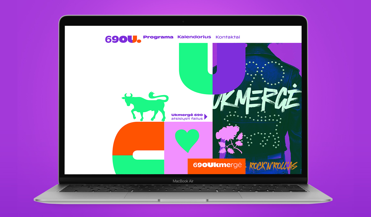
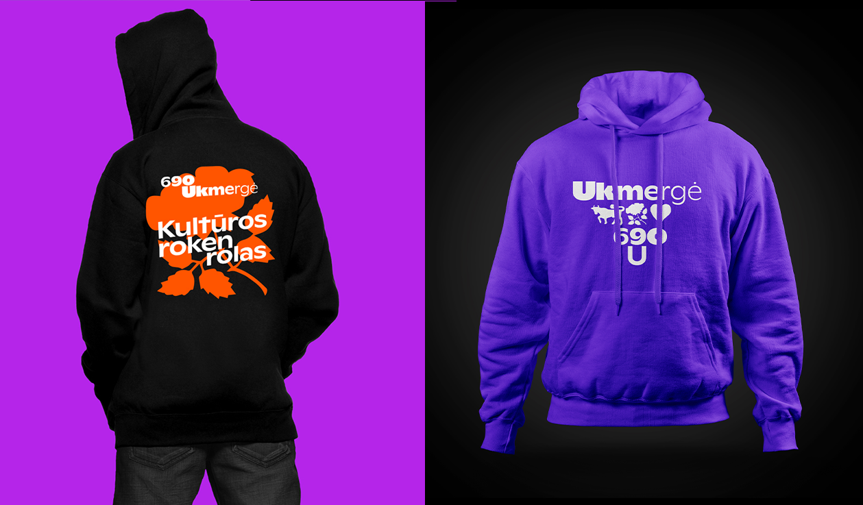
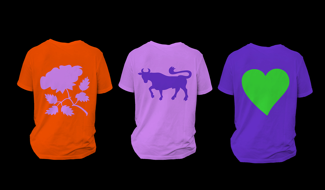
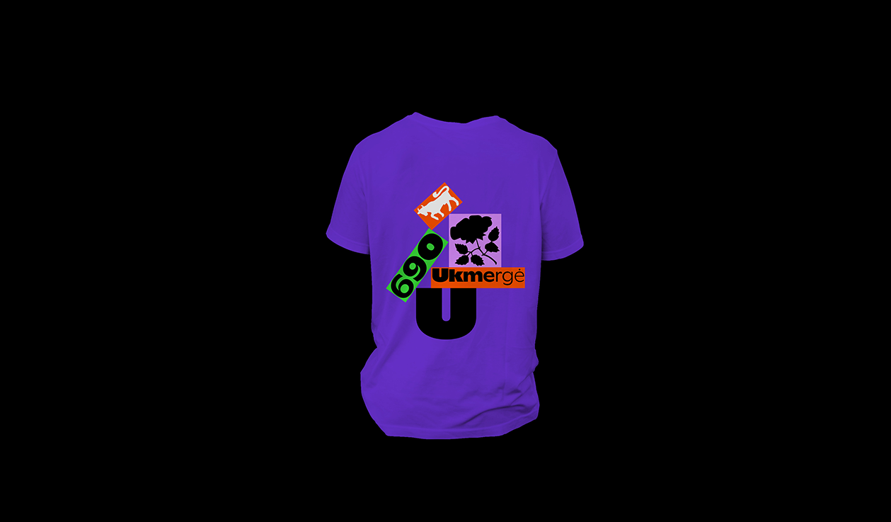
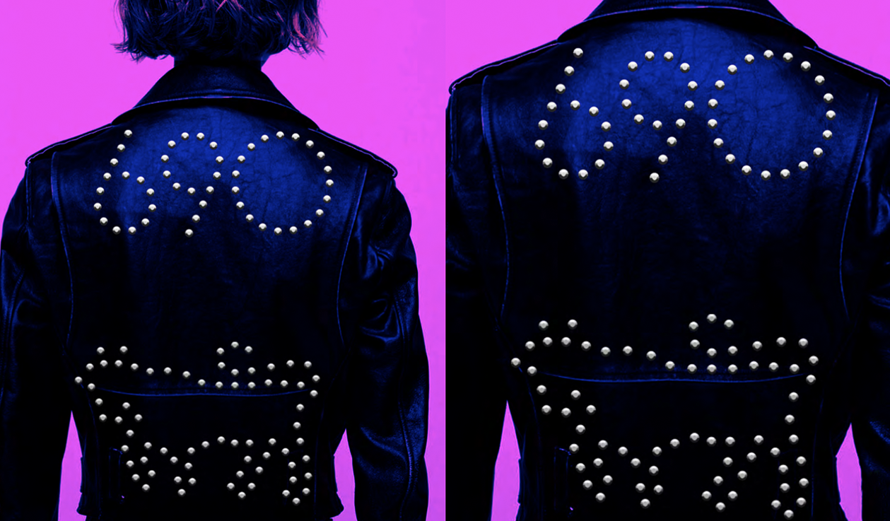
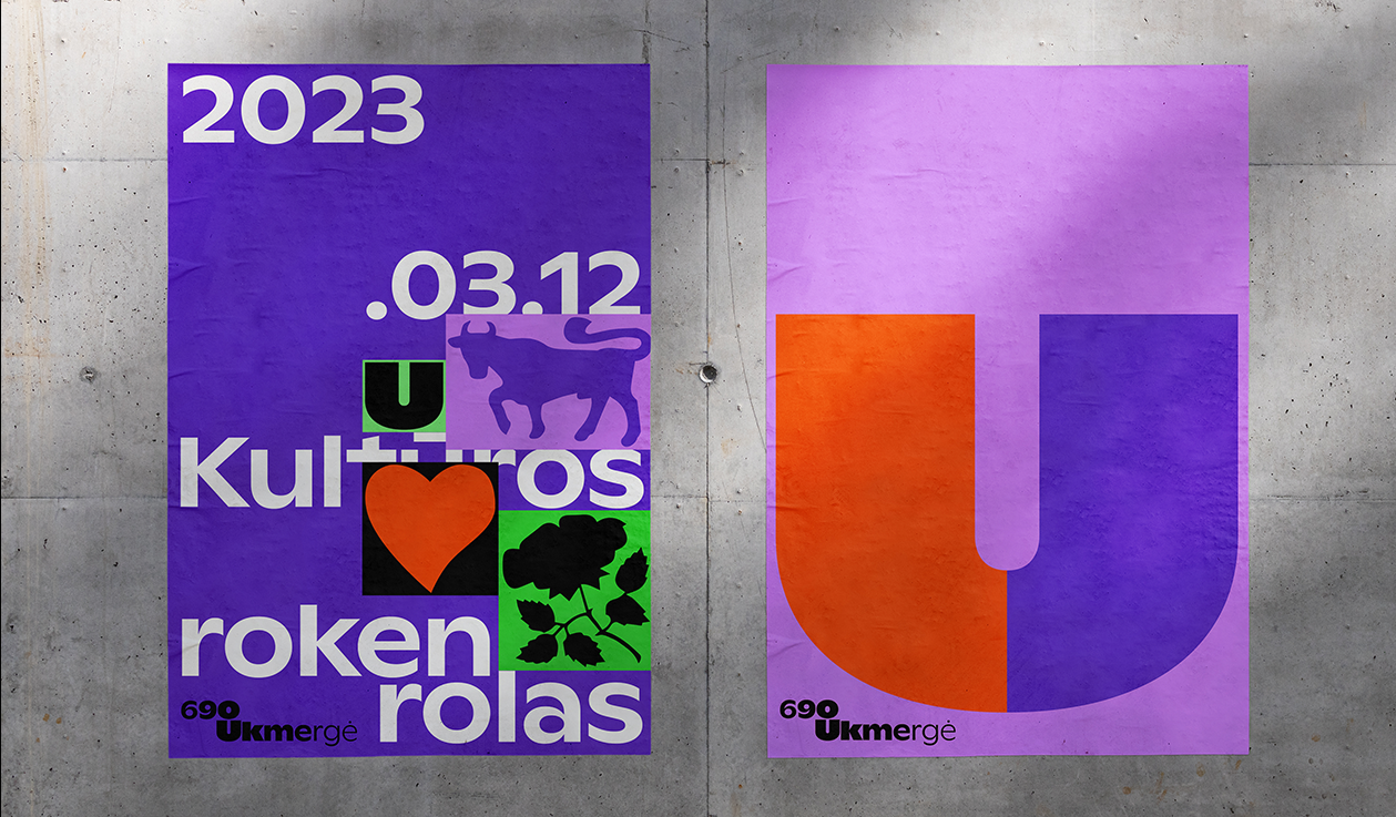
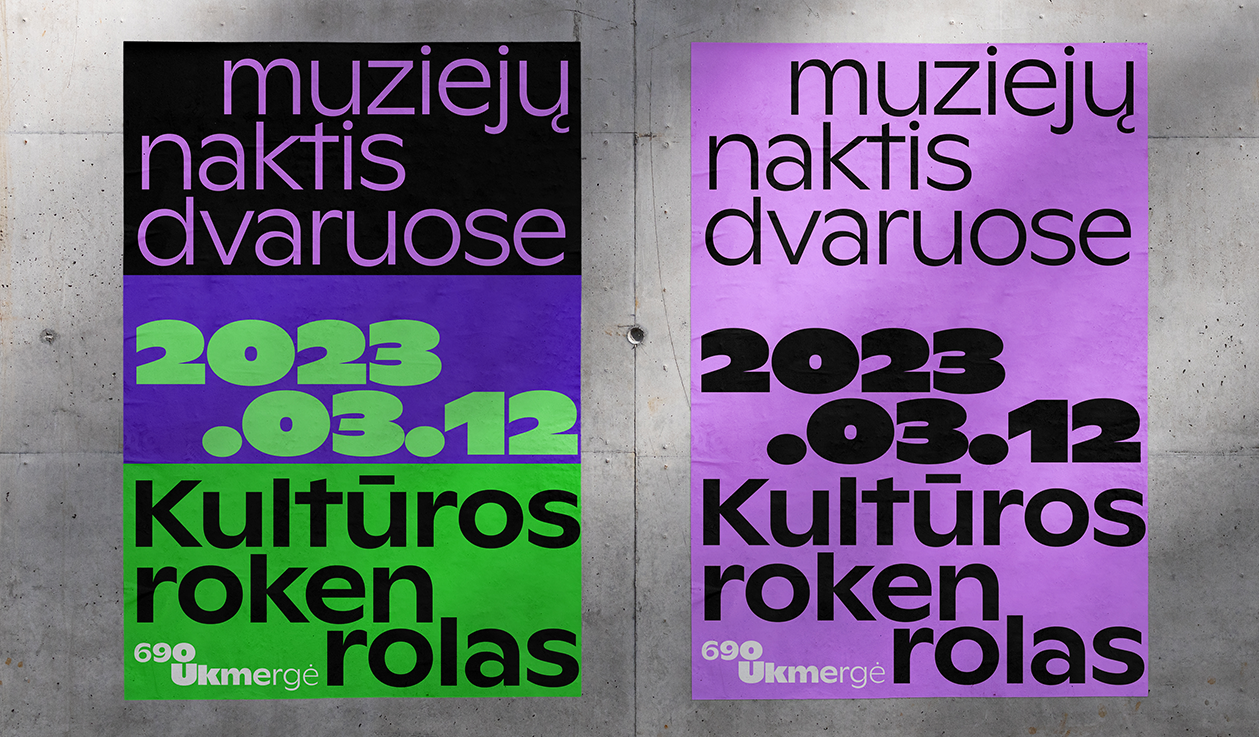
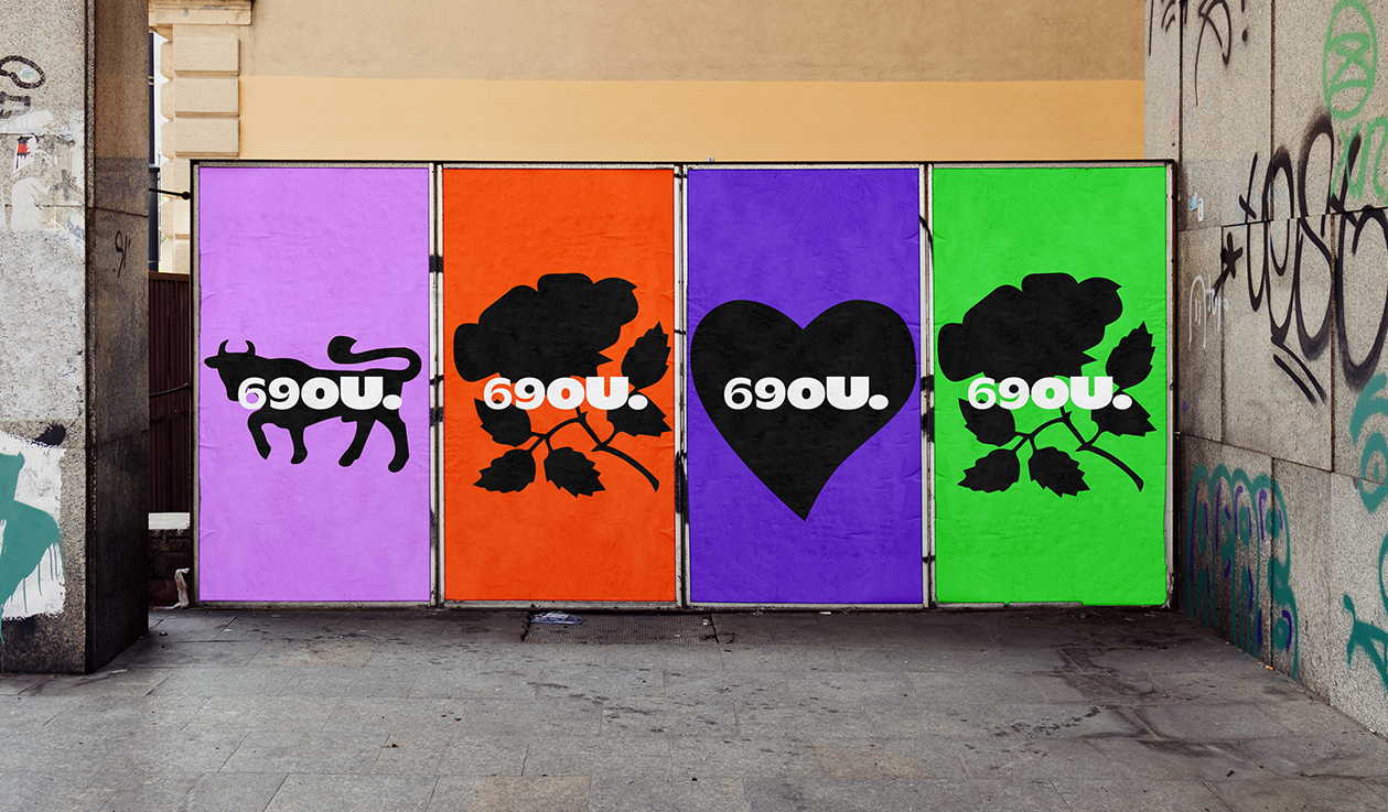
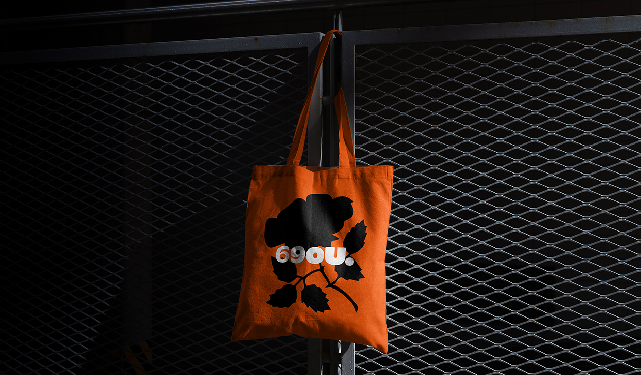
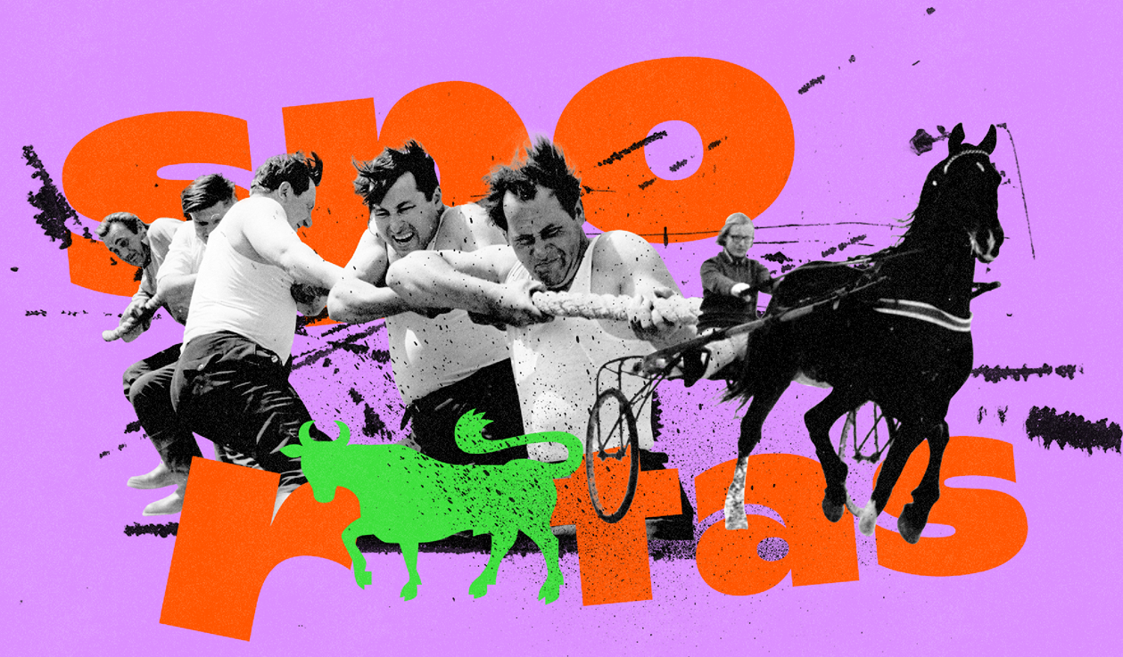
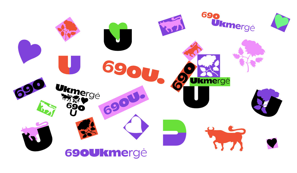
690Ukmergė Branding
At last we can present the project, we’d been working on for half a year – a complex campaign for the 690th birthday of Ukmerge town. Today the whole year program was announced – you can check it at www.ukmerge690.lt.
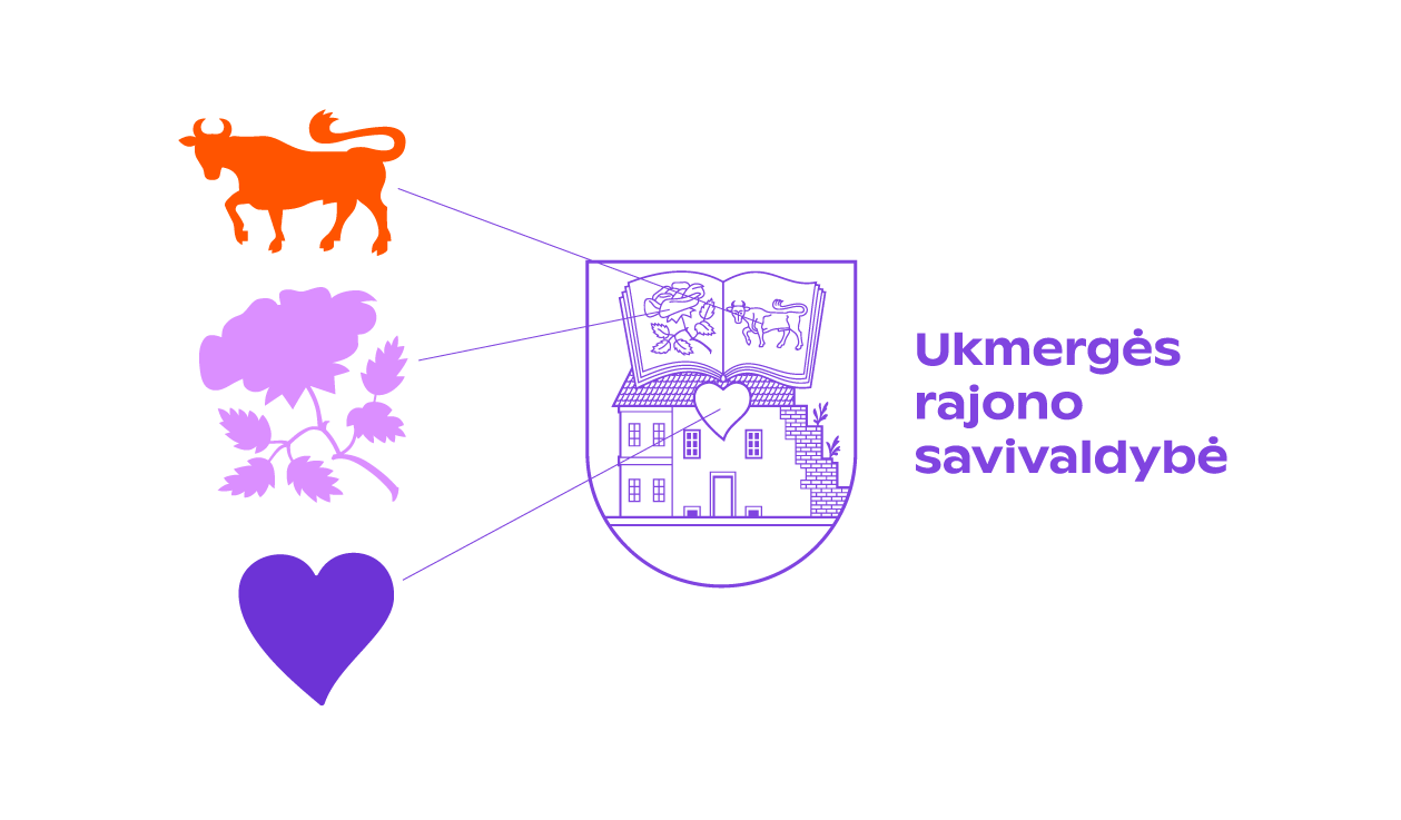
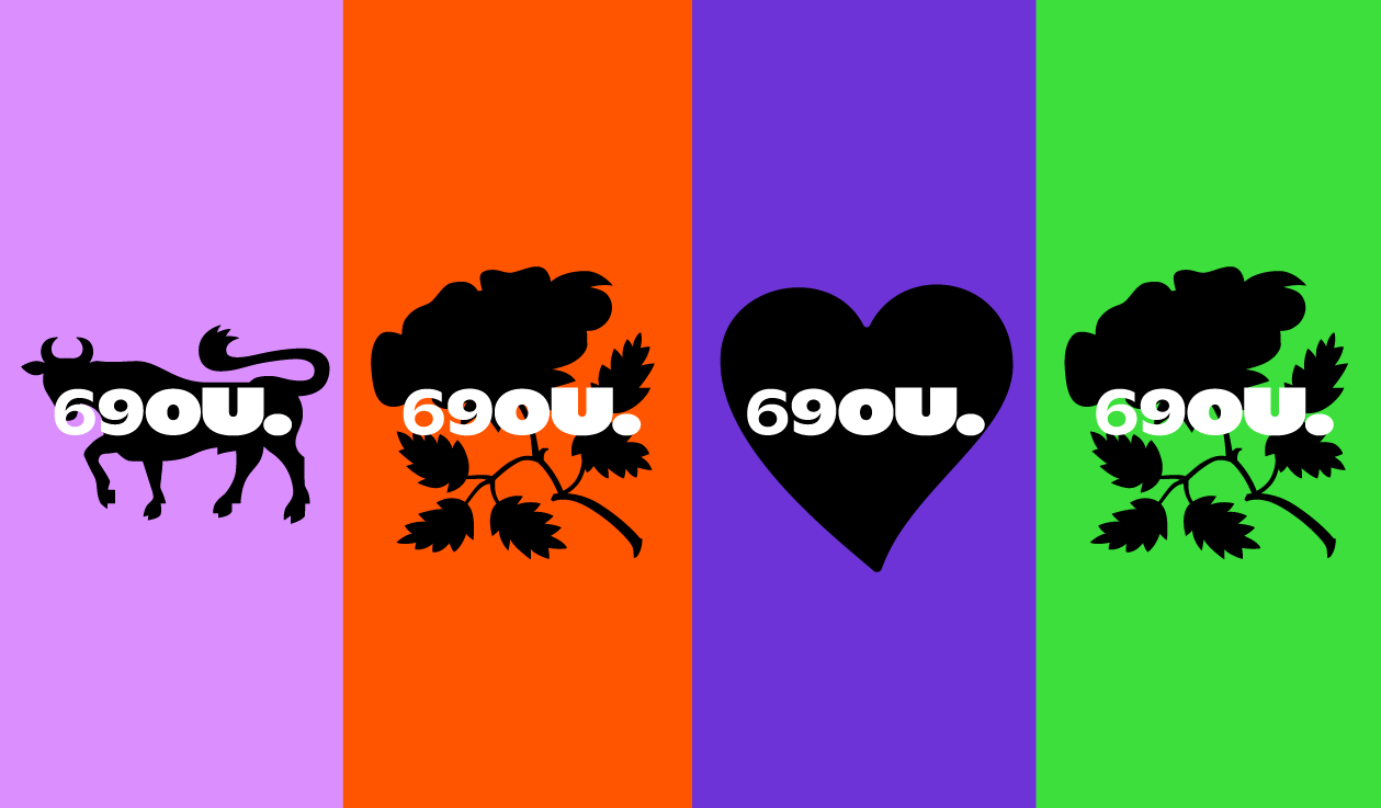
The main concept suggested the branding style of the project and the essential elements of the visual identity. The U letter has become kind of magnet – an axis for everything from typography to video content. After all, real, vibrant, authentic, unexpected things attract and engage. It’s hard to resist free rock’n’roll spirit, you can’t help but participate. The transformation and modernization of Ukmerge heraldry into rock’n’roll iconography became the core of design solutions. The elements of town’s coat of arms – rose, bull and heart – are very suitable for that.
The ambassadors of the event are various local personalities, familiar faces, inspiring community builders and movers. They were transformed into expressive rockers during a photo shoot. This portrait gallery became a part of the communication, social media campaign and the print anniversary year calendar. The design and the format of it reminds a vinyl record sleeve.

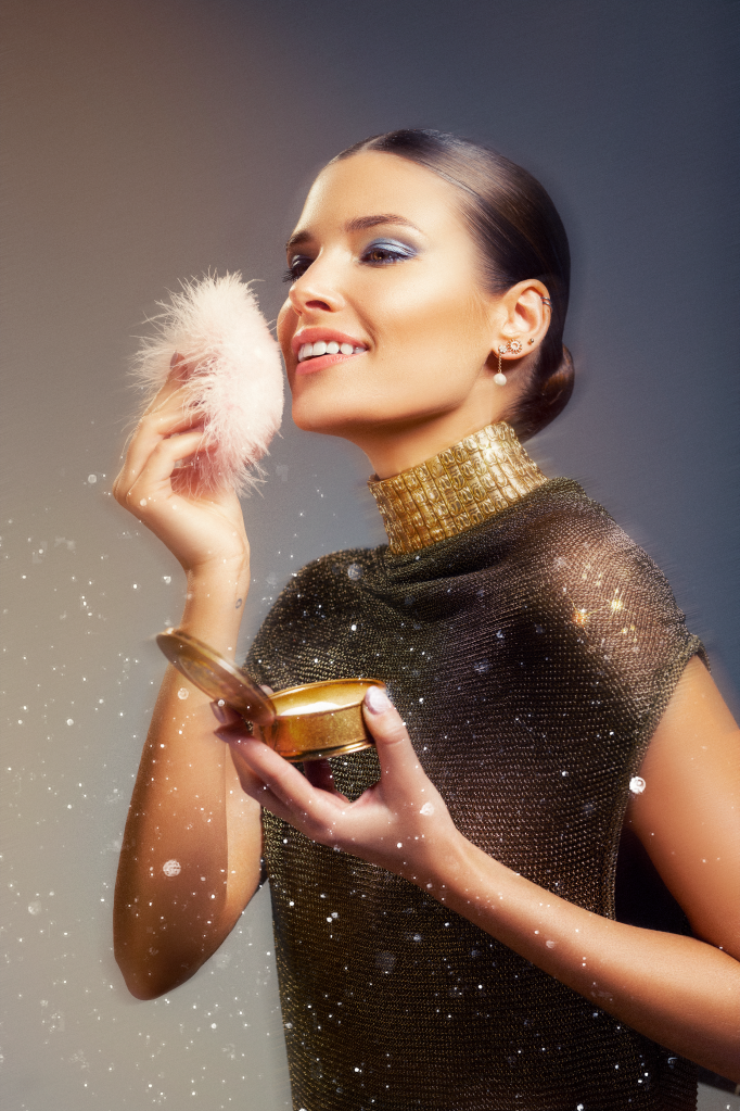
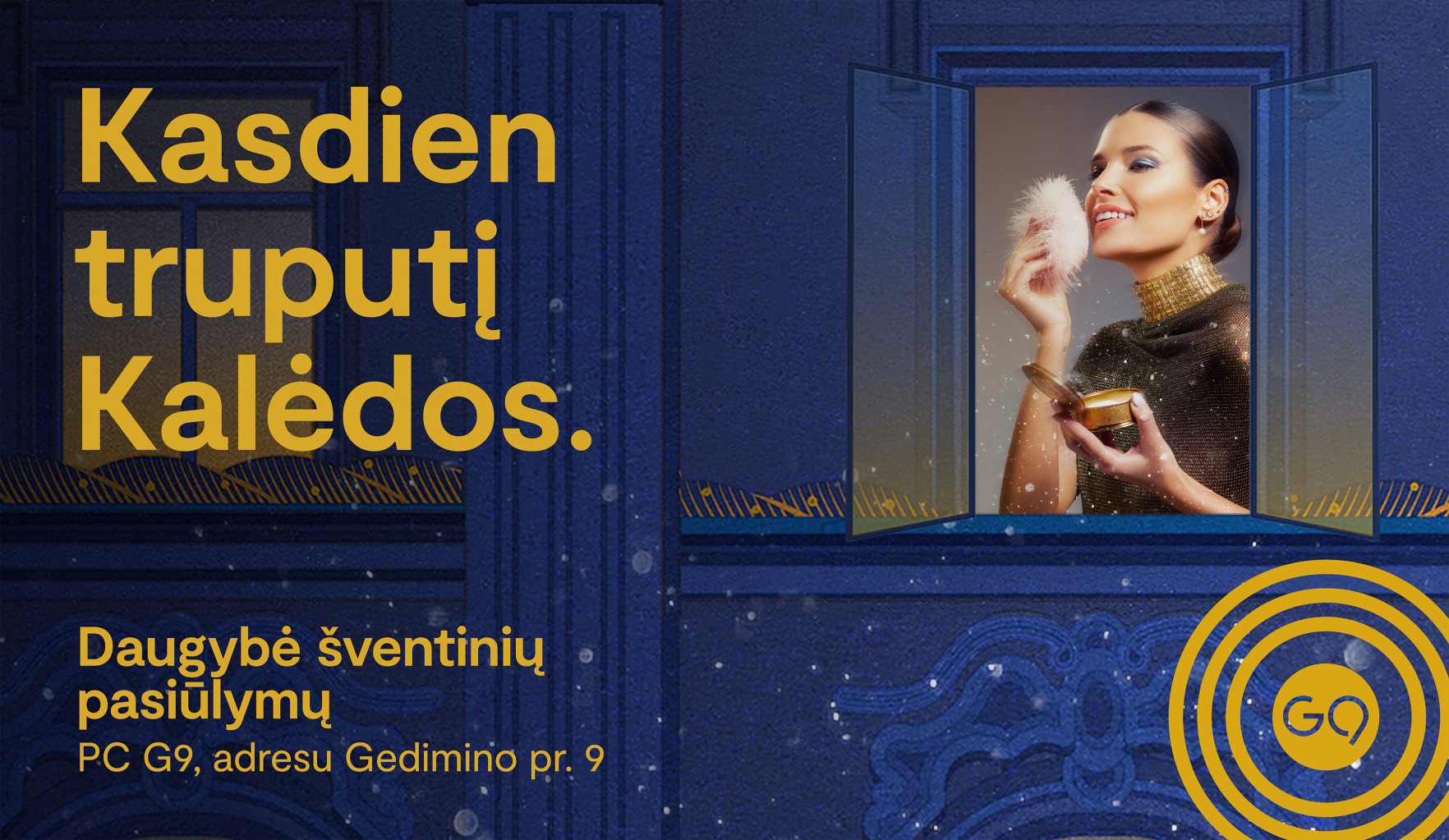
G9 CHRISTMAS 2022 Advertising
The Christmas sales campaign for G9 shopping center combines cozy illustration and festive fashion photography. The result is “Christmas classic” in a new way.
GYM PLIUS IMAGE CAMPAIGN 2023 Advertising
New year, new resolutions. We suggest starting with yourself, exercising again. “Create yourself anew”, says our new campaign for Gymplius, the largest network of fitness clubs in Lithuania. Say Happy New Year to your new self!
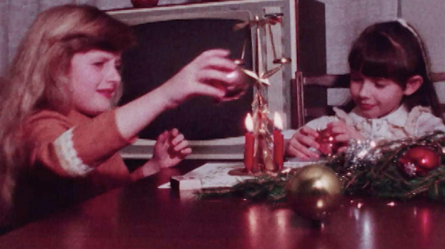
LRT Christmas TVC 2022 Advertising
May our snowy Christmas greetings reach you from LRT TV screens!
We had the opportunity to create an Christmas video for the national
broadcaster’s LRT Christmas campaign!
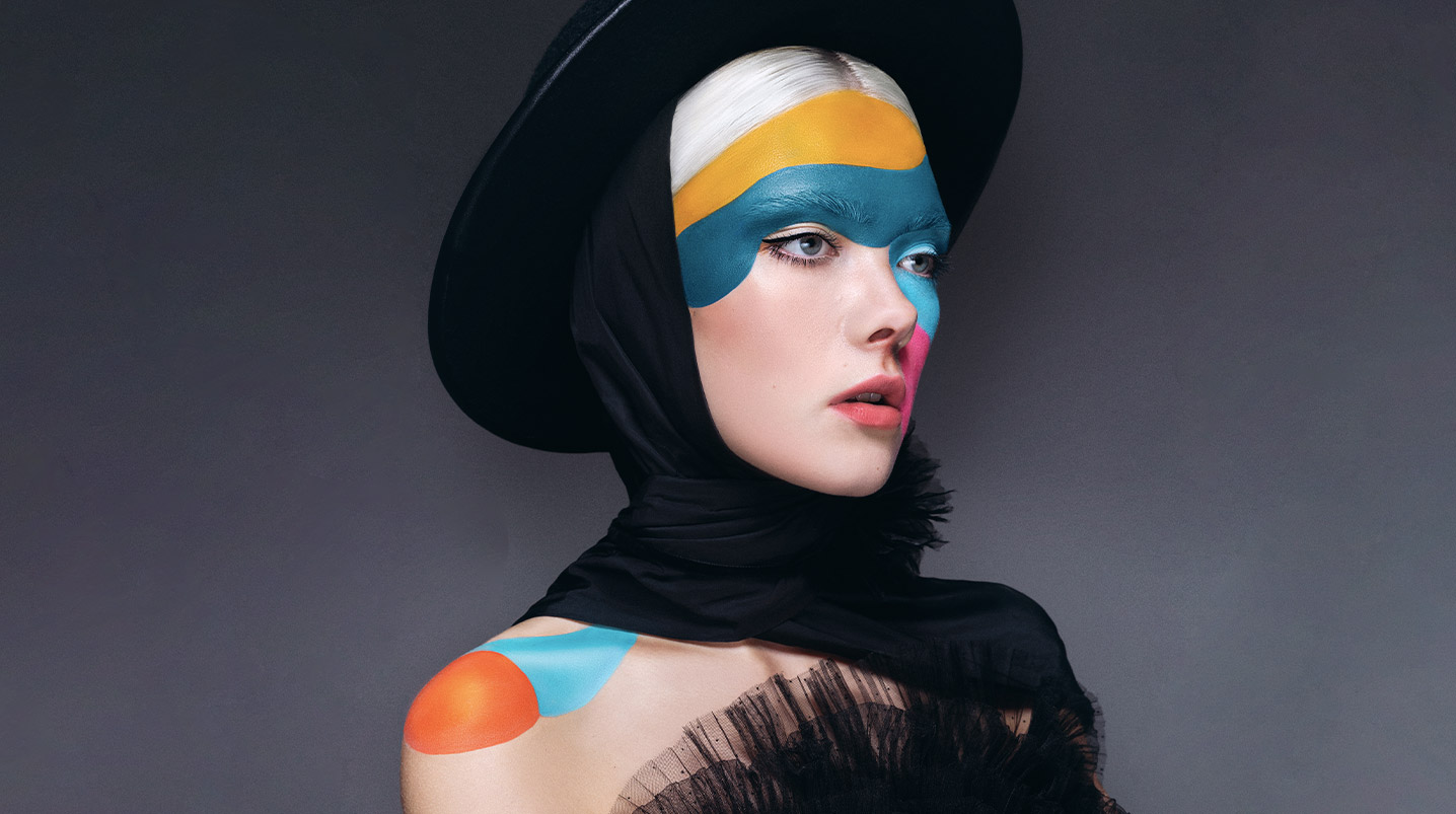
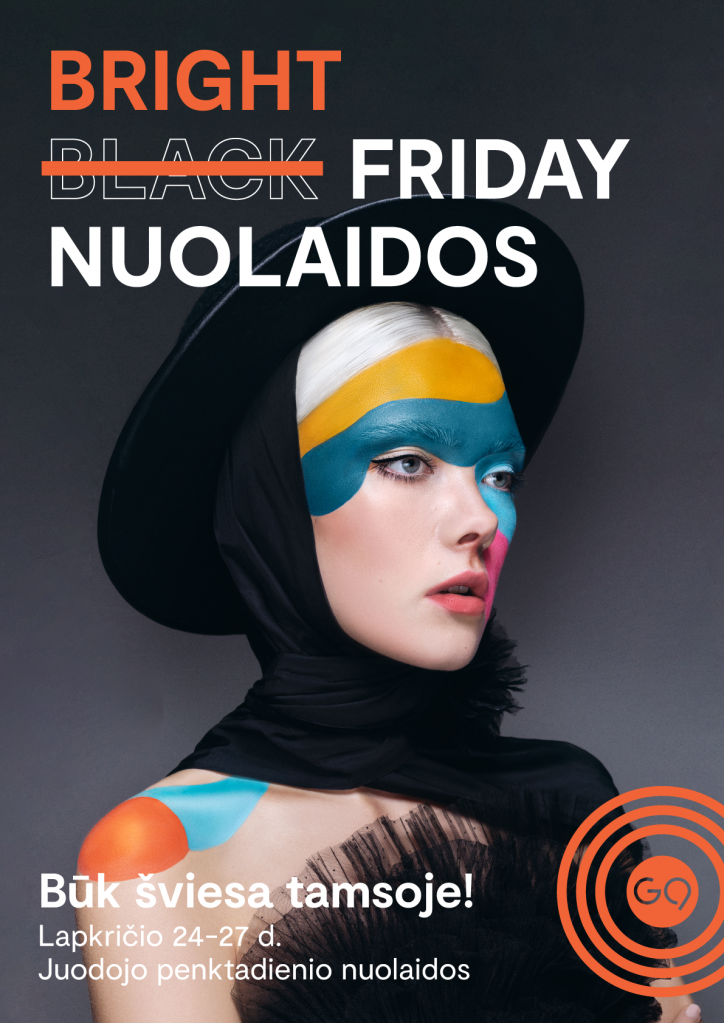
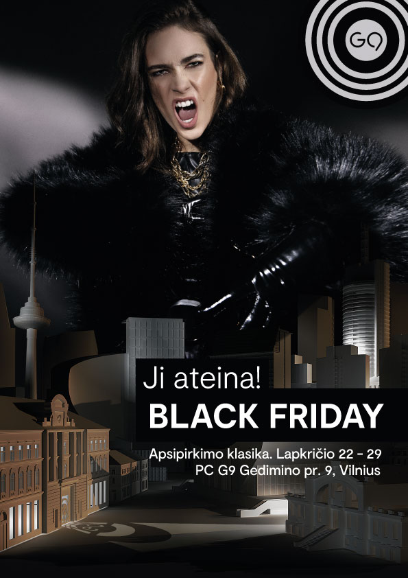
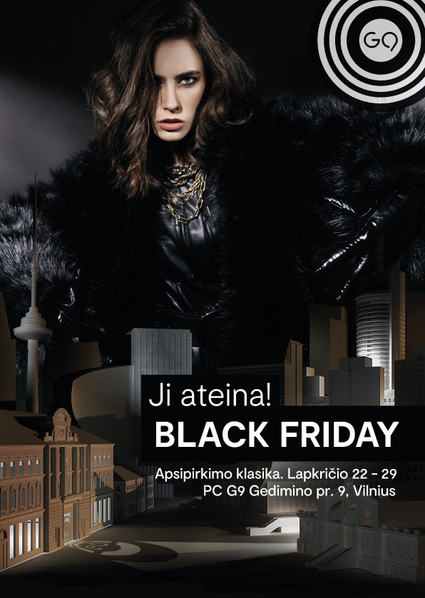
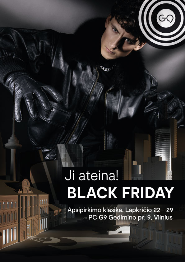
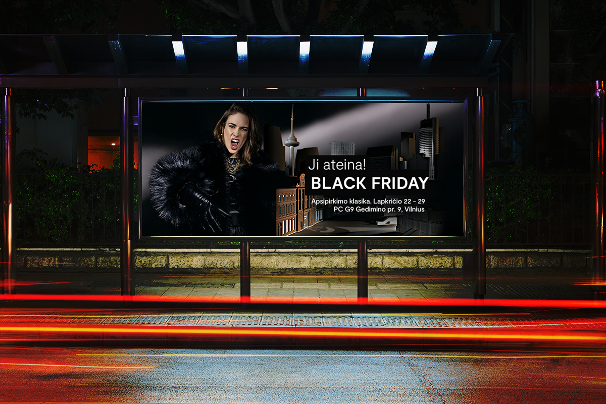
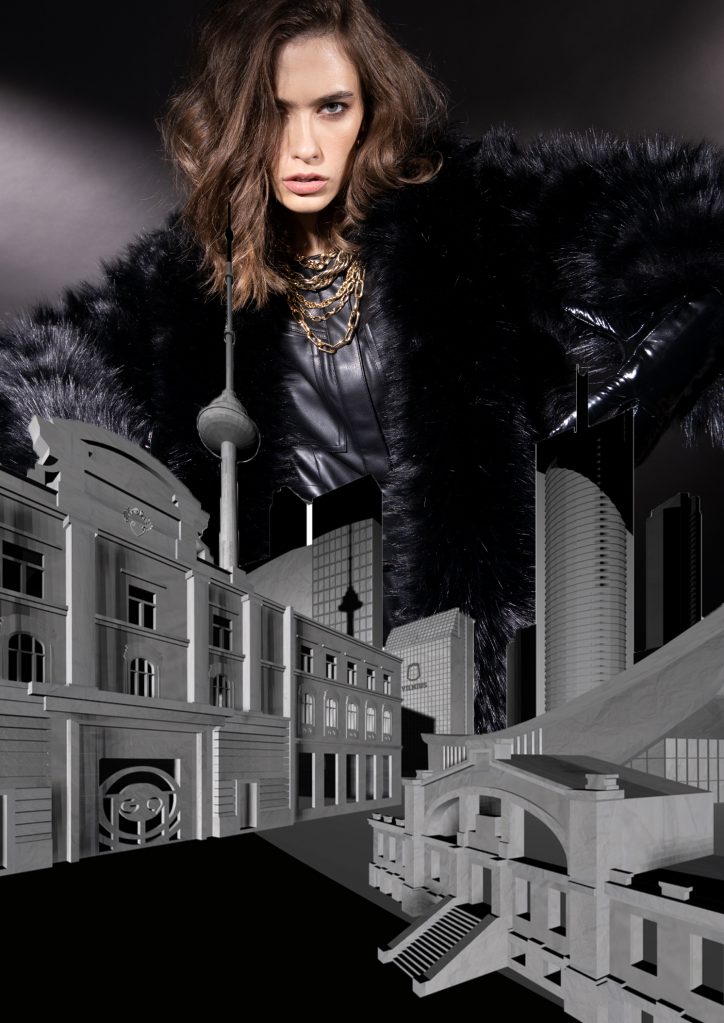
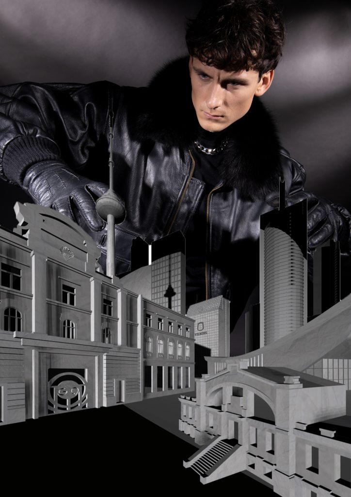
G9 BLACK FRIDAY 2022 Advertising
In this dark time of year, we are all looking for light and brightness.
this year – BLACK FRIDAY G9, we turned it into BRIGHT FRIDAY.
A colorful fashion twist on a dark dark black friday background.
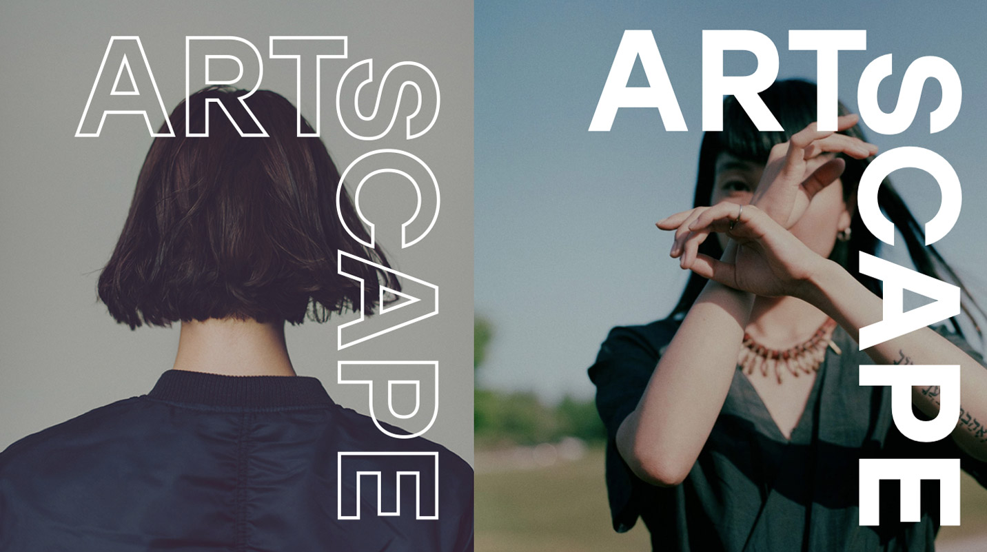
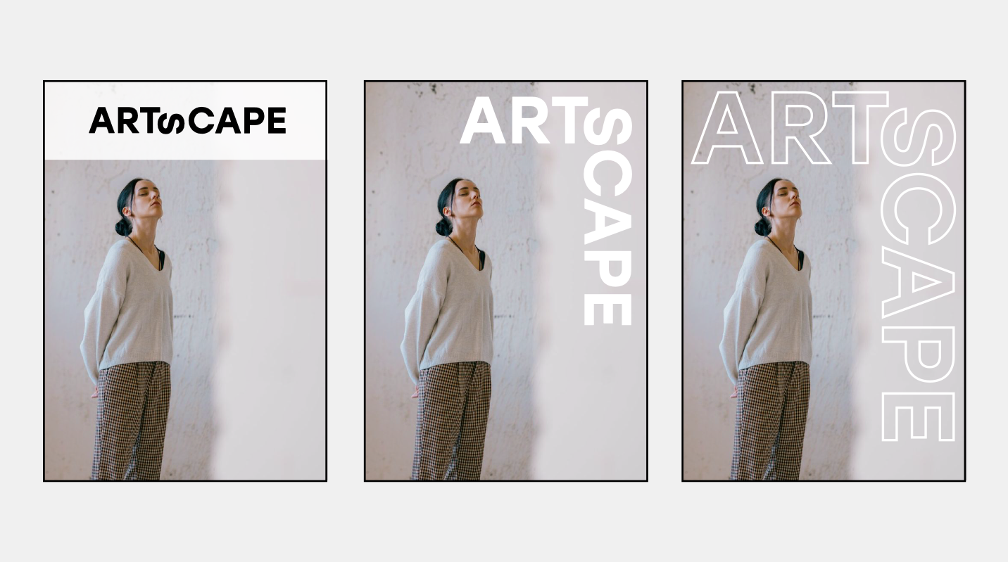
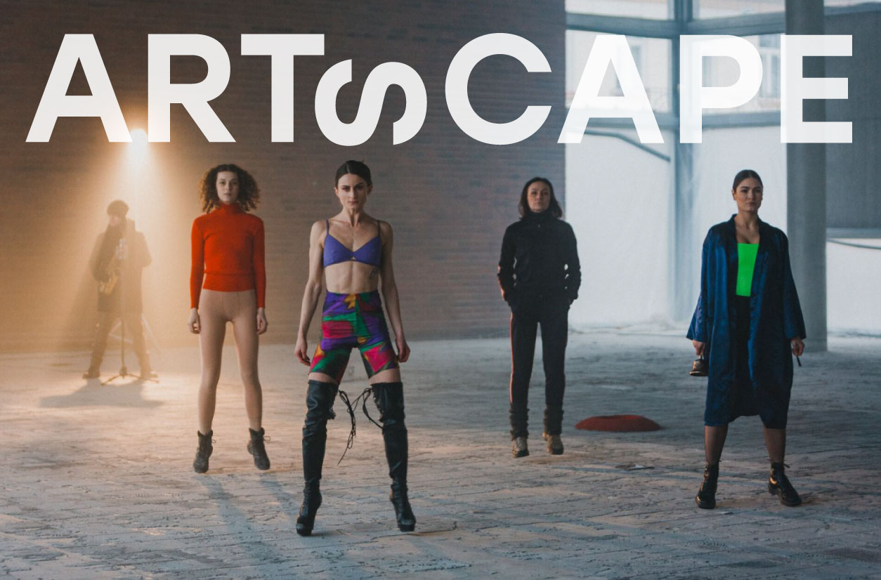
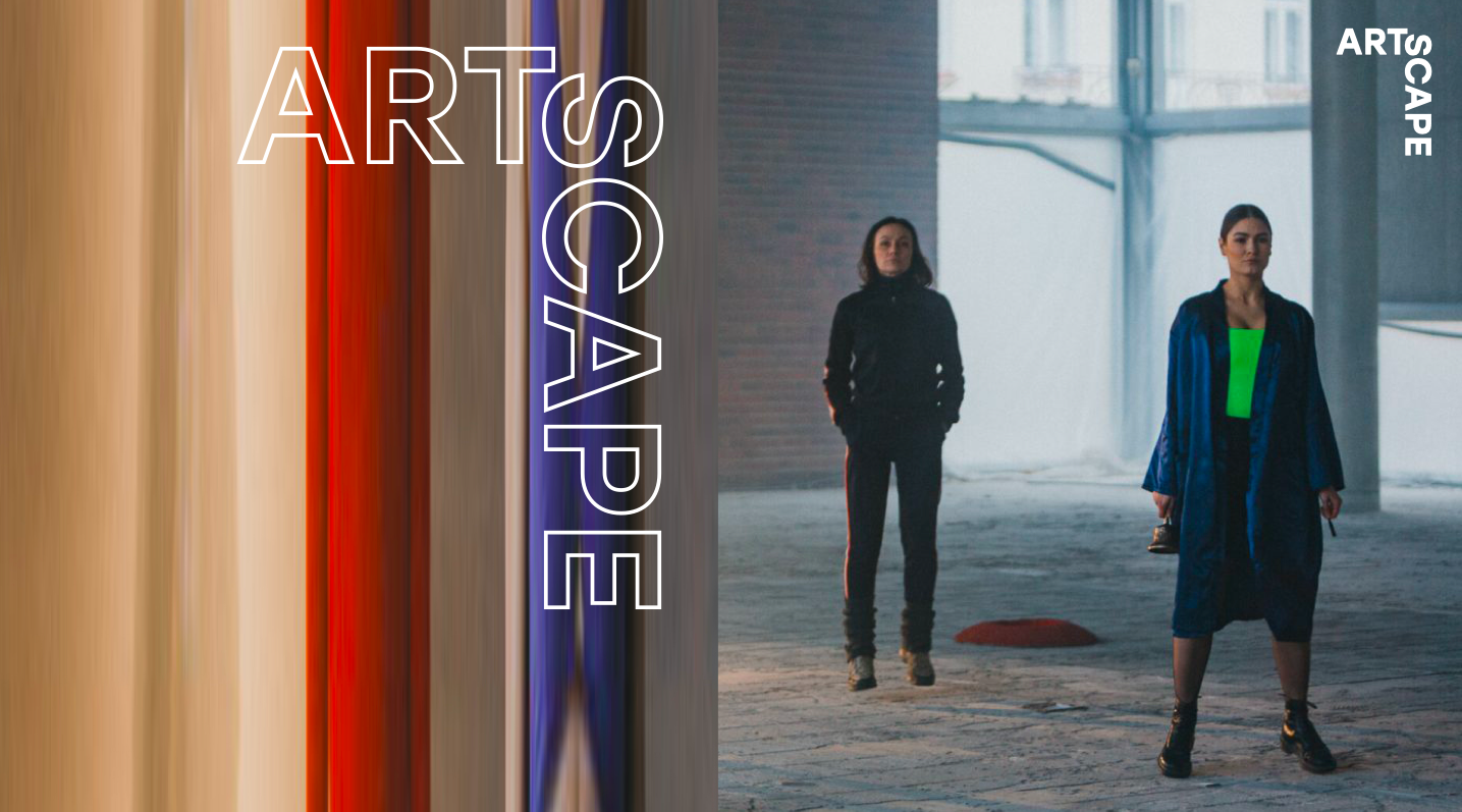
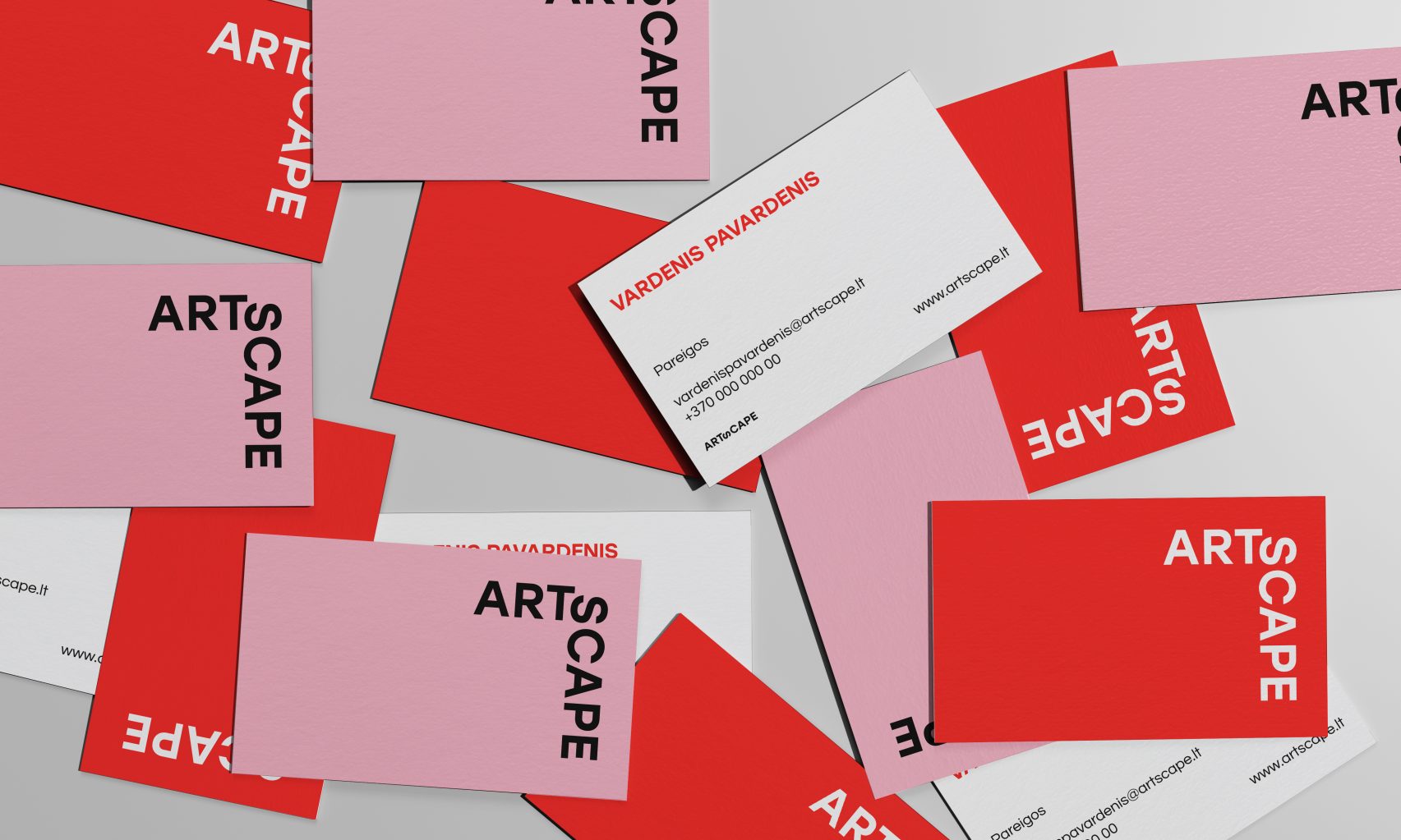
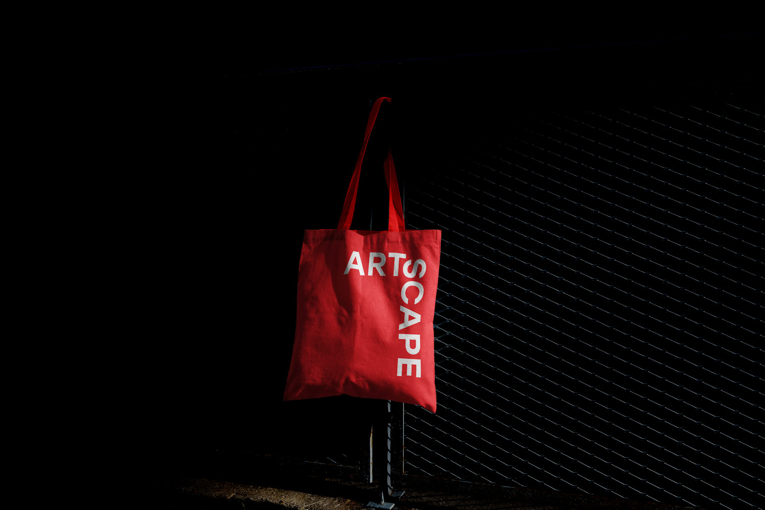
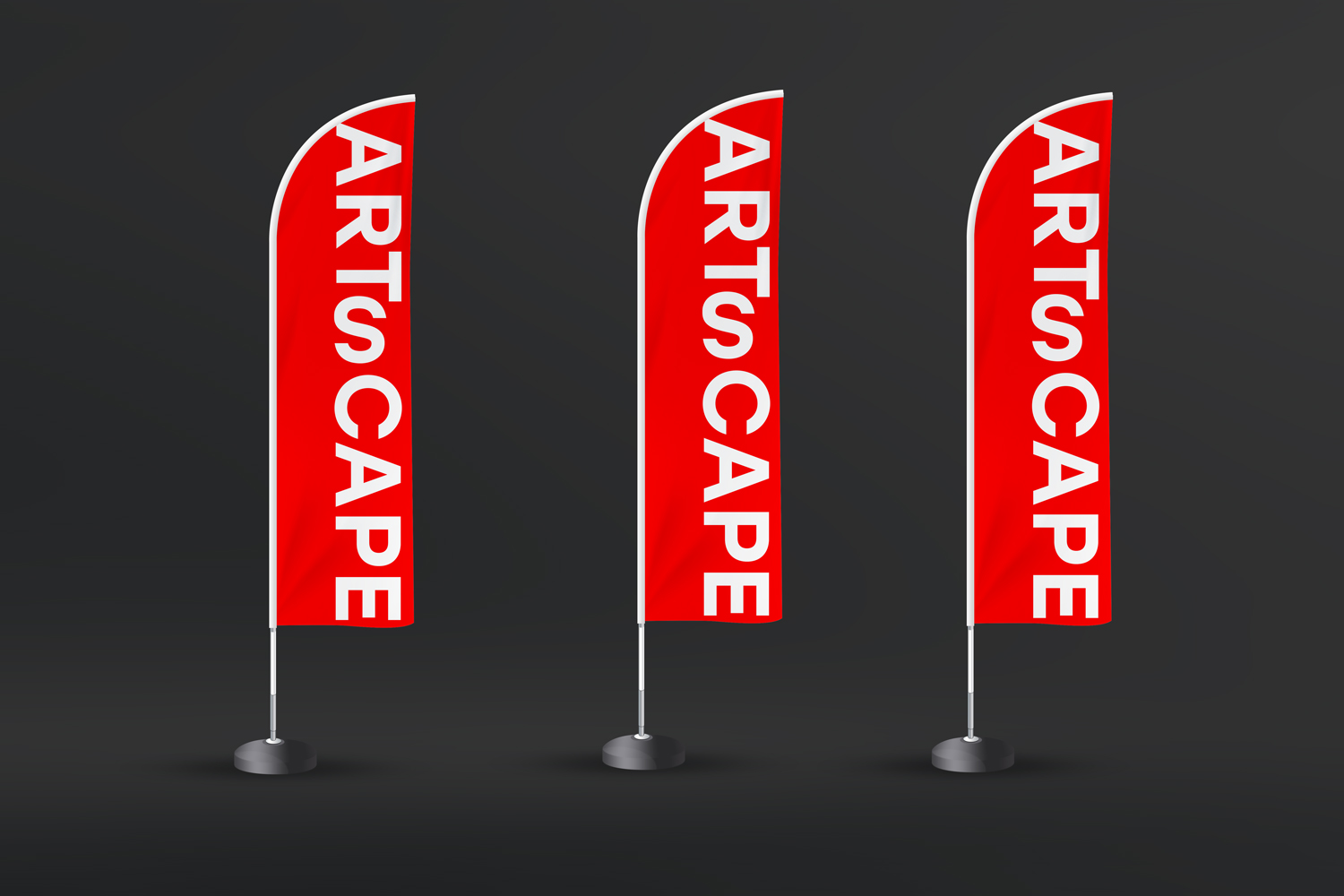
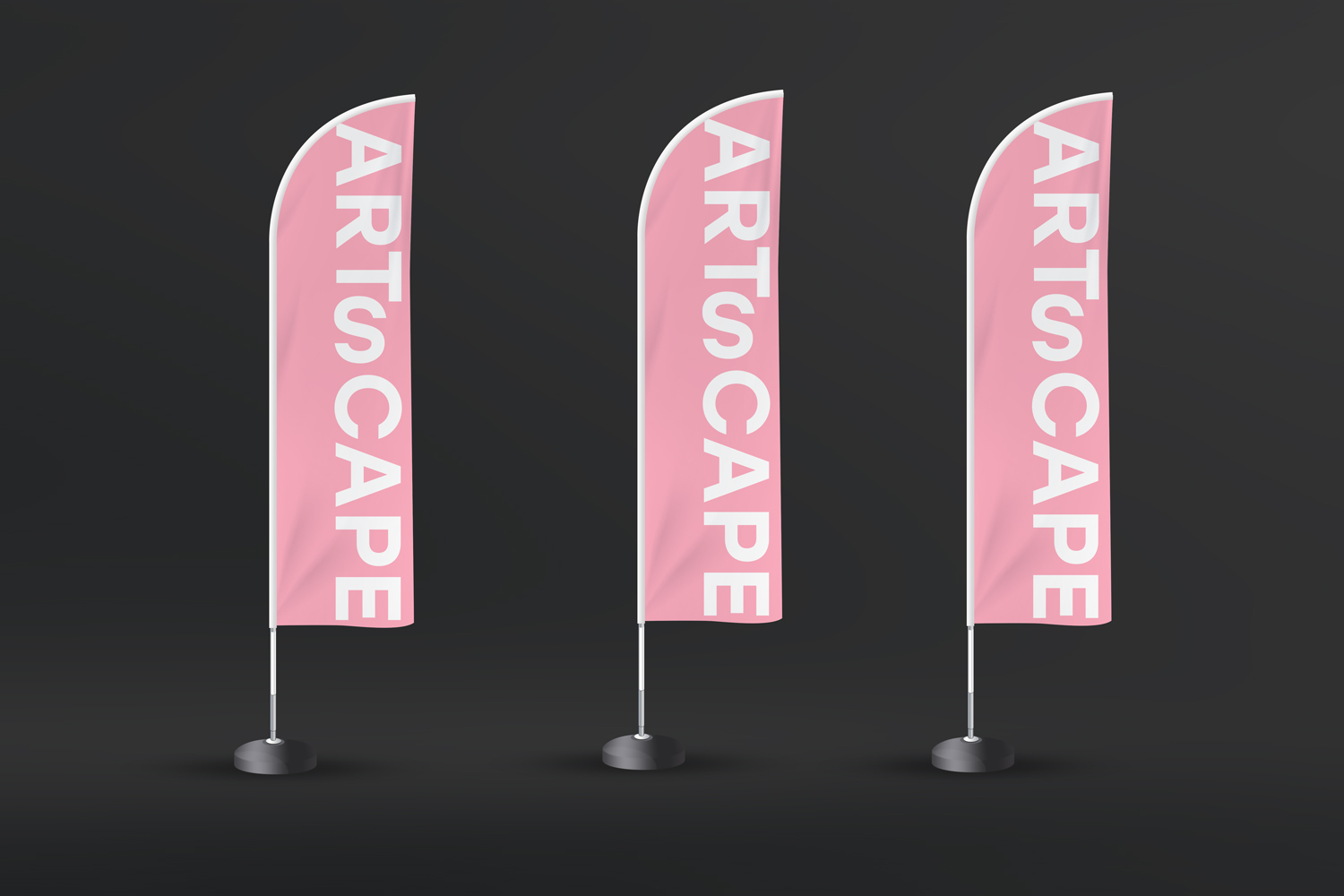
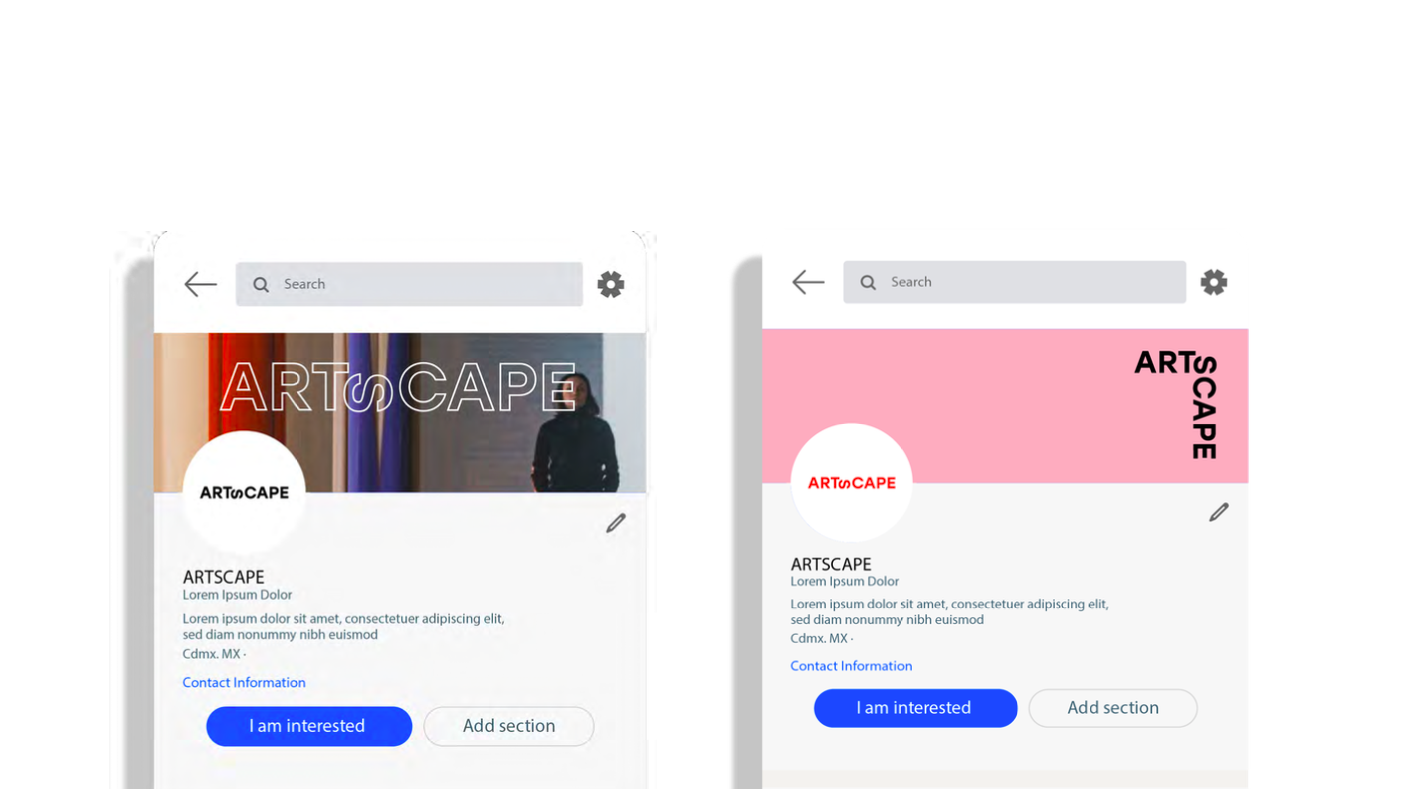
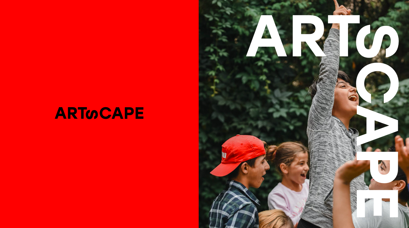
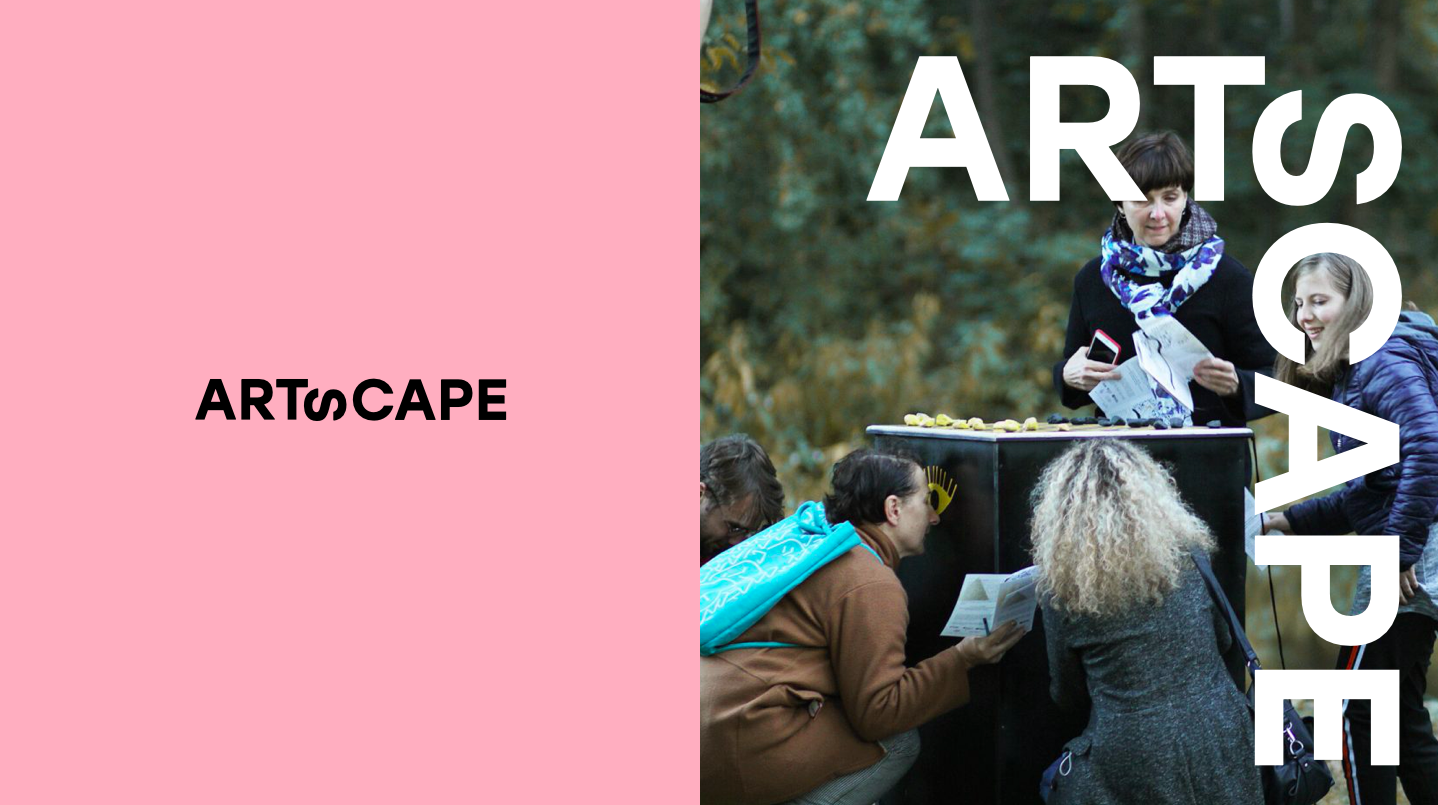
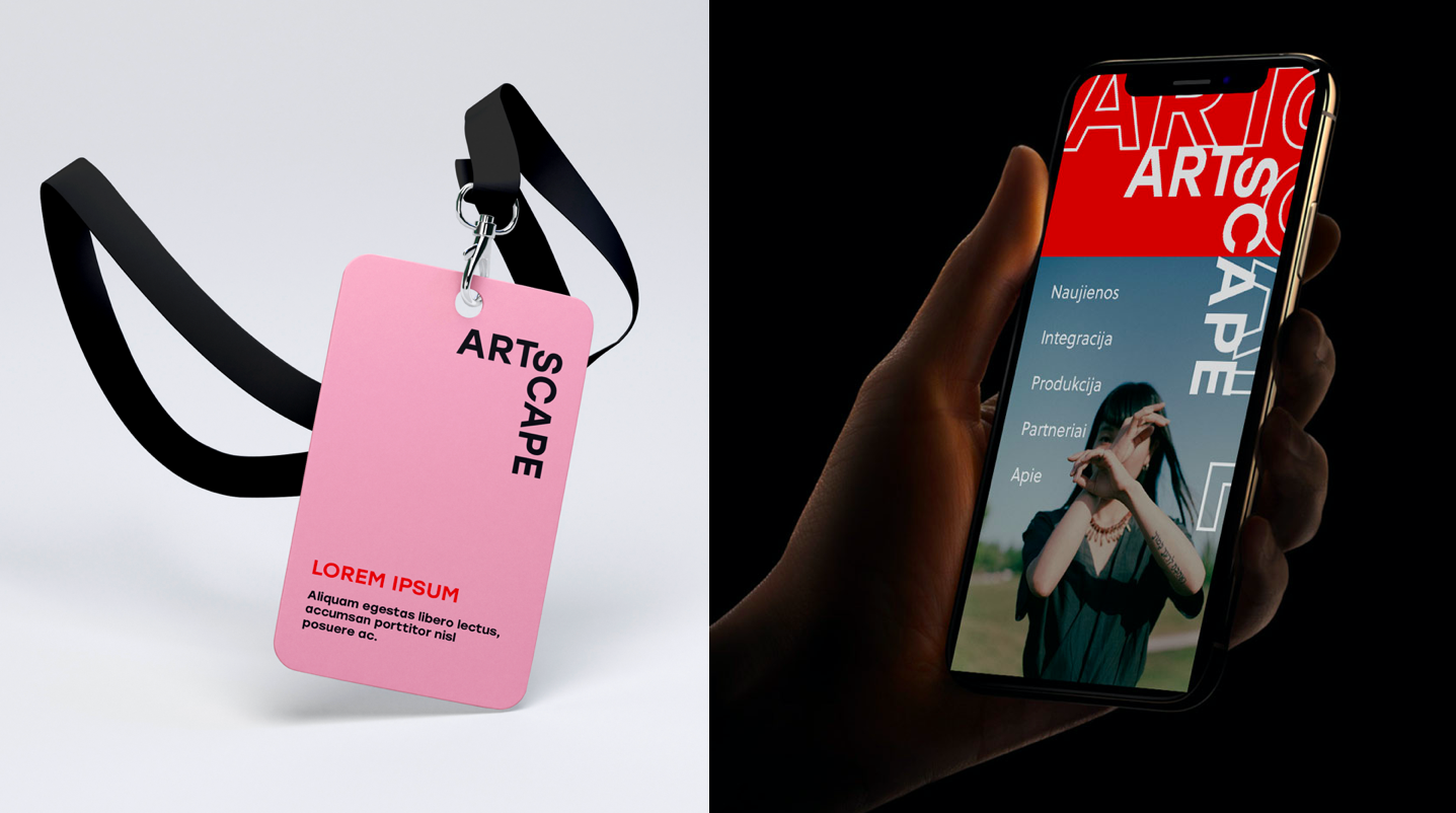
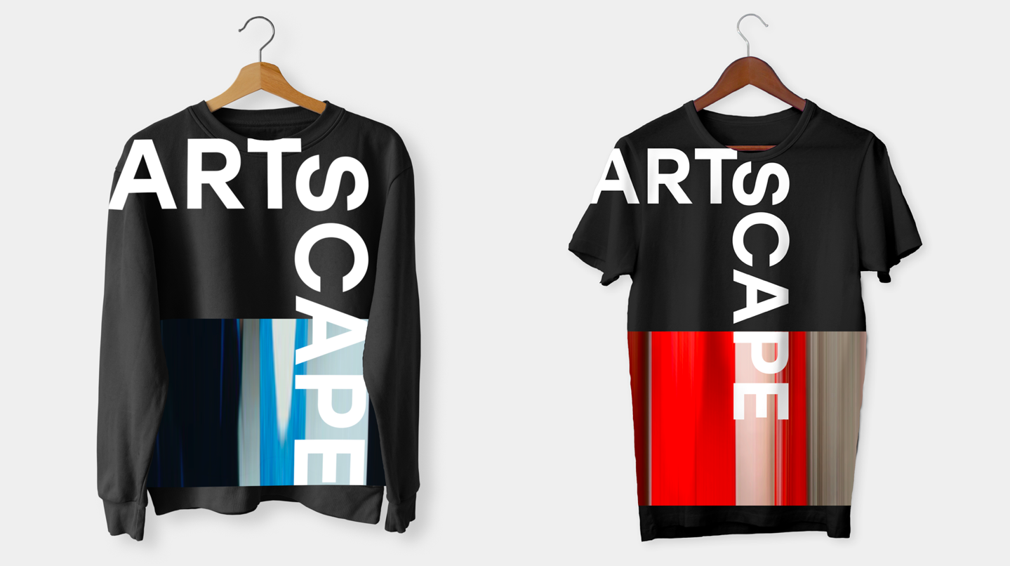
Artscape Branding
Mãrios Agency latest project is a visual identity for the art agency Arts Agency Artscape. The new logo aims to convey the very essence of Artscape – the desire to connect and empower different contexts, social and artistic projects. The logo adapts to the space, transforms and controls it, always fitting in, symbolizes the connection of these different dimensions.
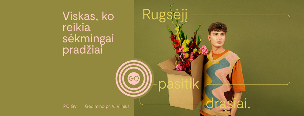
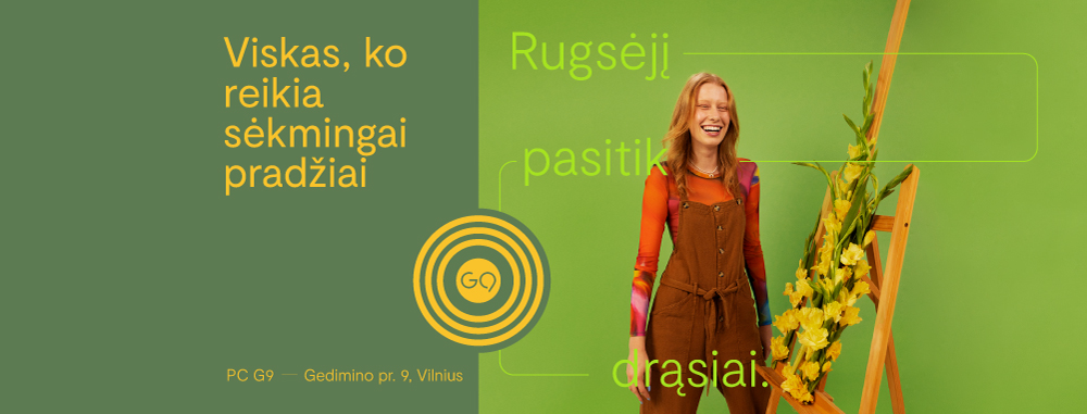
G9 BACK TO SCHOOL CAMPAIGN Advertising
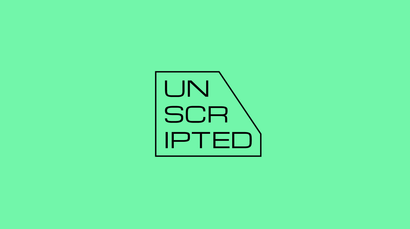
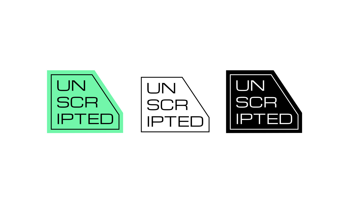
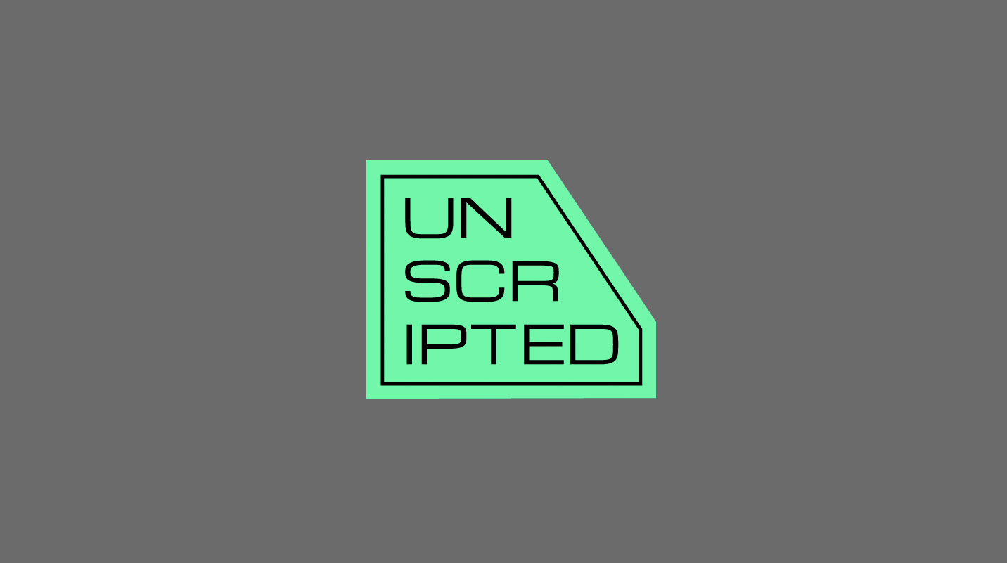
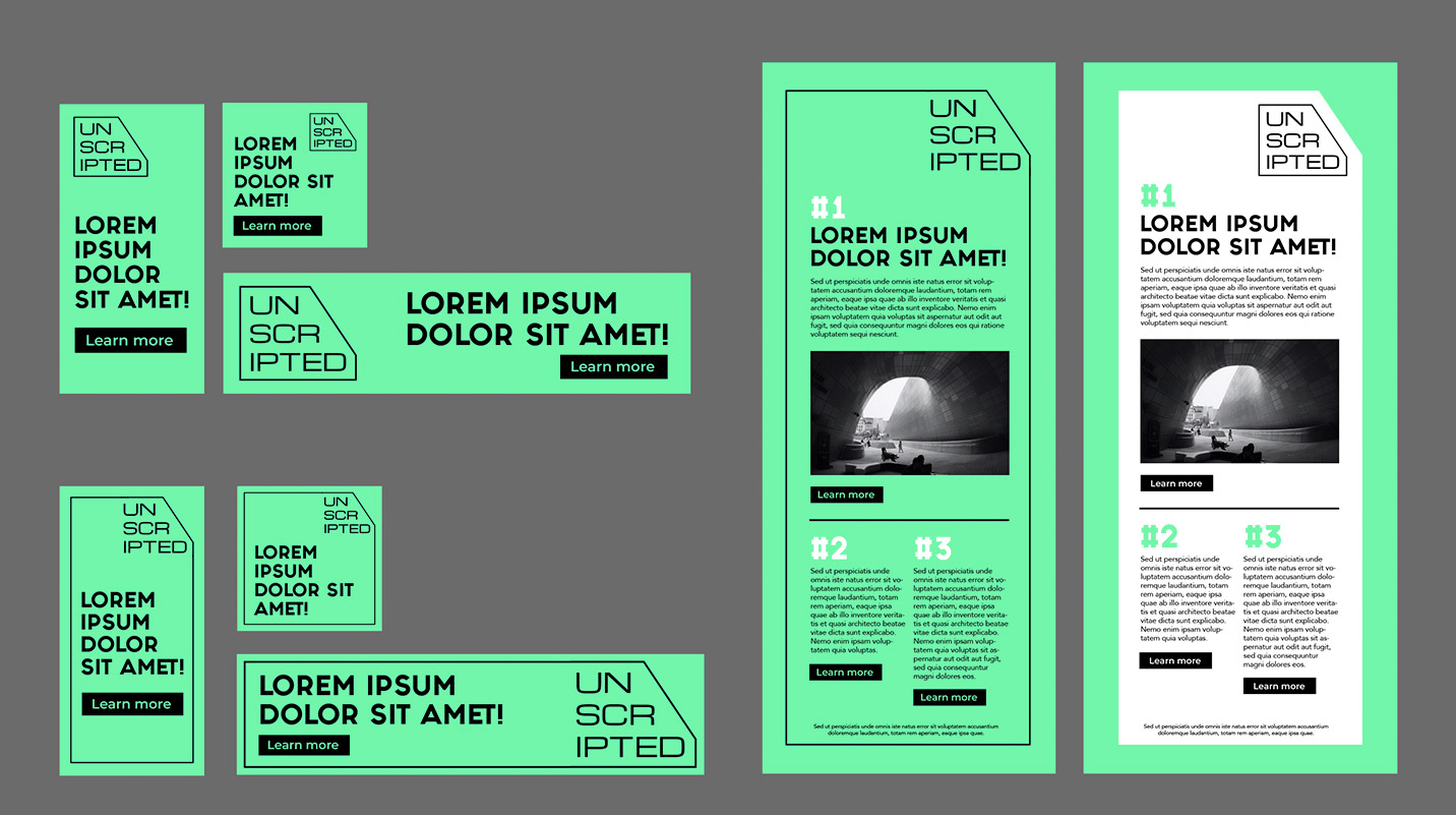
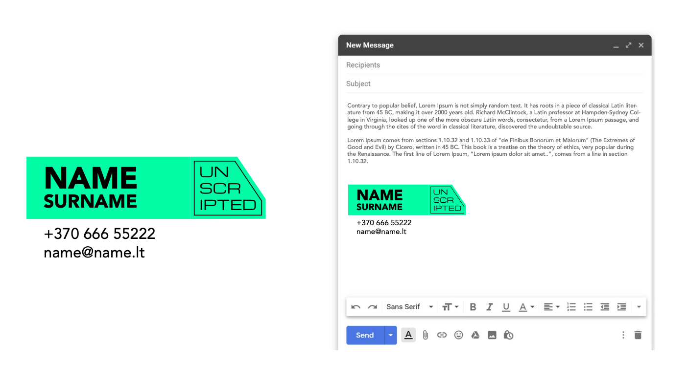
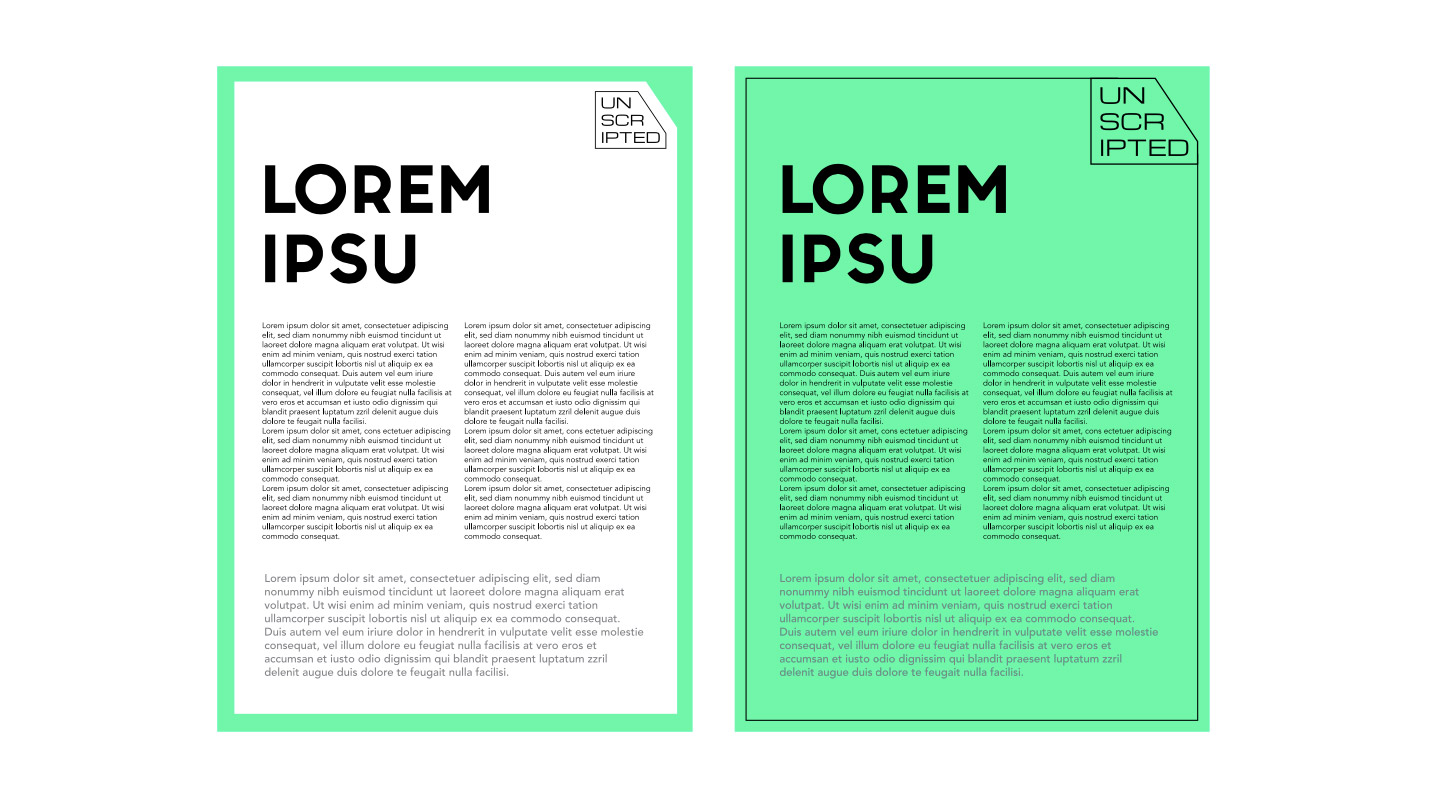
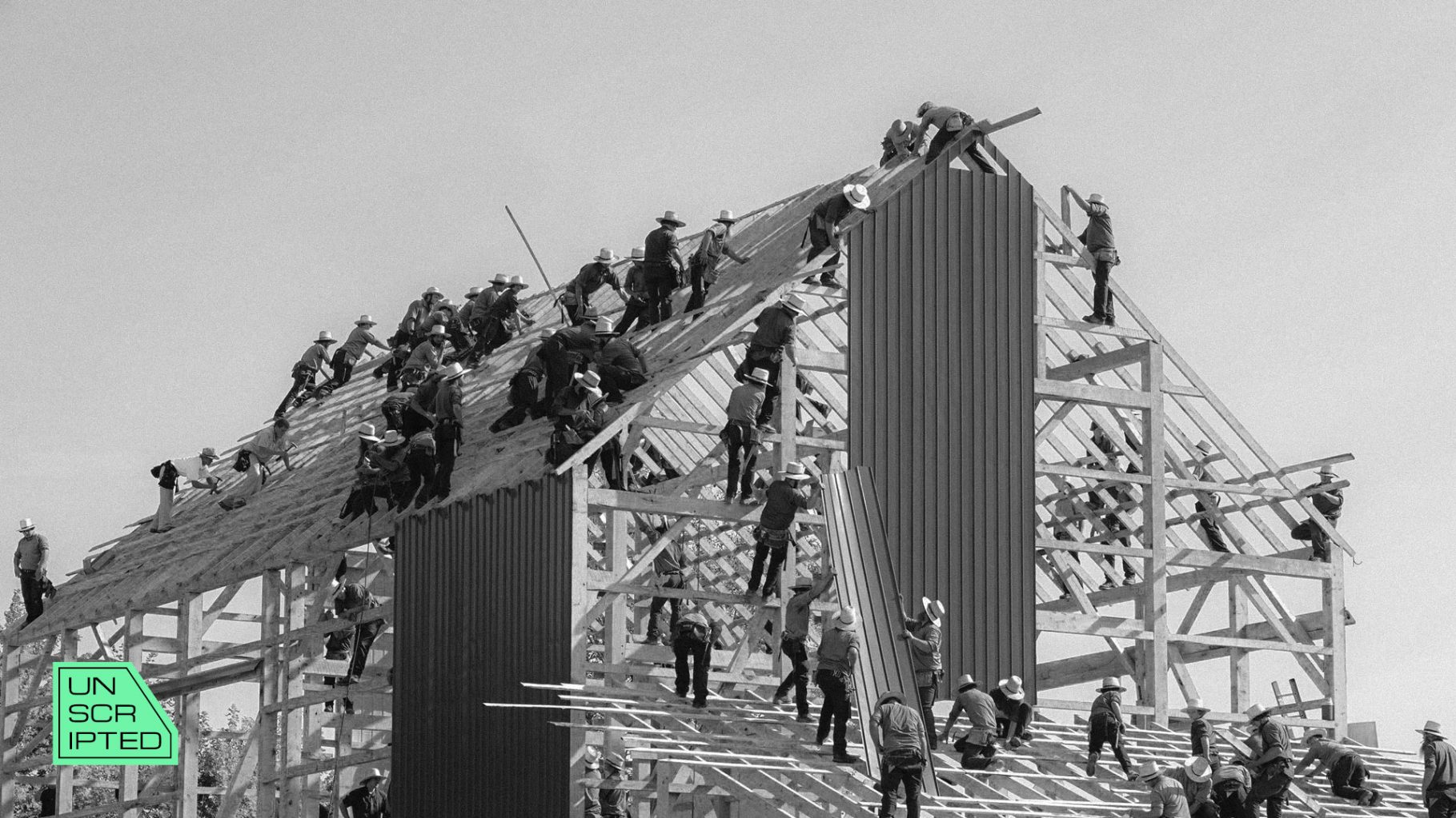
Unscripted Branding
Marios new branding for an exciting project, named UNSCRIPTED (www.unscripted.org), is an international online learning platform that unites education and an entrepreneurship community. UNSCRIPTED grows by creating engaging online programs that will help you sharpen your entrepreneurial mindset, hone your entrepreneurial skills and empower you to take your projects to the next level. Likewise, the graphic design of UNSCRIPTED helps us to focus on the essence, to become unique in the digital space, and not to stray away from what is most important.
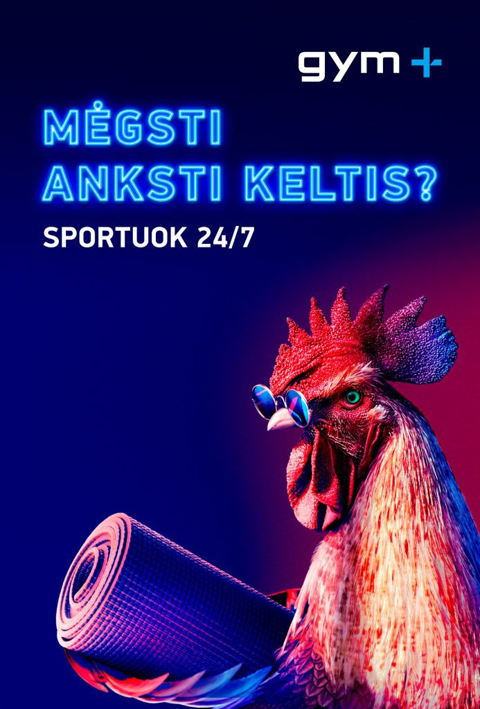
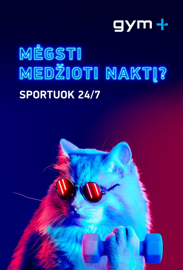
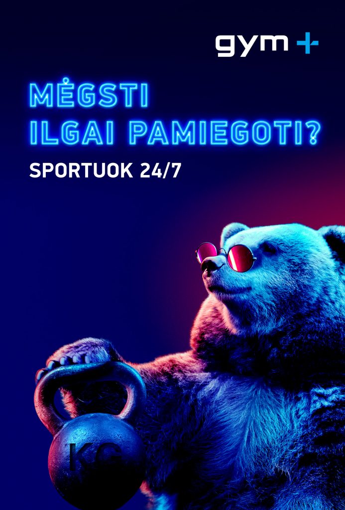
GYM PLIUS IMAGE CAMPAIGN 2022 Advertising
Are you a long sleeper like a bear? Or maybe you like hunting at night? Are you an early bird?
Whatever our characters and sleeping habits are, it is always possible to find the most convenient time for sports.
Gymplius is open 24/7.
Ethnic Diversity In Lithuania Advertising
Marios with the Office of the Government of the Republic of Lithuania is aimed at supporting ethnic diversity in Lithuania. Let’s stay united.
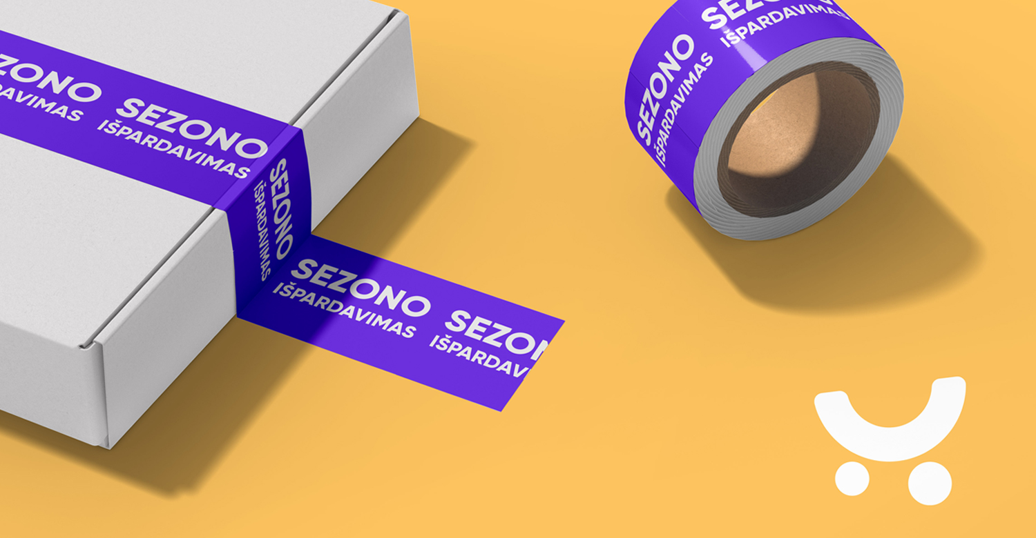
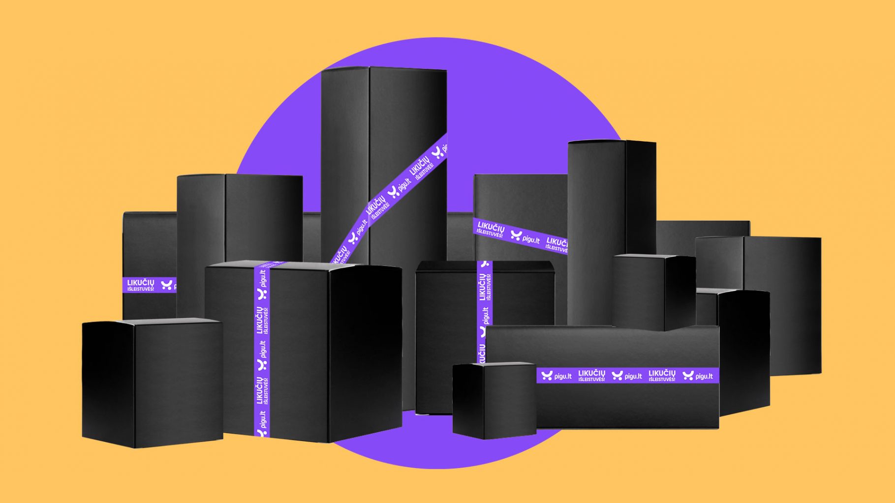
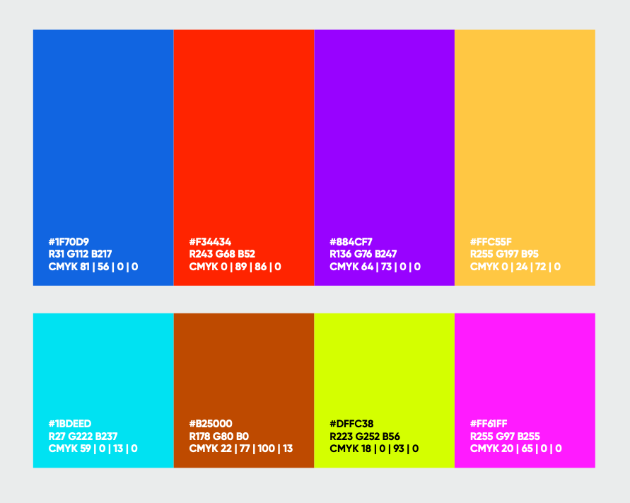
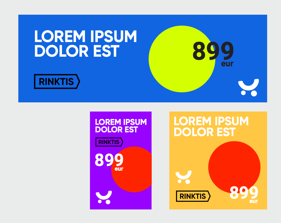
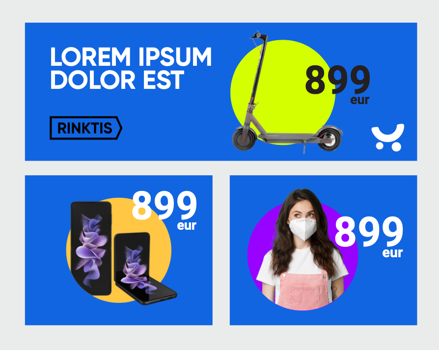
pigu.lt promo Branding
Together with the pigu.lt marketing team, we visually renewed one of the largest e-commerce brands in the Lithuanian market. We updated the brand’s colour palette and graphic design and created a unified style of promotional communication. Pigu.lt now looks far more modern, appealing and consistent.
ROMUVA CINEMA OPENING CAMPAIGN Advertising
TVC Campaign for one of the oldest cinema theatres in Kaunas, ROMUVA.
It represents the change of ROMUVA, from historical site, to inter-disciplinary art space. The idea of “Romuva” advertising campaign was the promiss of “skyrocketing“ experiences, discovering independent, experimental, contemporary films.
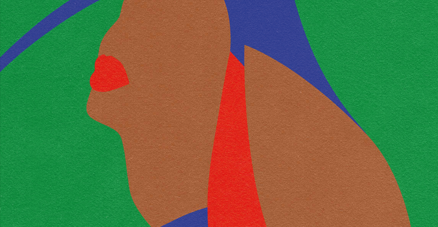
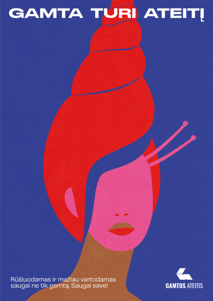
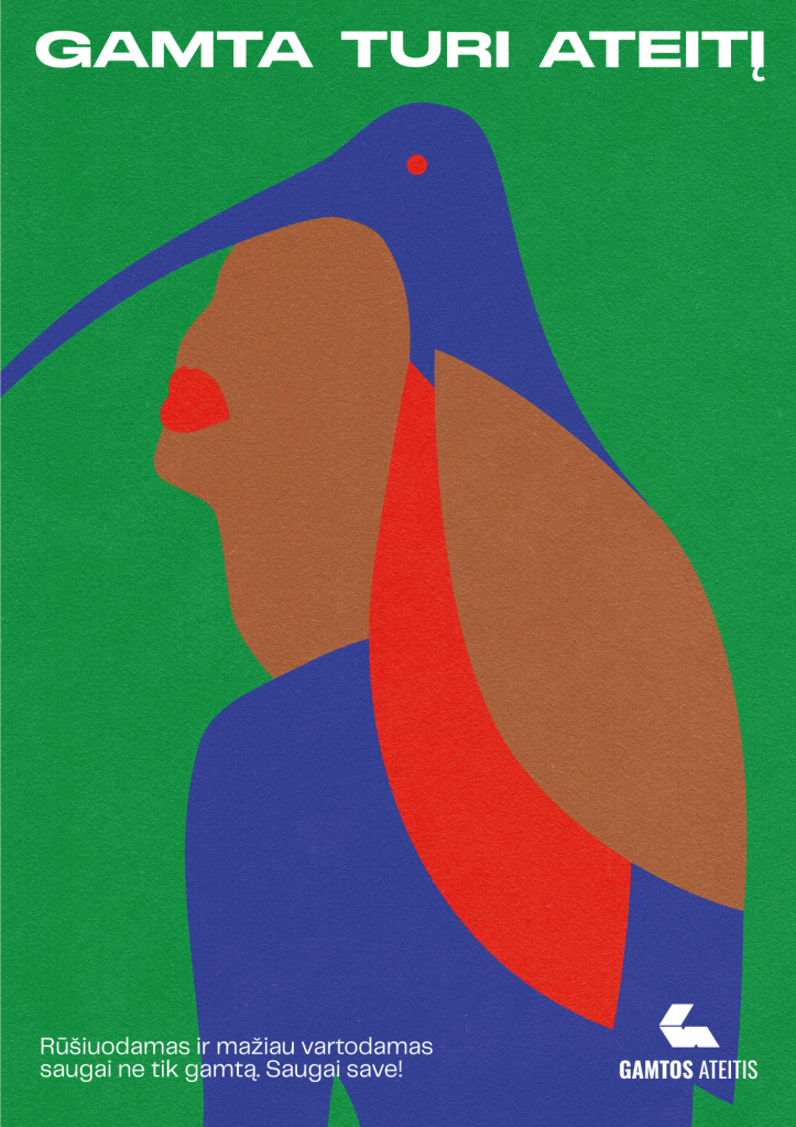
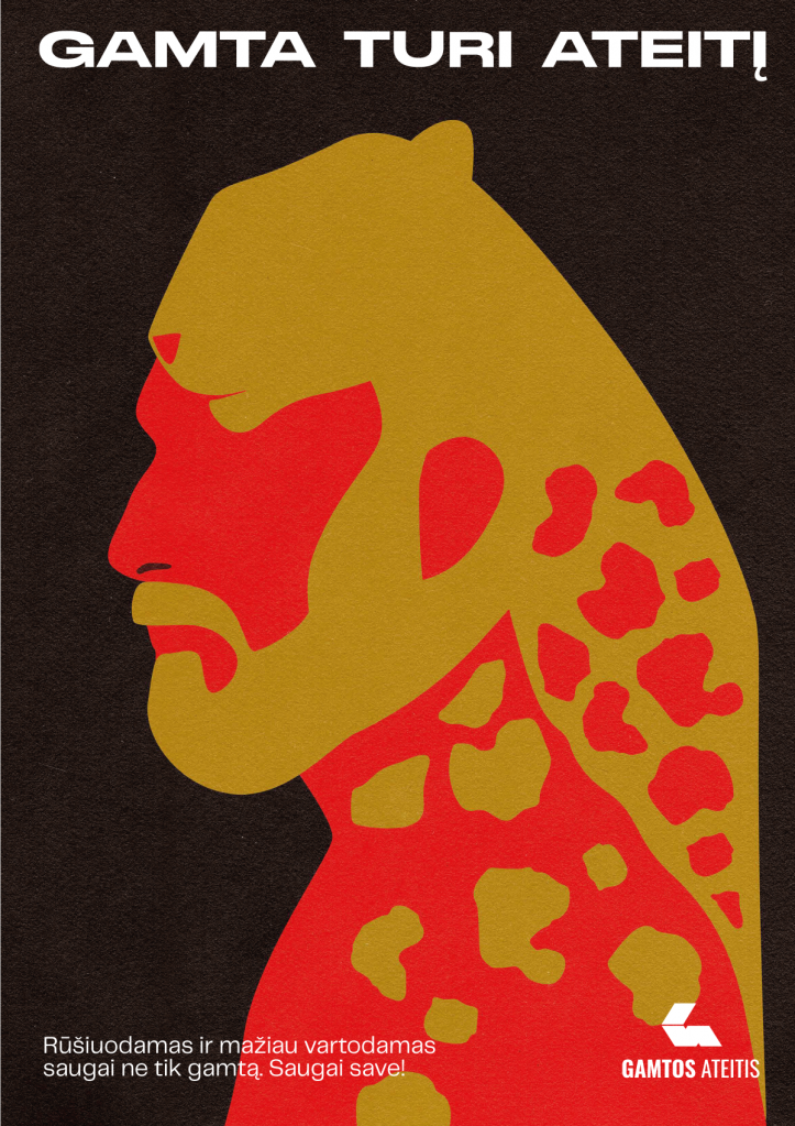
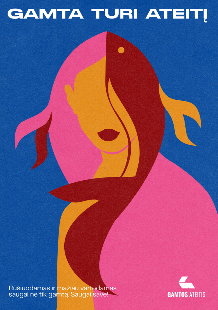
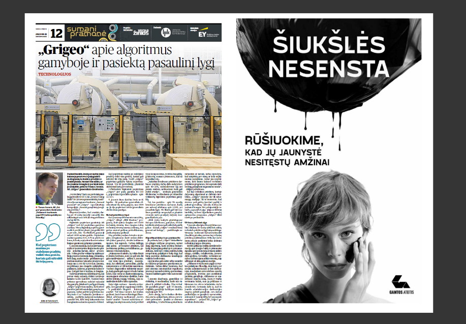
Nature’s Future OOH Advertising
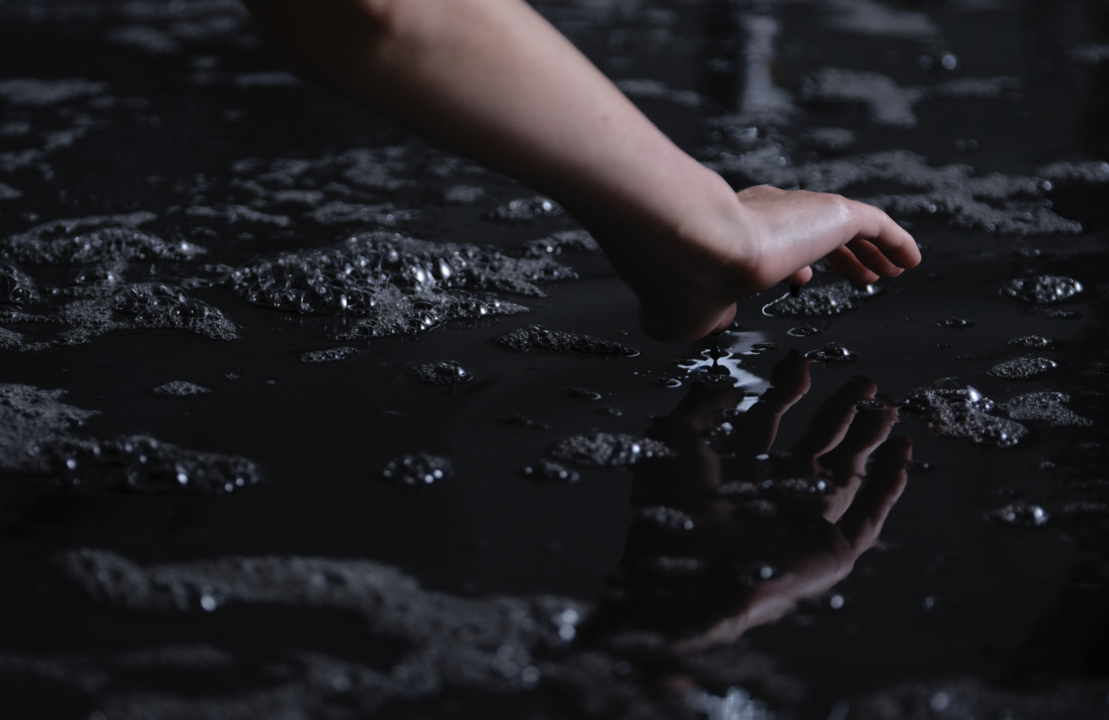
Social advertising campaign for the NGO “Nature’s Future” („Gamtos ateitis“) was dedicated to promote more conscious consumption and to fight the problem of global pollution.
The problem of pollution and over-consumption will only be resolved if it is noticed in time.
„The ship can still be turned, a catastrophe can still be avoided. Let the nature have a future!“ says the song we have created fot the video of this campaign. Recycling saves not only nature. It saves you. Says our series of posters, part of the “Gamtos ateitis” – “Nature has the future“ campaign.
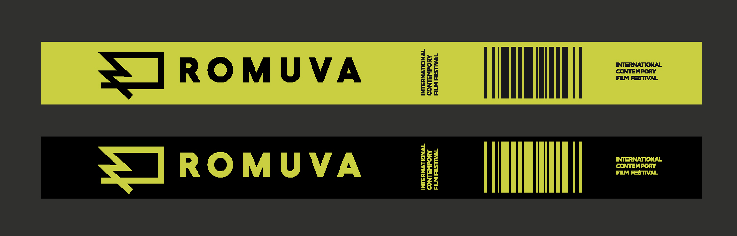
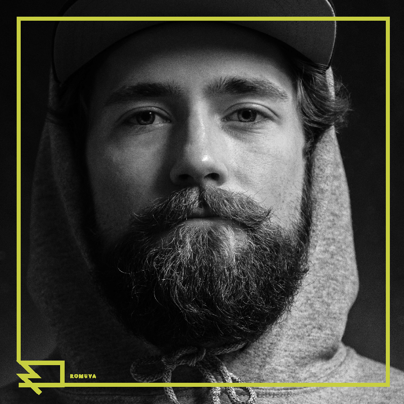
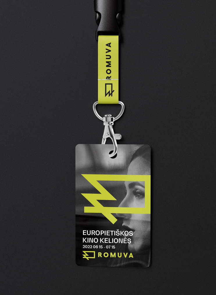
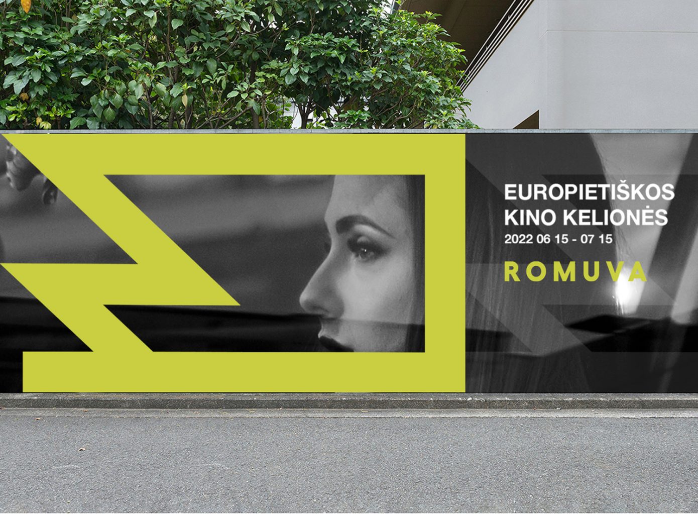
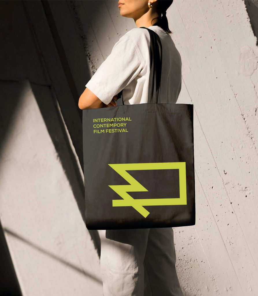
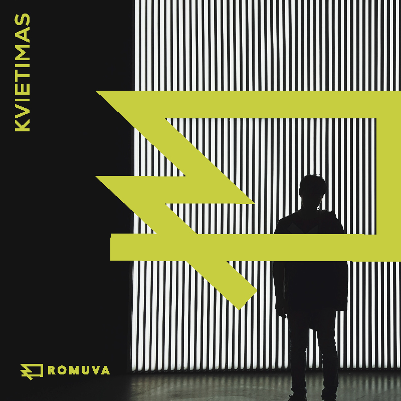
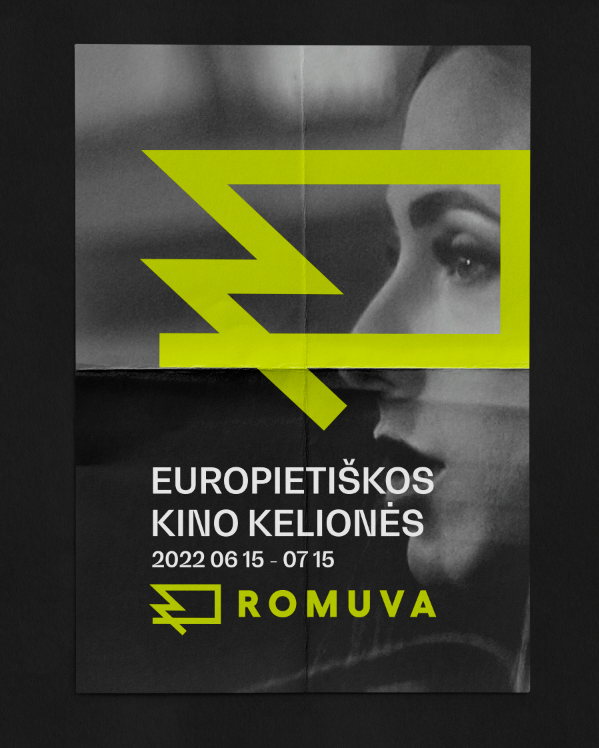
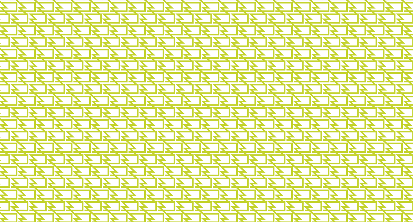
Romuva Cinema Branding
New branding for one of the oldest cinema theatres in Kaunas, ROMUVA.
This iconic, simple and timeless logo represents a symbol for film tape, the film screen and the letter “R”. It represents the change of ROMUVA, from historical site, to inter-disciplinary art space.
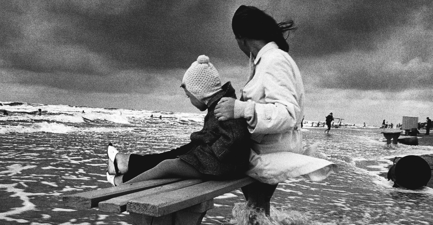
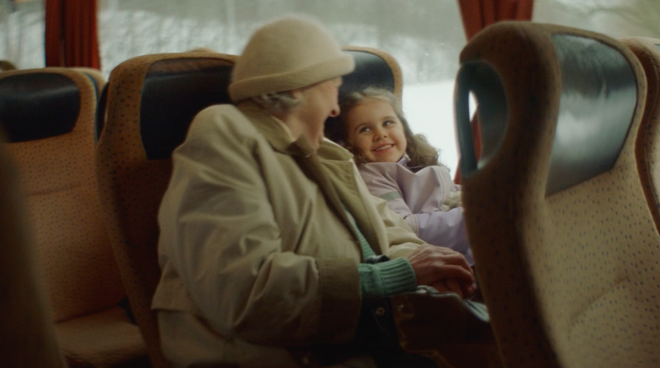
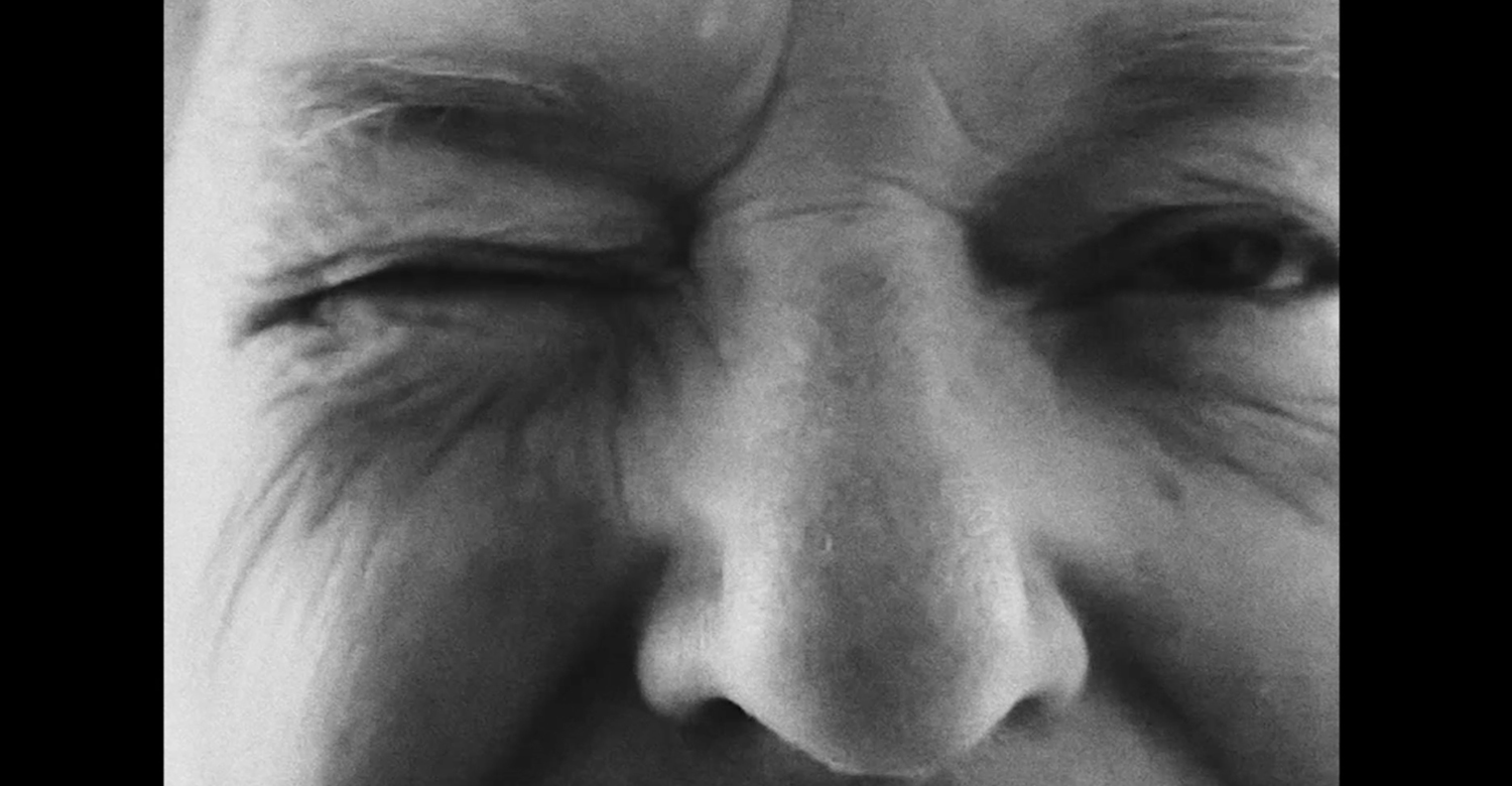
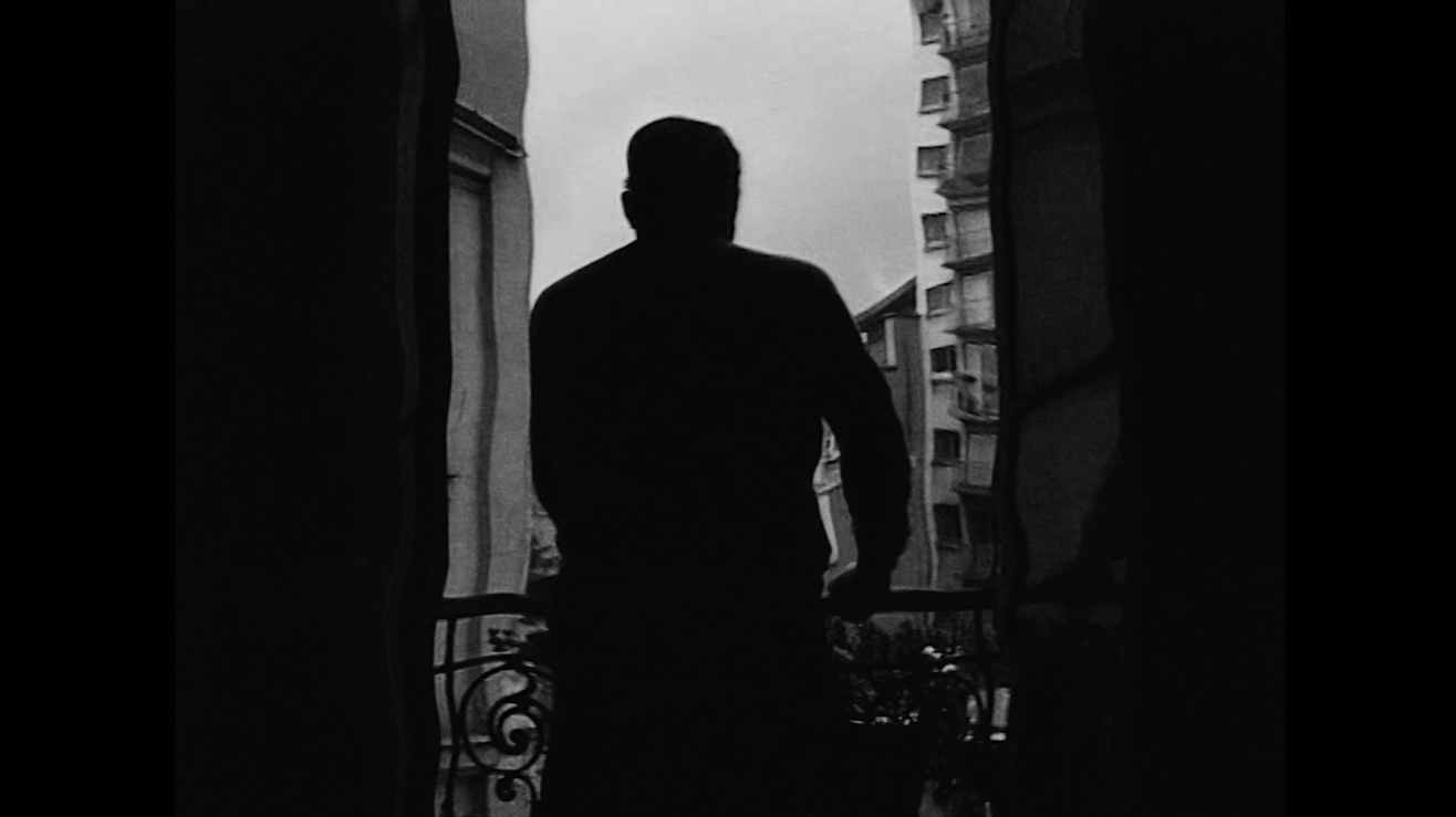
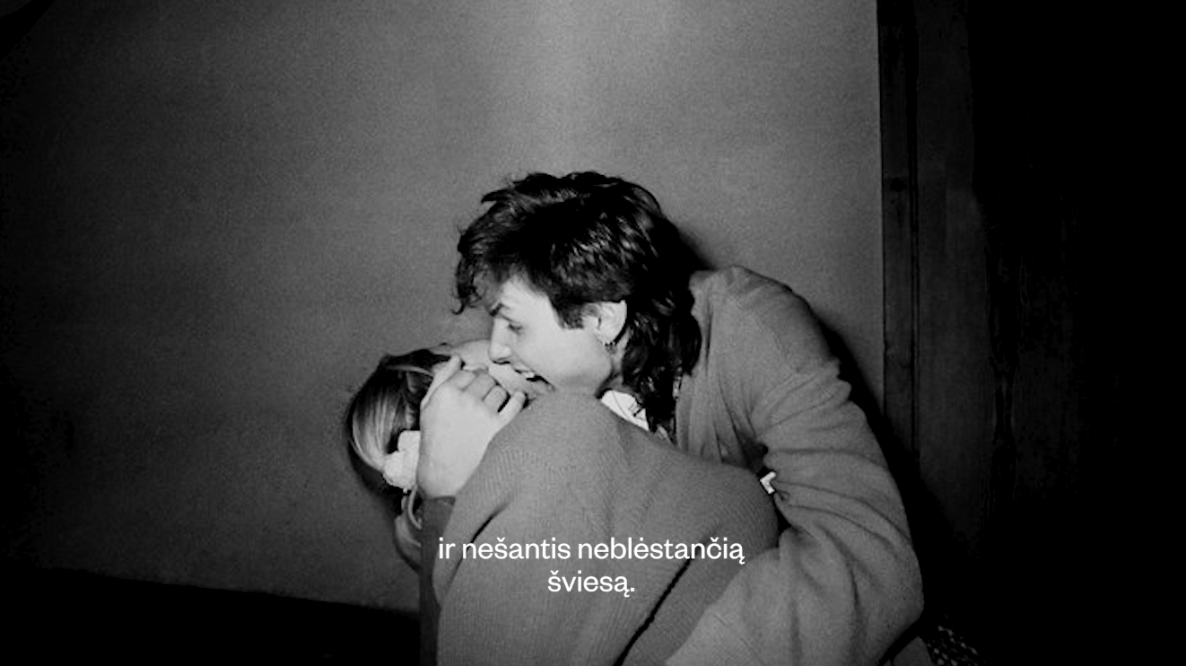
Order of Malta FUNDRAISING CAMPAIGN Advertising
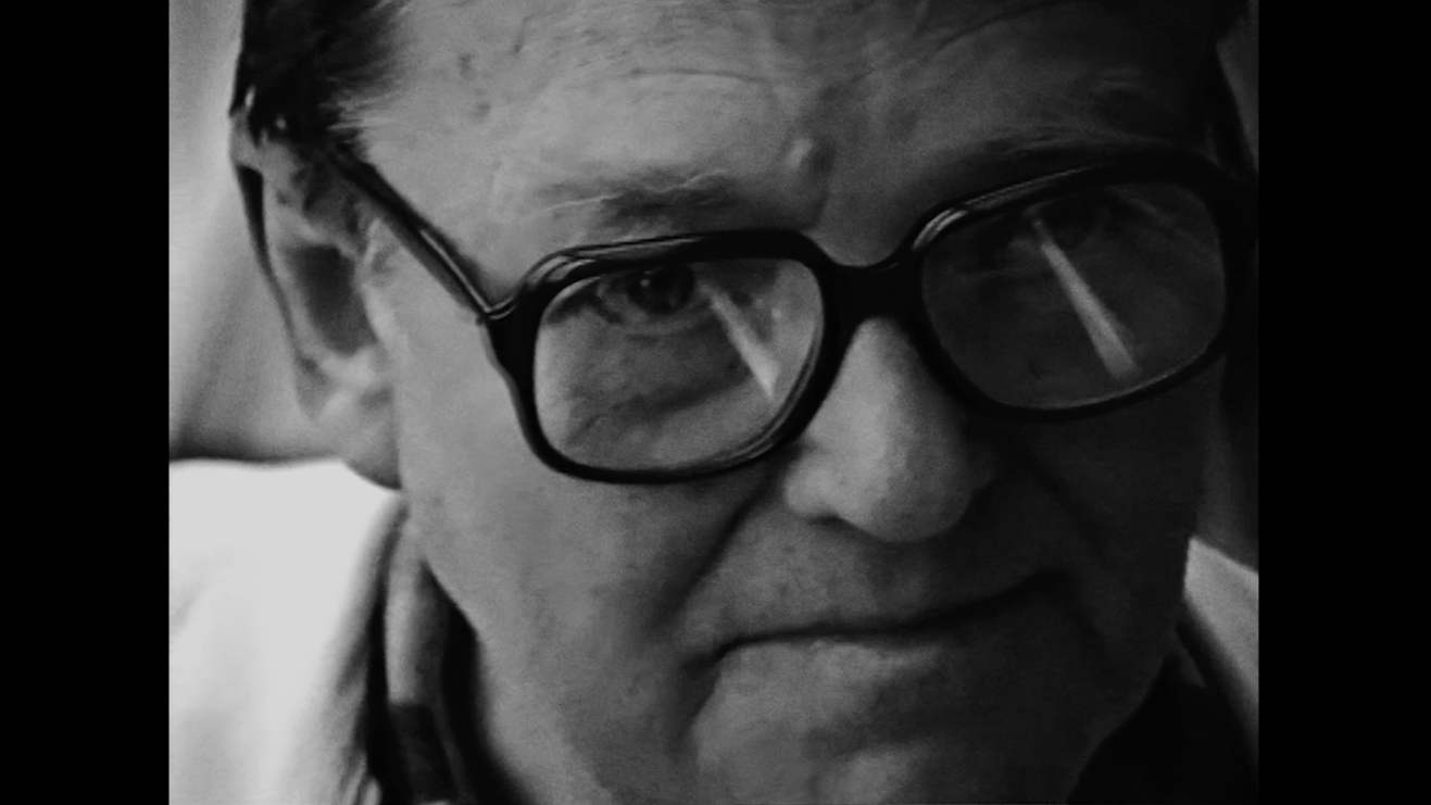
Order of Malta charity service is dedicated to the oldest generation of our society. Not only to the elderly in need, but to all who feel lonely and emotionally abandoned. The purpose of this campaign is fundraising for elderly care homes to offer financial support, organised by an international charity.The main message is that all the elderly are ours, they are our grandparents — “None of the elderly should be left alone”. Special thanks to the greatest Master of Lithuanian photography, Antanas Sutkus (Antanas Sutkus foundation) for the collaboration; and to the Lithuanian ‘Henry Bresson’ for donating an original, chrestomathic photography piece of art for this campaign.
G9 SPRING CAMPAIGN Advertising
Our 100% fashion experience in the latest outdoor&digital campaign for shopping mall “G9”. This minimalistic, yet emotional approach, like a breath of the fresh air, makes the spring feel better and the sales shopping for the new season, even more exciting.
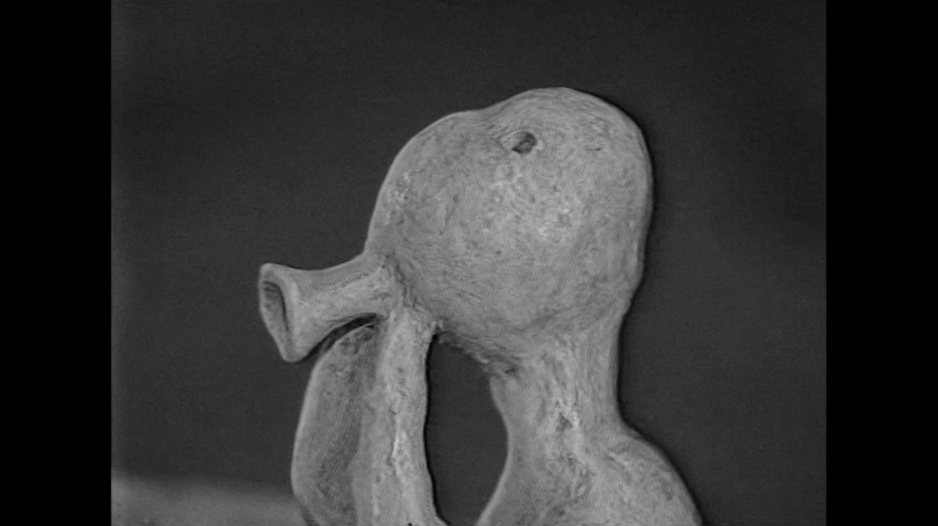
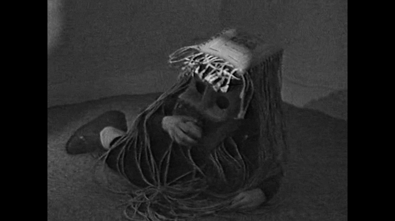
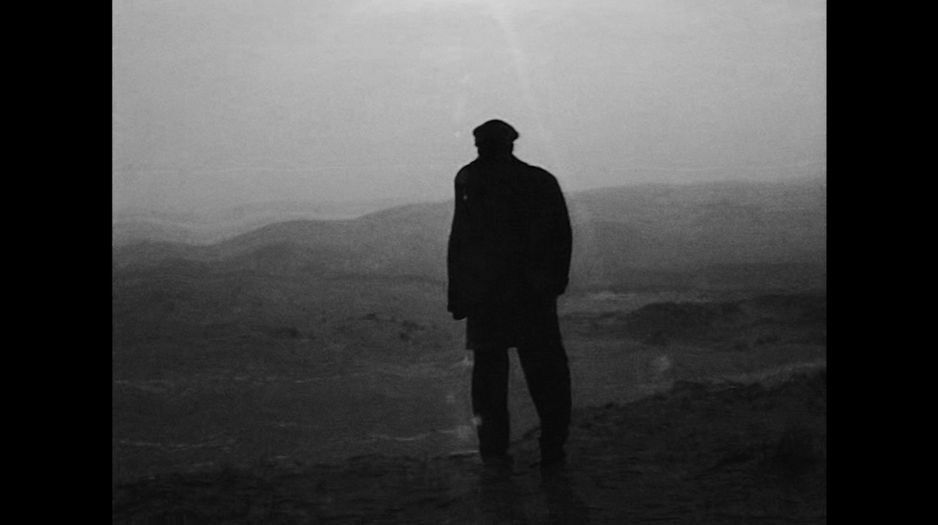
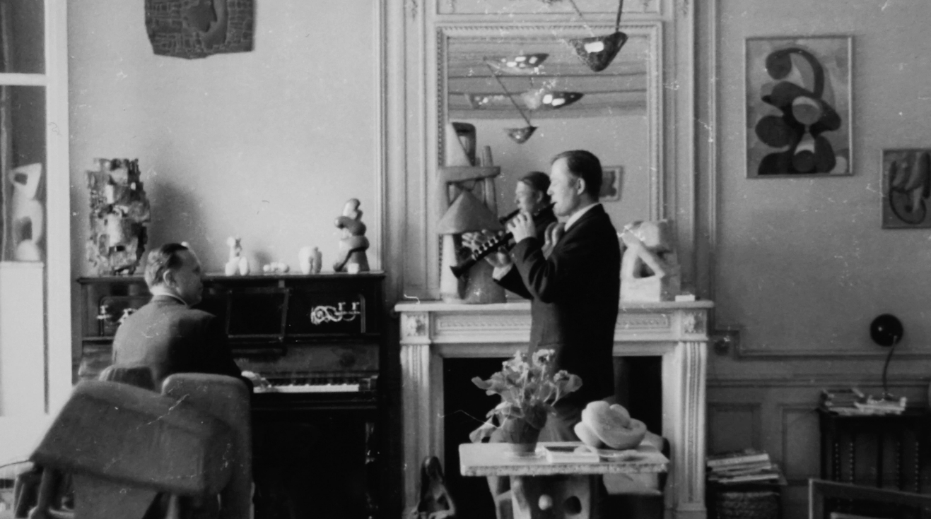
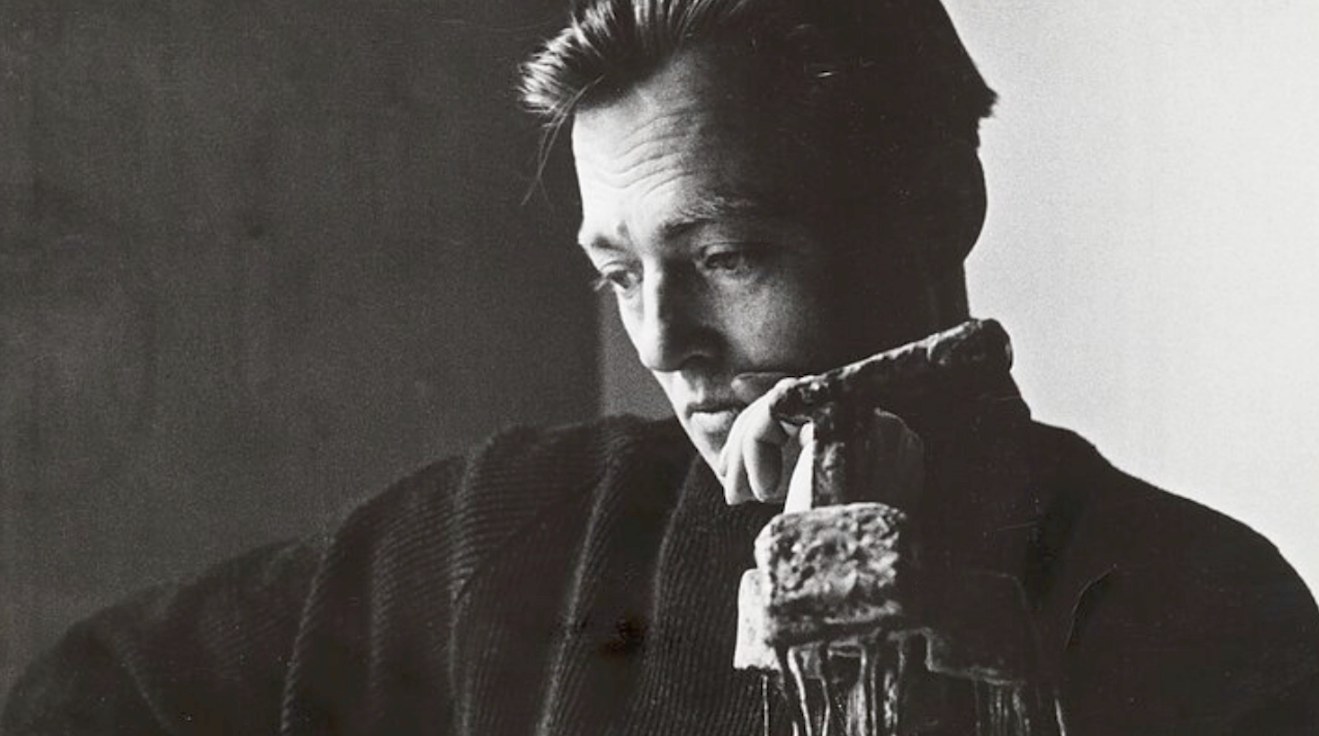
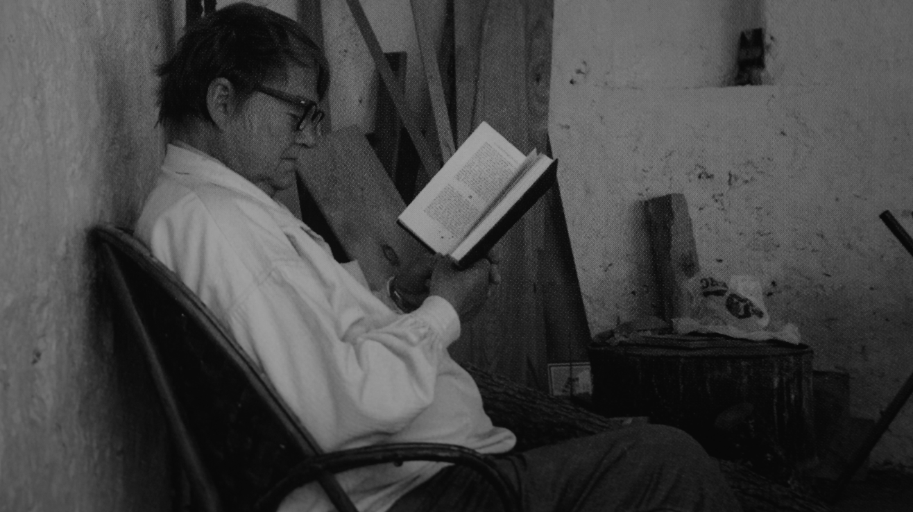
My Father Antas by Jean-Christophe Moncys Book FILM Advertising
We created a TV film to present a book of memories called: “My Father Antas” by Jean-Christophe Moncys. The book explored the life of the talented Lithuanian, modernist sculptor, Antanas Moncys. A Paris-based artist, and one of the most outstanding personalities in the XX centuary of the Lithuanian art field. Our idea was to show authentic video material as reflections in a water, a subtle metaphor for memories and time. This visual solution also creates real emotion, reflecting the sensitive and clear memories a son has about his father.

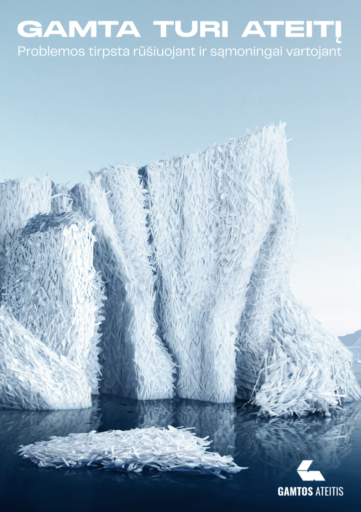
Nature’s Future Print Campaign Advertising
The idea of this campaign is to make us believe, to accept the problem more personally and to take action – recycle. It’s optimism, the true belief that the future scenario can be good, that climate change catastrophes can be prevented, and that pollution can be tackled as much as possible. After all, it all depends of our small steps. It’s positivity we need the most, in such a negative context of climate change, planetary pollution. We need to talk about more conscious consumption in an optimistic, inspiring and bright ways. In our day, when there is so little faith in the bright scenario for the future of our planet, it is very important to say out loud and boldly: I do believe that everything can be changed for the better.
National vaccination campaign Advertising
The second year of the COVID-19 pandemic. Part of the society is already vaccinated. The rest of it, mostly in the province, is not. Despite how grave the COVID-19 situation is at the hospitals. Intimidation doesn’t work anymore. Official communication is dry and ineffective. The biggest challenge is – a very specific audience. Who is not yet vaccinated, in the second year of the pandemic? When all types of vaccines are available to everyone? In fact, a less educated and risk-averse segment of society.
The province. Skeptical and distrustful… All kinds of rebels… …interested in everything, but vaccination. All of them have something in common: they are competitive and hate to be the ones, left behind. Nobody has to be the last. Especially in vaccination. Results: regional numbers of vaccination increase… and, hopefully, a happy end to the pandemic.
G9 CHRISTMAS CAMPAIGN Advertising
Our fashion photography experiment inspired by Bauhaus aesthetics, Christmas campaign for shopping mall G9. With „hande made“ and playfull aproache to fashion. To make you enjoy the best Christmass sales and help You to find THE dress for the New Years Eve!
Gamtos Ateitis Film Advertising
Social advertising campaign for the NGO “Nature’s Future” („Gamtos ateitis“)was dedicated to promote more conscious consumption and to fight the problem of global pollution.
Aren’t we all experience the lack of confidence, that we can change something for real? There is a lot of talking about “what” to do, instead of “why”. The idea of this campaign is to make us believe, to accept the problem more personally and to take action – recycle. It’s optimism, the true belief that the future scenario can be good, that climate change catastrophes can be prevented, and that pollution can be tackled as much as possible. After all, it all depends of our small steps. It’s positivity we need the most, in such a negative context of climate change, planetary pollution. We need to talk about more consciou
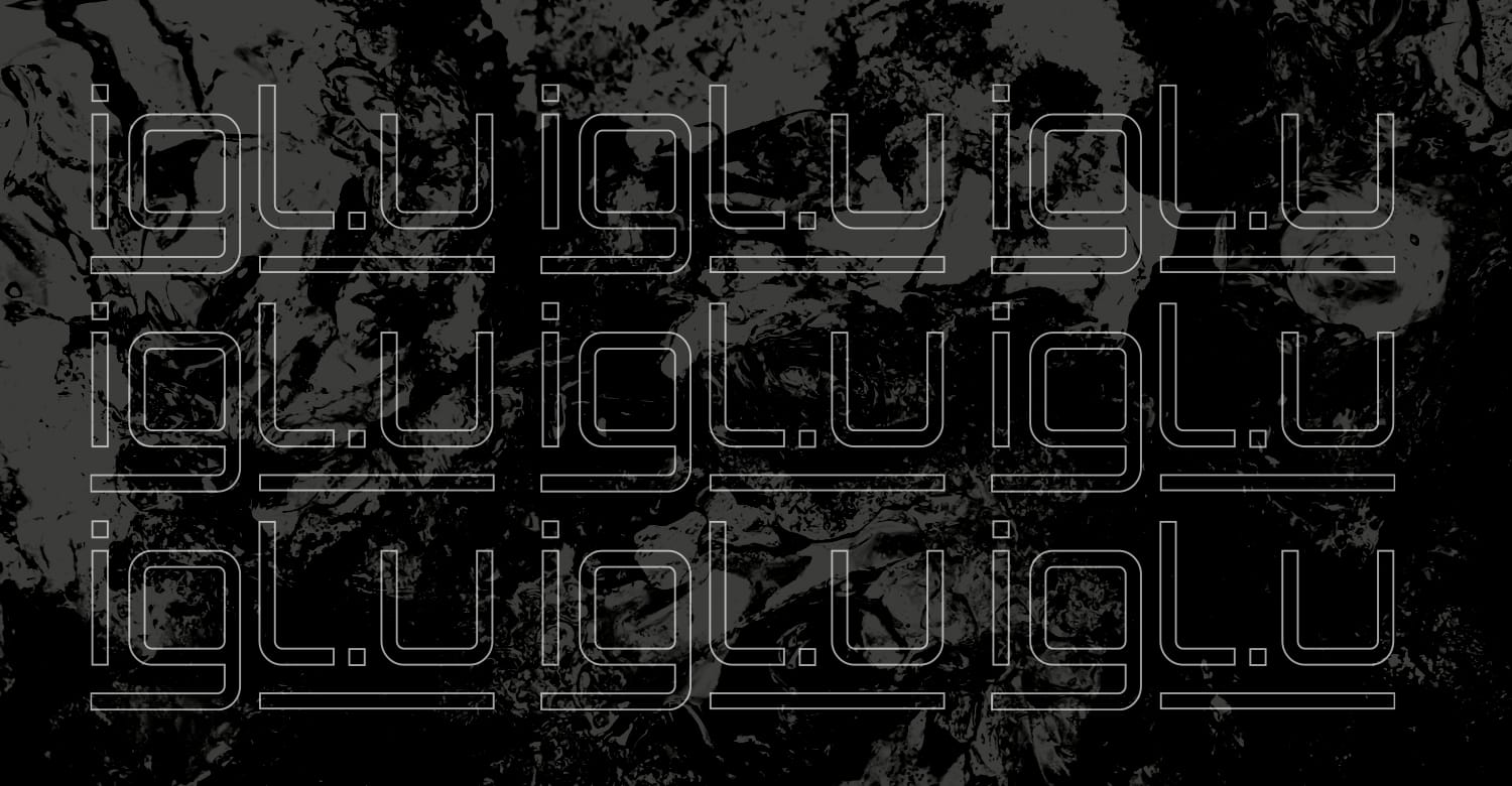
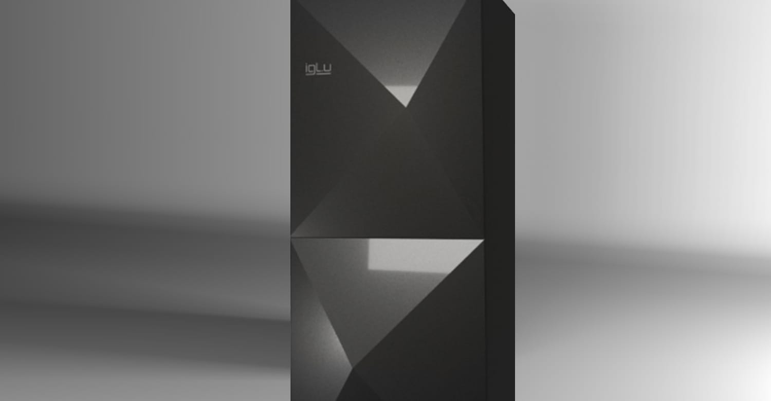
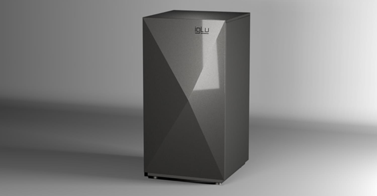
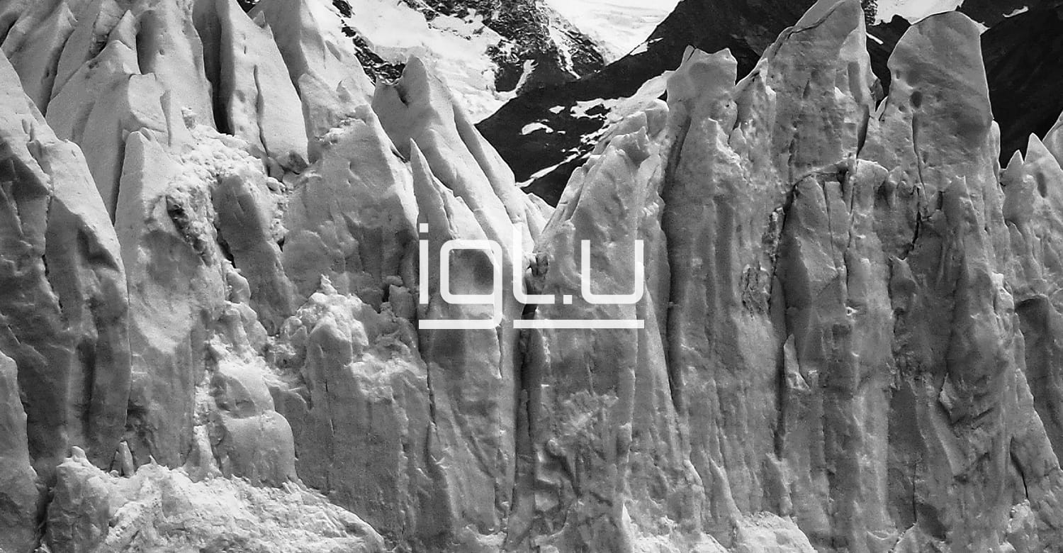
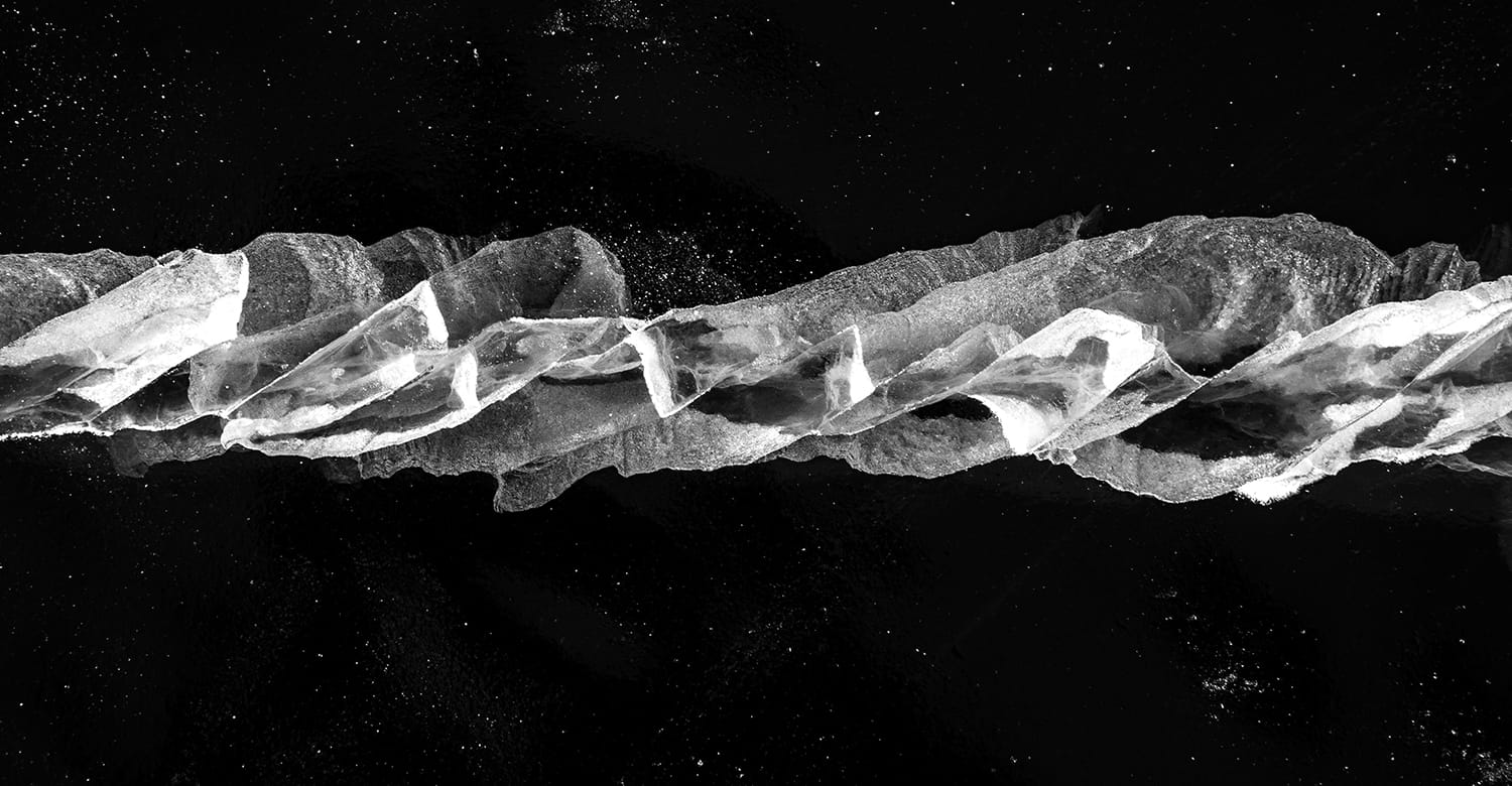
IGLU PUMPS PRODUCT DESIGN Branding
Climate change no longer raises the question of the inevitably growing demand for sustainable products that keep the house cool. MARIOS contributed to the birth of one such product – IGLU, a new generation of geothermal pumps. We had a rare opportunity to create not only a brand (brand strategy, name, logo design) but also the design concept of the product itself. The volcanic rock or ice crystal shapes of the product facade were inspired by the name of the product we created – IGLU. Igloos are ice lodges of northern nations that provide warmth and coolness at the same time.
Logo design is an original interpretation of geothermal energy, connection and flow.
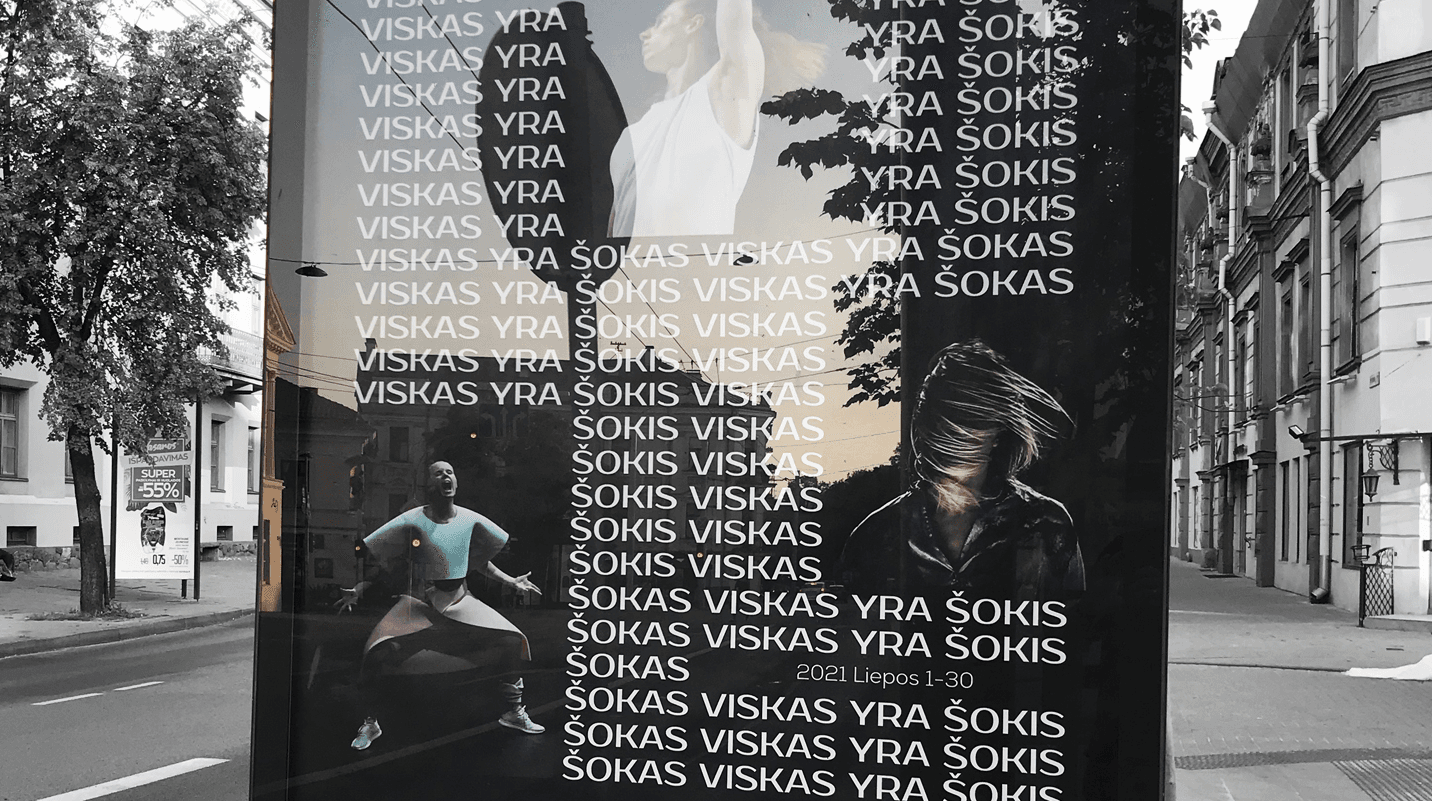
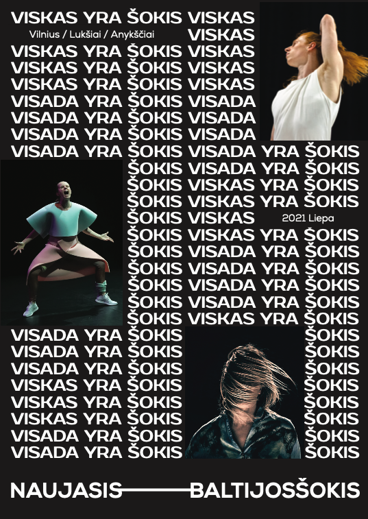
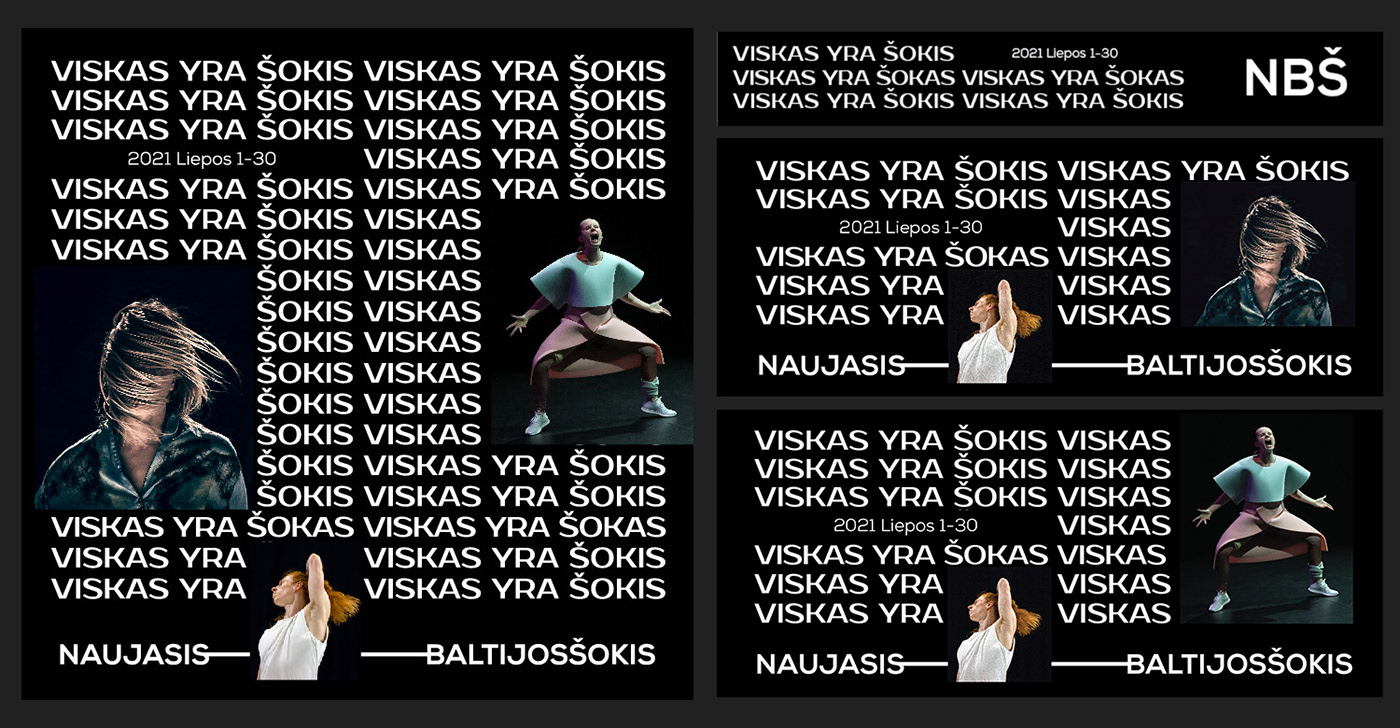
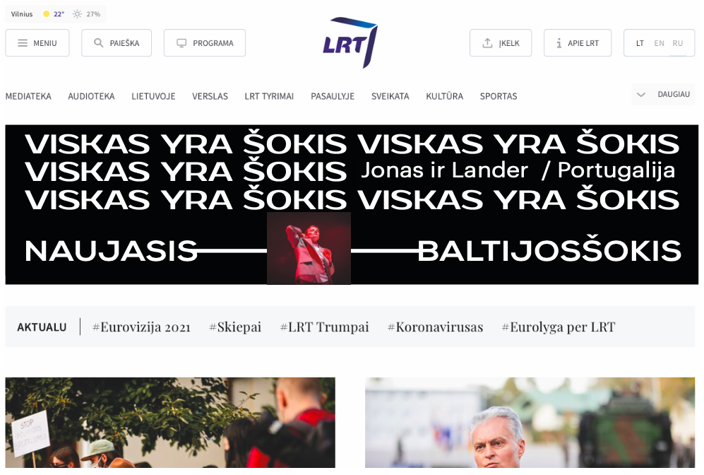
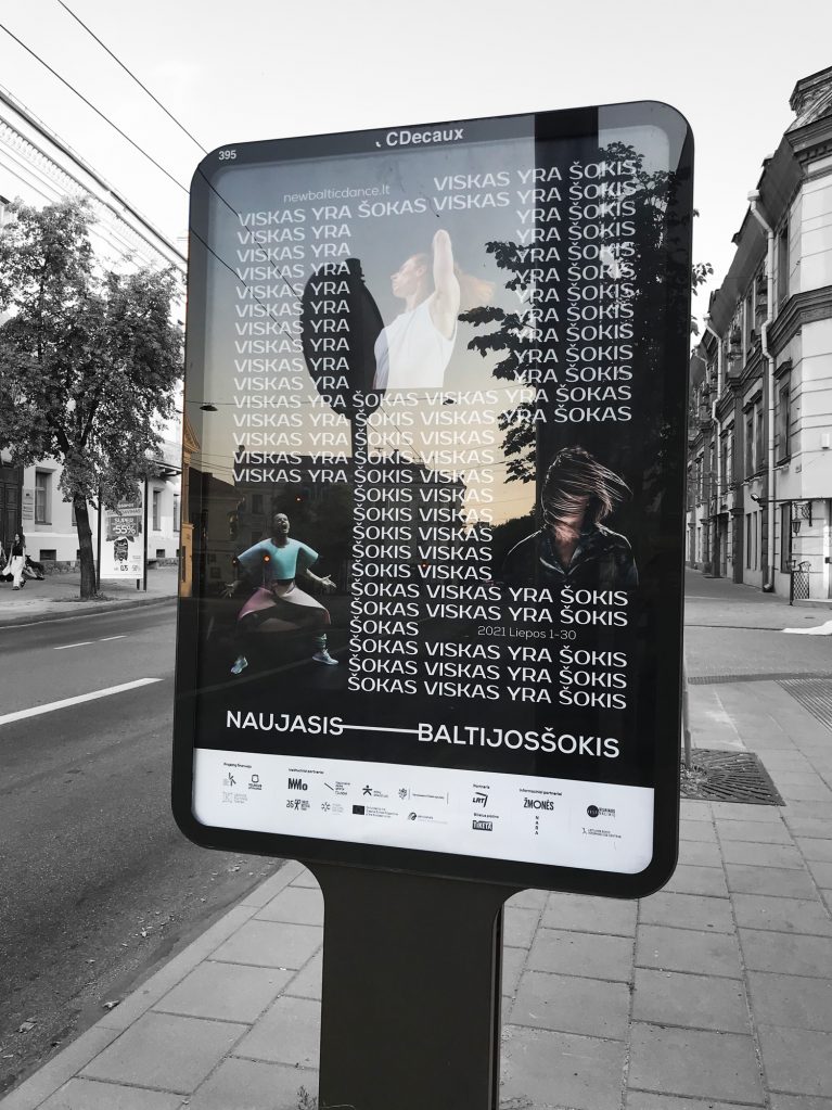
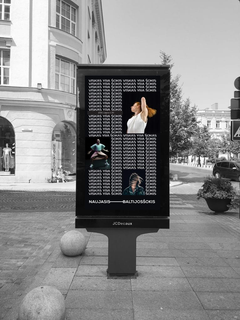
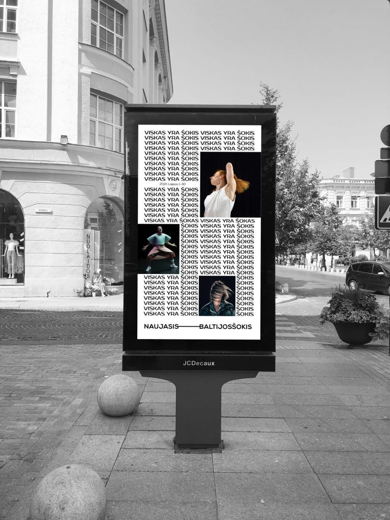
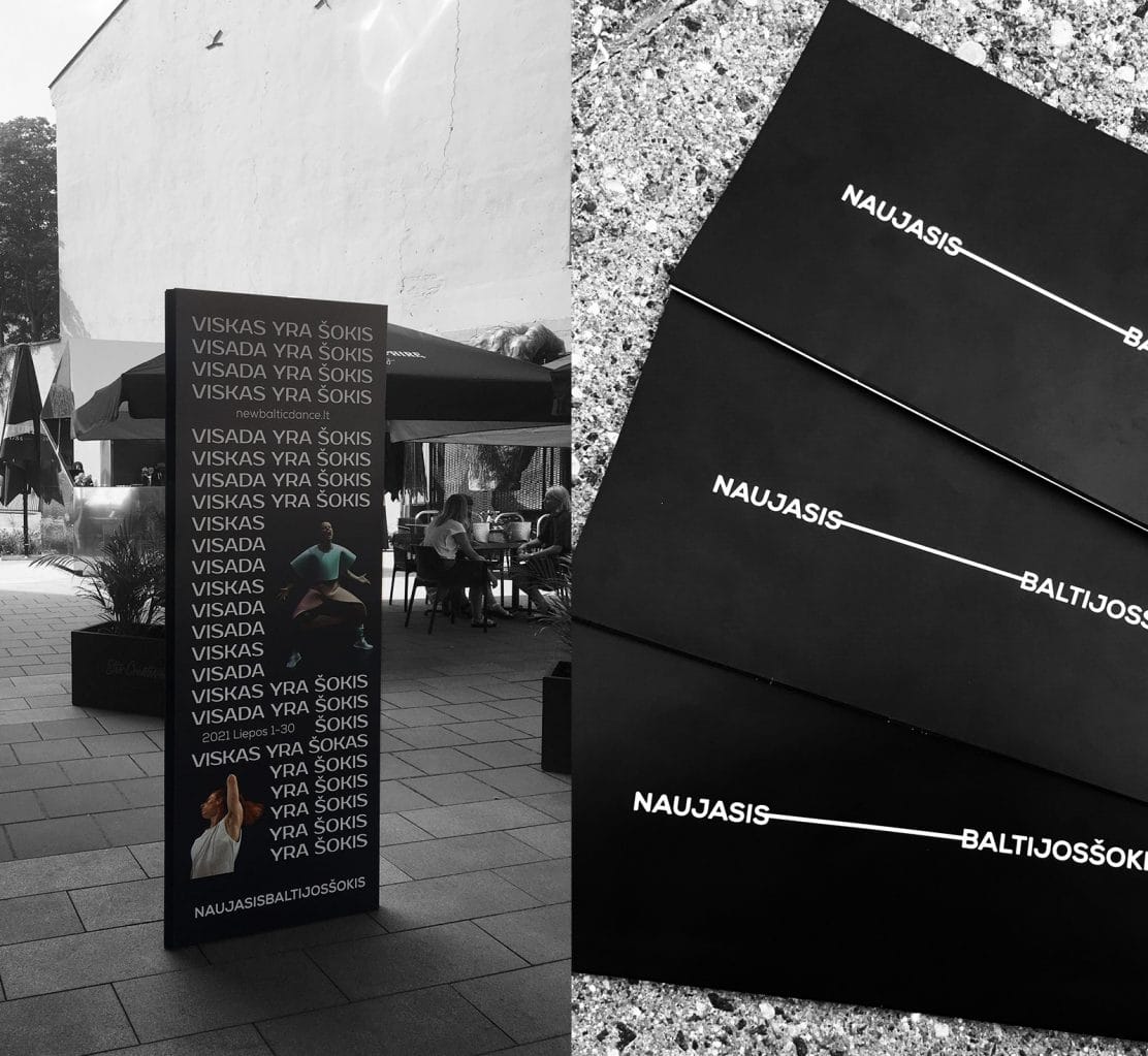
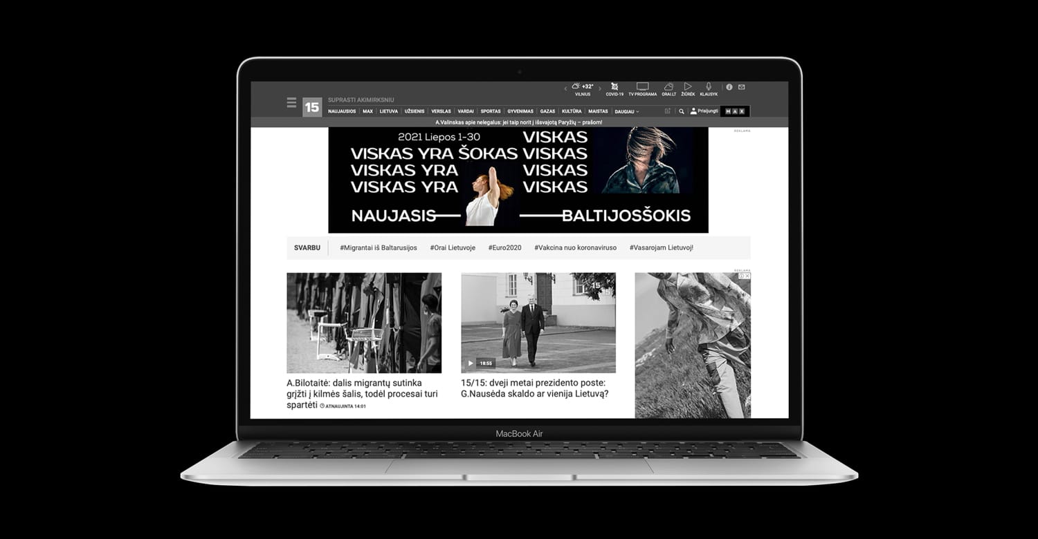
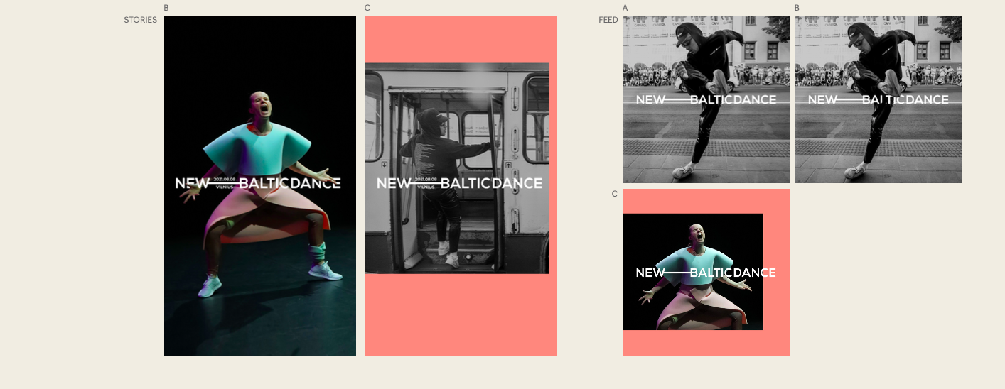
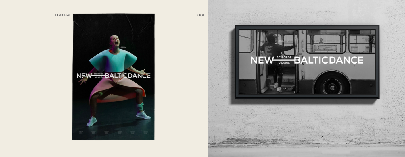
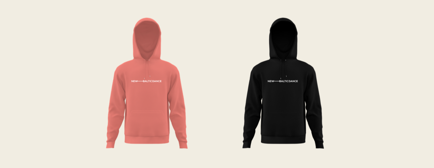
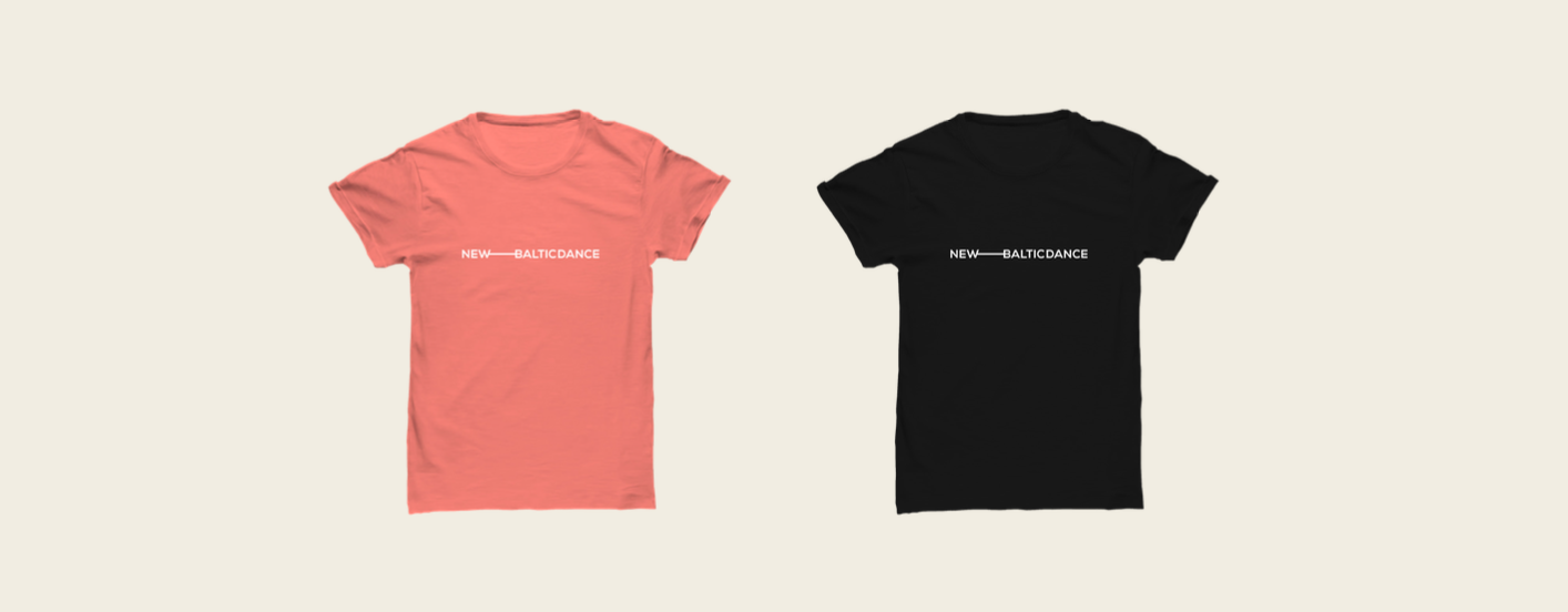
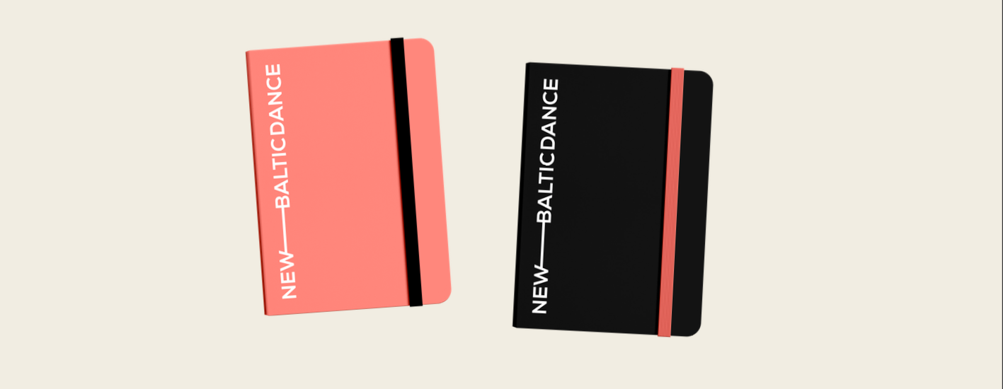
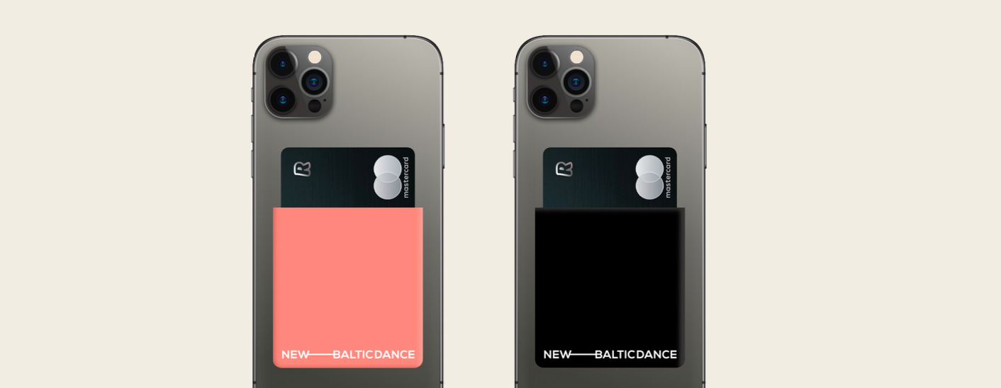
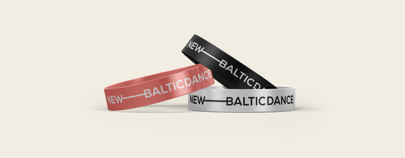
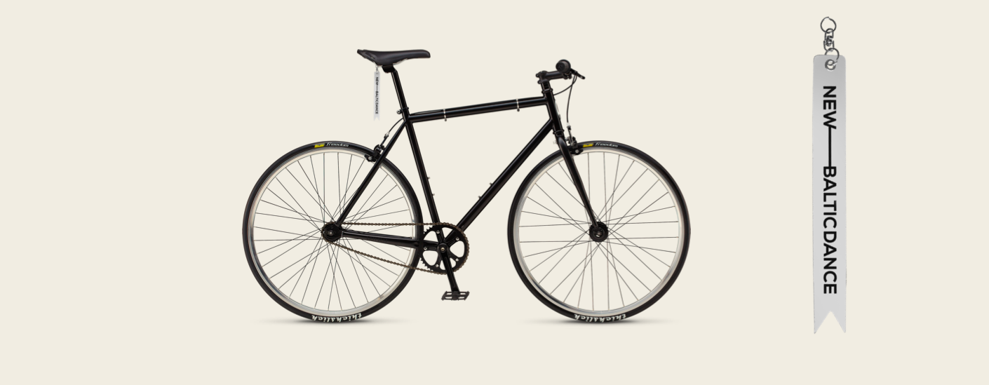
NEW BALTIC DANCE FESTIVAL 2021 Advertising
It was an impressive opportunity tu us, to give a new, progressive look for one of the largest dance festivals in Europe. By creating this dynamic logo, we were inspired by the main idea of contemporary dance, to create a scene where you are. Our logo moves and transforms the space around itself, everywere it goes. Conceptual, typography based ad campaign has complemented the launch of NBD new look. The wordplay between Lithuanian words “šokis“(„dance“) and „šokas“ („chock“) made the real „dance“ in a graphic design od the posters and digital outdoors, launching the new, wordplay based, slogan of the festival: VISKAS YRA ŠOKIS. (Everything is the dance. Everywhere is the dance. There is always the dance).
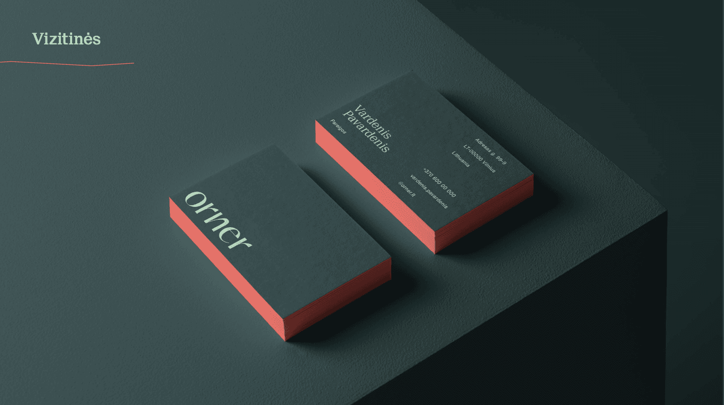
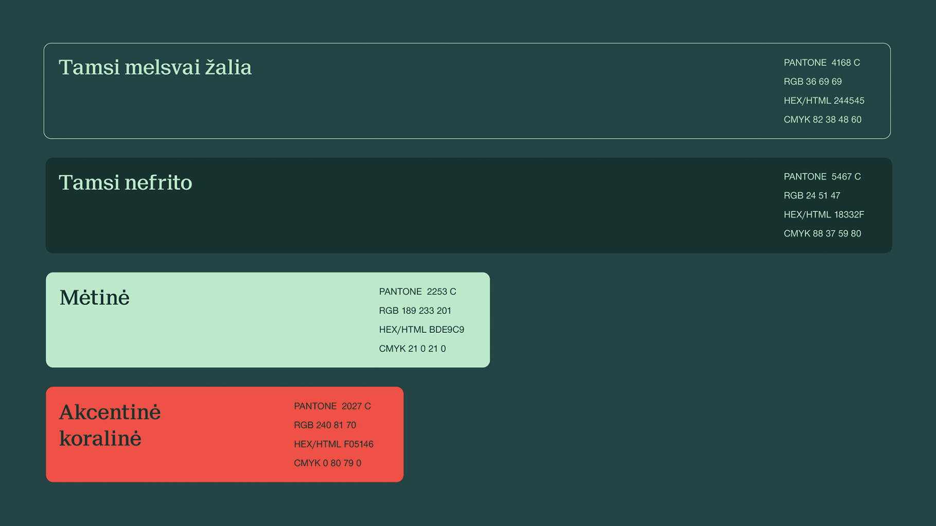
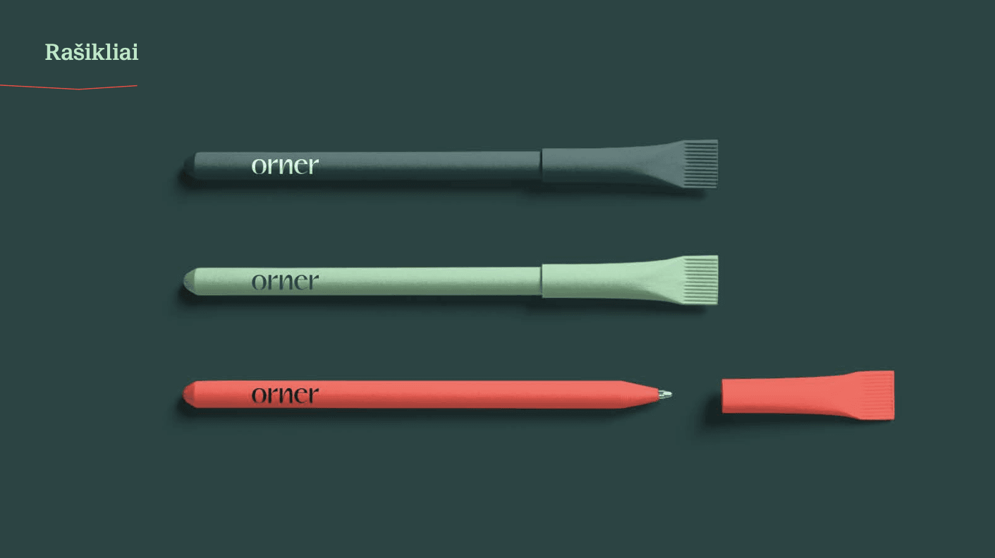
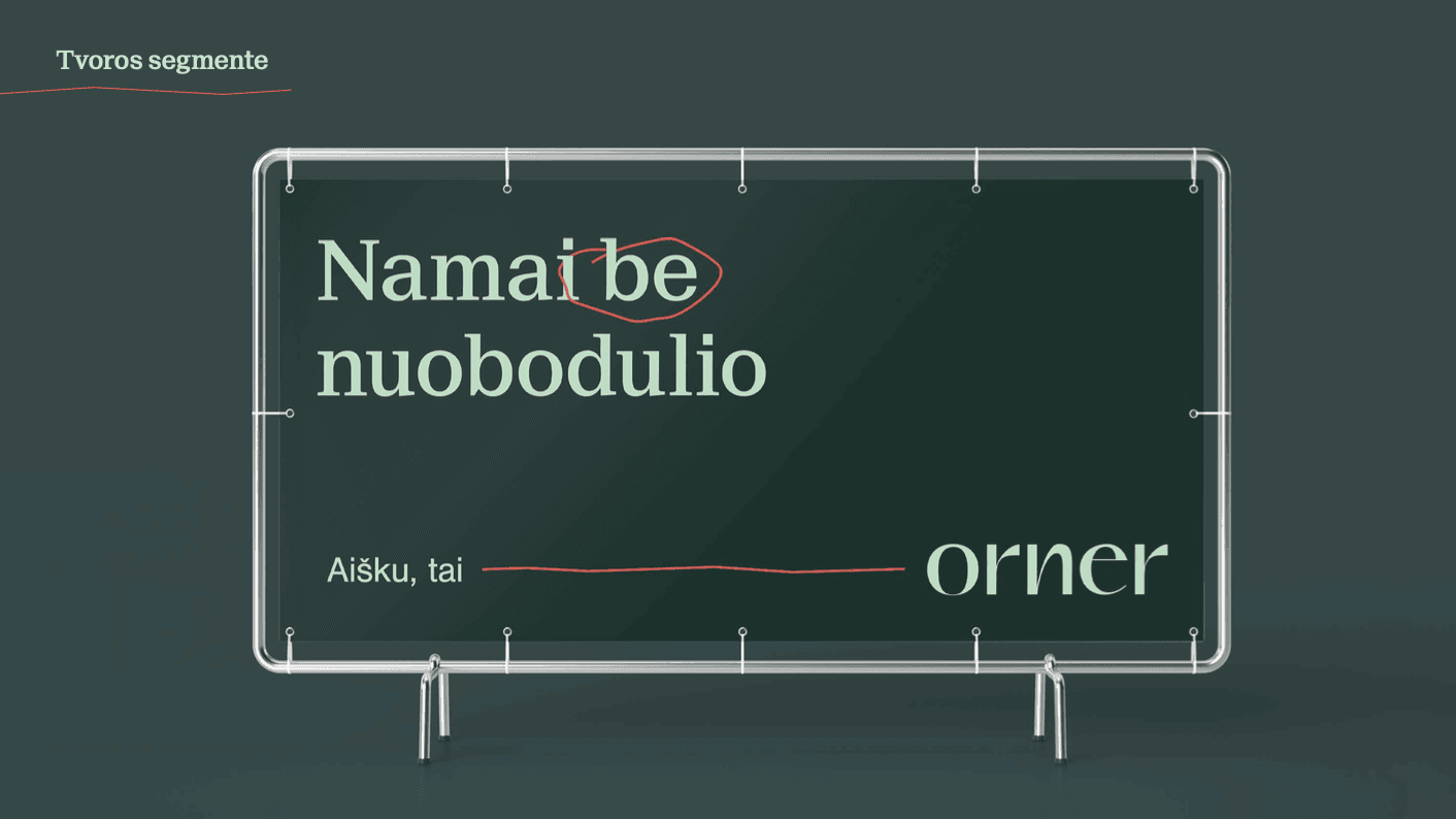
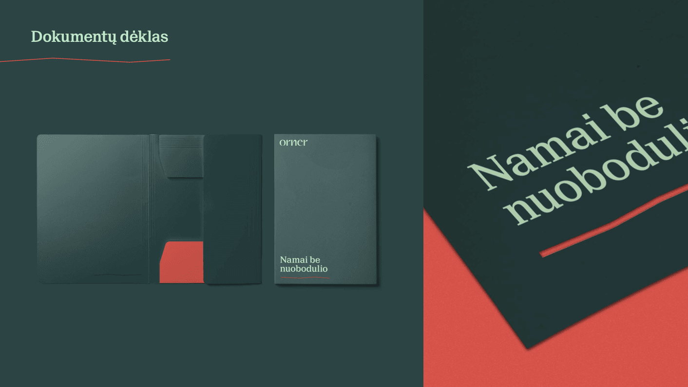
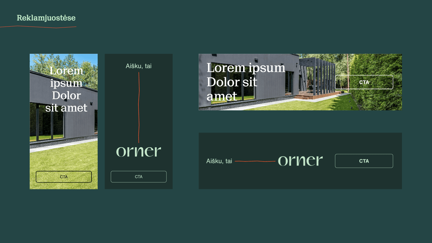
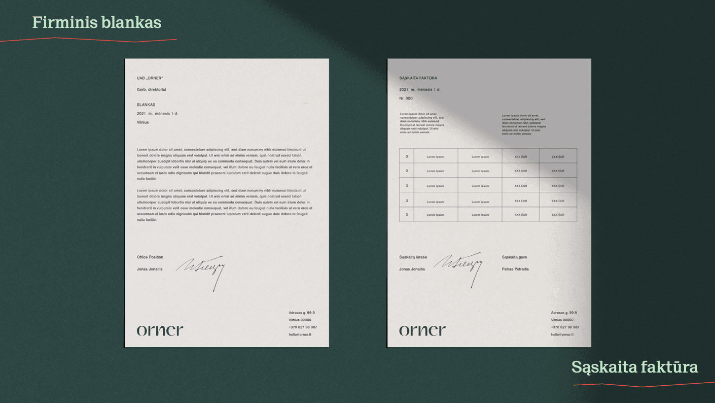
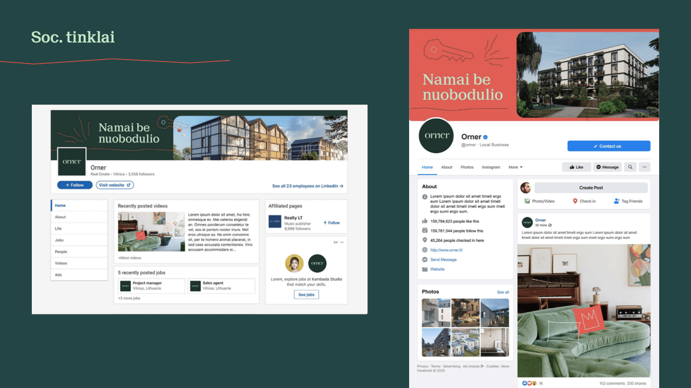

Orner Branding
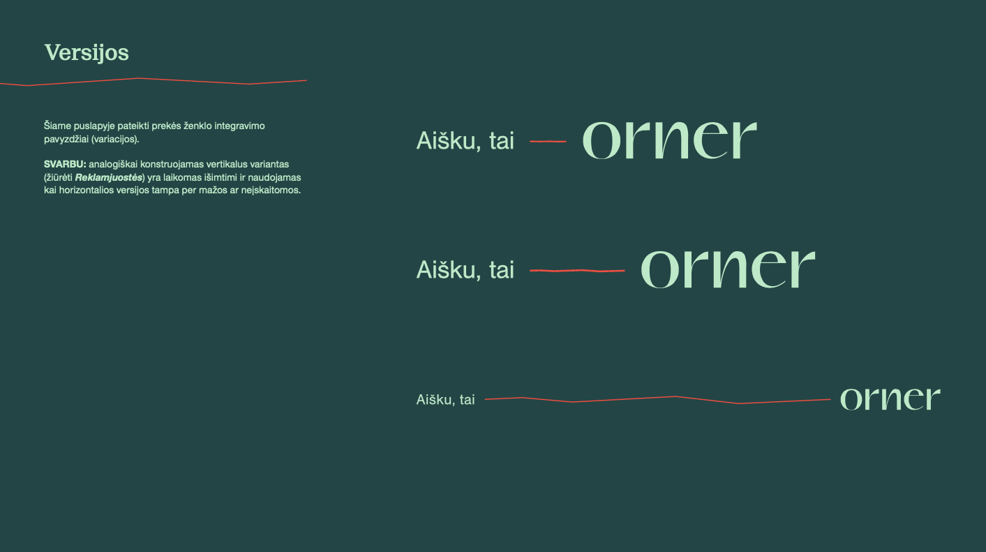
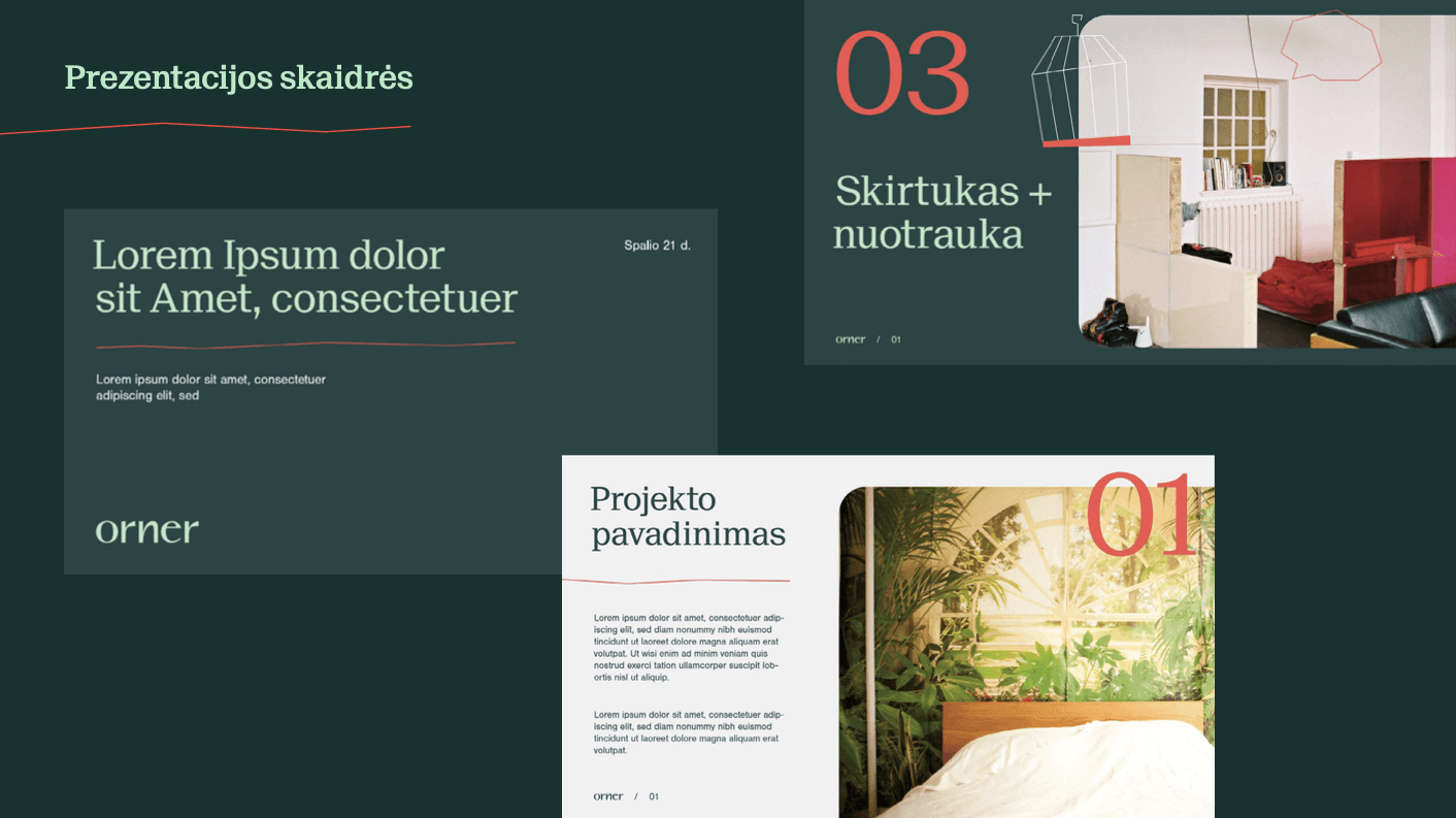
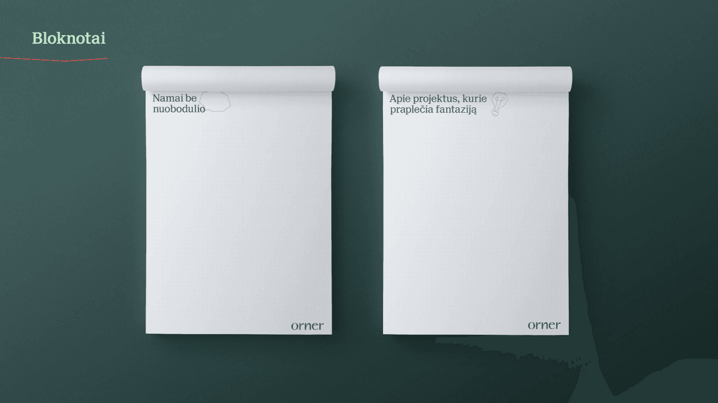
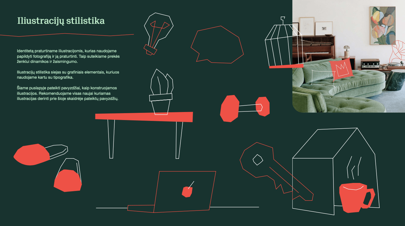
Orner, a Lithuanian real estate development company wanted a new brand identity with naming, logo and visual identity. The name ORNER originates from two words of Hebrew origin, meaning “of light and striking beauty“ and “light-carrying arrow”, as well as an acronym from the initials of the founder names. Modern typography, and a deep emerald colour combined with an accent coral orange, communicate reliability and trust with a surprising freshness. Typographic systems are simple, restrained and clear. We chose a friendly, direct illustration and its fragments. In the context of Lithuanian real estate brands, ORNER is now distinctly not corporate or boring.
GYM PLIUS PROMO CAMPAIGN 2021 Advertising
Fitness Club GYMPLIUS has a really clear advantage. It‘s open 24/7. So, we decided to highlight the “night life” at the sport club as the brand’s main theme in advertising campaign.
G9 BLACK FRIDAY Advertising
“Black Friday” is coming to Vilnius, as well as this hot outdoor campaign for the shopping center G9. The art direction is the mix of fashion and early Film noire aesthetics. Do You recognise the black and white movie classics? Inspired by the very first edition of “King Kong”(1933) and german expressionism cinema aesthetics, grabs your attention for the best “Black Friday” sales offers.
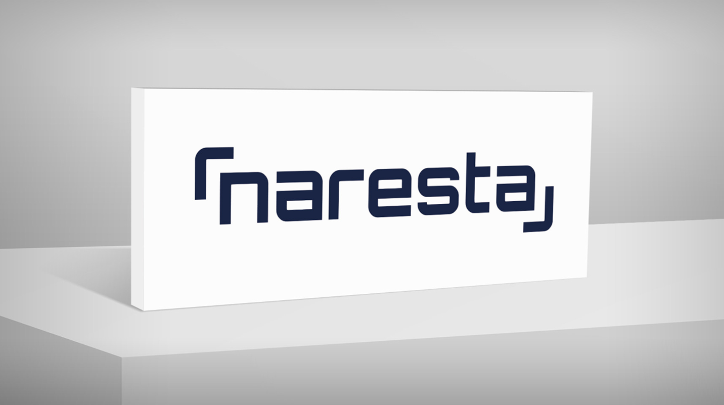
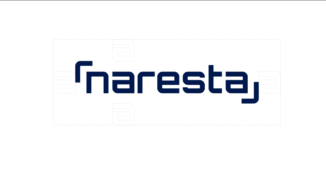
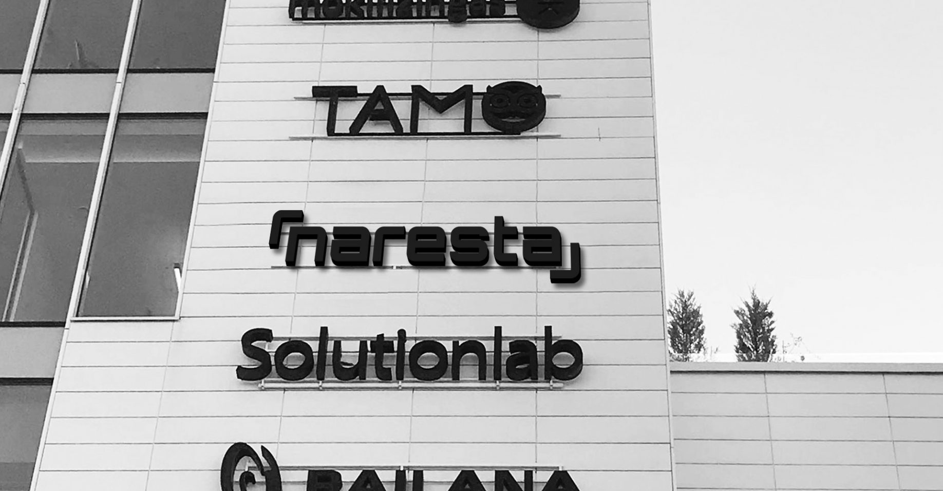
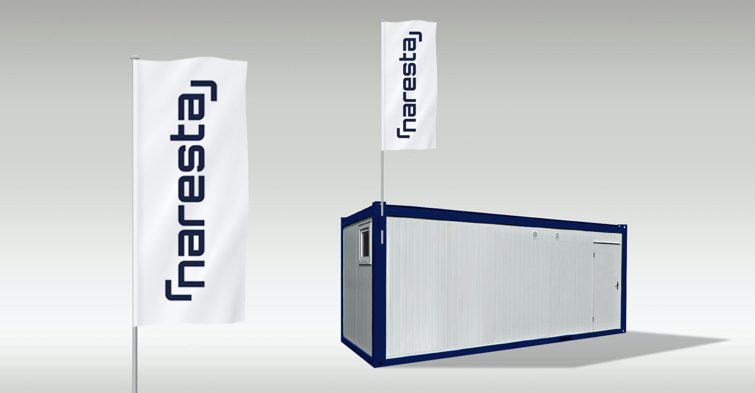
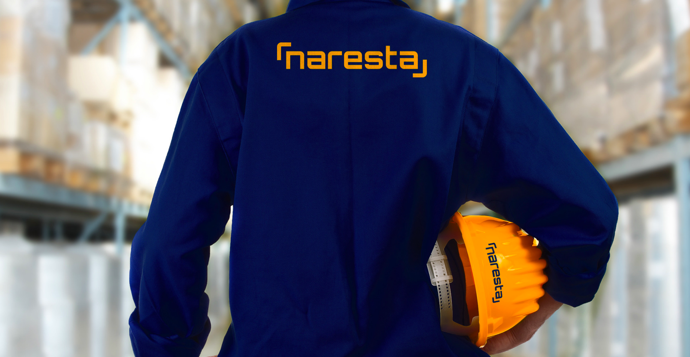
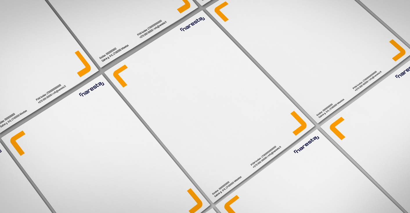
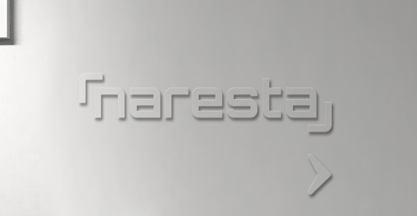
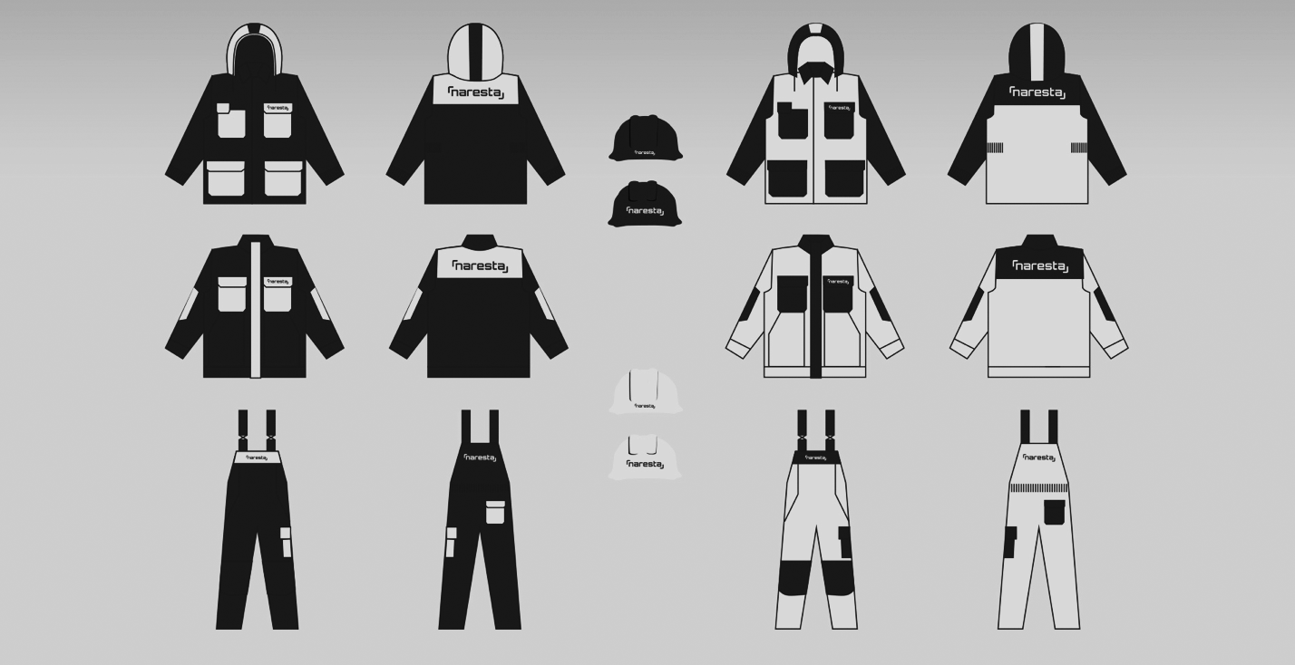
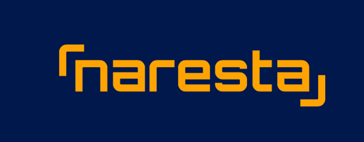
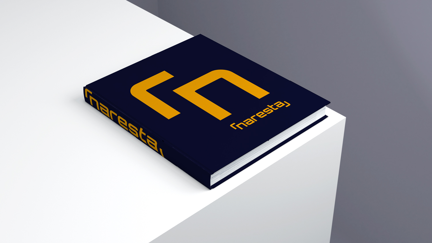
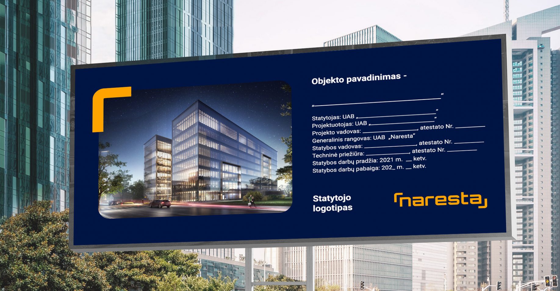
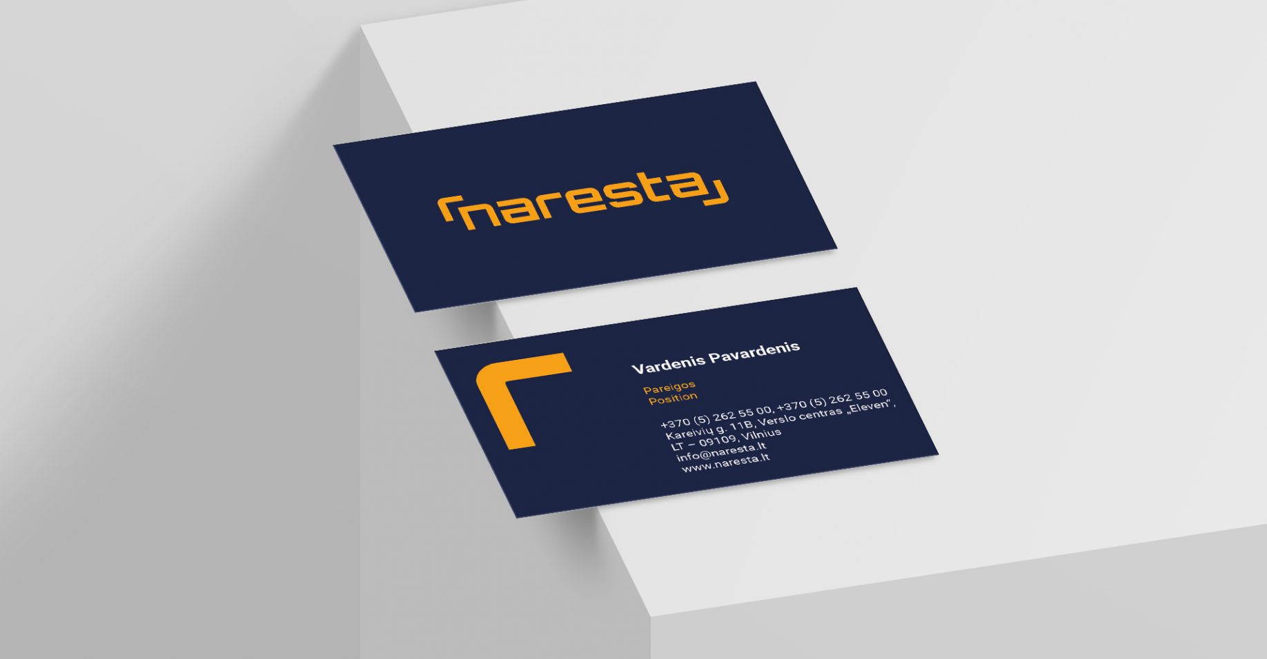
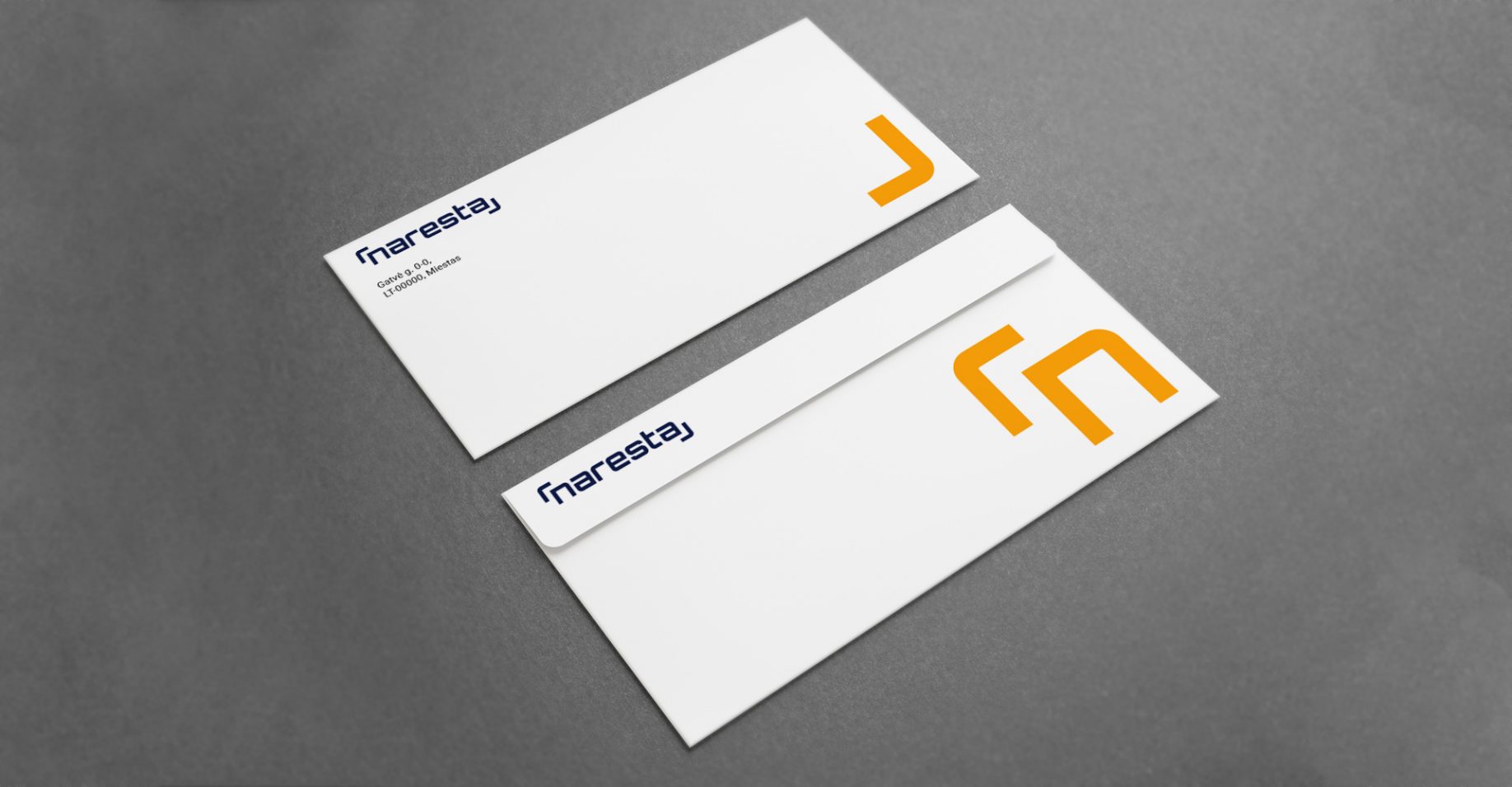
Naresta NEW Branding
There are projects that require patience like steel. For the result, stronger than the hardest concrete, our new branding project, for one of the bigest lithuanian construction companies NARESTA.
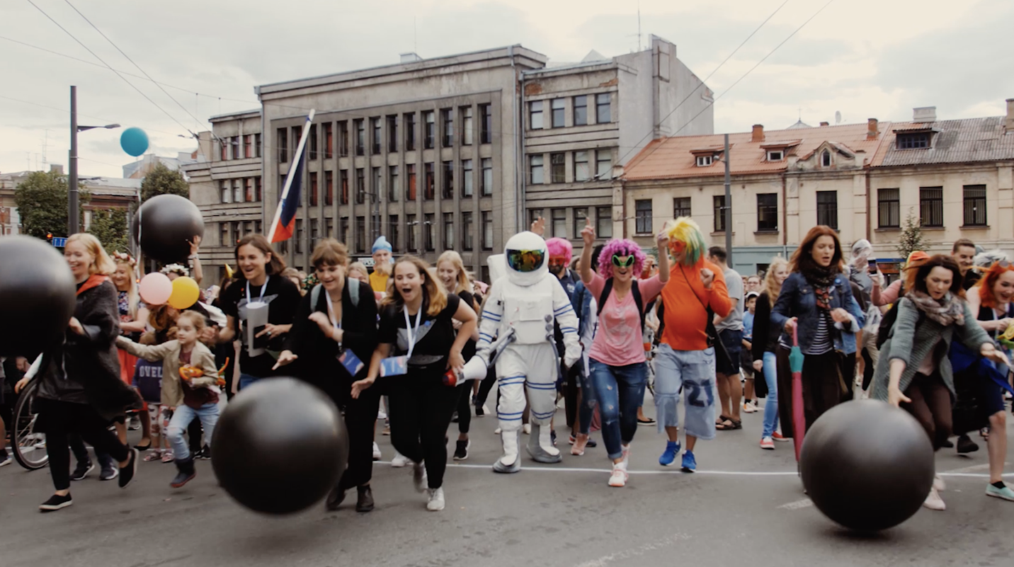
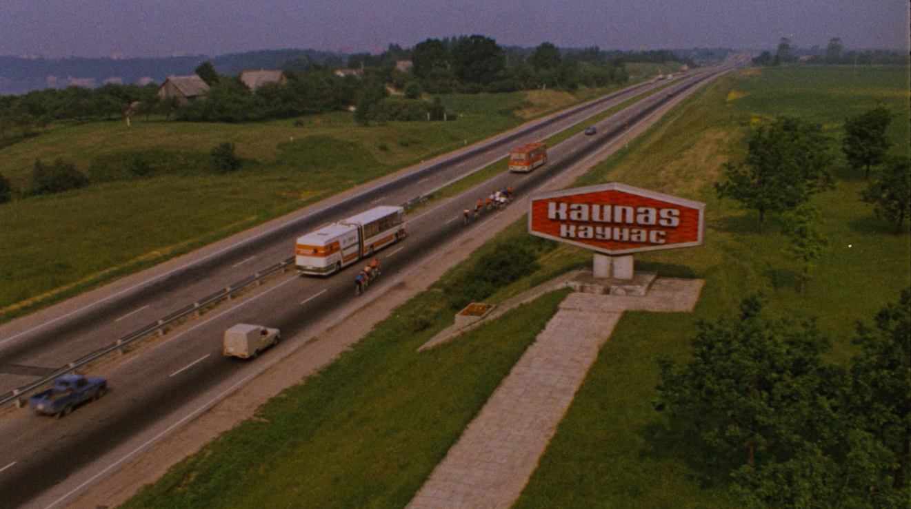
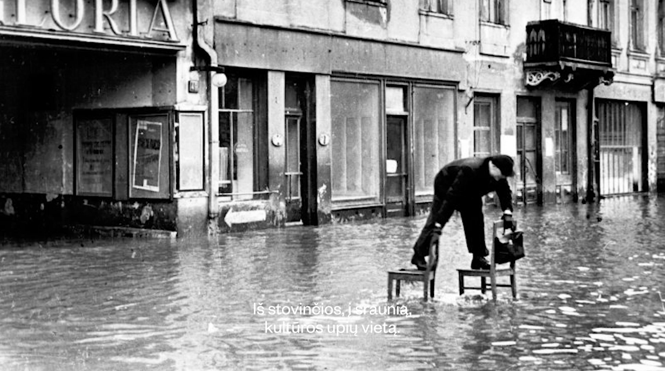
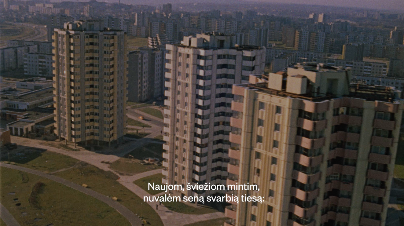
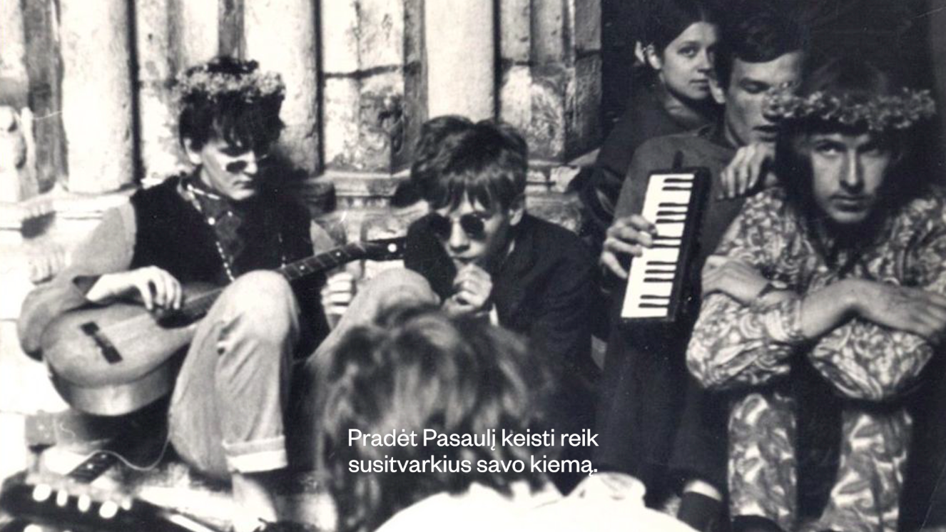
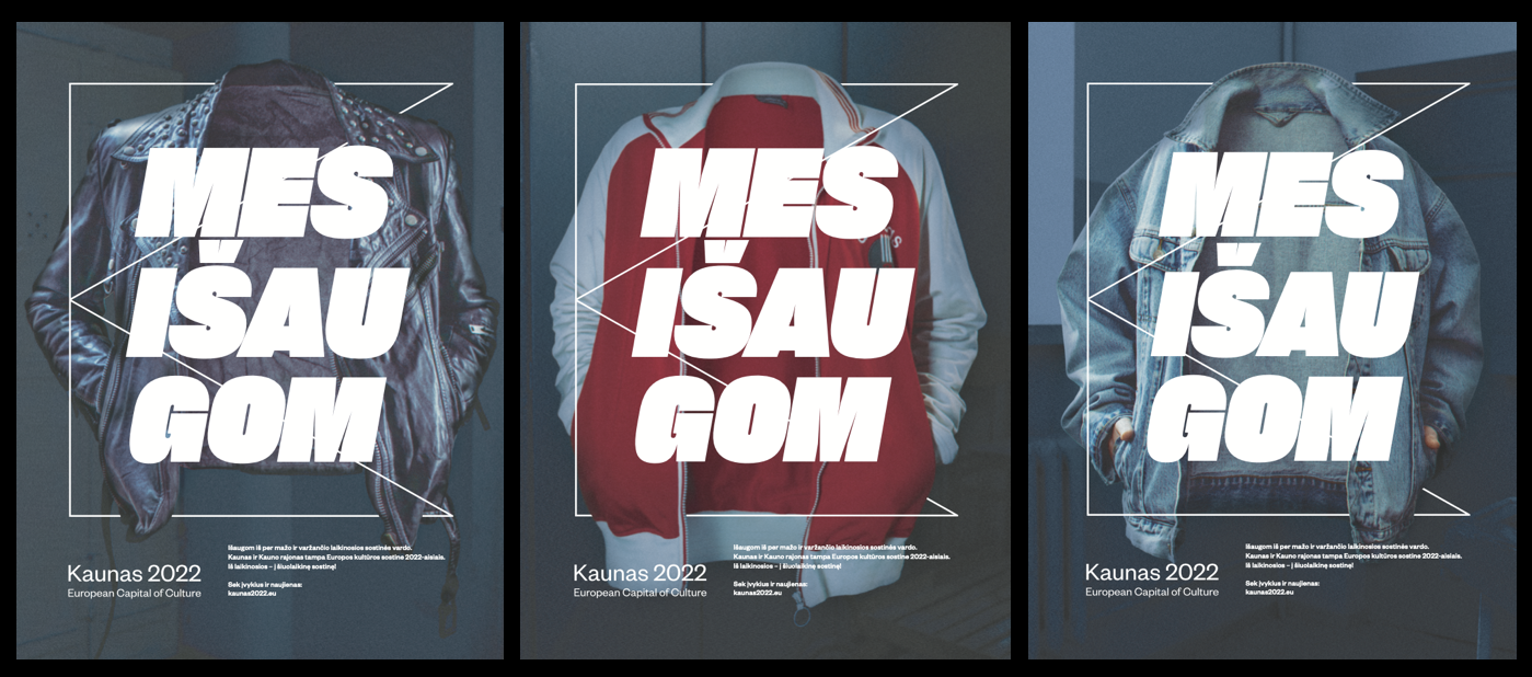
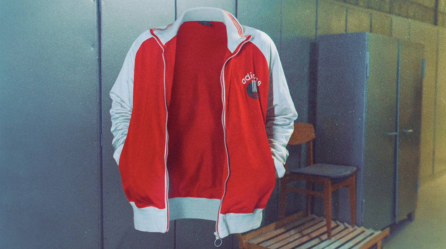
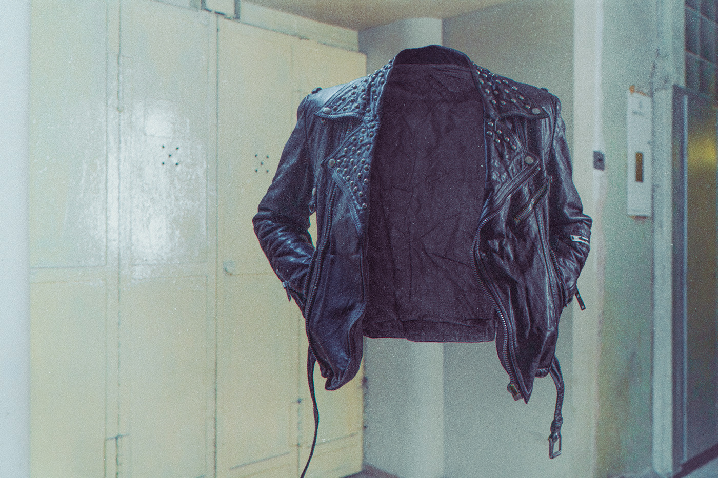
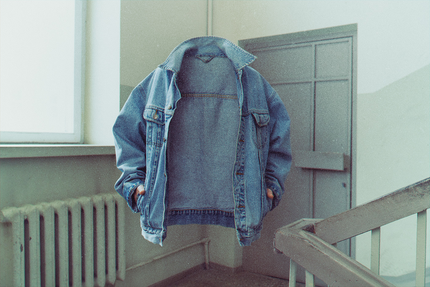
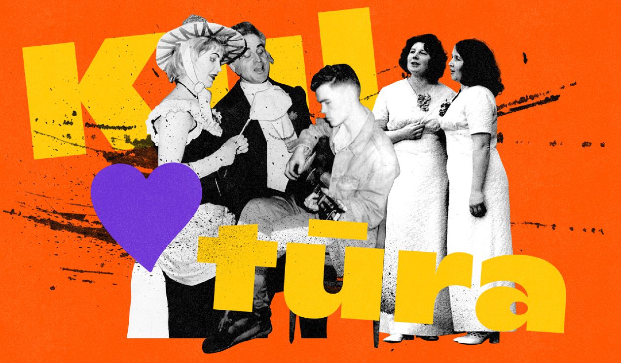
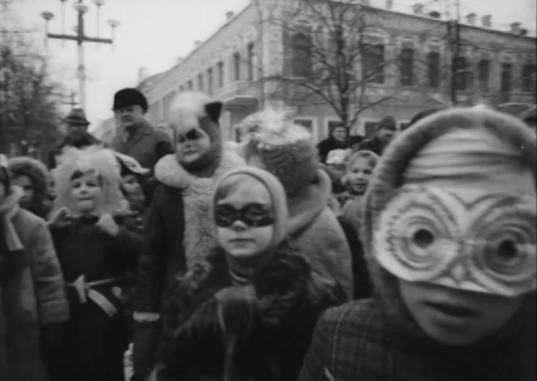
Kaunas European Capital of Culture 2022 Advertising
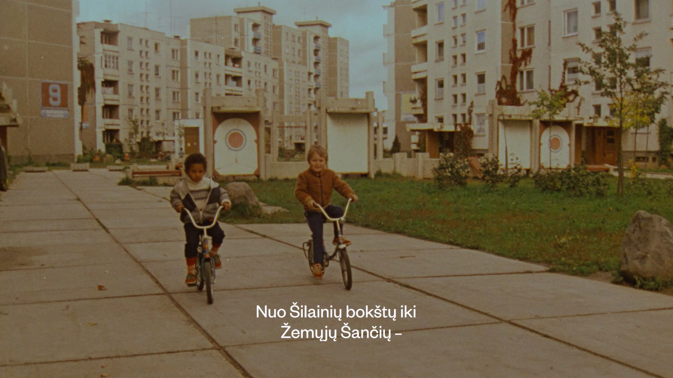
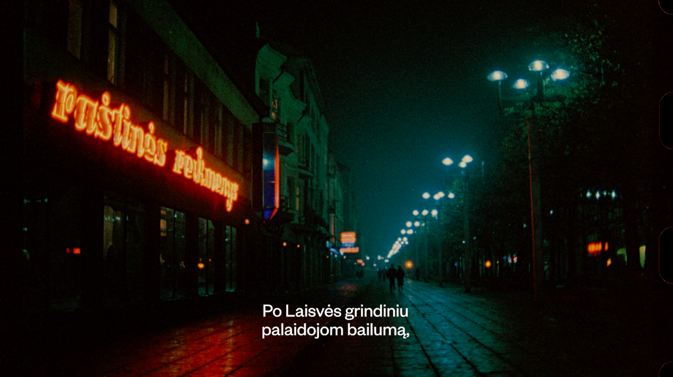
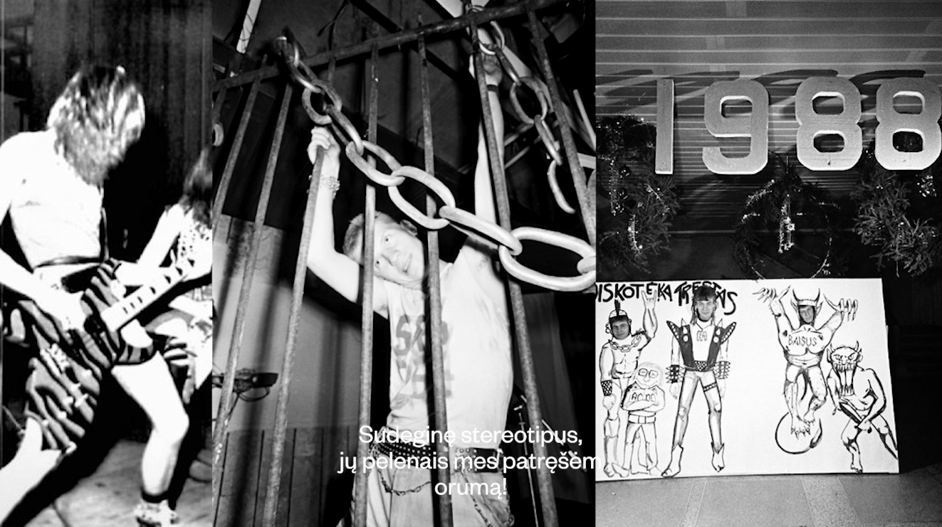
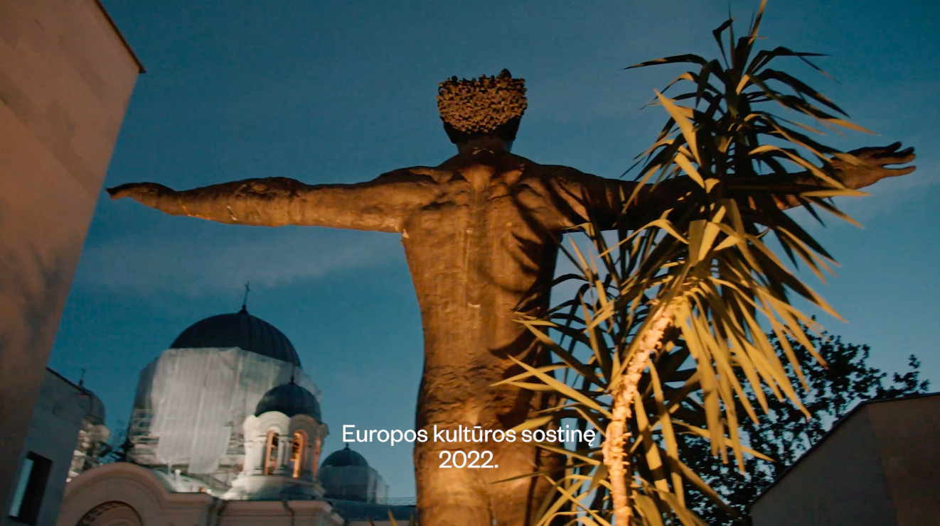
We have created the image campaign for “Kaunas European Capital of Culture 2022”. The goal of the Kaunas 2022 project is to get out of the usual image of the cultural festival, to reach the communities, the people of Kaunas districts, to show it’s real diversity. We have chosen the way to create the most authentic, alternative, informal portrait of Kaunas, real street poetry (slam), ode for Kaunas and the decades of his latest history, the real story of this city. We have found and selected the most characteristic images and archival film materials of Kaunas, to create the main message of the campaign: “we grow up!”.
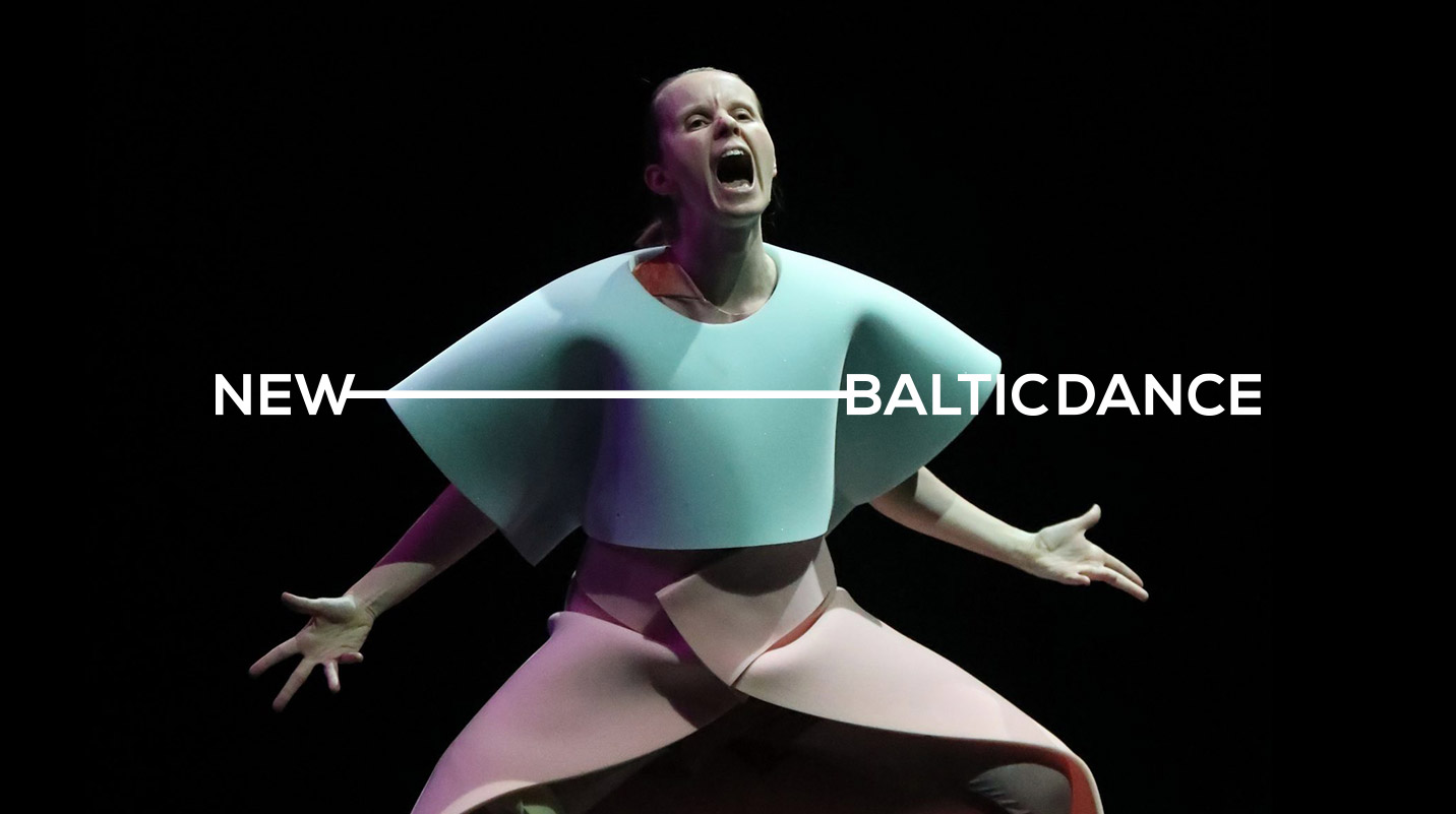
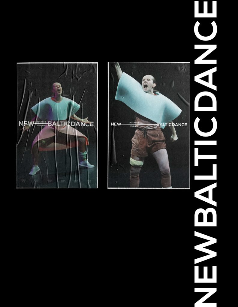
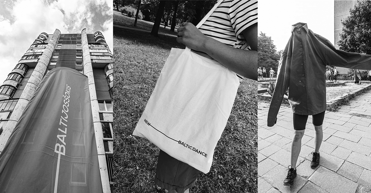
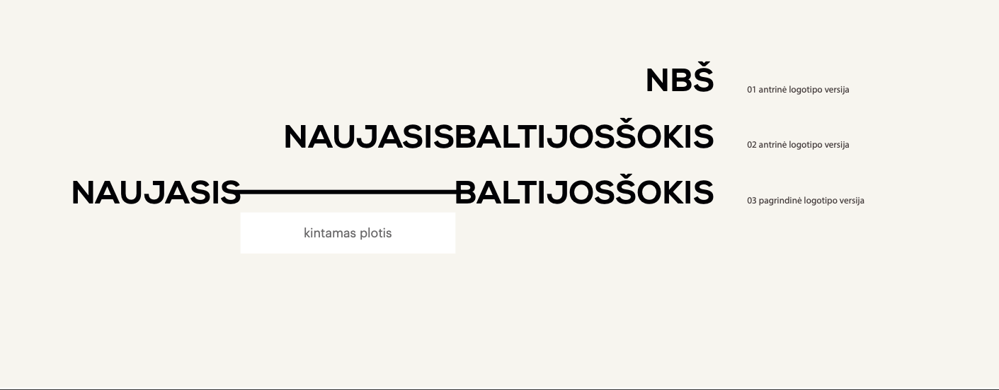

NEW BALTIC DANCE Branding
It was an impressive opportunity tu us, to give a new, progressive look for one of the largest dance festivals in Europe. By creating this dynamic logo, we were inspired by the main idea of contemporary dance, to create a scene where you are. Our logo moves and transforms the space around itself, everywere it goes.
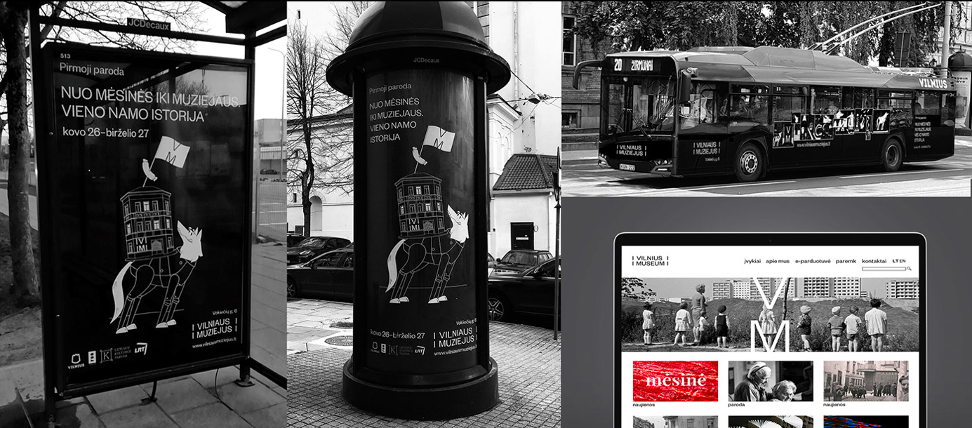
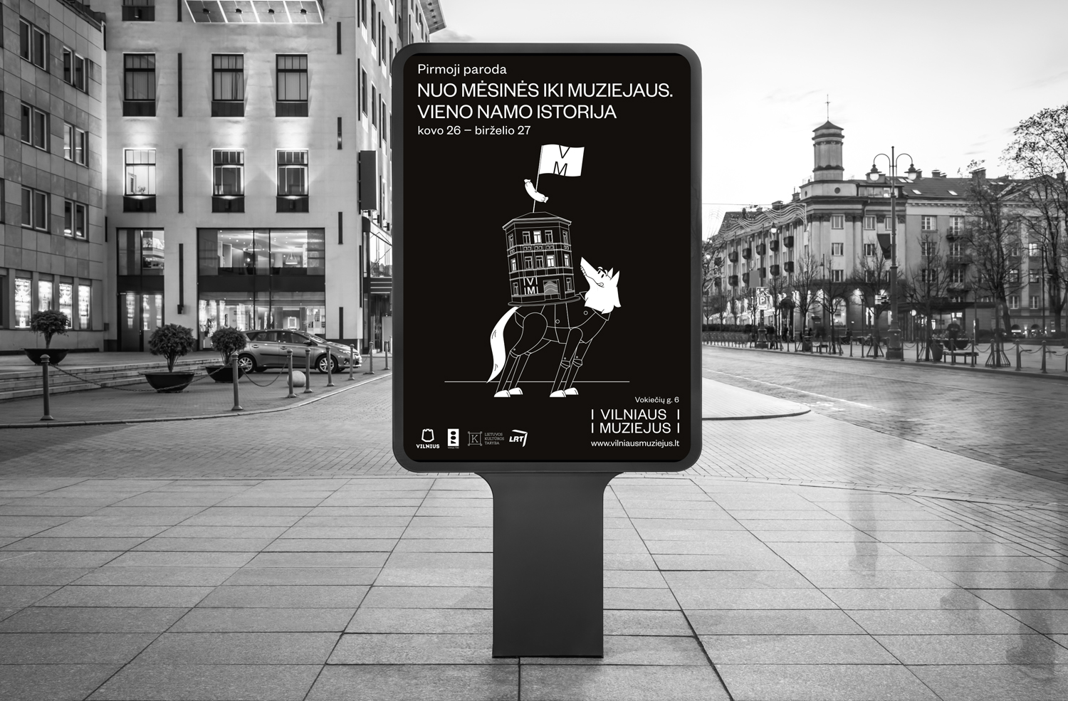
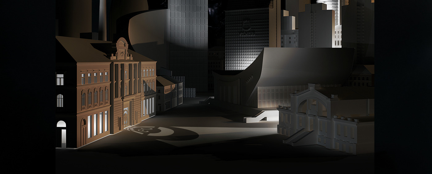
Vilnius Museum Opening Campaign Advertising
We created the launch campaign for the new VILNIUS MUSEUM, with a focus on the first exhibition: “From the butchers house to the museum. The story of one house”. The aim of the campaign was to attract all the citizens of Vilnius, with a clear appeal to families. We wanted to make complicated historical events accessible to all, so we created an attractive and playful atmosphere. Quite unexpected for a historical museum.
ICOR FILM Advertising
A film for one of the largest business groups of the Baltics, ICOR. Filmed in five countries (Lithuania, Poland, Latvia, Estonia and Russia). We created an original soundtrack for this video that represents the business philosophy of the ICOR group for partners and employees all over the world.
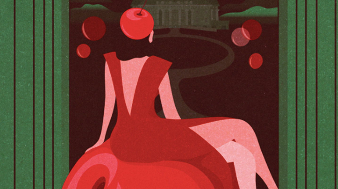
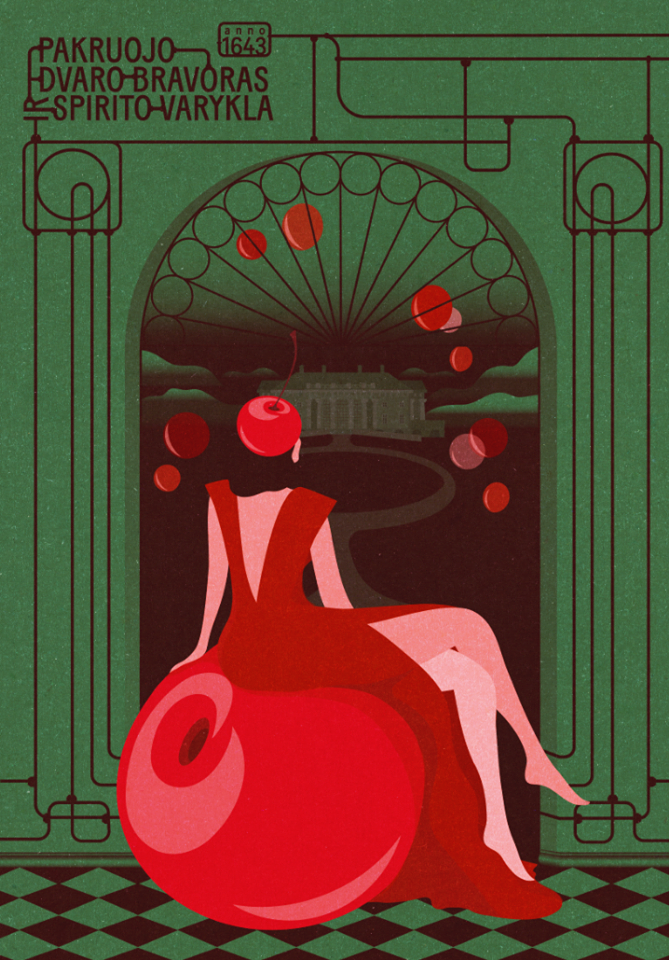
Cherry Brandy by Pakruojis Manor Distillery Print Advertising
This limited edition Cherry Brandy by Pakruojis Manor Distillery made our winter a little warmer with the sweet taste of red cherries in the snow. Every step, from packaging design to posters and illustration, was made by us. The look is bright, yet elegant, with a touch of tradition and retro-nostalgia.
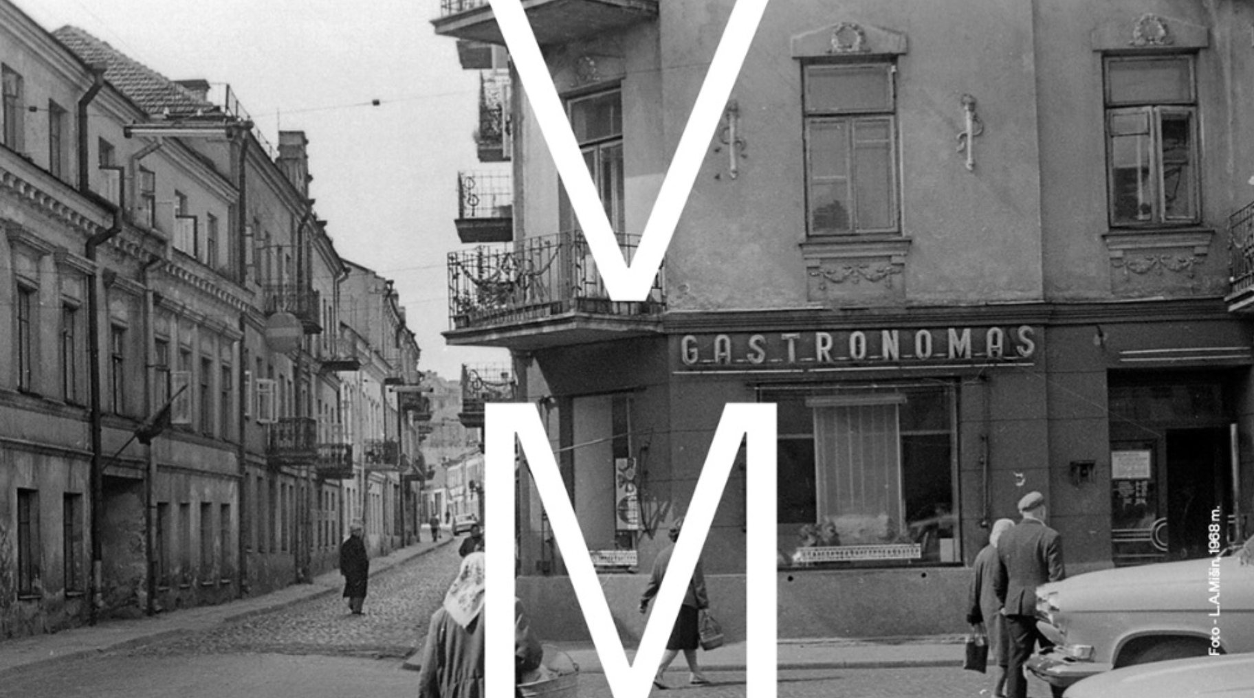
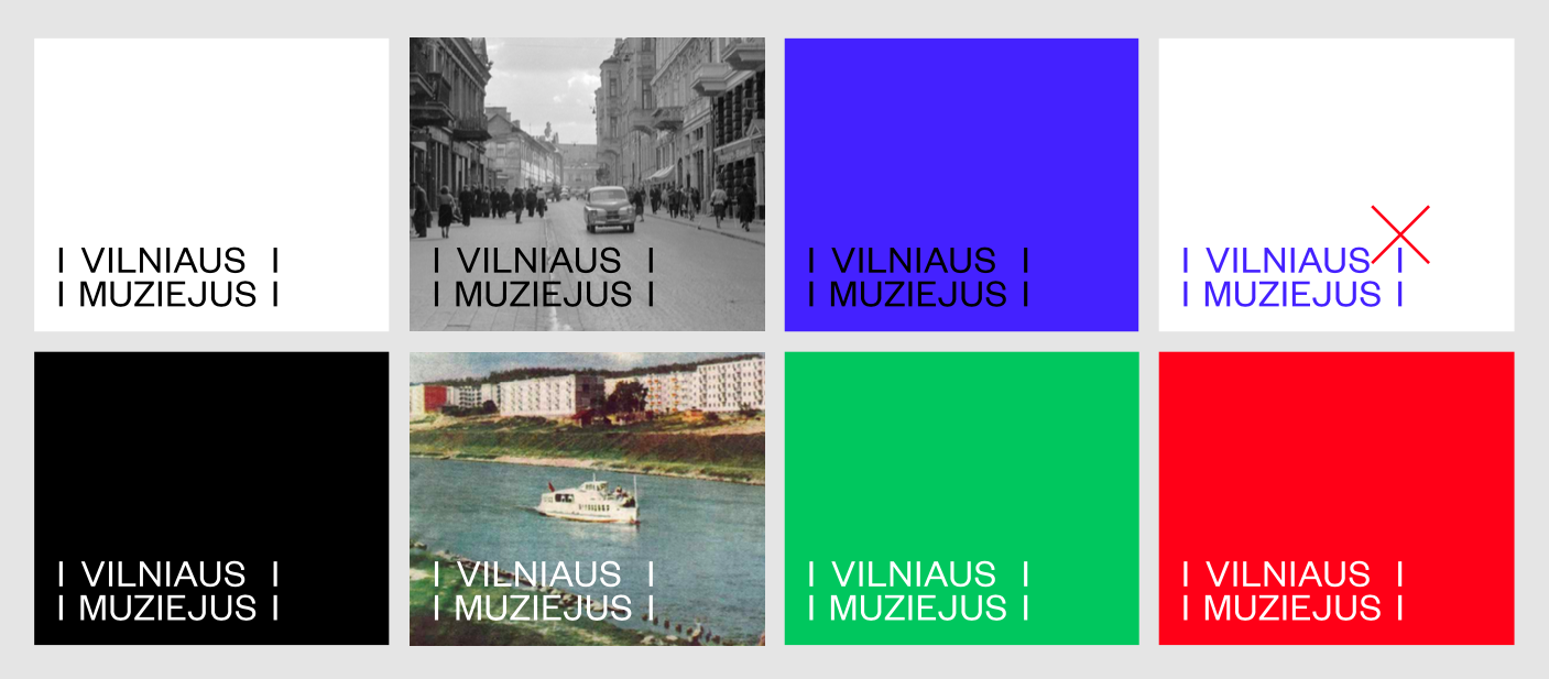
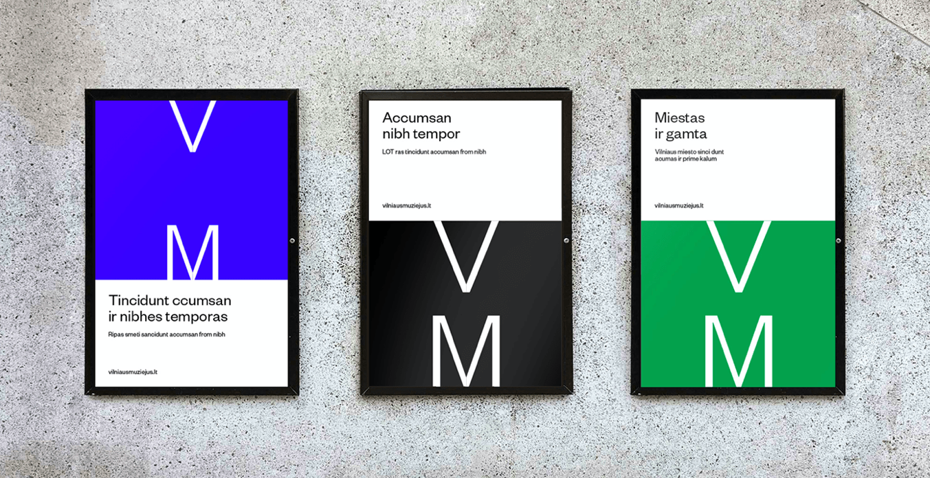
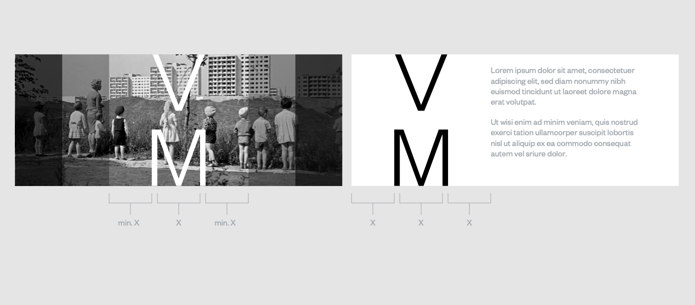
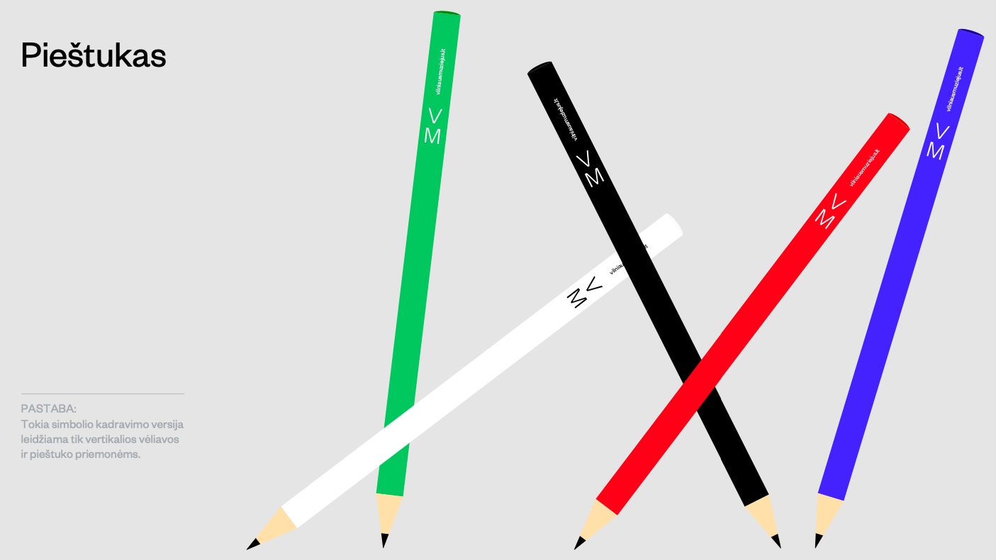
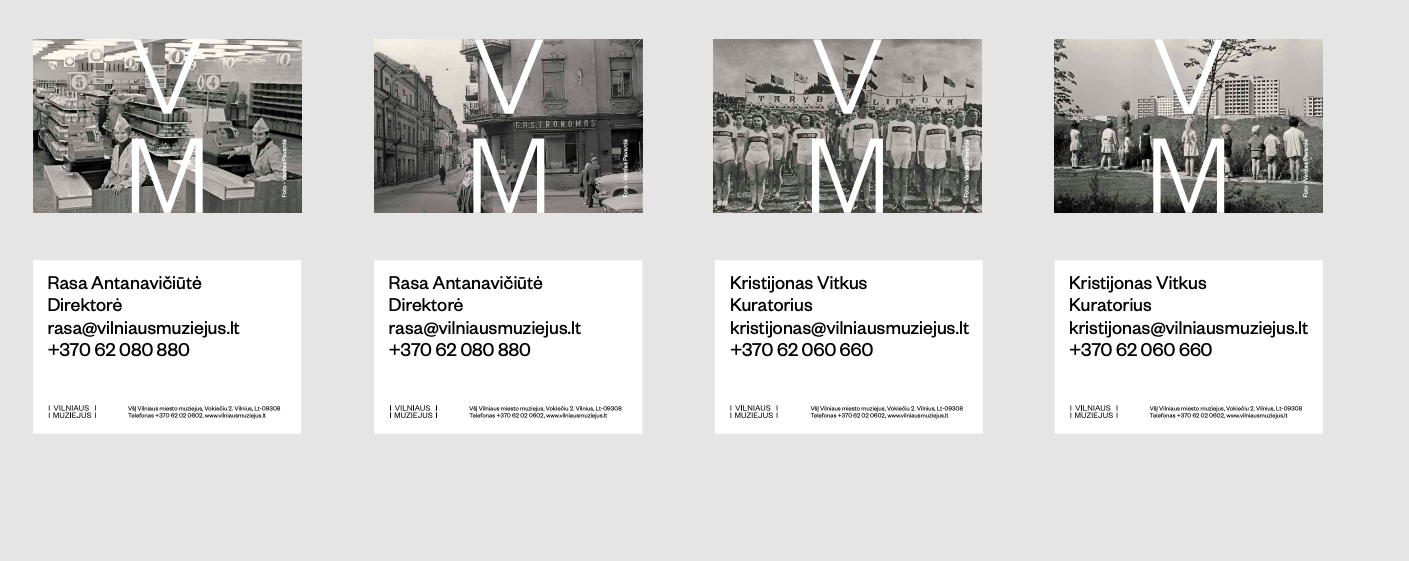
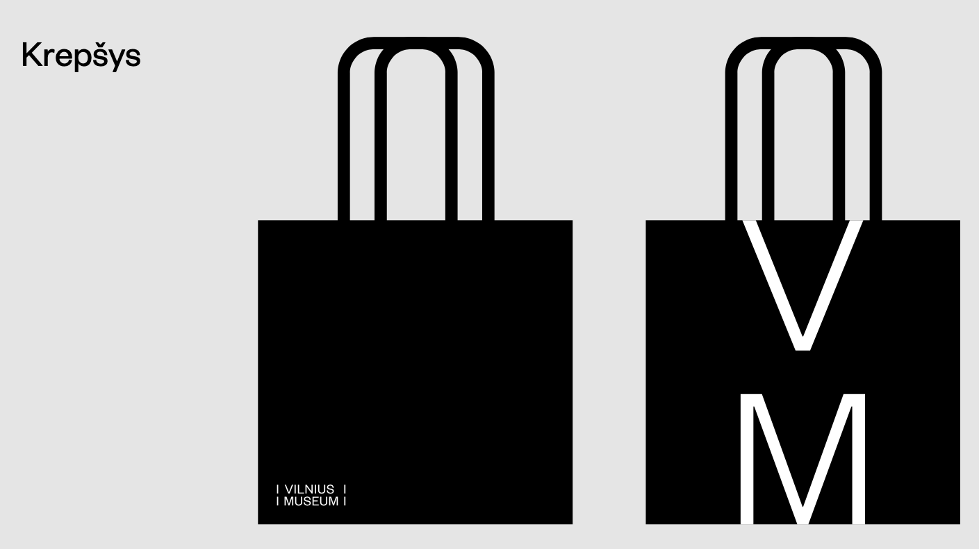
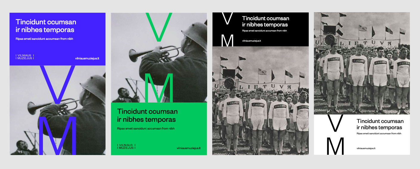
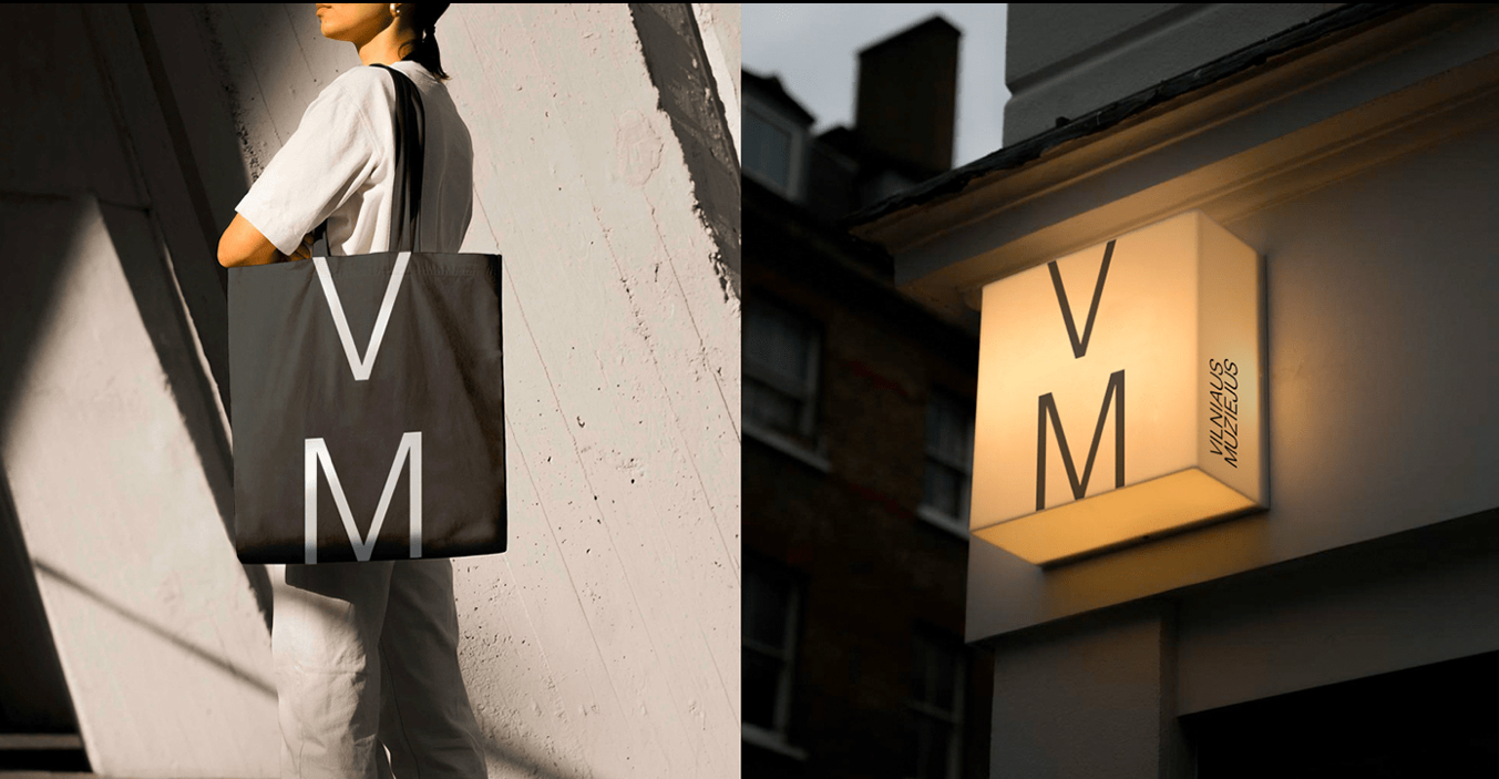
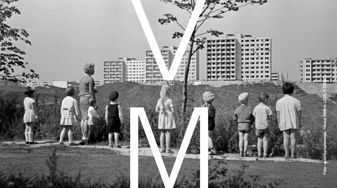
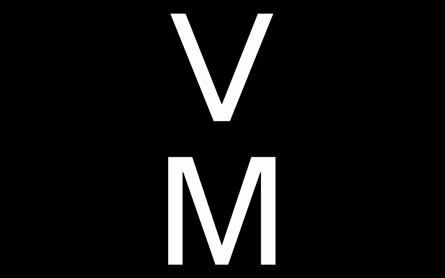
Vilnius Museum Branding
This unique city museum aims to tell you about Vilnius in many different ways. So our goal was not to be attached to any specific time period or style, but rather to achieve a timeless effect. We did this with minimalist, laconic graphic design solutions — the Founders Grotesk font shines at its best. We created the logo by conceptually constructing the Vilnius Museum initials – the letter “V” is smoothly transformed to a capital “M”.
GYM PLIUS PROMO CAMPAIGN 2020 Advertising
Fitness Club GYMPLIUS has a really clear advantage. It‘s open 24/7. So, we decided to highlight the “night life” at the sport club as the brand’s main theme in its first advertising campaign. We filmed the first TVC like a music video and created an entertaining parallel between a night club and a sports club.
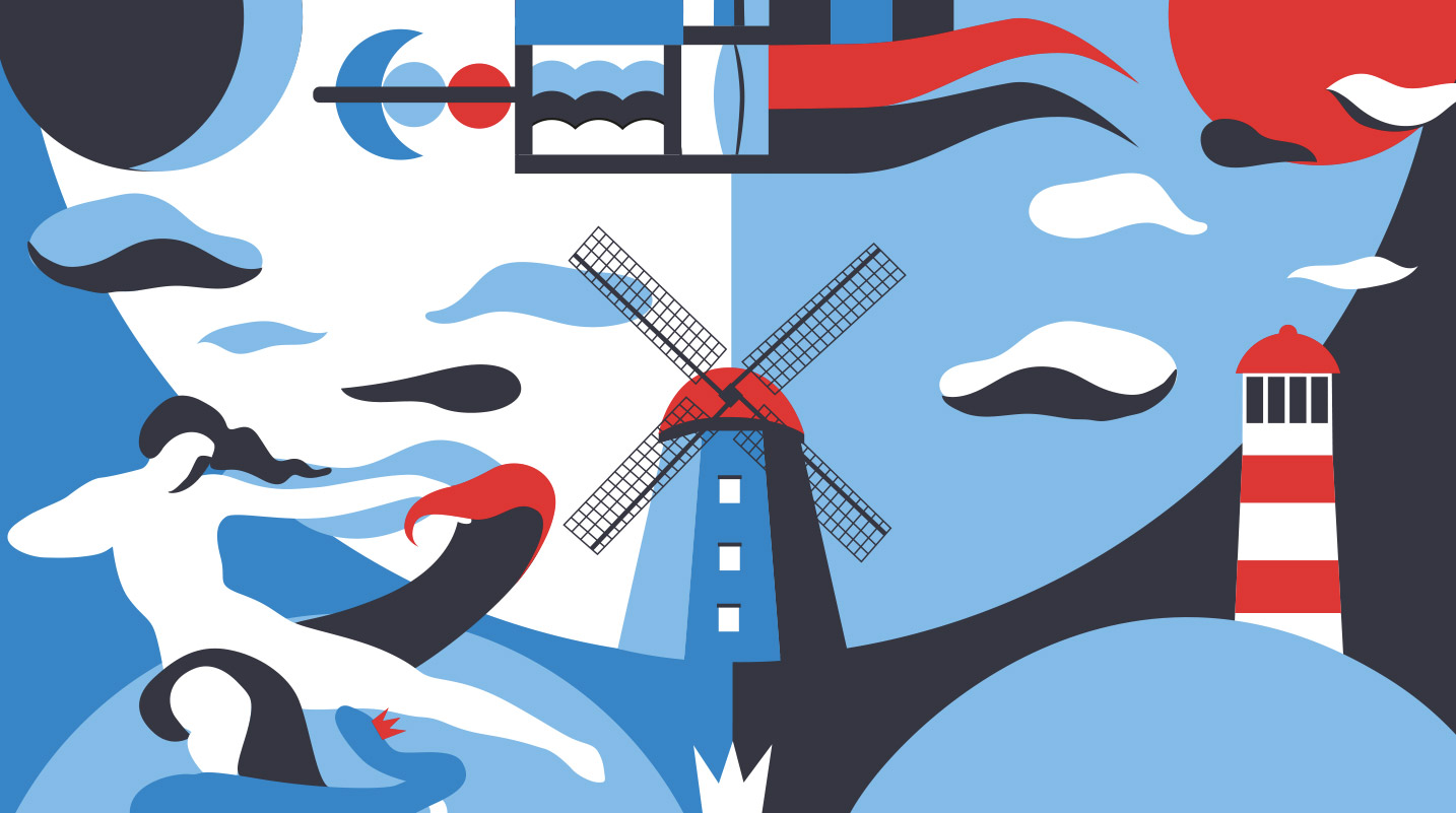
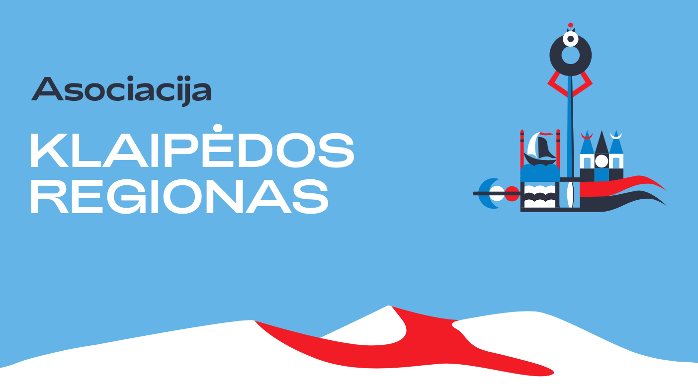
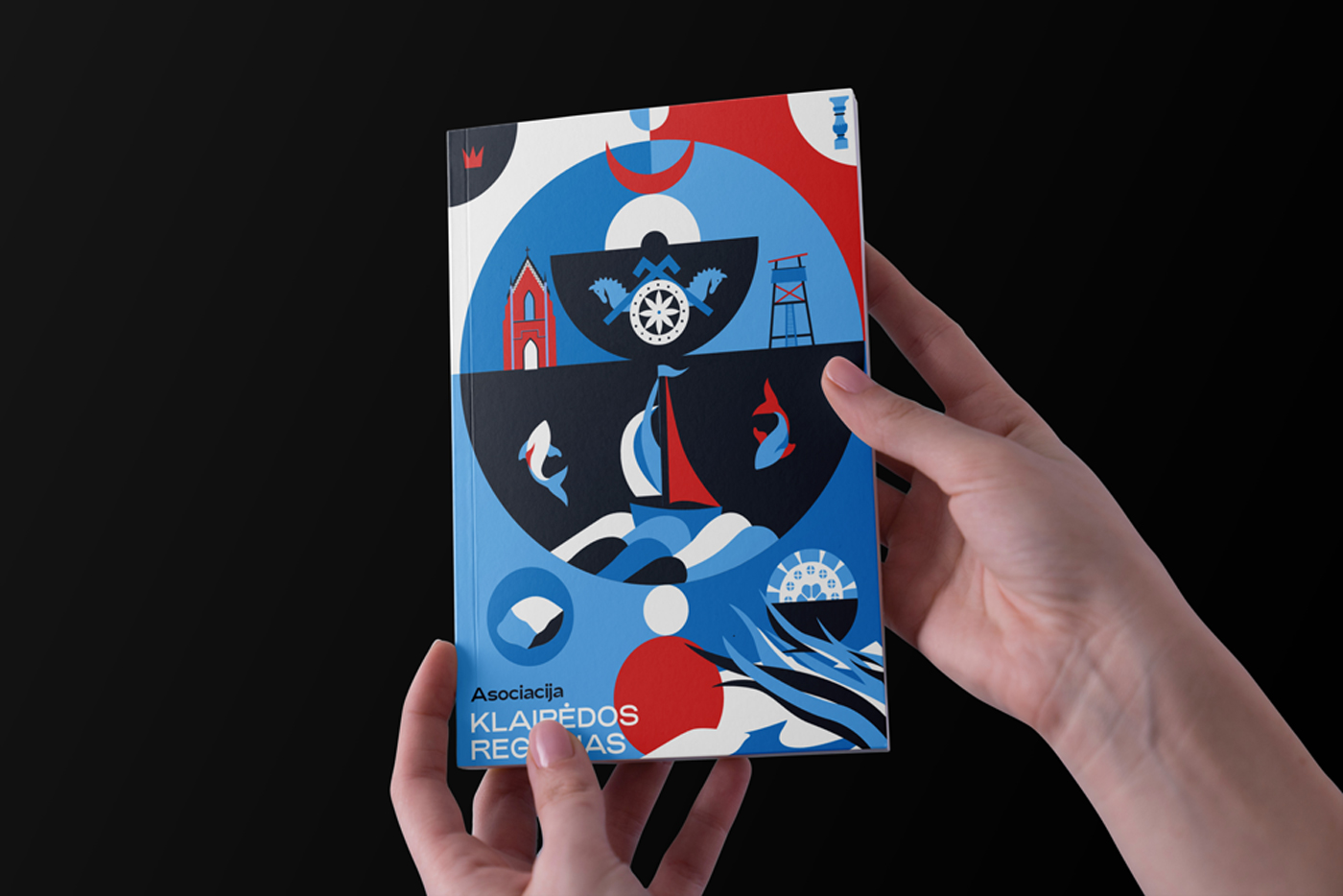
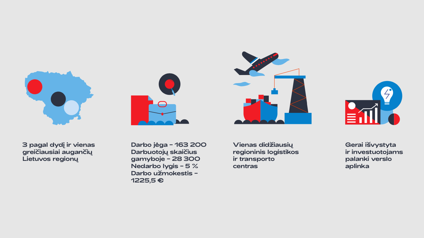
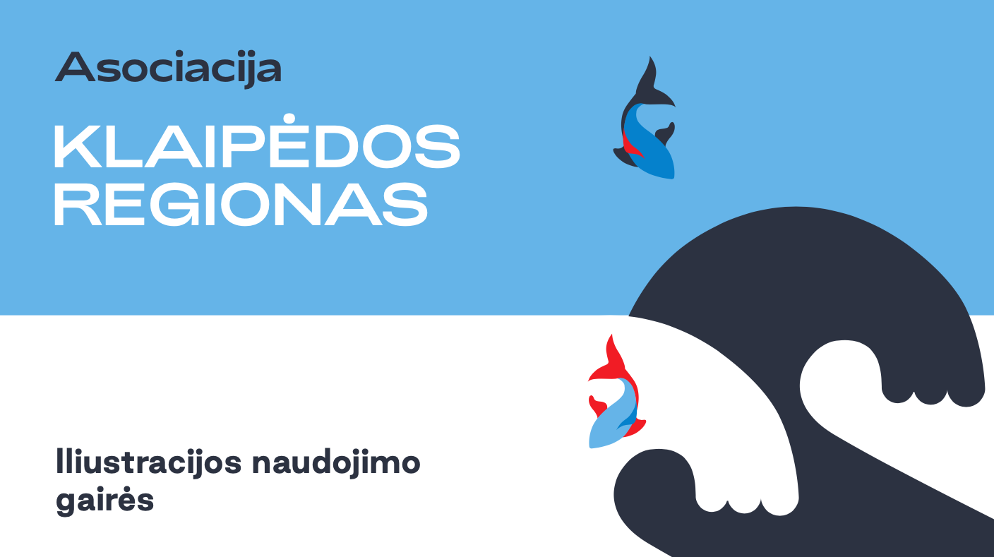
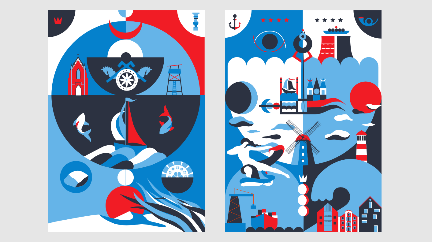
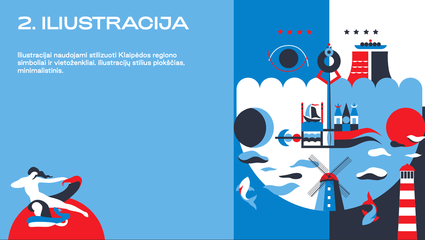
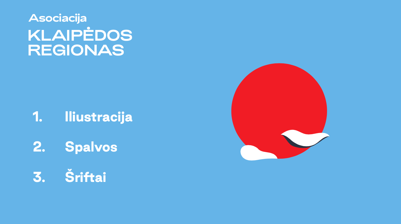
ASSOCIATION KLAIPĖDA REGION Branding
We created this fresh and vivid new look for the Association Klaipėda Region’s visual identity. We used local ethnic styles, the authentic colours of regional folk art, seaside stories and landmark symbols of different towns in our design system.
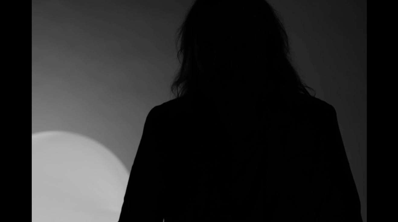
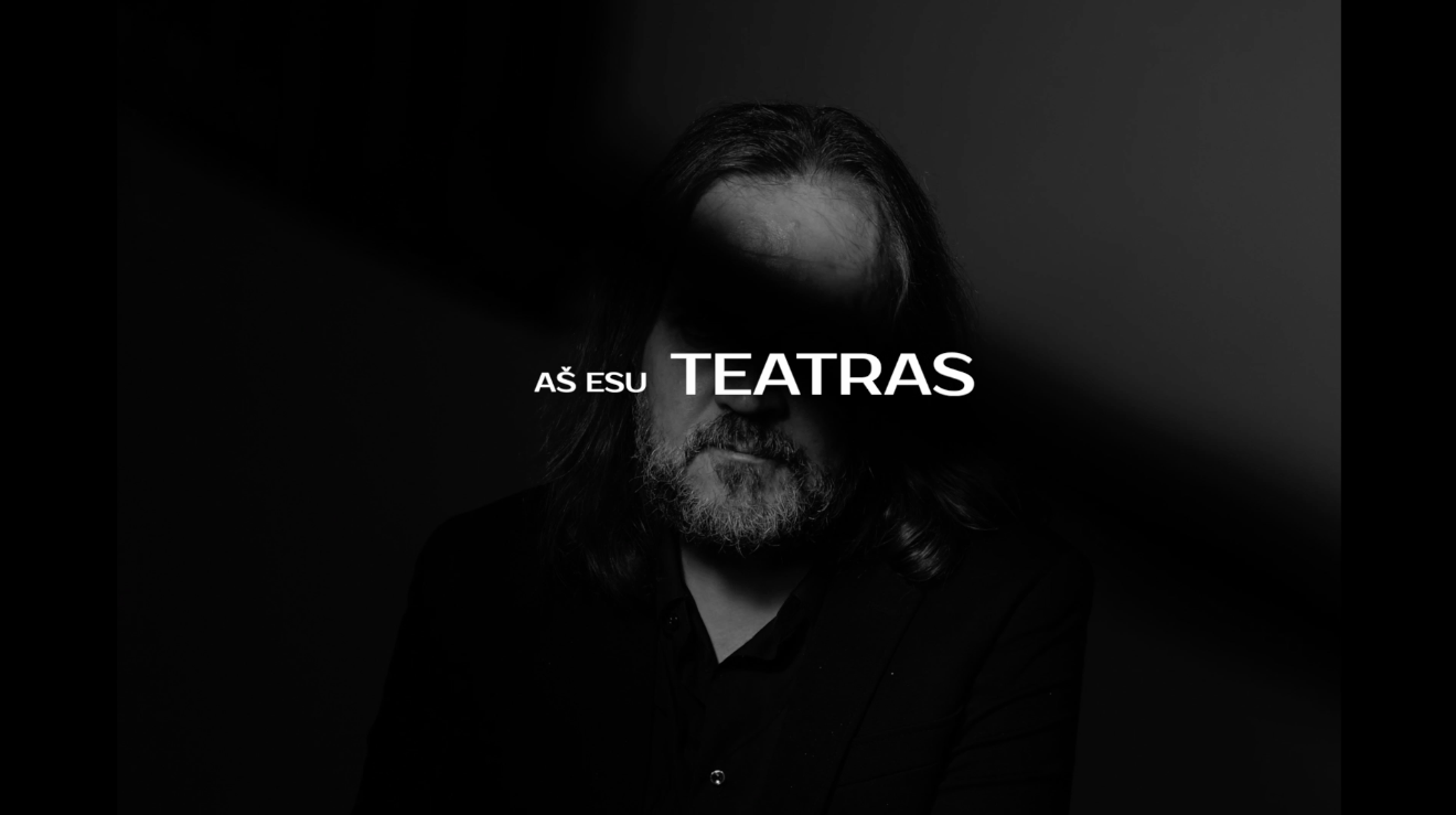
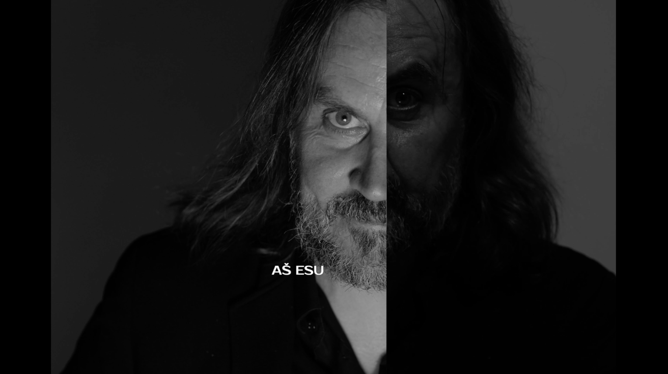
OKT Film Advertising
World-famous theatre director, Oskaras Koršunovas, has created his own theatre called “OKT”. To publicise this, this, we created this conceptual video representing 20 years of the new wave in contemporary theatre — featuring edgy, world famous, award-winning plays and Oskaras Koršunovas larger-than-life personality. The tagline boldly states: “I am the theatre”.
Gym Plius Promo Campaign 2019 Advertising
Fitness Club GYMPLIUS has a really clear advantage. It‘s open 24/7. So, we decided to highlight the “night life” at the sport club as the brand’s main theme in its first advertising campaign. We filmed the first TVC like a music video and created an entertaining parallel between a night club and a sports club.
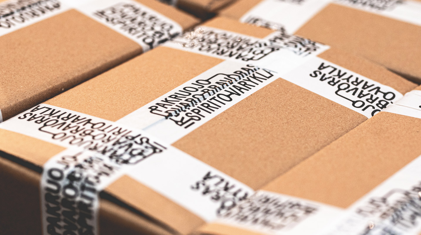
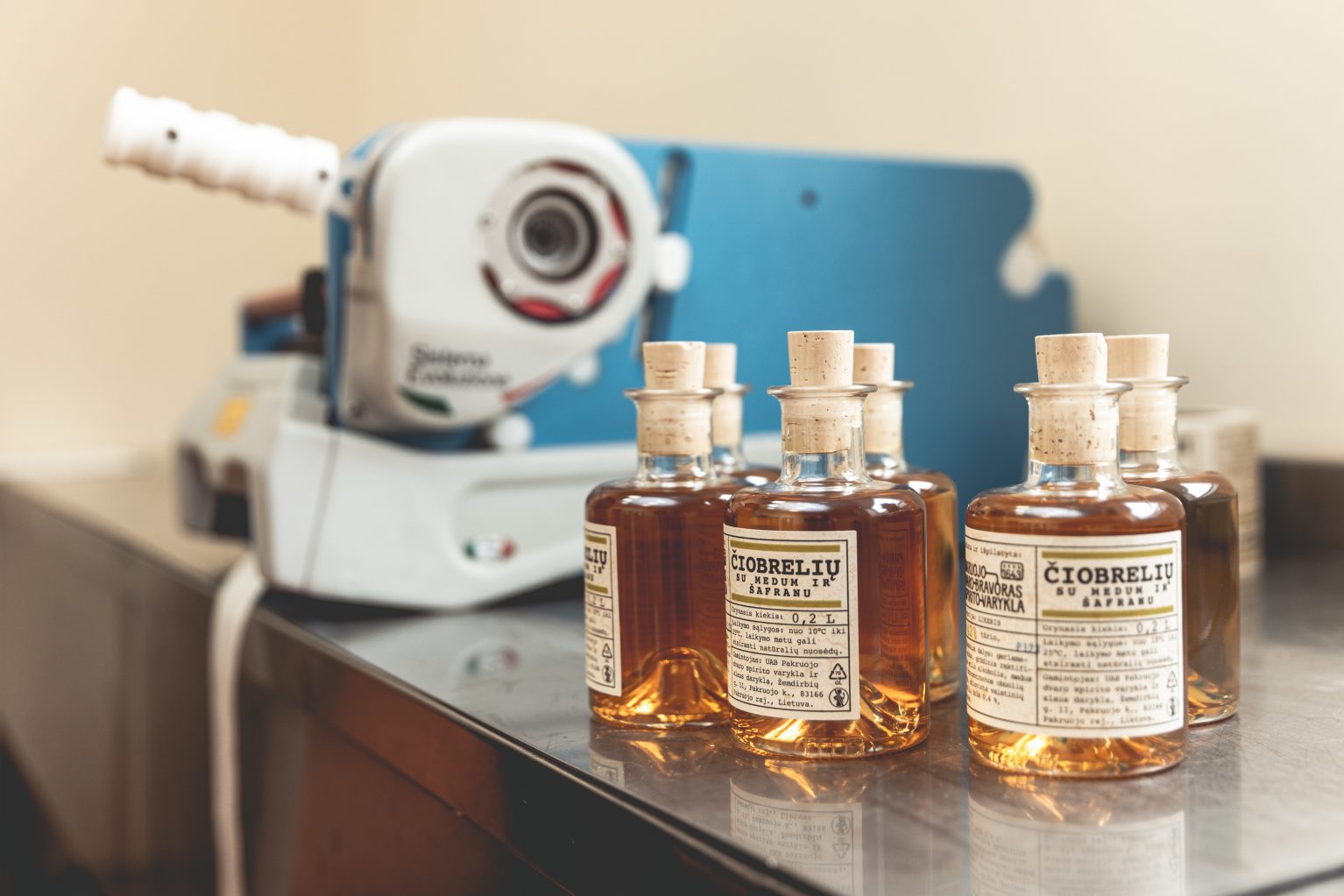
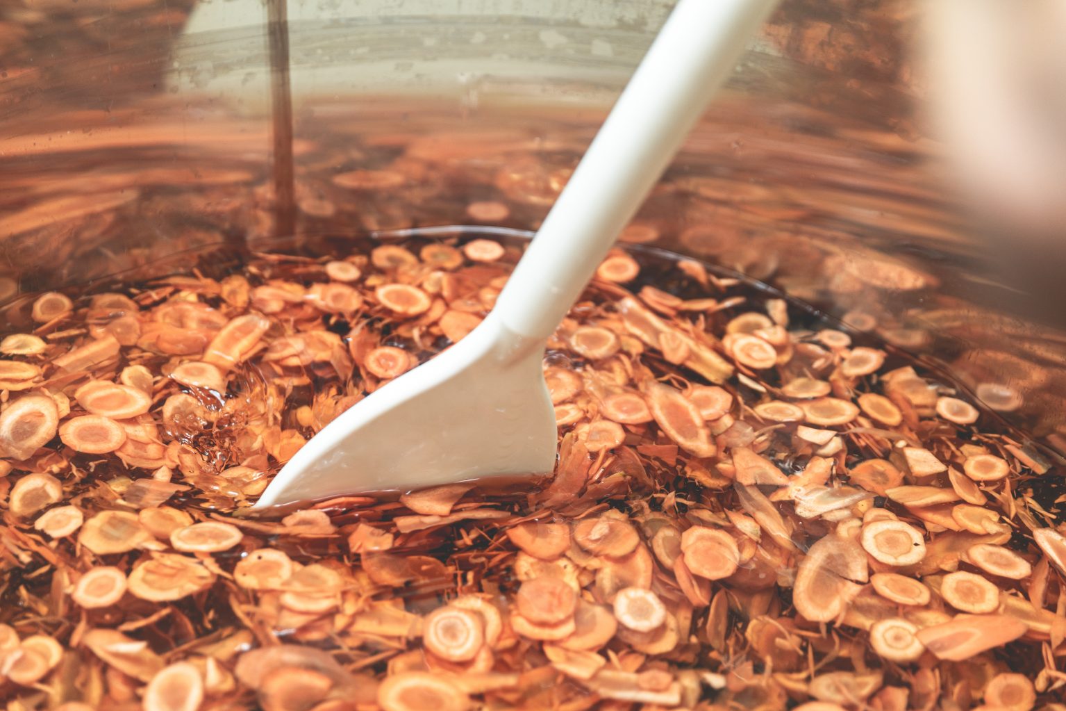
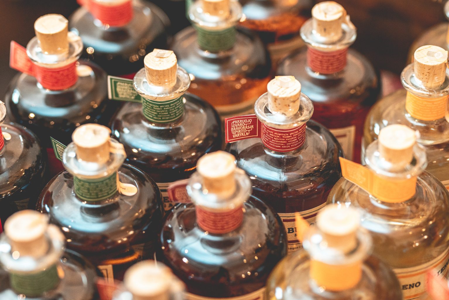
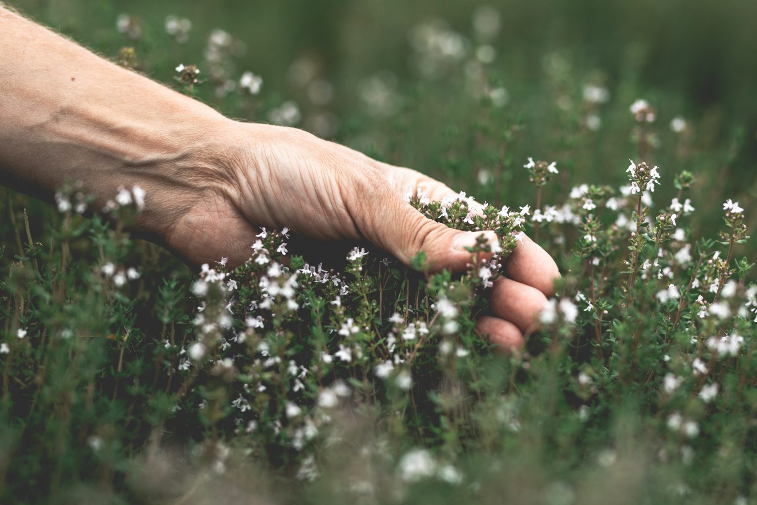
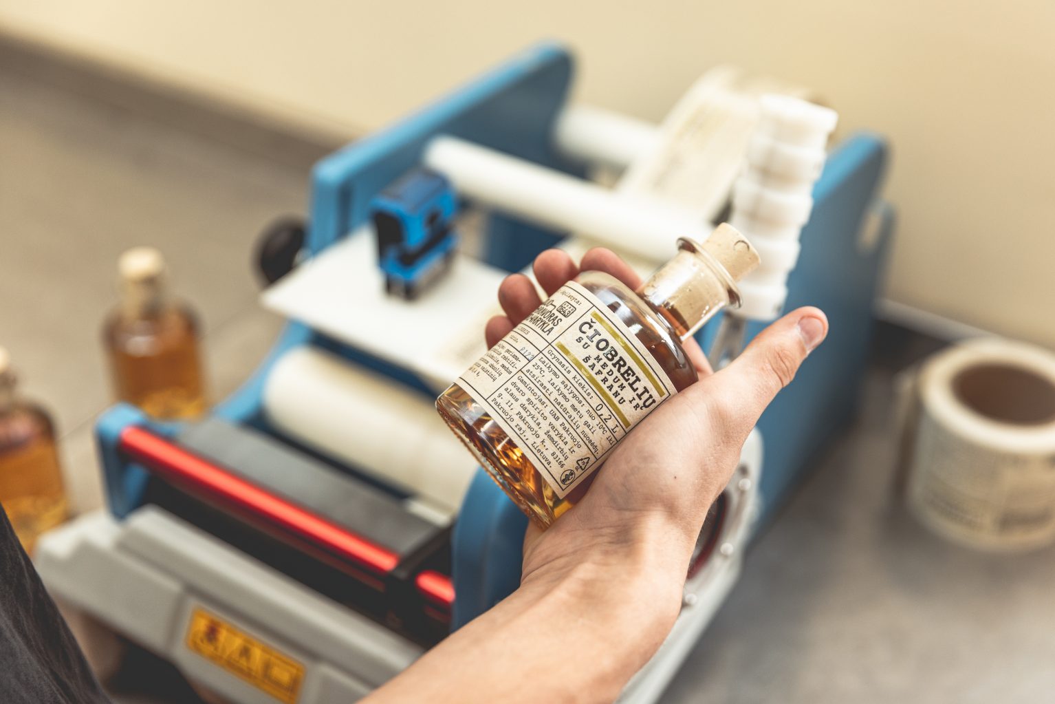
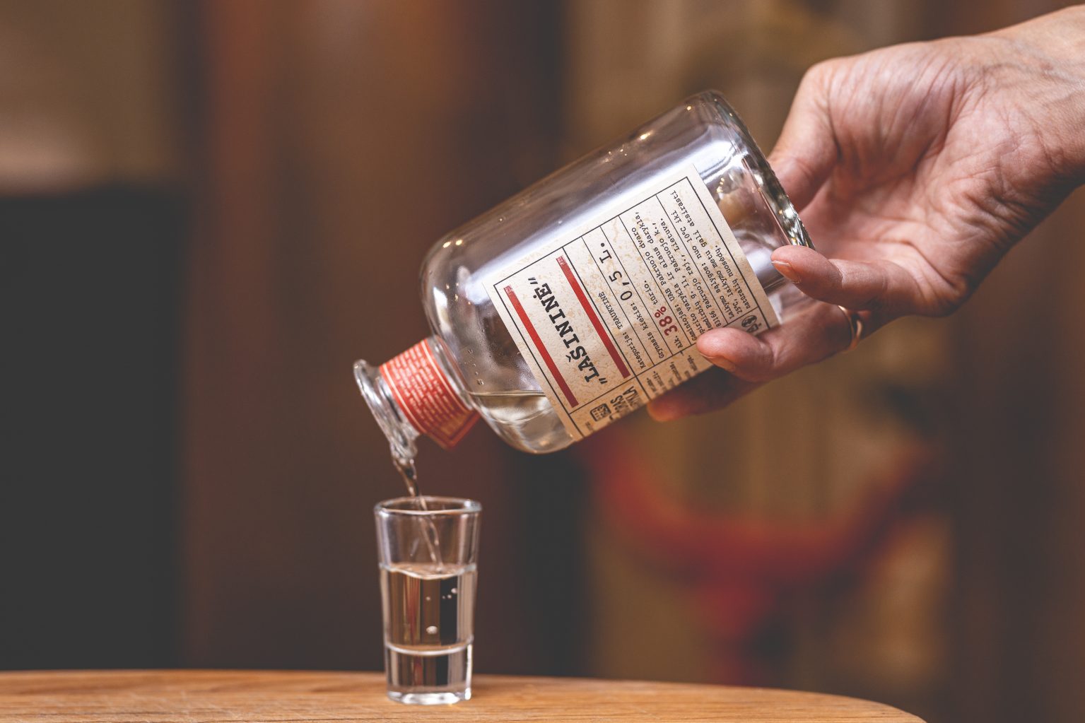
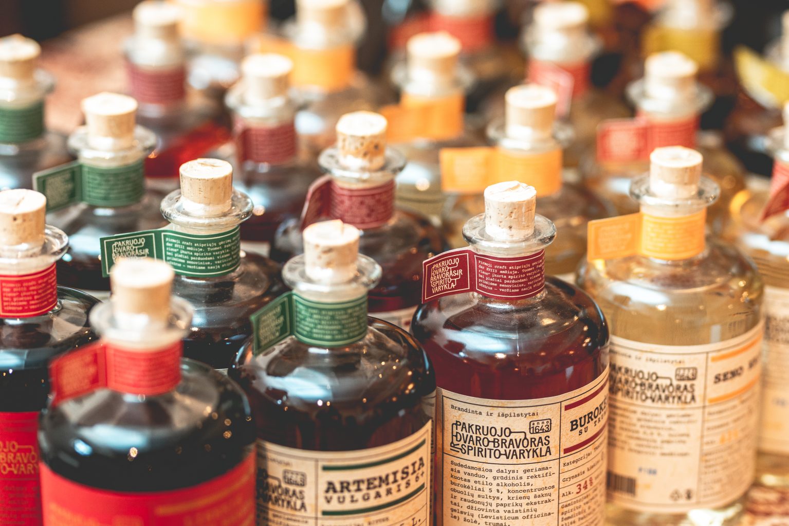
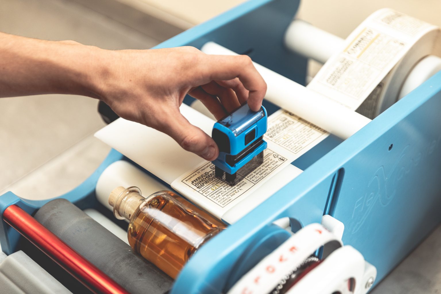
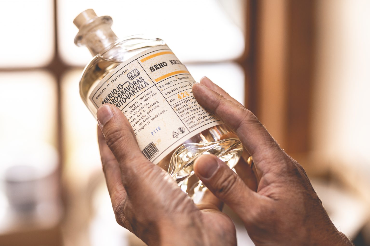
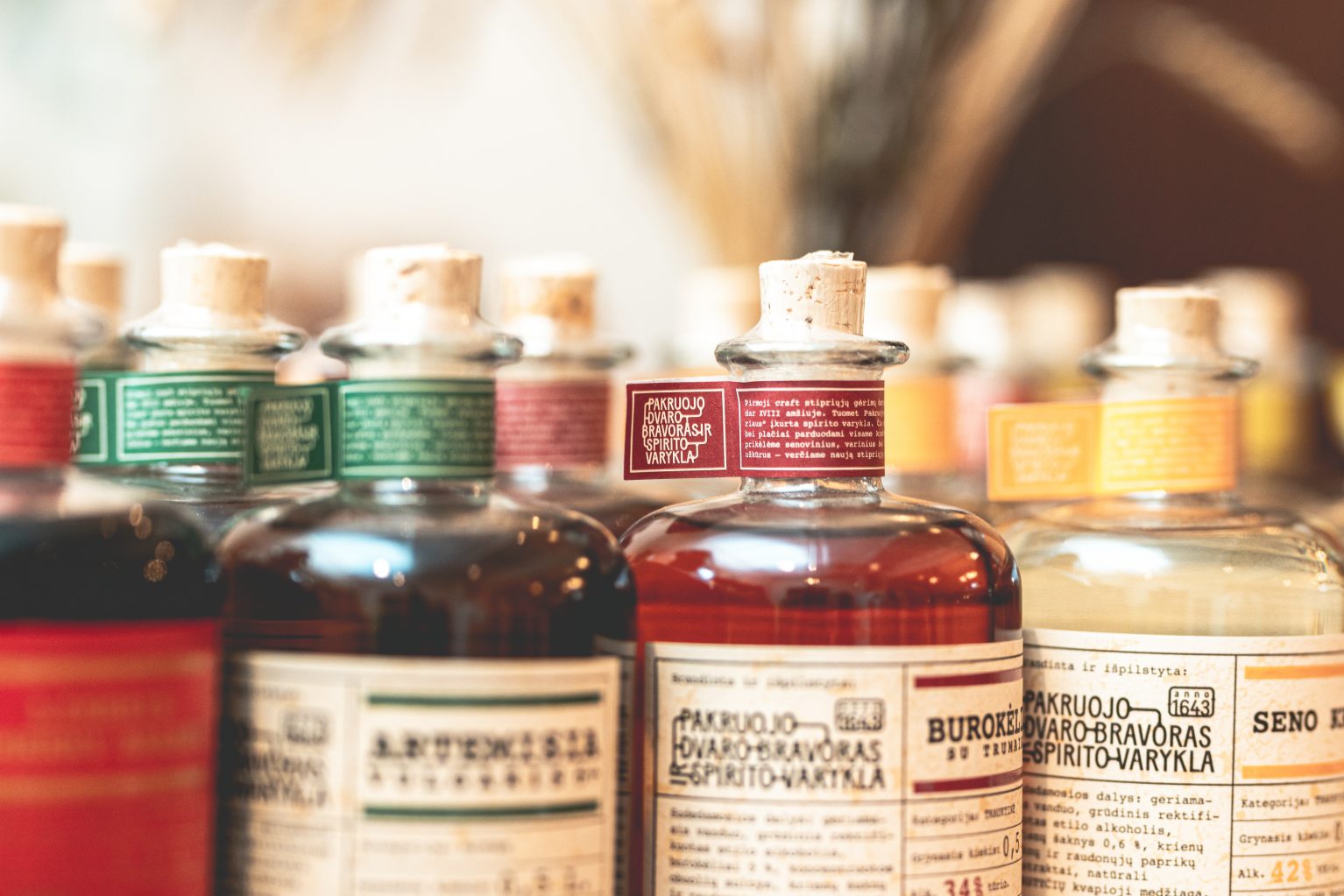
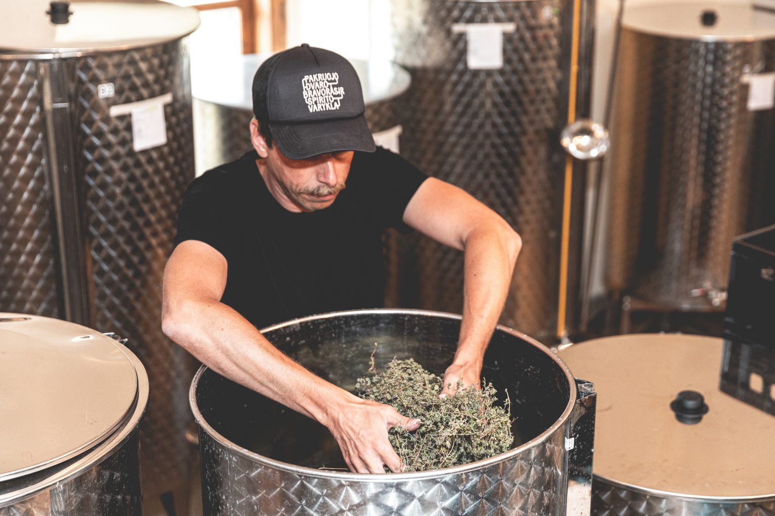
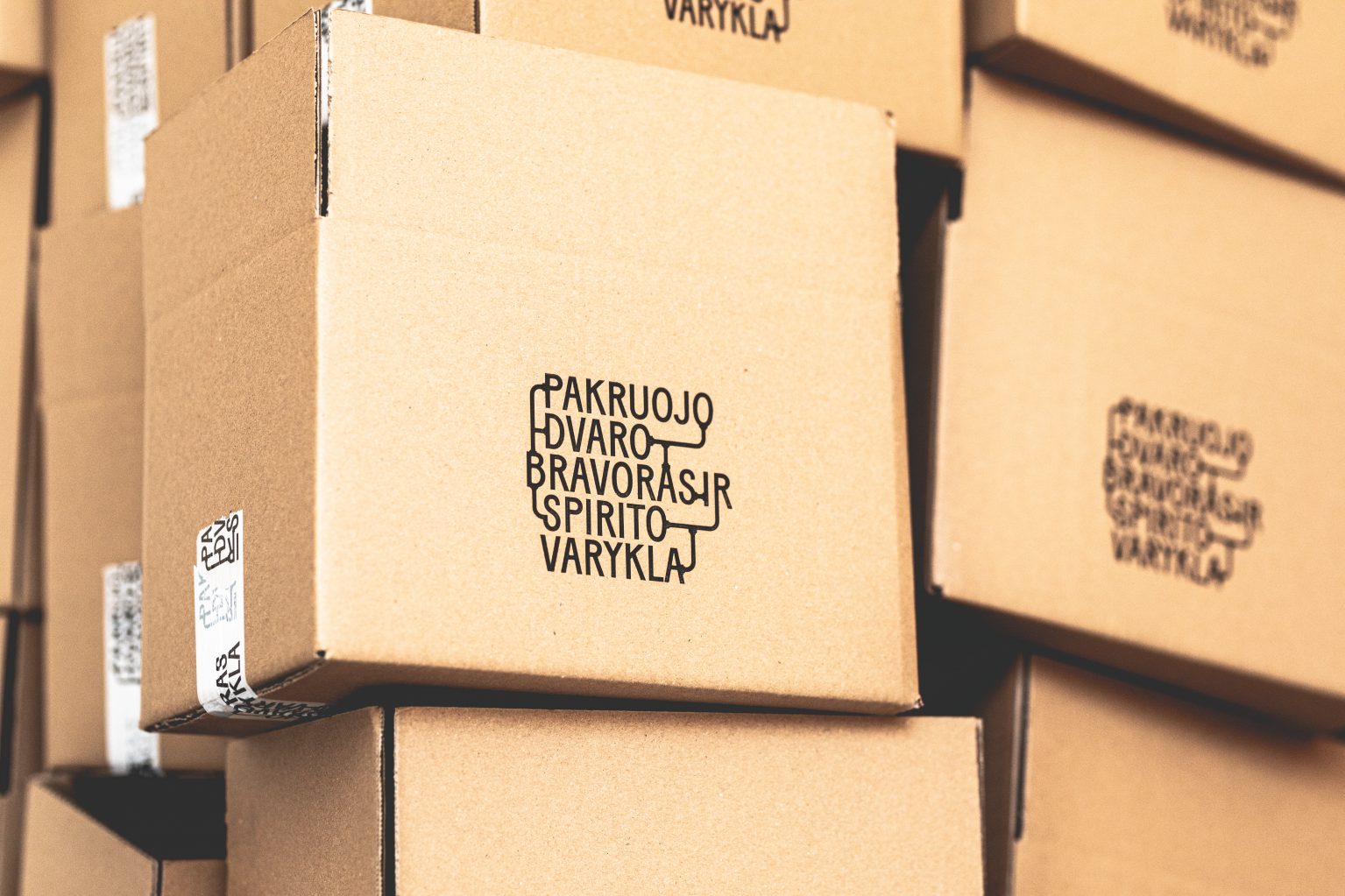
Pakruojis Manor Distillery Branding
Just as the Pakruojis Manor Distillery takes great care selecting the natural ingredients for its beverages, so we carefully created and developed the brewery’s visual identity for its craft beverages. Everything from the logo to product labels, photography, art direction, website content and design have been made by us. We really enjoy the naturalness and authenticity of this brand.