Works
Gamtos Ateitis Film Advertising
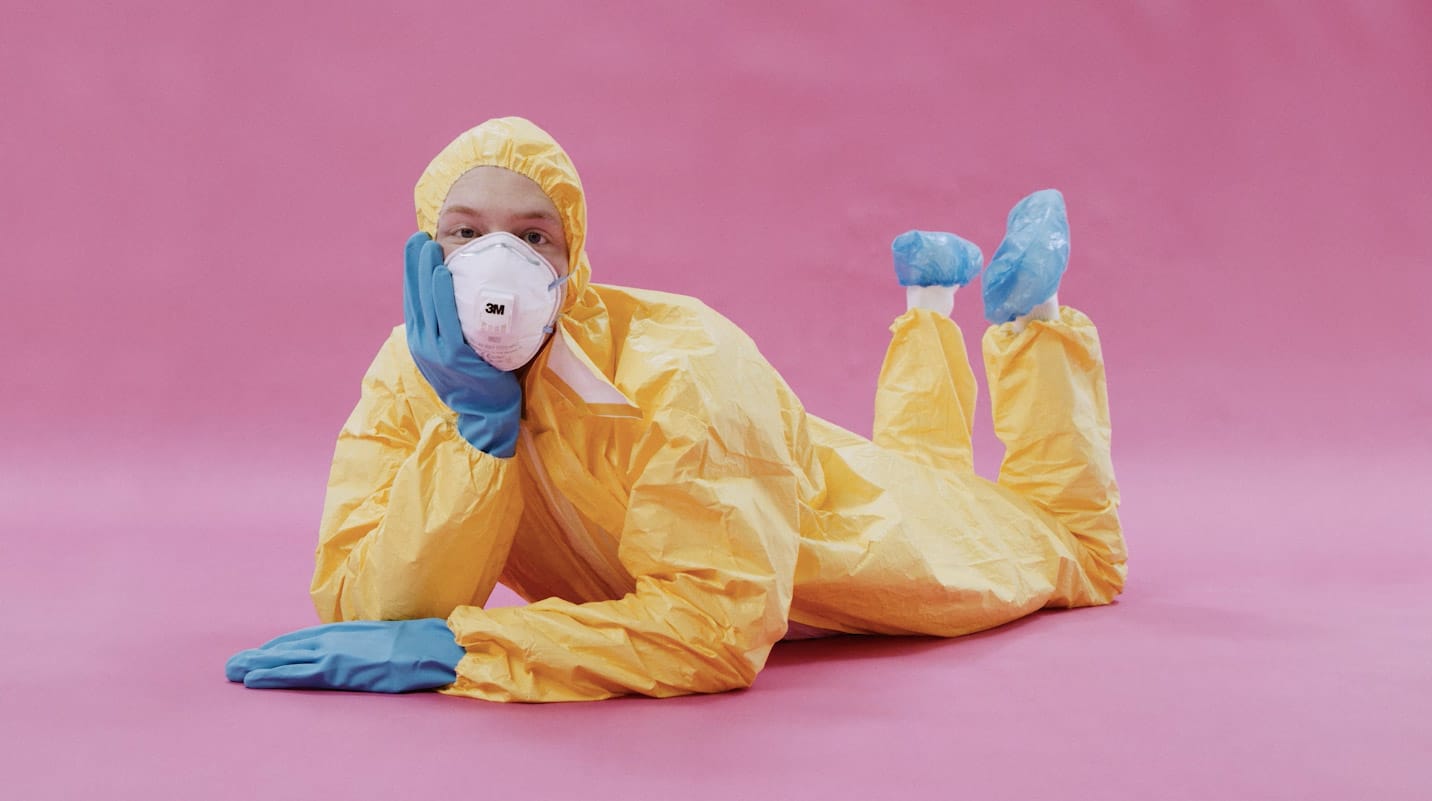
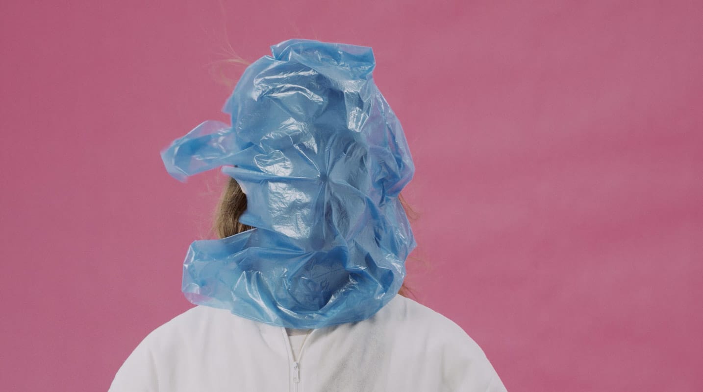
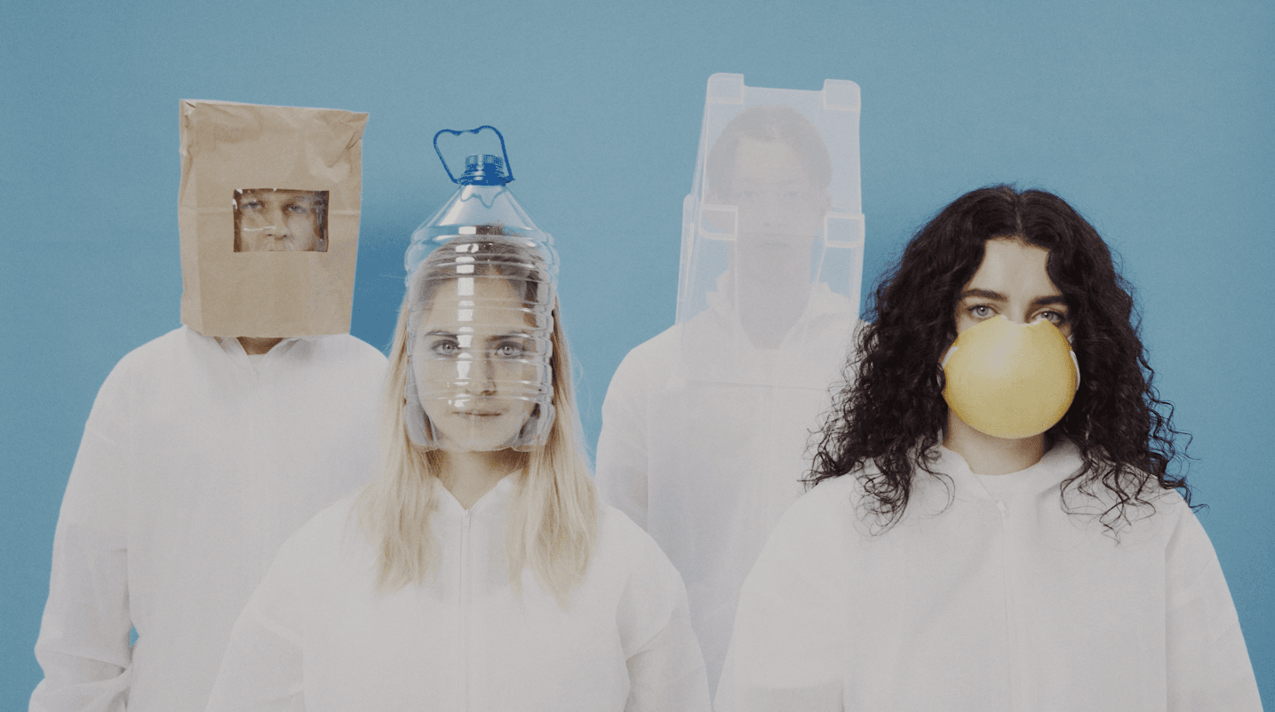
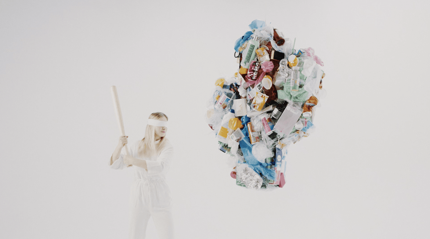
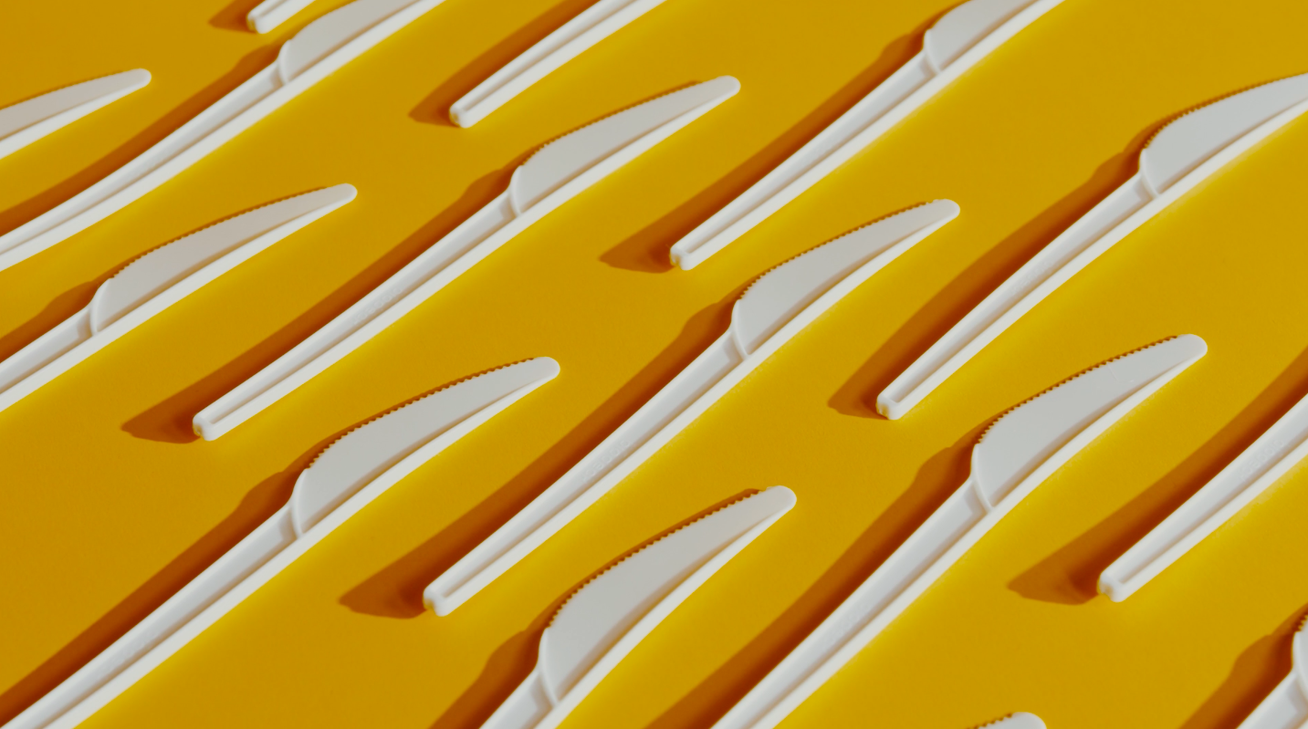
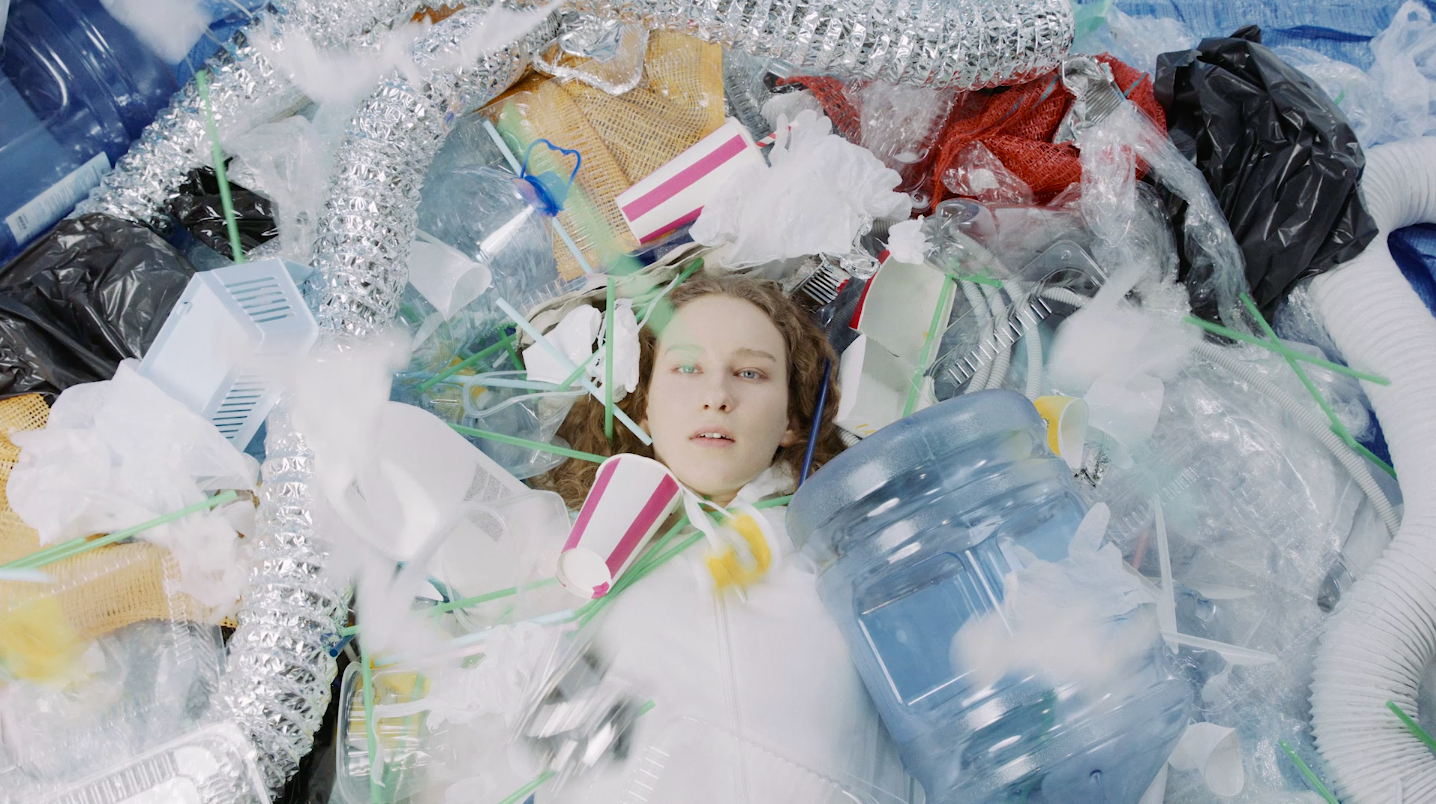
Social advertising campaign for the NGO “Nature’s Future” („Gamtos ateitis“)was dedicated to promote more conscious consumption and to fight the problem of global pollution.
Aren’t we all experience the lack of confidence, that we can change something for real? There is a lot of talking about “what” to do, instead of “why”. The idea of this campaign is to make us believe, to accept the problem more personally and to take action – recycle. It’s optimism, the true belief that the future scenario can be good, that climate change catastrophes can be prevented, and that pollution can be tackled as much as possible. After all, it all depends of our small steps. It’s positivity we need the most, in such a negative context of climate change, planetary pollution. We need to talk about more consciou
IGLU PUMPS PRODUCT DESIGN Branding
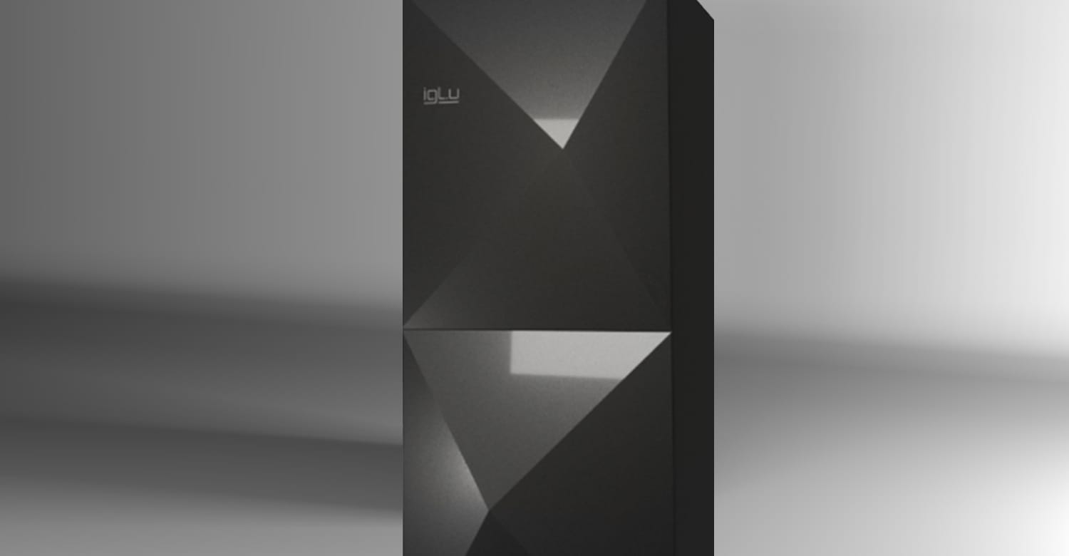
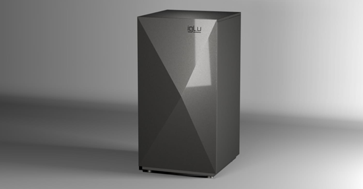
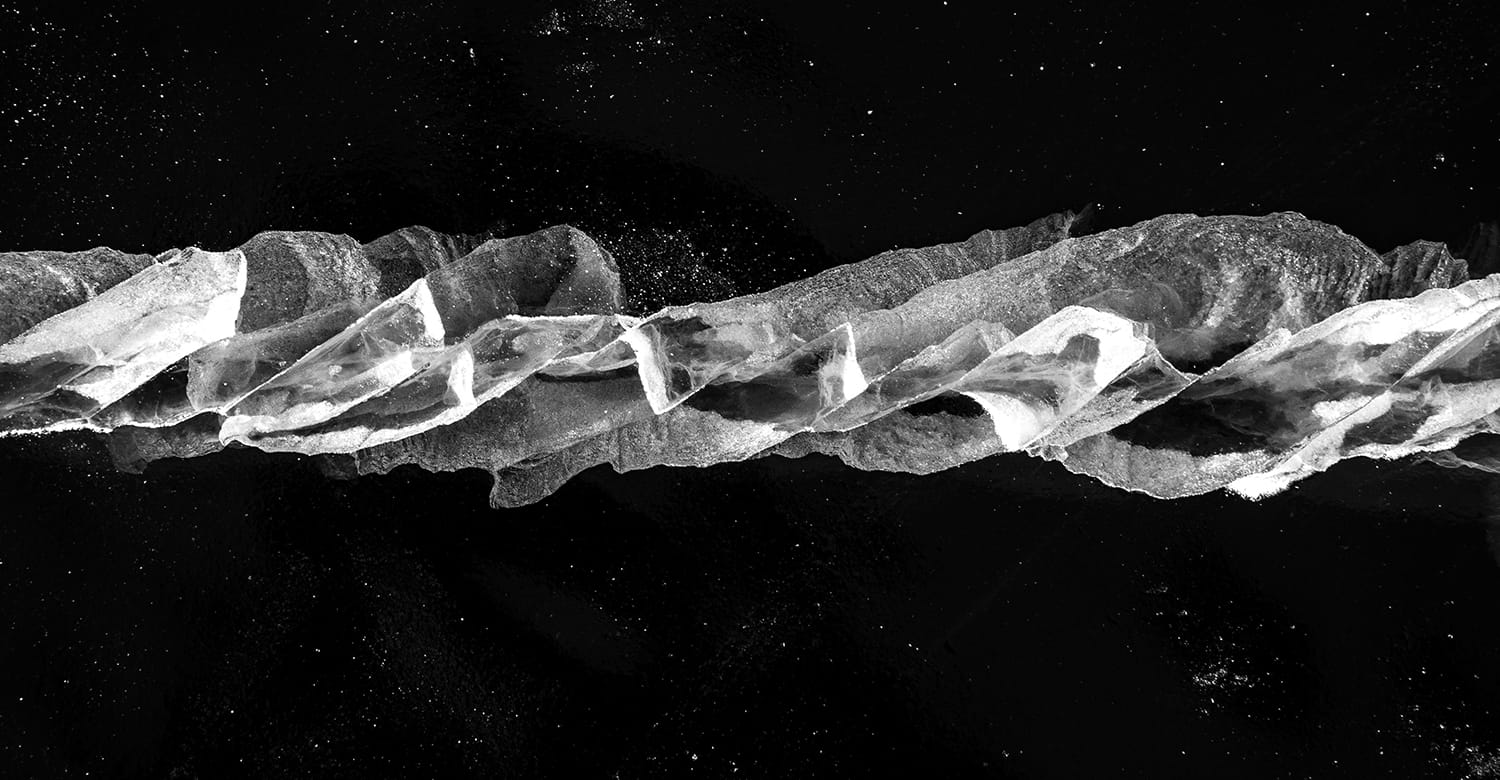
Climate change no longer raises the question of the inevitably growing demand for sustainable products that keep the house cool. MARIOS contributed to the birth of one such product – IGLU, a new generation of geothermal pumps. We had a rare opportunity to create not only a brand (brand strategy, name, logo design) but also the design concept of the product itself. The volcanic rock or ice crystal shapes of the product facade were inspired by the name of the product we created – IGLU. Igloos are ice lodges of northern nations that provide warmth and coolness at the same time.
Logo design is an original interpretation of geothermal energy, connection and flow.
NEW BALTIC DANCE FESTIVAL 2021 Advertising
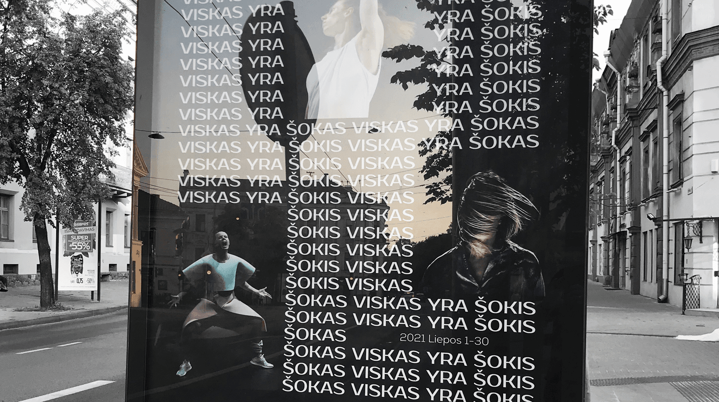
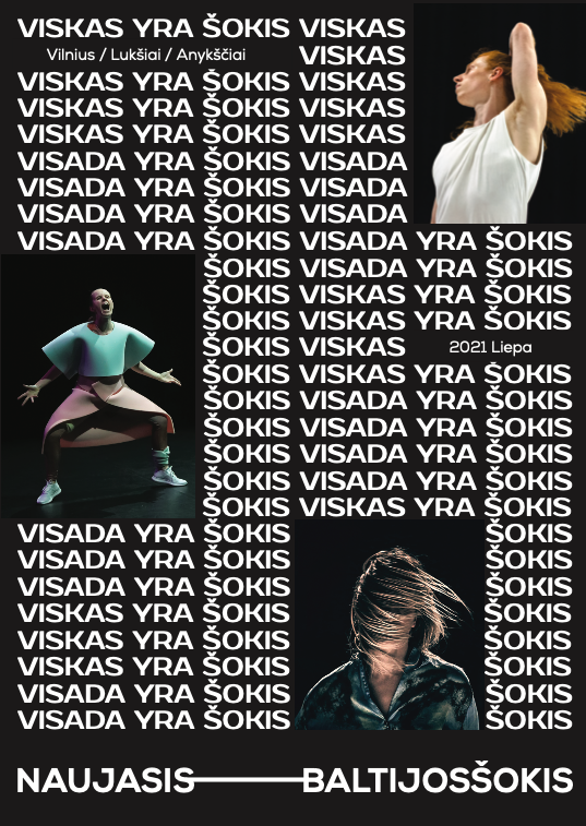
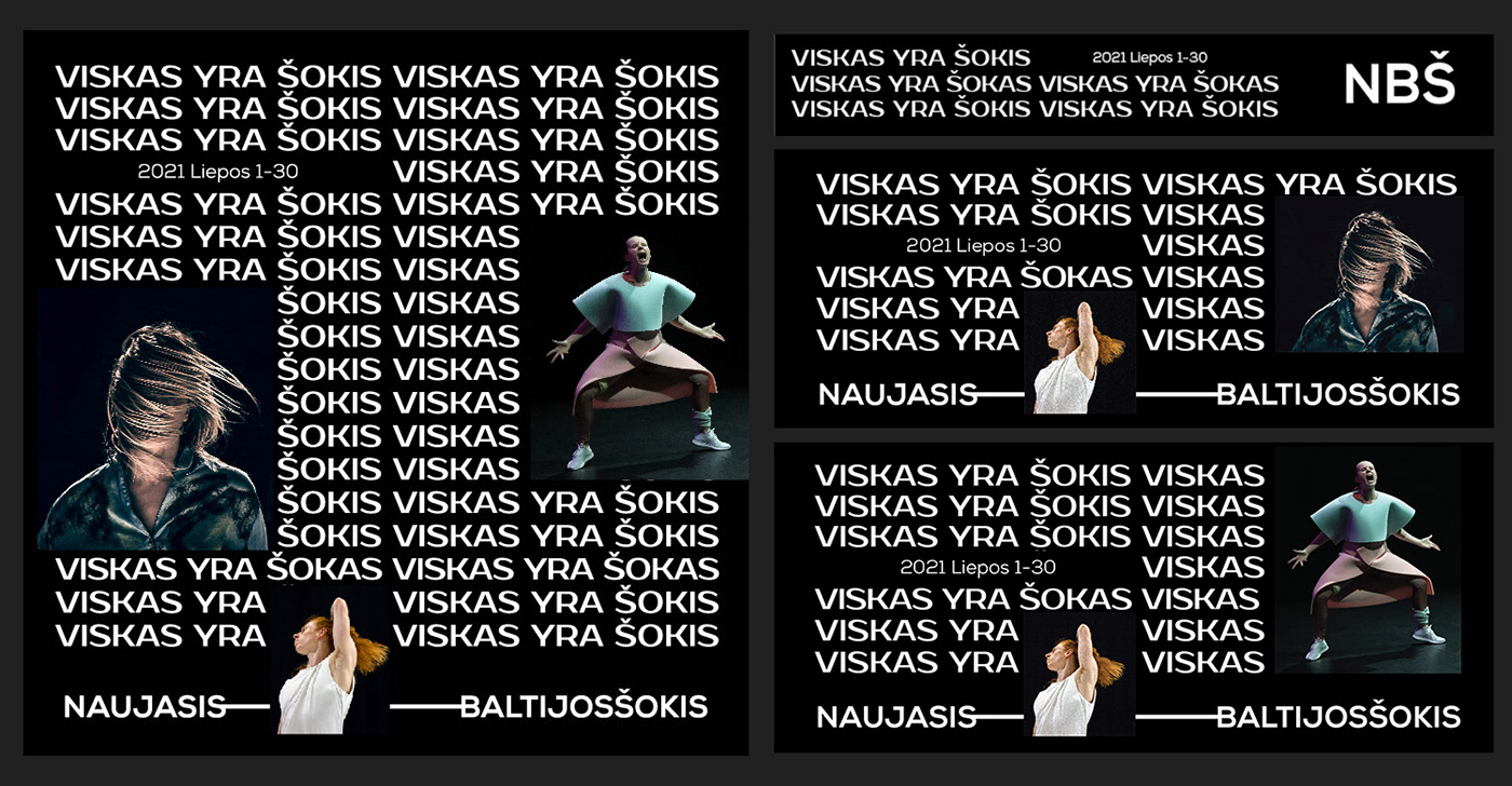
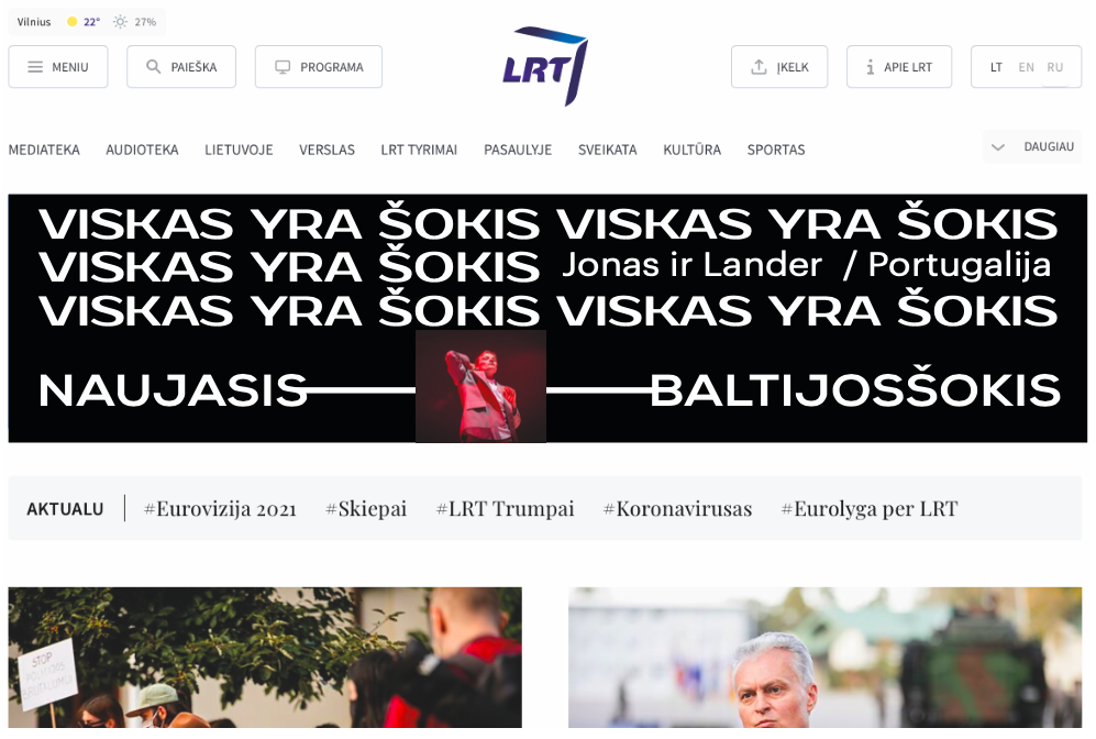
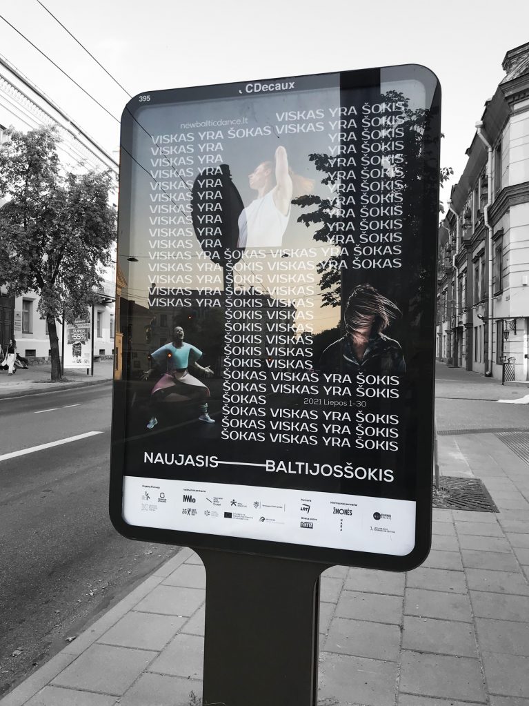
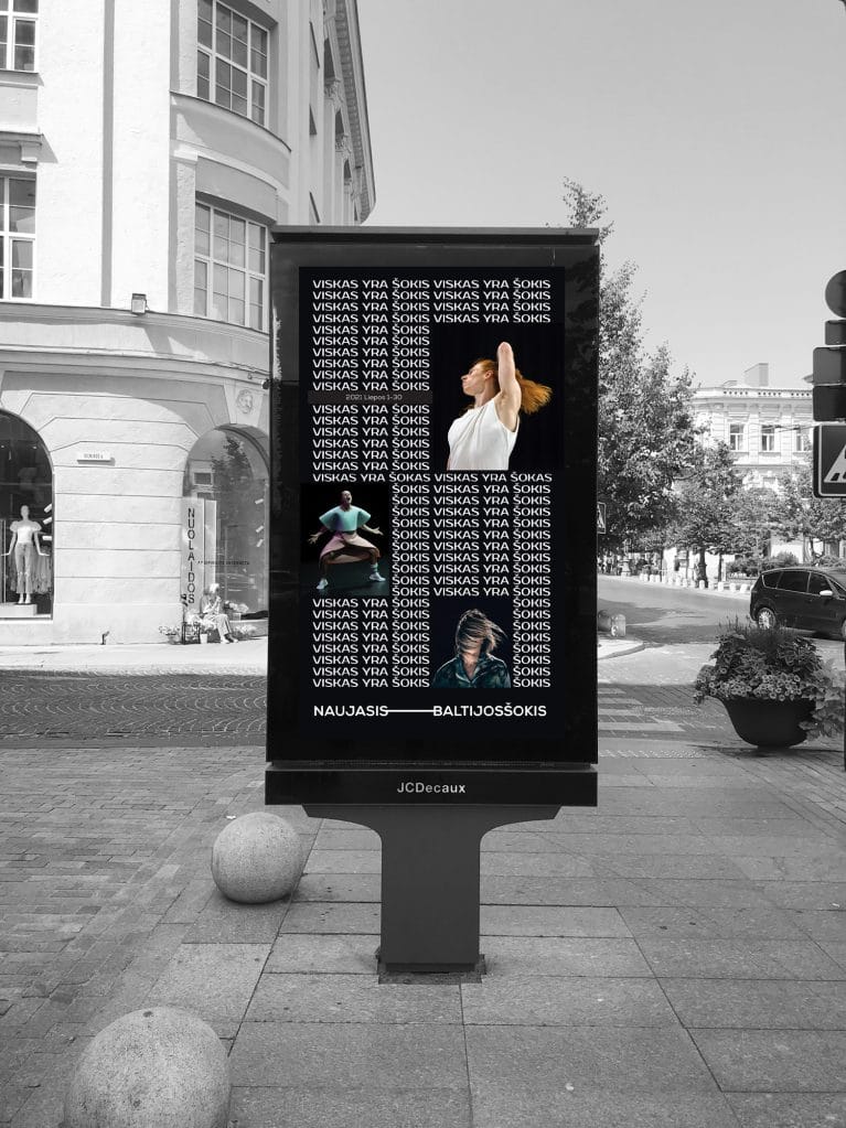
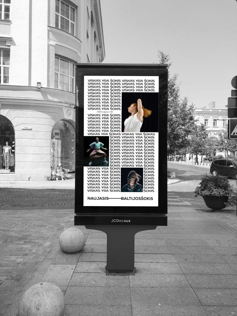
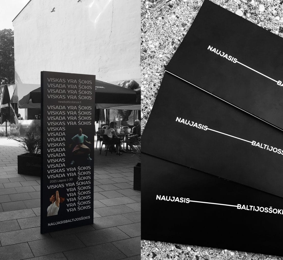
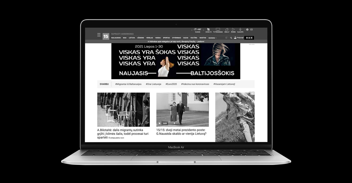
It was an impressive opportunity tu us, to give a new, progressive look for one of the largest dance festivals in Europe. By creating this dynamic logo, we were inspired by the main idea of contemporary dance, to create a scene where you are. Our logo moves and transforms the space around itself, everywere it goes. Conceptual, typography based ad campaign has complemented the launch of NBD new look. The wordplay between Lithuanian words “šokis“(„dance“) and „šokas“ („chock“) made the real „dance“ in a graphic design od the posters and digital outdoors, launching the new, wordplay based, slogan of the festival: VISKAS YRA ŠOKIS. (Everything is the dance. Everywhere is the dance. There is always the dance).
Orner Branding
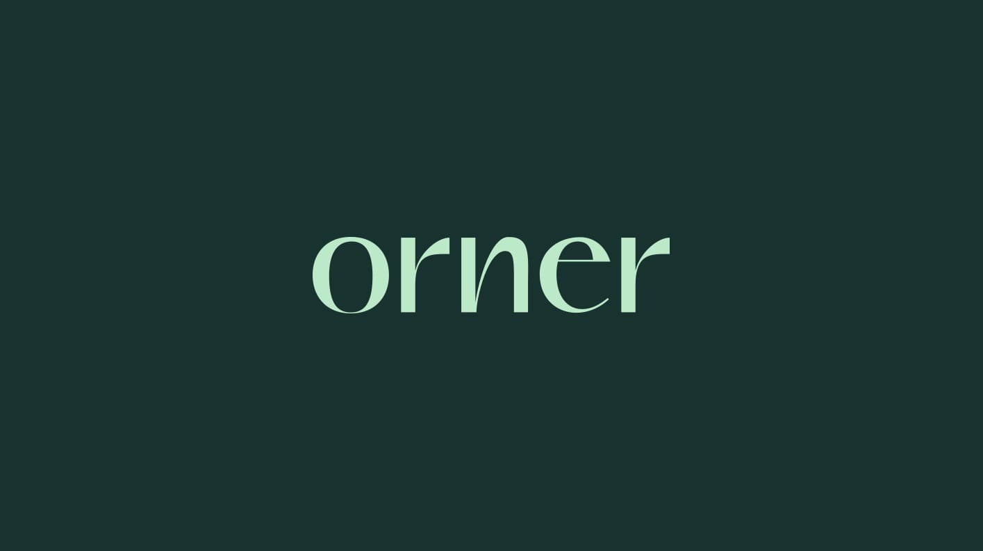
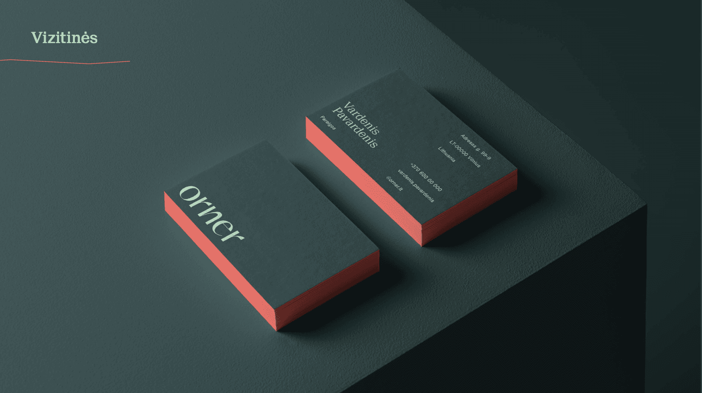
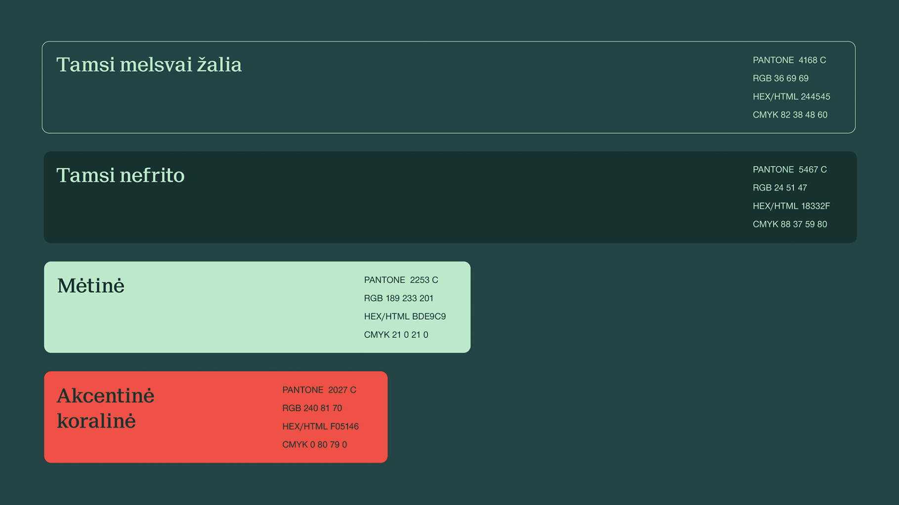
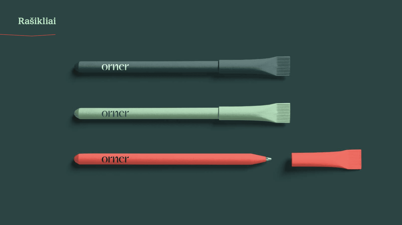
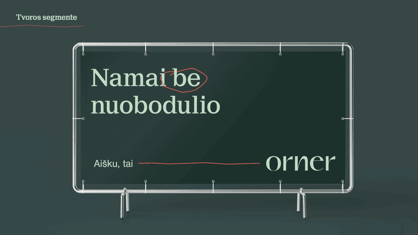
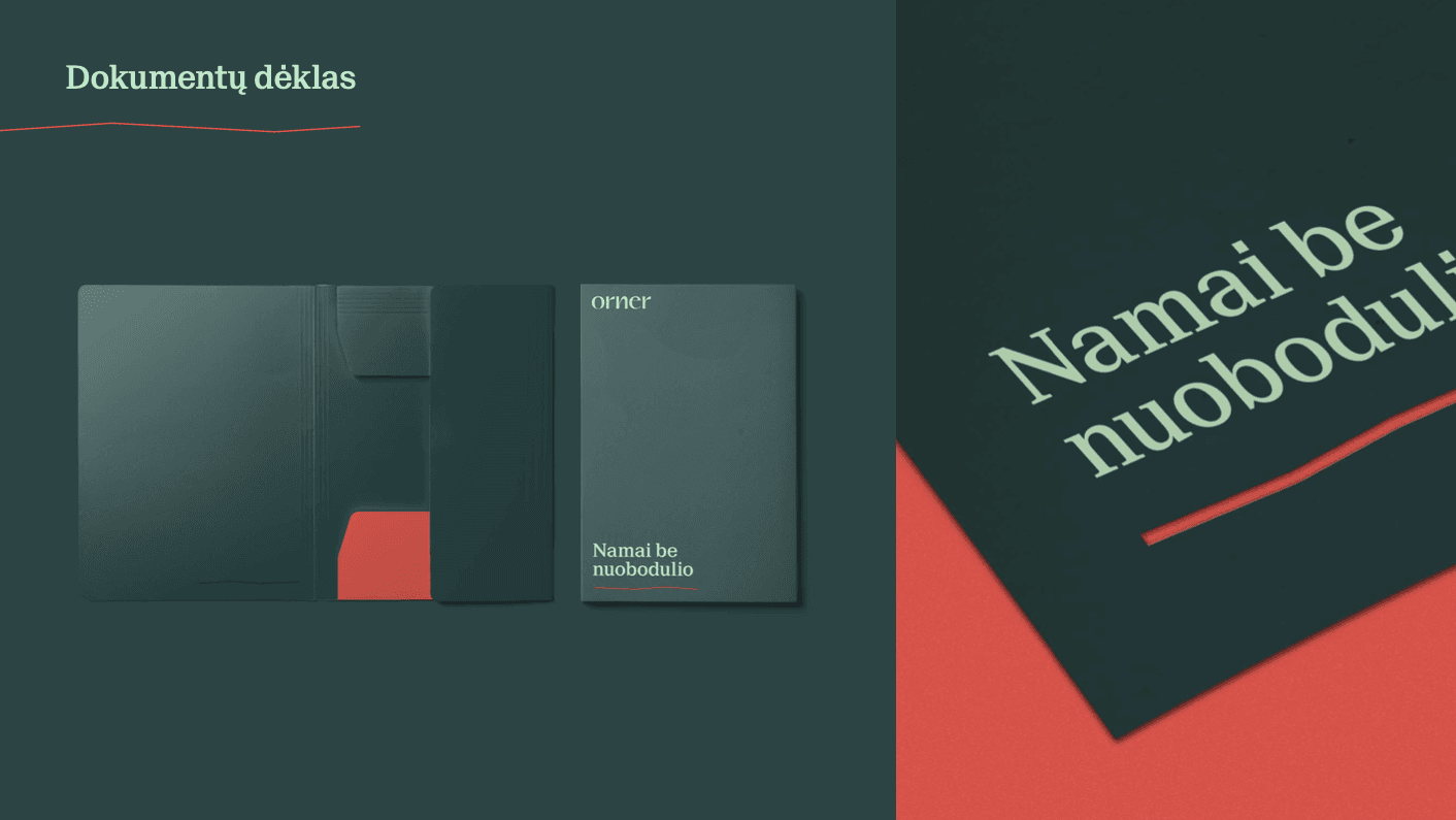
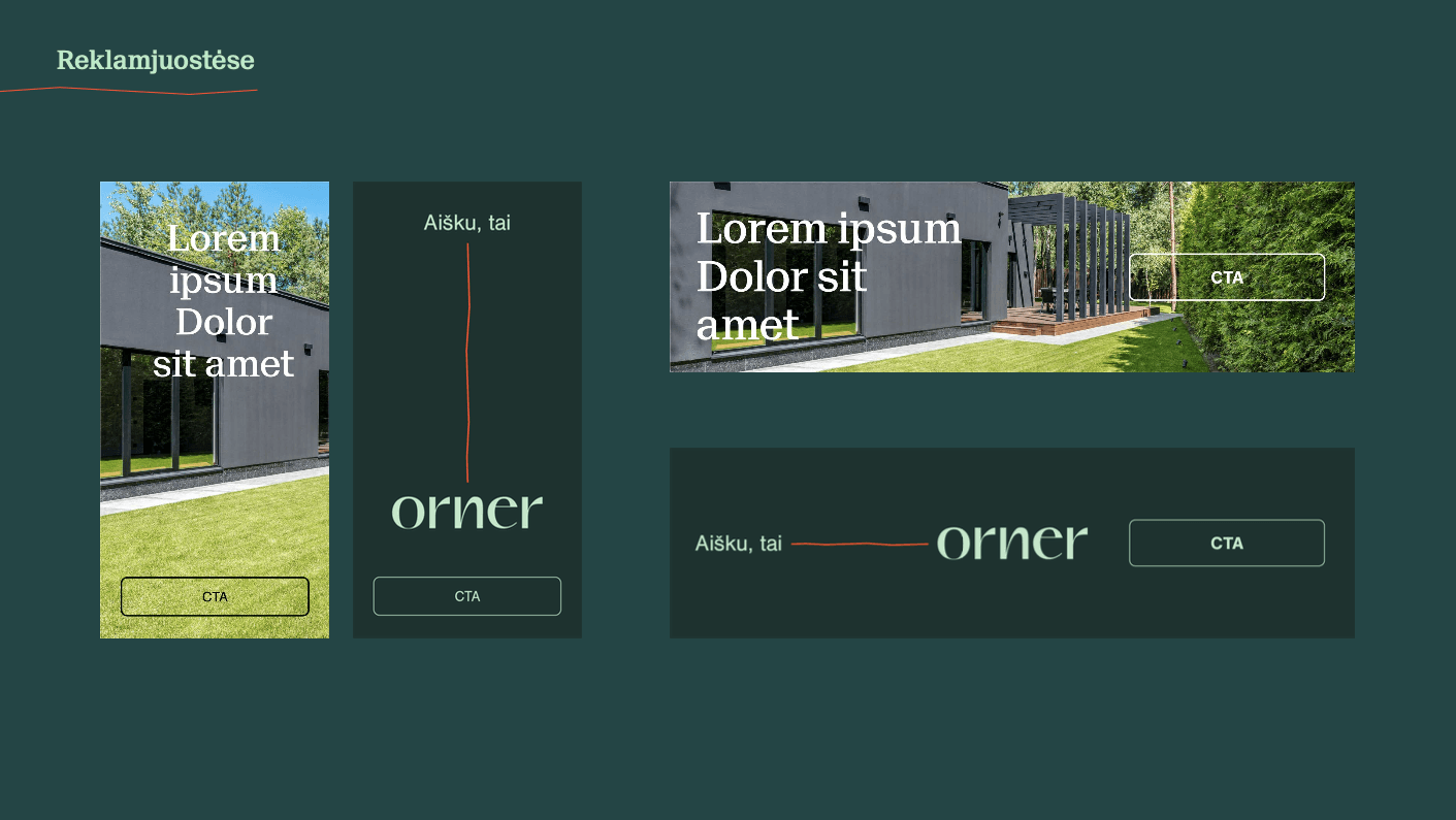
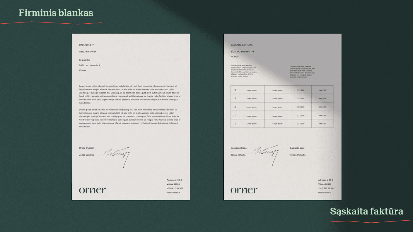
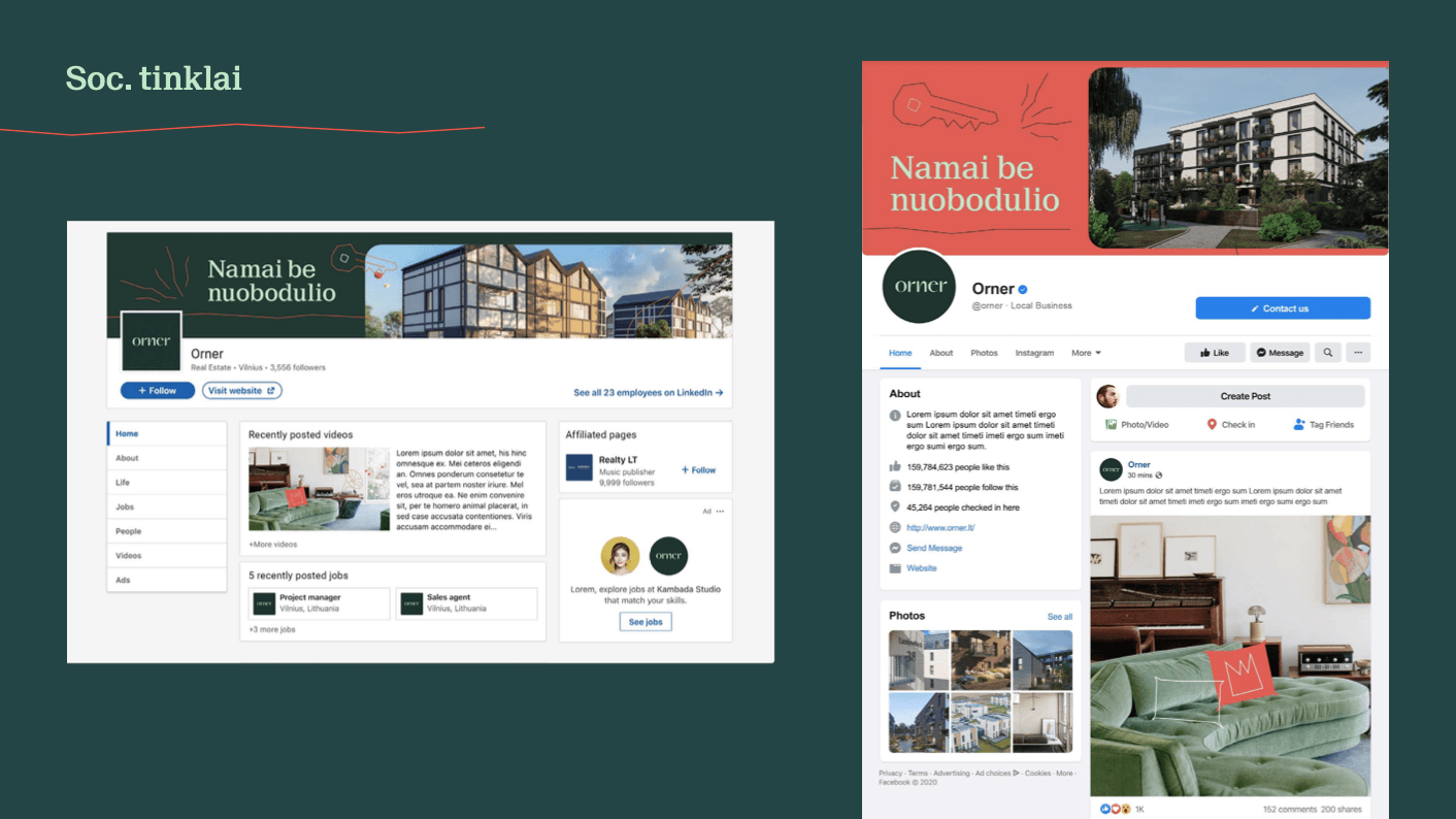
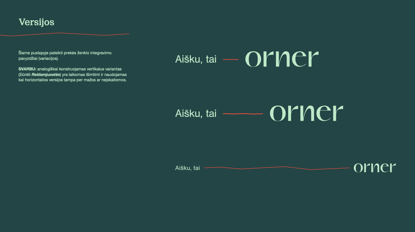
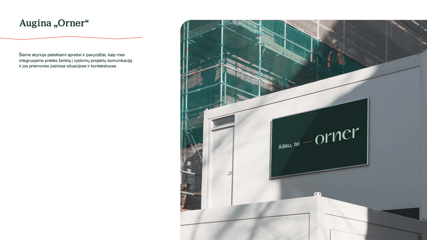
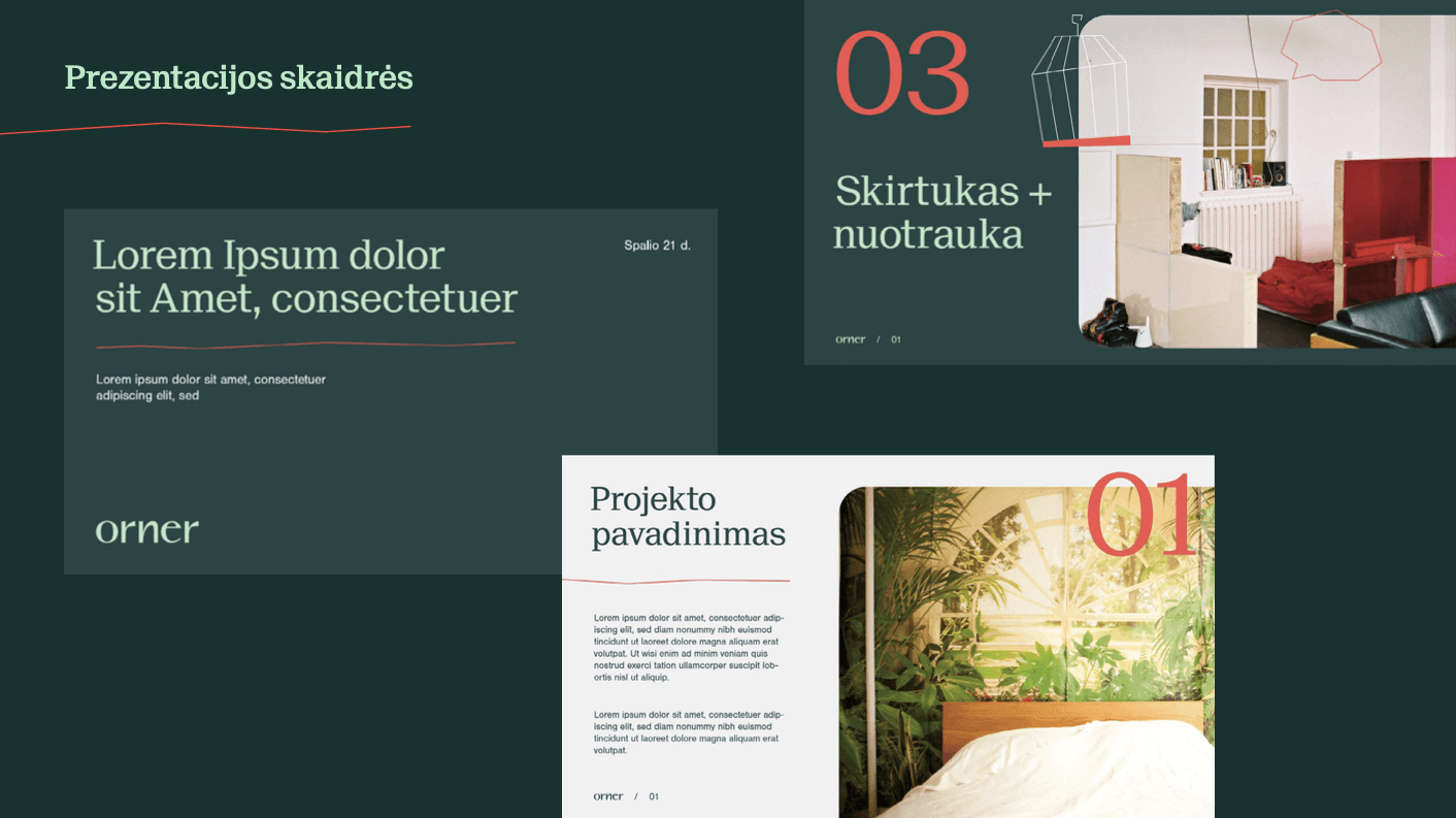
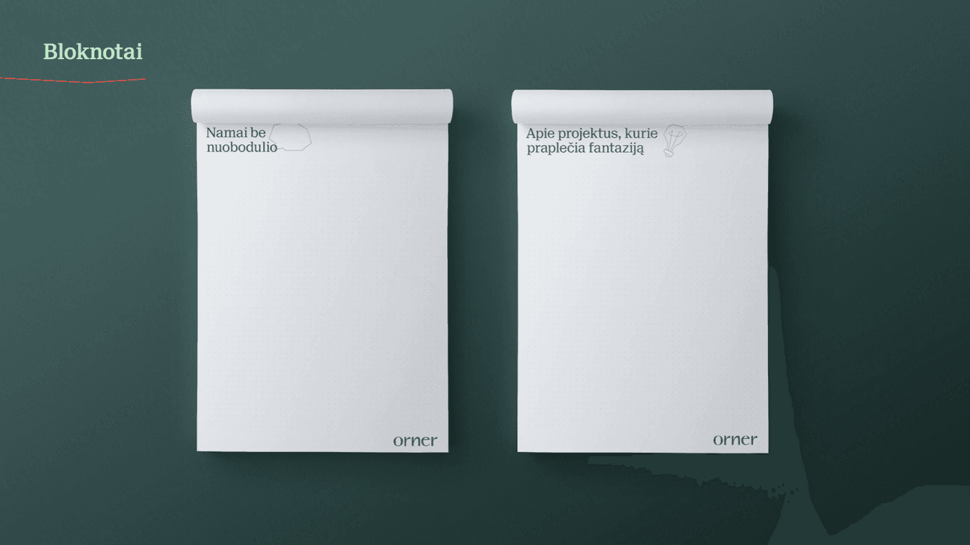
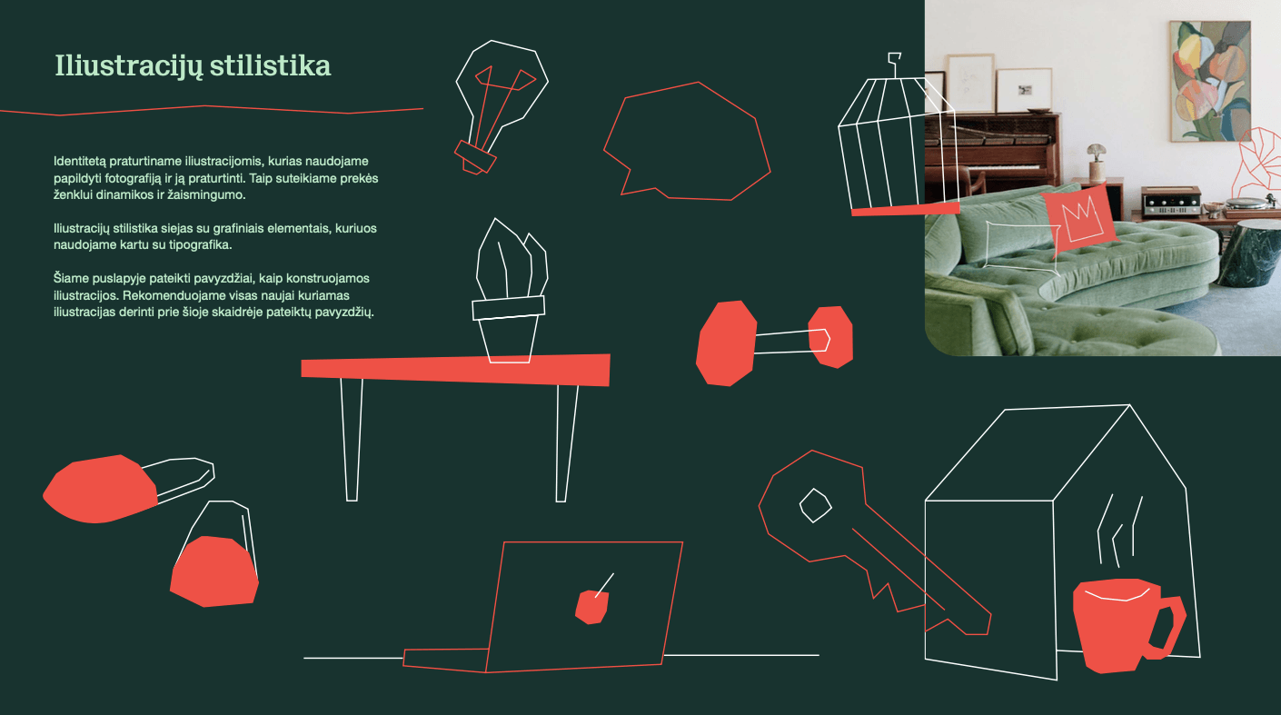
Orner, a Lithuanian real estate development company wanted a new brand identity with naming, logo and visual identity. The name ORNER originates from two words of Hebrew origin, meaning “of light and striking beauty“ and “light-carrying arrow”, as well as an acronym from the initials of the founder names. Modern typography, and a deep emerald colour combined with an accent coral orange, communicate reliability and trust with a surprising freshness. Typographic systems are simple, restrained and clear. We chose a friendly, direct illustration and its fragments. In the context of Lithuanian real estate brands, ORNER is now distinctly not corporate or boring.